ArcScrollBar
The ArcScrollBar component is designed to be used together with scrollable components such as ArcList, List, Grid, Scroll, and WaterFlow to provide a circular scrollbar.
NOTE
- This component is supported since API version 18. Updates will be marked with a superscript to indicate their earliest API version.
- When the width and height of the ArcScrollBar component are not set, the maxSize value in the layout constraint of its parent component is used as the width and height. If the parent component of the ArcScrollBar component contains scrollable components, such as ArcList, List, Grid, Scroll, or WaterFlow, you are advised to set the width and height of the ArcScrollBar component. Otherwise, the width and height of the component may be infinite.
Child Components
Not supported
APIs
ArcScrollBar(options: ArcScrollBarOptions)
Creates an instance of the ArcScrollBar component.
Atomic service API: This API can be used in atomic services since API version 18.
System capability: SystemCapability.ArkUI.ArkUI.Circle
Parameters
| Name | Type | Mandatory | Description |
|---|---|---|---|
| options | ArcScrollBarOptions | Yes | Parameters of the ArcScrollBar component. |
ArcScrollBarOptions
Represents the parameters used to construct an ArcScrollBar component.
Atomic service API: This API can be used in atomic services since API version 18.
System capability: SystemCapability.ArkUI.ArkUI.Circle
| Name | Type | Mandatory | Description |
|---|---|---|---|
| scroller | Scroller | Yes | Scroller, which can be bound to scrollable components for scrolling control. |
| state | BarState | No | State of the scrollbar. Default value: BarState.Auto |
NOTE
ArcScrollBar must be bound to a scrollable component through scroller to achieve synchronization. Only a one-to-one binding is allowed between ArcScrollBar and a scrollable component.
Example
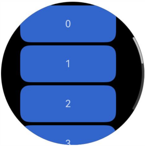
This example demonstrates how to use ArcScrollBar with a Scroll component to create an external circular scrollbar.
import { ArcScrollBar } from '@kit.ArkUI';

@Entry
@Component
struct ArcScrollBarExample {
  private scroller: Scroller = new Scroller()
  private arr: number[] = [0, 1, 2, 3, 4, 5, 6, 7, 8, 9];

  build() {
    Stack({ alignContent: Alignment.Center }) {
      Scroll(this.scroller) {
        Flex({ direction: FlexDirection.Column }) {
          ForEach(this.arr, (item: number) => {
            Row() {
              Text(item.toString())
                .width('80%')
                .height(60)
                .backgroundColor('#3366CC')
                .borderRadius(15)
                .fontSize(16)
                .textAlign(TextAlign.Center)
                .margin({ top: 5 })
            }
          }, (item: number) => item.toString())
        }.margin({ right: 15 })
      }
      .width('90%')
      .scrollBar(BarState.Off)

      ArcScrollBar({ scroller: this.scroller, state: BarState.Auto })
    }
    .width('100%')
    .height('100%')
  }
}