ArcButton
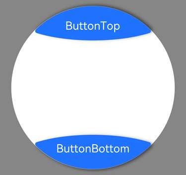
The ArcButton component represents an arc button specifically designed for circular screens. It offers various button styles, such as emphasized, normal, and warning, tailored for watch UIs.
NOTE
This component is supported since API version 18. Updates will be marked with a superscript to indicate their earliest API version.
Modules to Import
import {
  ArcButton,
  ArcButtonOptions,
  ArcButtonStatus,
  ArcButtonStyleMode,
  ArcButtonPosition,
}  from '@kit.ArkUI';
Child Components
Not supported
Attributes
The universal attributes are not supported.
Events
Among the universal events, the click event and touch event are supported.
ArcButton
ArcButton({ options: ArcButtonOptions })
Creates an instance of ArcButton with configuration parameters.
Decorator: @Component
Atomic service API: This API can be used in atomic services since API version 18.
System capability: SystemCapability.ArkUI.ArkUI.Circle
Parameters
| Name | Type | Mandatory | Decorator | Description |
|---|---|---|---|---|
| options | ArcButtonOptions | Yes | @Require | Text, background color, shadow, and other parameters of the ArcButton component. |
ArcButtonOptions
Defines the default or custom style parameters for the ArcButton component.
Atomic service API: This API can be used in atomic services since API version 18.
System capability: SystemCapability.ArkUI.ArkUI.Circle
Properties
| Name | Type | Mandatory | Description |
|---|---|---|---|
| position | ArcButtonPosition | Yes | Type of the arc button. Default value: ArcButtonPosition.BOTTOM_EDGE |
| styleMode | ArcButtonStyleMode | Yes | Style mode for the arc button. Default value: ArcButtonStyleMode.EMPHASIZED_LIGHT |
| status | ArcButtonStatus | Yes | Status of the arc button. Default value: ArcButtonStatus.NORMAL |
| label | ResourceStr | Yes | Text displayed on the arc button. |
| backgroundBlurStyle | BlurStyle | Yes | Background blur style of the arc button. Default value: BlurStyle.NONE |
| backgroundColor | ColorMetrics | Yes | Background color of the arc button. Default value: Color.Black |
| shadowColor | ColorMetrics | Yes | Shadow color of the arc button. Default value: Color.Black |
| shadowEnabled | boolean | Yes | Whether to enable the shadow for the arc button. Default value: false The value true means to enable the shadow, and false means the opposite. |
| fontSize | LengthMetrics | Yes | Font size of the arc button. Default value: 19fp |
| fontColor | ColorMetrics | Yes | Font color of the arc button. Default value: Color.White |
| pressedFontColor | ColorMetrics | Yes | Font color of the arc button when pressed. Default value: Color.White |
| fontStyle | FontStyle | Yes | Font style of the arc button. Default value: FontStyle.Normal |
| fontFamily | string |Resource | Yes | Font family of the arc button. |
| fontMargin | LocalizedMargin | Yes | Margin of the arc button text. Default value: { start: 24vp, top: 10vp,end: 24vp, bottom: 16vp } |
| onTouch | Callback< TouchEvent> | No | Callback triggered by touch actions on the arc button. |
| onClick | Callback<ClickEvent) > | No | Callback triggered by click actions on the arc button. |
constructor
constructor(options: CommonArcButtonOptions)
A constructor used to create an ArcButton component.
Atomic service API: This API can be used in atomic services since API version 18.
System capability: SystemCapability.ArkUI.ArkUI.Circle
Parameters
| Name | Type | Mandatory | Description |
|---|---|---|---|
| options | CommonArcButtonOptions | Yes | Text, background color, shadow, and other parameters of the ArcButton component. |
CommonArcButtonOptions
Defines the default or custom style parameters for the ArcButton component.
Atomic service API: This API can be used in atomic services since API version 18.
System capability: SystemCapability.ArkUI.ArkUI.Circle
| Name | Type | Mandatory | Description |
|---|---|---|---|
| position | ArcButtonPosition | Yes | Type of the arc button. Default value: ArcButtonPosition.BOTTOM_EDGE |
| styleMode | ArcButtonStyleMode | Yes | Style mode for the arc button. Default value: ArcButtonStyleMode.EMPHASIZED_LIGHT |
| status | ArcButtonStatus | Yes | Status of the arc button. Default value: ArcButtonStatus.NORMAL |
| label | ResourceStr | Yes | Text displayed on the arc button. |
| backgroundBlurStyle | BlurStyle | Yes | Background blur style of the arc button. Default value: BlurStyle.NONE |
| backgroundColor | ColorMetrics | Yes | Background color of the arc button. Default value: Color.Black |
| shadowColor | ColorMetrics | Yes | Shadow color of the arc button. Default value: Color.Black |
| shadowEnabled | boolean | Yes | Whether to enable the shadow for the arc button. Default value: false The value true means to enable the shadow, and false means the opposite. |
| fontSize | LengthMetrics | Yes | Font size of the arc button. Default value: 19fp |
| fontColor | ColorMetrics | Yes | Font color of the arc button. Default value: Color.White |
| pressedFontColor | ColorMetrics | Yes | Font color of the arc button when pressed. Default value: Color.White |
| fontStyle | FontStyle | Yes | Font style of the arc button. Default value: FontStyle.Normal |
| fontFamily | string |Resource | Yes | Font family of the arc button. |
| fontMargin | LocalizedMargin | Yes | Margin of the arc button text. Default value: { start: 24vp, top: 10vp,end: 24vp, bottom: 16vp } |
| onTouch | Callback< TouchEvent> | No | Callback triggered by touch actions on the arc button. |
| onClick | Callback<ClickEvent) > | No | Callback triggered by click actions on the arc button. |
ArcButtonPosition
Enumerates the types of arc buttons that can be set for ArcButton.
Atomic service API: This API can be used in atomic services since API version 18.
System capability: SystemCapability.ArkUI.ArkUI.Circle
| Name | Value | Description |
|---|---|---|
| TOP_EDGE | 0 | Upper arc button located at the top of the circular screen. |
| BOTTOM_EDGE | 1 | Lower arc button located at the bottom of the circular screen. |
ArcButtonStyleMode
Enumerates the style modes that can be set for ArcButton.
Atomic service API: This API can be used in atomic services since API version 18.
System capability: SystemCapability.ArkUI.ArkUI.Circle
| Name | Value | Description |
|---|---|---|
| EMPHASIZED_LIGHT | 0 | Emphasized, light color. |
| EMPHASIZED_DARK | 1 | Emphasized, dark color. |
| NORMAL_LIGHT | 2 | Normal, light color. |
| NORMAL_DARK | 3 | Normal, dark color. |
| CUSTOM | 4 | Custom style. |
ArcButtonStatus
Enumerates the states that can be set for ArcButton.
Atomic service API: This API can be used in atomic services since API version 18.
System capability: SystemCapability.ArkUI.ArkUI.Circle
| Name | Value | Description |
|---|---|---|
| NORMAL | 0 | Normal state. |
| PRESSED | 1 | Pressed state. |
| DISABLED | 2 | Disabled state. |
Example
This example shows the usage of ArcButton.
topOptions defines an upper arc button with the button text "ButtonTop," a font size of 15 fp, and shadow enabled, in the normal state with a light-color emphasized style.
bottomOptions defines a bottom arc button with the button text "ButtonBottom," a font size of 15 fp, shadow enabled, in a light-color emphasized style, with a click event set for the button.
// xxx.ets
import {
  ColorMetrics,
  LengthMetrics,
  LengthUnit,
  ArcButton,
  ArcButtonOptions,
  ArcButtonStatus,
  ArcButtonStyleMode,
  ArcButtonTypeMode,
}  from '@kit.ArkUI';

@Entry
@ComponentV2
struct Index {
  @Local topOptions: ArcButtonOptions = new ArcButtonOptions({})
  @Local bottomOptions: ArcButtonOptions = new ArcButtonOptions({})

  aboutToAppear() {
    this.topOptions = new ArcButtonOptions({
      label: 'ButtonTop',
      status: ArcButtonStatus.NORMAL,
      position: ArcButtonPosition.TOP_EDGE,
      styleMode: ArcButtonStyleMode.EMPHASIZED_LIGHT,
      fontSize: new LengthMetrics(15, LengthUnit.FP),
      shadowEnabled: true
    })

    this.bottomOptions = new ArcButtonOptions({
      label: 'ButtonBottom',
      styleMode: ArcButtonStyleMode.EMPHASIZED_LIGHT,
      fontSize: new LengthMetrics(15, LengthUnit.FP),
      shadowEnabled: true,
      onClick: () => {
        console.info('click from ArcButton.')
      }
    })
  }

  build() {
    Stack() {
      Stack() {
        Circle({ width: 233, height: 233 })
          .strokeWidth(0.1)
          .fill(Color.White)

        Column() {
          ArcButton({ options: this.topOptions })
          Blank()
          ArcButton({ options: this.bottomOptions })

        }.width('100%')
        .height('100%')
      }.width(233)
      .height(233)
    }.width('100%')
    .height('100%')
    .alignContent(Alignment.Center)
    .backgroundColor(Color.Gray)
  }
}