Enums
NOTE
The initial APIs of this module are supported since API version 7. Newly added APIs will be marked with a superscript to indicate their earliest API version.
Color
Widget capability: This API can be used in ArkTS widgets since API version 9.
Atomic service API: This API can be used in atomic services since API version 11.
System capability: SystemCapability.ArkUI.ArkUI.Full
| Color | Value | Illustration |
|---|---|---|
| Black | 0x000000 |  |
| Blue | 0x0000ff |  |
| Brown | 0xa52a2a |  |
| Gray | 0x808080 |  |
| Grey | 0x808080 | |
| Green | 0x008000 |  |
| Orange | 0xffa500 |  |
| Pink | 0xffc0cb |  |
| Red | 0xff0000 |  |
| White | 0xffffff |  |
| Yellow | 0xffff00 |  |
| Transparent9+ | rgba(0,0,0,0) | Transparent |
ImageFit
System capability: SystemCapability.ArkUI.ArkUI.Full
| Name | Value | Description |
|---|---|---|
| Contain | 0 | The image is scaled with its aspect ratio retained for the content to be completely displayed within the display boundaries. Widget capability: This API can be used in ArkTS widgets since API version 9. Atomic service API: This API can be used in atomic services since API version 11.  |
| Cover | 1 | The image is scaled with its aspect ratio retained for both sides to be greater than or equal to the display boundaries. Widget capability: This API can be used in ArkTS widgets since API version 9. Atomic service API: This API can be used in atomic services since API version 11.  |
| Auto | 2 | The image is scaled automatically based on its own size and the size of the component to fit the display area. Widget capability: This API can be used in ArkTS widgets since API version 9. Atomic service API: This API can be used in atomic services since API version 11. |
| Fill | 3 | The image is scaled to fill the display area, and its aspect ratio is not retained. Widget capability: This API can be used in ArkTS widgets since API version 9. Atomic service API: This API can be used in atomic services since API version 11.  |
| ScaleDown | 4 | The image is displayed with its aspect ratio retained, in a size smaller than or equal to the original size. Widget capability: This API can be used in ArkTS widgets since API version 9. Atomic service API: This API can be used in atomic services since API version 11. |
| None | 5 | The image is displayed in its original size. Widget capability: This API can be used in ArkTS widgets since API version 9. Atomic service API: This API can be used in atomic services since API version 11.  |
| TOP_START12+ | 7 | The image is displayed at the top start corner of the Image component, keeping its original size. Widget capability: This API can be used in ArkTS widgets since API version 12. Atomic service API: This API can be used in atomic services since API version 12.  |
| TOP12+ | 8 | The image is displayed horizontally centered at the top of the Image component, keeping its original size. Widget capability: This API can be used in ArkTS widgets since API version 12. Atomic service API: This API can be used in atomic services since API version 12.  |
| TOP_END12+ | 9 | The image is displayed at the top end corner of the Image component, keeping its original size. Widget capability: This API can be used in ArkTS widgets since API version 12. Atomic service API: This API can be used in atomic services since API version 12.  |
| START12+ | 10 | The image is displayed vertically centered at the start of the Image component, keeping its original size. Widget capability: This API can be used in ArkTS widgets since API version 12. Atomic service API: This API can be used in atomic services since API version 12.  |
| CENTER12+ | 11 | The image is displayed at the center of the Image component both horizontally and vertically, keeping its original size. Widget capability: This API can be used in ArkTS widgets since API version 12. Atomic service API: This API can be used in atomic services since API version 12.  |
| END12+ | 12 | The image is displayed vertically centered at the end of the Image component, keeping its original size. Widget capability: This API can be used in ArkTS widgets since API version 12. Atomic service API: This API can be used in atomic services since API version 12.  |
| BOTTOM_START12+ | 13 | The image is displayed at the bottom start corner of the Image component, keeping its original size. Widget capability: This API can be used in ArkTS widgets since API version 12. Atomic service API: This API can be used in atomic services since API version 12.  |
| BOTTOM12+ | 14 | The image is displayed horizontally centered at the bottom of the Image component, keeping its original size. Widget capability: This API can be used in ArkTS widgets since API version 12. Atomic service API: This API can be used in atomic services since API version 12.  |
| BOTTOM_END12+ | 15 | The image is displayed at the bottom end corner of the Image component, keeping its original size. Widget capability: This API can be used in ArkTS widgets since API version 12. Atomic service API: This API can be used in atomic services since API version 12.  |
| MATRIX15+ | 16 | The image, with the use of imageMatrix, is displayed in the specified position of the Image component, keeping its original size. SVG images are not supported. Atomic service API: This API can be used in atomic services since API version 15. |
BorderStyle
Widget capability: This API can be used in ArkTS widgets since API version 9.
Atomic service API: This API can be used in atomic services since API version 11.
System capability: SystemCapability.ArkUI.ArkUI.Full
| Name | Description |
|---|---|
| Dotted | Dotted border. The radius of a dot is half of borderWidth. |
| Dashed | Dashed border. |
| Solid | Solid border. |
LineJoinStyle
Widget capability: This API can be used in ArkTS widgets since API version 9.
Atomic service API: This API can be used in atomic services since API version 11.
System capability: SystemCapability.ArkUI.ArkUI.Full
| Name | Description |
|---|---|
| Bevel | Bevel is used to connect paths. |
| Miter | Miter is used to connect paths. |
| Round | Round is used to connect paths. |
TouchType
Atomic service API: This API can be used in atomic services since API version 11.
System capability: SystemCapability.ArkUI.ArkUI.Full
| Name | Description |
|---|---|
| Down | A finger is pressed. |
| Up | A finger is lifted. |
| Move | A finger moves on the screen in pressed state. |
| Cancel | A touch event is canceled. |
MouseButton8+
Atomic service API: This API can be used in atomic services since API version 11.
System capability: SystemCapability.ArkUI.ArkUI.Full
| Name | Description |
|---|---|
| Left | Left button on the mouse. |
| Right | Right button on the mouse. |
| Middle | Middle button on the mouse. |
| Back | Back button on the left of the mouse. |
| Forward | Forward button on the left of the mouse. |
| None | No button. |
MouseAction8+
System capability: SystemCapability.ArkUI.ArkUI.Full
| Name | Description |
|---|---|
| Press | The mouse button is pressed. Atomic service API: This API can be used in atomic services since API version 11. |
| Release | The mouse button is released. Atomic service API: This API can be used in atomic services since API version 11. |
| Move | The mouse cursor moves. Atomic service API: This API can be used in atomic services since API version 11. |
| Hover | The mouse pointer is hovered on an element. NOTE This value has no effect. Atomic service API: This API can be used in atomic services since API version 11. |
| CANCEL18+ | The mouse button action is canceled. Atomic service API: This API can be used in atomic services since API version 18. |
ModifierKey10+
Enumerates the input method modifier keys.
Atomic service API: This API can be used in atomic services since API version 11.
System capability: SystemCapability.ArkUI.ArkUI.Full
| Name | Description |
|---|---|
| CTRL | Ctrl key on the keyboard. |
| SHIFT | Shift key on the keyboard. |
| ALT | Alt key on the keyboard. |
FunctionKey10+
Enumerates the input method function keys.
System capability: SystemCapability.ArkUI.ArkUI.Full
| Name | Description |
|---|---|
| ESC | Esc key on the keyboard. Atomic service API: This API can be used in atomic services since API version 11. |
| F1 | F1 key on the keyboard. Atomic service API: This API can be used in atomic services since API version 11. |
| F2 | F2 key on the keyboard. Atomic service API: This API can be used in atomic services since API version 11. |
| F3 | F3 key on the keyboard. Atomic service API: This API can be used in atomic services since API version 11. |
| F4 | F4 key on the keyboard. Atomic service API: This API can be used in atomic services since API version 11. |
| F5 | F5 key on the keyboard. Atomic service API: This API can be used in atomic services since API version 11. |
| F6 | F6 key on the keyboard. Atomic service API: This API can be used in atomic services since API version 11. |
| F7 | F7 key on the keyboard. Atomic service API: This API can be used in atomic services since API version 11. |
| F8 | F8 key on the keyboard. Atomic service API: This API can be used in atomic services since API version 11. |
| F9 | F9 key on the keyboard. Atomic service API: This API can be used in atomic services since API version 11. |
| F10 | F10 key on the keyboard. Atomic service API: This API can be used in atomic services since API version 11. |
| F11 | F11 key on the keyboard. Atomic service API: This API can be used in atomic services since API version 11. |
| F12 | F12 key on the keyboard. Atomic service API: This API can be used in atomic services since API version 11. |
| TAB12+ | Tab key on the keyboard. Atomic service API: This API can be used in atomic services since API version 12. |
| DPAD_UP12+ | Up arrow key on the keyboard. Atomic service API: This API can be used in atomic services since API version 12. |
| DPAD_DOWN12+ | Down arrow key on the keyboard. Atomic service API: This API can be used in atomic services since API version 12. |
| DPAD_LEFT12+ | Left arrow key on the keyboard. Atomic service API: This API can be used in atomic services since API version 12. |
| DPAD_RIGHT12+ | Right arrow key on the keyboard. Atomic service API: This API can be used in atomic services since API version 12. |
Curve
Enumerates the interpolation curves. For details about the animation, see Bezier Curve.
Widget capability: This API can be used in ArkTS widgets since API version 9.
Atomic service API: This API can be used in atomic services since API version 11.
System capability: SystemCapability.ArkUI.ArkUI.Full
| Name | Description |
|---|---|
| Linear | The animation speed keeps unchanged. |
| Ease | The animation starts slowly, accelerates, and then slows down towards the end. The cubic-bezier curve (0.25, 0.1, 0.25, 1.0) is used. |
| EaseIn | The animation starts at a low speed and then picks up speed until the end. The cubic-bezier curve (0.42, 0.0, 1.0, 1.0) is used. |
| EaseOut | The animation ends at a low speed. The cubic-bezier curve (0.0, 0.0, 0.58, 1.0) is used. |
| EaseInOut | The animation starts and ends at a low speed. The cubic-bezier curve (0.42, 0.0, 0.58, 1.0) is used. |
| FastOutSlowIn | The animation uses the standard cubic-bezier curve (0.4, 0.0, 0.2, 1.0). |
| LinearOutSlowIn | The animation uses the deceleration cubic-bezier curve (0.0, 0.0, 0.2, 1.0). |
| FastOutLinearIn | The animation uses the acceleration cubic-bezier curve (0.4, 0.0, 1.0, 1.0). |
| ExtremeDeceleration | The animation uses the extreme deceleration cubic-bezier curve (0.0, 0.0, 0.0, 1.0). |
| Sharp | The animation uses the sharp cubic-bezier curve (0.33, 0.0, 0.67, 1.0). |
| Rhythm | The animation uses the rhythm cubic-bezier curve (0.7, 0.0, 0.2, 1.0). |
| Smooth | The animation uses the smooth cubic-bezier curve (0.4, 0.0, 0.4, 1.0). |
| Friction | The animation uses the friction cubic-bezier curve (0.2, 0.0, 0.2, 1.0). |
AnimationStatus
Widget capability: This API can be used in ArkTS widgets since API version 10.
Atomic service API: This API can be used in atomic services since API version 11.
System capability: SystemCapability.ArkUI.ArkUI.Full
| Name | Description |
|---|---|
| Initial | The animation is in the initial state. |
| Running | The animation is being played. |
| Paused | The animation is paused. |
| Stopped | The animation is stopped. |
FillMode
Widget capability: This API can be used in ArkTS widgets since API version 10.
Atomic service API: This API can be used in atomic services since API version 11.
System capability: SystemCapability.ArkUI.ArkUI.Full
| Name | Description |
|---|---|
| None | Before execution, the animation does not apply any styles to the target component. After execution, the animation restores the target component to its default state. |
| Forwards | The target component retains the state set by the last keyframe encountered during execution of the animation. |
| Backwards | The animation applies the values defined in the first relevant keyframe once it is applied to the target component, and retains the values during the period set by delay. The first relevant keyframe depends on the value of playMode. If playMode is Normal or Alternate, the first relevant keyframe is in the from state. If playMode is Reverse or AlternateReverse, the first relevant keyframe is in the to state. |
| Both | The animation follows the rules for both Forwards and Backwards, extending the animation attributes in both directions. |
PlayMode
Widget capability: This API can be used in ArkTS widgets since API version 9.
Atomic service API: This API can be used in atomic services since API version 11.
System capability: SystemCapability.ArkUI.ArkUI.Full
| Name | Description |
|---|---|
| Normal | The animation is played forwards. |
| Reverse | The animation is played backwards. |
| Alternate | The animation is played forwards for an odd number of times (1, 3, 5...) and backwards for an even number of times (2, 4, 6...). |
| AlternateReverse | The animation is played backwards for an odd number of times (1, 3, 5...) and forwards for an even number of times (2, 4, 6...). |
KeyType
Atomic service API: This API can be used in atomic services since API version 11.
System capability: SystemCapability.ArkUI.ArkUI.Full
| Name | Description |
|---|---|
| Down | The key is pressed. |
| Up | The key is released. |
KeySource
Atomic service API: This API can be used in atomic services since API version 11.
System capability: SystemCapability.ArkUI.ArkUI.Full
| Name | Description |
|---|---|
| Unknown | Unknown input device. |
| Keyboard | The input device is a keyboard. |
| JOYSTICK15+ | The input device is a joystick. Atomic service API: This API can be used in atomic services since API version 15. |
Edge
System capability: SystemCapability.ArkUI.ArkUI.Full
| Name | Description |
|---|---|
| Top | Top edge in the vertical direction. Atomic service API: This API can be used in atomic services since API version 11. |
| Center(deprecated) | Center position in the vertical direction. This API is deprecated since API version 9. |
| Bottom | Bottom edge in the vertical direction. Atomic service API: This API can be used in atomic services since API version 11. |
| Baseline(deprecated) | Text baseline position in the cross axis direction. This API is deprecated since API version 9. |
| Start | Start position in the horizontal direction. Atomic service API: This API can be used in atomic services since API version 11. |
| Middle(deprecated) | Center position in the horizontal direction. This API is deprecated since API version 9. |
| End | End position in the horizontal direction. Atomic service API: This API can be used in atomic services since API version 11. |
Week
Atomic service API: This API can be used in atomic services since API version 11.
System capability: SystemCapability.ArkUI.ArkUI.Full
| Name | Description |
|---|---|
| Mon | Monday. |
| Tue | Tuesday. |
| Wed | Wednesday. |
| Thur | Thursday. |
| Fri | Friday. |
| Sat | Saturday. |
| Sun | Sunday. |
Direction
Widget capability: This API can be used in ArkTS widgets since API version 9.
Atomic service API: This API can be used in atomic services since API version 11.
System capability: SystemCapability.ArkUI.ArkUI.Full
| Name | Description |
|---|---|
| Ltr | Components are arranged from left to right. |
| Rtl | Components are arranged from right to left. |
| Auto | The default layout direction is used. |
BarState
Widget capability: This API can be used in ArkTS widgets since API version 9.
Atomic service API: This API can be used in atomic services since API version 11.
System capability: SystemCapability.ArkUI.ArkUI.Full
| Name | Description |
|---|---|
| Off | Not displayed. |
| On | Always displayed. |
| Auto | Displayed when the screen is touched and hidden after 2s. |
TitleHeight9+
Atomic service API: This API can be used in atomic services since API version 11.
System capability: SystemCapability.ArkUI.ArkUI.Full
| Name | Description |
|---|---|
| MainOnly | Recommended height (56 vp) of the title bar when only the main title is available. |
| MainWithSub | Recommended height (82 vp) of the title bar when both the main title and subtitle exist. |
EdgeEffect
Widget capability: This API can be used in ArkTS widgets since API version 9.
Atomic service API: This API can be used in atomic services since API version 11.
System capability: SystemCapability.ArkUI.ArkUI.Full
| Name | Description |
|---|---|
| Spring | Spring effect. When at one of the edges, the component can move beyond the bounds through touches, and produces a bounce effect when the user releases their finger. |
| Fade | Fade effect. When at one of the edges, the component produces a fade effect. |
| None | No effect when the component is at one of the edges. |
Alignment
Widget capability: This API can be used in ArkTS widgets since API version 9.
Atomic service API: This API can be used in atomic services since API version 11.
System capability: SystemCapability.ArkUI.ArkUI.Full
| Name | Description |
|---|---|
| TopStart | Top start. |
| Top | Horizontally centered on the top. |
| TopEnd | Top end. |
| Start | Vertically centered start. |
| Center | Horizontally and vertically centered. |
| End | Vertically centered end. |
| BottomStart | Bottom start. |
| Bottom | Horizontally centered on the bottom. |
| BottomEnd | Bottom end. |
TransitionType
Widget capability: This API can be used in ArkTS widgets since API version 9.
Atomic service API: This API can be used in atomic services since API version 11.
System capability: SystemCapability.ArkUI.ArkUI.Full
| Name | Description |
|---|---|
| All | The transition takes effect in all scenarios. |
| Insert | The transition takes effect when a component is inserted or displayed. |
| Delete | The transition takes effect when a component is deleted or hidden. |
RelateType
Atomic service API: This API can be used in atomic services since API version 11.
System capability: SystemCapability.ArkUI.ArkUI.Full
| Name | Description |
|---|---|
| FILL | The current child component is scaled to fill the parent component. |
| FIT | The current child component is scaled to adapt to the parent component. |
Visibility
Widget capability: This API can be used in ArkTS widgets since API version 9.
Atomic service API: This API can be used in atomic services since API version 11.
System capability: SystemCapability.ArkUI.ArkUI.Full
| Name | Description |
|---|---|
| Hidden | The component is hidden, and a placeholder is used for it in the layout. |
| Visible | The component is visible. |
| None | The component is hidden. It is not involved in the layout, and no placeholder is used for it. |
LineCapStyle
Widget capability: This API can be used in ArkTS widgets since API version 9.
Atomic service API: This API can be used in atomic services since API version 11.
System capability: SystemCapability.ArkUI.ArkUI.Full
| Name | Description |
|---|---|
| Butt | The ends of the line are squared off, and the line does not extend beyond its two endpoints. |
| Round | The line is extended at the endpoints by a half circle whose diameter is equal to the line width. |
| Square | The line is extended at the endpoints by a rectangle whose width is equal to half the line width and height equal to the line width. |
Axis
Widget capability: This API can be used in ArkTS widgets since API version 9.
Atomic service API: This API can be used in atomic services since API version 11.
System capability: SystemCapability.ArkUI.ArkUI.Full
| Name | Description |
|---|---|
| Vertical | Vertical direction. |
| Horizontal | Horizontal direction. |
HorizontalAlign
Widget capability: This API can be used in ArkTS widgets since API version 9.
Atomic service API: This API can be used in atomic services since API version 11.
System capability: SystemCapability.ArkUI.ArkUI.Full
| Name | Description |
|---|---|
| Start | Aligned with the start edge in the same direction as the language in use. |
| Center | Aligned with the center. This is the default alignment mode. |
| End | Aligned with the end edge in the same direction as the language in use. |
FlexAlign
Widget capability: This API can be used in ArkTS widgets since API version 9.
Atomic service API: This API can be used in atomic services since API version 11.
System capability: SystemCapability.ArkUI.ArkUI.Full
| Name | Description |
|---|---|
| Start | The child components are aligned with the start edge of the main axis. The first component is aligned with the main-start, and subsequent components are aligned with the previous one. |
| Center | The child components are aligned in the center of the main axis. The space between the first component and the main-start is the same as that between the last component and the main-end. |
| End | The child components are aligned with the end edge of the main axis. The last component is aligned with the main-end, and other components are aligned with the next one. |
| SpaceBetween | The child components are evenly distributed along the main axis. The space between any two adjacent components is the same. The first component is aligned with the main-start, the last component is aligned with the main-end, and the remaining components are distributed so that the space between any two adjacent components is the same. |
| SpaceAround | The child components are evenly distributed along the main axis. The space between any two adjacent components is the same. The space between the first component and main-start, and that between the last component and cross-main are both half the size of the space between two adjacent components. |
| SpaceEvenly | The child components are evenly distributed along the main axis. The space between the first component and main-start, the space between the last component and main-end, and the space between any two adjacent components are the same. |
ItemAlign
Widget capability: This API can be used in ArkTS widgets since API version 9.
Atomic service API: This API can be used in atomic services since API version 11.
System capability: SystemCapability.ArkUI.ArkUI.Full
| Name | Description |
|---|---|
| Auto | The default configuration of the flex container is used. |
| Start | The items in the flex container are aligned with the cross-start edge. |
| Center | The items in the flex container are centered along the cross axis. |
| End | The items in the flex container are aligned with the cross-end edge. |
| Stretch | The items in the flex container are stretched and padded along the cross axis. If the flex container has the Wrap attribute set to FlexWrap.Wrap or FlexWrap.WrapReverse, the items are stretched to the cross size of the widest element on the current row or column. In other cases, the items are stretched to the container size regardless of whether their size is set. |
| Baseline | The items in the flex container are aligned in such a manner that their text baselines are aligned along the cross axis. |
FlexDirection
Widget capability: This API can be used in ArkTS widgets since API version 9.
Atomic service API: This API can be used in atomic services since API version 11.
System capability: SystemCapability.ArkUI.ArkUI.Full
| Name | Description |
|---|---|
| Row | The child components are arranged in the same direction as the main axis runs along the rows. |
| RowReverse | The child components are arranged opposite to the Row direction. |
| Column | The child components are arranged in the same direction as the main axis runs down the columns. |
| ColumnReverse | The child components are arranged opposite to the Column direction. |
FlexWrap
Widget capability: This API can be used in ArkTS widgets since API version 9.
Atomic service API: This API can be used in atomic services since API version 11.
System capability: SystemCapability.ArkUI.ArkUI.Full
| Name | Description |
|---|---|
| NoWrap | The child components in the flex container are arranged in a single line. If any of them have minimum size constraints applied, the flex container does not forcibly shrink them when overflow occurs. |
| Wrap | The child components in the flex container are arranged in multiple lines, and they may overflow. |
| WrapReverse | The child components in the flex container are reversely arranged in multiple lines, and they may overflow. |
VerticalAlign
Widget capability: This API can be used in ArkTS widgets since API version 9.
Atomic service API: This API can be used in atomic services since API version 11.
System capability: SystemCapability.ArkUI.ArkUI.Full
| Name | Description |
|---|---|
| Top | Top aligned. |
| Center | Center aligned. This is the default alignment mode. |
| Bottom | Bottom aligned. |
ImageRepeat
Widget capability: This API can be used in ArkTS widgets since API version 9.
Atomic service API: This API can be used in atomic services since API version 11.
System capability: SystemCapability.ArkUI.ArkUI.Full
| Name | Description |
|---|---|
| X | The image is repeatedly drawn only along the horizontal axis. |
| Y | The image is repeatedly drawn only along the vertical axis. |
| XY | The image is repeatedly drawn along both axes. |
| NoRepeat | The image is not repeatedly drawn. |
ImageSize
System capability: SystemCapability.ArkUI.ArkUI.Full
| Name | Value | Description |
|---|---|---|
| Cover | 1 | The image is scaled with its aspect ratio retained for both sides to be greater than or equal to the display boundaries. Widget capability: This API can be used in ArkTS widgets since API version 9. Atomic service API: This API can be used in atomic services since API version 11. |
| Contain | 2 | The image is scaled with its aspect ratio retained for the content to be completely displayed within the display boundaries. Widget capability: This API can be used in ArkTS widgets since API version 9. Atomic service API: This API can be used in atomic services since API version 11. |
| Auto | 0 | The original image aspect ratio remains unchanged. Default value. Widget capability: This API can be used in ArkTS widgets since API version 9. Atomic service API: This API can be used in atomic services since API version 11. |
| FILL12+ | 3 | The image is scaled to fill the display area, and its aspect ratio is not retained. Atomic service API: This API can be used in atomic services since API version 12. |
GradientDirection
Widget capability: This API can be used in ArkTS widgets since API version 9.
Atomic service API: This API can be used in atomic services since API version 11.
System capability: SystemCapability.ArkUI.ArkUI.Full
| Name | Description |
|---|---|
| Left | The gradient direction is from right to left. |
| Top | The gradient direction is from bottom to top. |
| Right | The gradient direction is from left to right. |
| Bottom | The gradient direction is from top to bottom. |
| LeftTop | The gradient direction is upper left. |
| LeftBottom | The gradient direction is lower left. |
| RightTop | The gradient direction is upper right. |
| RightBottom | The gradient direction is lower right. |
| None | No gradient. |
SharedTransitionEffectType
Atomic service API: This API can be used in atomic services since API version 11.
System capability: SystemCapability.ArkUI.ArkUI.Full
| Name | Description |
|---|---|
| Static | The element position remains unchanged on the target page, and transition opacity can be configured. Currently, this effect is only valid in redirecting to the target page. |
| Exchange | The element is relocated and scaled properly on the target page. |
FontStyle
Widget capability: This API can be used in ArkTS widgets since API version 9.
Atomic service API: This API can be used in atomic services since API version 11.
System capability: SystemCapability.ArkUI.ArkUI.Full
| Name | Description |
|---|---|
| Normal | Standard font style. |
| Italic | Italic font style. |
FontWeight
Widget capability: This API can be used in ArkTS widgets since API version 9.
Atomic service API: This API can be used in atomic services since API version 11.
System capability: SystemCapability.ArkUI.ArkUI.Full
| Name | Value | Description |
|---|---|---|
| Lighter | 100 | The font weight is lighter. |
| Normal | 400 | The font weight is normal. |
| Regular | 400 | The font weight is regular. |
| Medium | 500 | The font weight is medium. |
| Bold | 700 | The font weight is bold. |
| Bolder | 900 | The font weight is bolder. |
TextAlign
Atomic service API: This API can be used in atomic services since API version 11.
System capability: SystemCapability.ArkUI.ArkUI.Full
| Name | Description |
|---|---|
| Start | Aligned with the start. Widget capability: This API can be used in ArkTS widgets since API version 9. |
| Center | Horizontally centered. Widget capability: This API can be used in ArkTS widgets since API version 9. |
| End | Aligned with the end. Widget capability: This API can be used in ArkTS widgets since API version 9. |
| JUSTIFY10+ | Aligned with both margins. Widget capability: This API can be used in ArkTS widgets since API version 10. |
TextOverflow
Atomic service API: This API can be used in atomic services since API version 11.
System capability: SystemCapability.ArkUI.ArkUI.Full
| Name | Description |
|---|---|
| None | Overflowing content is clipped at the limit of the maximum line width. Widget capability: This API can be used in ArkTS widgets since API version 9. |
| Clip | Overflowing content is clipped at the limit of the maximum line width. Widget capability: This API can be used in ArkTS widgets since API version 9. |
| Ellipsis | An ellipsis (...) is used to represent text overflow. Widget capability: This API can be used in ArkTS widgets since API version 9. |
| MARQUEE10+ | Text continuously scrolls when text overflow occurs. |
TextDecorationType
Widget capability: This API can be used in ArkTS widgets since API version 9.
Atomic service API: This API can be used in atomic services since API version 11.
System capability: SystemCapability.ArkUI.ArkUI.Full
| Name | Description |
|---|---|
| Underline | Line under the text. |
| LineThrough | Line through the text. |
| Overline | Line over the text. |
| None | No text decoration. |
TextCase
Widget capability: This API can be used in ArkTS widgets since API version 9.
Atomic service API: This API can be used in atomic services since API version 11.
System capability: SystemCapability.ArkUI.ArkUI.Full
| Name | Description |
|---|---|
| Normal | The original case of the text is retained. |
| LowerCase | All letters in the text are in lowercase. |
| UpperCase | All letters in the text are in uppercase. |
ResponseType8+
Atomic service API: This API can be used in atomic services since API version 11.
System capability: SystemCapability.ArkUI.ArkUI.Full
| Name | Description |
|---|---|
| LongPress | The menu is displayed when the component is long-pressed. |
| RightClick | The menu is displayed when the component is right-clicked. |
HoverEffect8+
Atomic service API: This API can be used in atomic services since API version 11.
System capability: SystemCapability.ArkUI.ArkUI.Full
| Name | Description |
|---|---|
| Auto | Default hover effect. |
| Scale | Scale effect. |
| Highlight | Background fade-in and fade-out effect. |
| None | No effect. |
Placement8+
Atomic service API: This API can be used in atomic services since API version 11.
System capability: SystemCapability.ArkUI.ArkUI.Full
| Name | Description |
|---|---|
| Left | The popup is on the left of the component, vertically aligned with the component on the left. |
| Right | The popup is on the right of the component, vertically aligned with the component on the right. |
| Top | The popup is at the top of the component, horizontally aligned with the component at the top. |
| Bottom | The popup is at the bottom of the component, horizontally aligned with the component at the bottom. |
| TopLeft | The popup is at the top of the component and, since API version 9, aligned with the left of the component. |
| TopRight | The popup is at the top of the component and, since API version 9, aligned with the right of the component. |
| BottomLeft | The popup is at the bottom of the component and, since API version 9, aligned with the left of the component. |
| BottomRight | The popup is at the bottom of the component and, since API version 9, aligned with the right of the component. |
| LeftTop9+ | The popup is on the left of the component and aligned with the top of the component. |
| LeftBottom9+ | The popup is on the left of the component and aligned with the bottom of the component. |
| RightTop9+ | The popup is on the right of the component and aligned with the top of the component. |
| RightBottom9+ | The popup is on the right of the component and aligned with the bottom of the component. |
CopyOptions9+
System capability: SystemCapability.ArkUI.ArkUI.Full
| Name | Value | Description |
|---|---|---|
| None | 0 | Copy is not allowed. Widget capability: This API can be used in ArkTS widgets since API version 9. Atomic service API: This API can be used in atomic services since API version 11. |
| InApp | 1 | Intra-application copy is allowed. Widget capability: This API can be used in ArkTS widgets since API version 9. Atomic service API: This API can be used in atomic services since API version 11. |
| LocalDevice | 2 | Intra-device copy is allowed. Widget capability: This API can be used in ArkTS widgets since API version 9. Atomic service API: This API can be used in atomic services since API version 11. |
| CROSS_DEVICE(deprecated) | 3 | Cross-device copy is allowed. Widget capability: This API can be used in ArkTS widgets since API version 11. NOTE This API is supported since API version 11 and deprecated since API version 12. |
HitTestMode9+
Atomic service API: This API can be used in atomic services since API version 11.
System capability: SystemCapability.ArkUI.ArkUI.Full
| Name | Description |
|---|---|
| Default | Both the node and its child node respond to the hit test of a touch event, but its sibling node is blocked from the hit test. |
| Block | The node responds to the hit test of a touch event, but its child node and sibling node are blocked from the hit test. |
| Transparent | Both the node and its child node respond to the hit test of a touch event, and its sibling node is also considered during the hit test. |
| None | The node does not respond to the hit test of a touch event, but its child node and sibling node are considered during the hit test. |
DialogButtonStyle10+
System capability: SystemCapability.ArkUI.ArkUI.Full
Atomic service API: This API can be used in atomic services since API version 11.
System capability: SystemCapability.ArkUI.ArkUI.Full
| Name | Value | Description |
|---|---|---|
| DEFAULT | 0 | Blue text on white background (black background under the dark theme). |
| HIGHLIGHT | 1 | White text on blue background. |
TextHeightAdaptivePolicy10+
Atomic service API: This API can be used in atomic services since API version 11.
System capability: SystemCapability.ArkUI.ArkUI.Full
| Name | Description |
|---|---|
| MAX_LINES_FIRST | Prioritize the maxLines settings. |
| MIN_FONT_SIZE_FIRST | Prioritize the minFontSize settings. |
| LAYOUT_CONSTRAINT_FIRST | Prioritize the layout constraint settings in terms of height. |
NestedScrollMode10+
Atomic service API: This API can be used in atomic services since API version 11.
System capability: SystemCapability.ArkUI.ArkUI.Full
| Name | Description |
|---|---|
| SELF_ONLY | The scrolling is contained within the component, and no scroll chaining occurs, that is, the parent component does not scroll when the component scrolling reaches the boundary. |
| SELF_FIRST | The component scrolls first, and when it hits the boundary, the parent component scrolls. When the parent component hits the boundary, its edge effect is displayed. If no edge effect is specified for the parent component, the edge effect of the child component is displayed instead. |
| PARENT_FIRST | The parent component scrolls first, and when it hits the boundary, the component scrolls. When the component hits the boundary, its edge effect is displayed. If no edge effect is specified for the component, the edge effect of the parent component is displayed instead. |
| PARALLEL | The component and its parent component scroll at the same time. When both the component and its parent component hit the boundary, the edge effect of the component is displayed. If no edge effect is specified for the component, the edge effect of the parent component is displayed instead. |
ObscuredReasons10+
Atomic service API: This API can be used in atomic services since API version 11.
System capability: SystemCapability.ArkUI.ArkUI.Full
| Name | Value | Description |
|---|---|---|
| PLACEHOLDER | 0 | The content is replaced by a placeholder. |
ColoringStrategy10+
Enumerates the coloring strategies.
System capability: SystemCapability.ArkUI.ArkUI.Full
| Name | Value | Description |
|---|---|---|
| INVERT | invert | The foreground colors are the inverse of the component background colors. This strategy is only applicable when set within the foregroundColor attribute. Atomic service API: This API can be used in atomic services since API version 11. |
| AVERAGE11+ | average | The shadow colors of the component are the average color obtained from the component background shadow area. This strategy is only applicable when set within the shadow attribute whose input parameter type is ShadowOptions. Atomic service API: This API can be used in atomic services since API version 12. |
| PRIMARY11+ | primary | The shadow colors of the component are the primary color obtained from the component background shadow area. This strategy is only applicable when set within the shadow attribute whose input parameter type is ShadowOptions. Atomic service API: This API can be used in atomic services since API version 12. |
ClickEffectLevel10+
Atomic service API: This API can be used in atomic services since API version 11.
System capability: SystemCapability.ArkUI.ArkUI.Full
| Name | Description | Animation Settings | Default Zoom Ratio |
|---|---|---|---|
| LIGHT | Small area (light) | Spring effect, with stiffness of 410, damping of 38, and initial velocity of 1. | 90% |
| MIDDLE | Medium area (stable) | Spring effect, with stiffness of 350, damping of 35, and initial velocity of 0.5. | 95% |
| HEAVY | Large area (heavy) | Spring effect, with stiffness of 240, damping of 28, and initial velocity of 0. | 95% |
CheckBoxShape11+
Widget capability: This API can be used in ArkTS widgets since API version 11.
Atomic service API: This API can be used in atomic services since API version 12.
System capability: SystemCapability.ArkUI.ArkUI.Full
| Name | Value | Description |
|---|---|---|
| CIRCLE | 0 | Circle. |
| ROUNDED_SQUARE | 1 | Rounded square. |
FoldStatus11+
Atomic service API: This API can be used in atomic services since API version 12.
System capability: SystemCapability.ArkUI.ArkUI.Full
| Name | Value | Description |
|---|---|---|
| FOLD_STATUS_UNKNOWN | 0 | The folding status of the device is unknown. |
| FOLD_STATUS_EXPANDED | 1 | The device is fully open. |
| FOLD_STATUS_FOLDED | 2 | The device is folded (completely closed). |
| FOLD_STATUS_HALF_FOLDED | 3 | The device is half-folded, somewhere between fully open and completely closed. |
TextContentStyle10+
Atomic service API: This API can be used in atomic services since API version 11.
System capability: SystemCapability.ArkUI.ArkUI.Full
| Name | Description |
|---|---|
| DEFAULT | Default style. The caret width is fixed at 1.5 vp, and the caret height is subject to the background height and font size of the selected text. |
| INLINE | Inline input style. The background height of the selected text is the same as the height of the text box. This style is used in scenarios where editing and non-editing states are obvious, for example, renaming in the file list view. The showError attribute is not supported for this style. This style does not allow for text dragging and dropping. |
Nullable<T>11+
type Nullable<T> = T|undefined;
The object of this type can be of a custom type or undefined.
Atomic service API: This API can be used in atomic services since API version 12.
System capability: SystemCapability.ArkUI.ArkUI.Full
| Type | Description |
|---|---|
| T |undefined | The object of this type can be of a custom type or undefined. |
WordBreak11+
System capability: SystemCapability.ArkUI.ArkUI.Full
| Name | Value | Description |
|---|---|---|
| NORMAL | 0 | Word breaks can occur between any two characters for Chinese, Japanese, and Korean (CJK) text, but can occur only at a space character for non-CJK text (such as English). Atomic service API: This API can be used in atomic services since API version 11. |
| BREAK_ALL | 1 | Line breaks can occur between any two characters for non-CJK text. CJK text behavior is the same as for NORMAL. Atomic service API: This API can be used in atomic services since API version 11. |
| BREAK_WORD | 2 | This option has the same effect as BREAK_ALL for non-CJK text, except that it preferentially wraps lines at appropriate characters (for example, spaces) whenever possible. CJK text behavior is the same as for NORMAL. Atomic service API: This API can be used in atomic services since API version 11. |
| HYPHENATION18+ | 3 | Line breaks can occur between any two syllabic units for non-CJK text. CJK text behavior is the same as for NORMAL. Atomic service API: This API can be used in atomic services since API version 18. |
LineBreakStrategy12+
Atomic service API: This API can be used in atomic services since API version 12.
System capability: SystemCapability.ArkUI.ArkUI.Full
| Name | Value | Description |
|---|---|---|
| GREEDY | 0 | Places as many words on a line as possible and moves to the next line only if no more words can fit into the same line. |
| HIGH_QUALITY | 1 | Fills in lines as much as possible on the basis of BALANCED, which may results in a large blank area on the last line. |
| BALANCED | 2 | Balances the line length when possible without word splitting. |
TextSelectableMode12+
Atomic service API: This API can be used in atomic services since API version 12.
System capability: SystemCapability.ArkUI.ArkUI.Full
| Name | Value | Description |
|---|---|---|
| SELECTABLE_UNFOCUSABLE | 0 | The text is selectable, but not focusable. Setting the selection, bindSelectionMenu, or copyOption attribute does not affect the behavior. |
| SELECTABLE_FOCUSABLE | 1 | The text is selectable and focusable. It obtains focus when touched. |
| UNSELECTABLE | 2 | The text is not selectable nor focusable. The selection, bindSelectionMenu, and copyOption attributes do not work in this case. |
AccessibilityHoverType12+
Atomic service API: This API can be used in atomic services since API version 12.
System capability: SystemCapability.ArkUI.ArkUI.Full
| Name | Value | Description |
|---|---|---|
| HOVER_ENTER | 0 | A finger is pressed. |
| HOVER_MOVE | 1 | The touch moves. |
| HOVER_EXIT | 2 | The finger is lifted. |
| HOVER_CANCEL | 3 | The current event is canceled. |
EllipsisMode11+
Atomic service API: This API can be used in atomic services since API version 12.
System capability: SystemCapability.ArkUI.ArkUI.Full
| Name | Value | Description |
|---|---|---|
| START | 0 | An ellipsis is used at the start of the line of text. |
| CENTER | 1 | An ellipsis is used at the center of the line of text. |
| END | 2 | An ellipsis is used at the end of the line of text. |
ArrowPointPosition11+
Atomic service API: This API can be used in atomic services since API version 12.
System capability: SystemCapability.ArkUI.ArkUI.Full
| Name | Value | Description |
|---|---|---|
| START | 'Start' | On the leftmost side of the parent component in the horizontal layout; on the top of the parent component in the vertical layout. |
| CENTER | 'Center' | In the center of the parent component. |
| END | 'End' | On the rightmost side of the parent component in the horizontal layout; at the bottom of the parent component in the vertical layout. |
OptionWidthMode11+
Atomic service API: This API can be used in atomic services since API version 12.
System capability: SystemCapability.ArkUI.ArkUI.Full
| Name | Value | Description |
|---|---|---|
| FIT_CONTENT | 'fit_content' | Uses the default width, that is, width of two columns. |
| FIT_TRIGGER | 'fit_trigger' | Inherits the width of the drop-down list button. |
PixelRoundCalcPolicy11+
Enumerates the pixel rounding policies for component boundaries.
Widget capability: This API can be used in ArkTS widgets since API version 11.
Atomic service API: This API can be used in atomic services since API version 11.
System capability: SystemCapability.ArkUI.ArkUI.Full
| Name | Value | Description |
|---|---|---|
| NO_FORCE_ROUND | 0 | The value is not rounded off. |
| FORCE_CEIL | 1 | The value is rounded up to the nearest integer. |
| FORCE_FLOOR | 2 | The value is rounded down to the nearest integer. |
TextDecorationStyle12+
Atomic service API: This API can be used in atomic services since API version 12.
System capability: SystemCapability.ArkUI.ArkUI.Full
| Name | Value | Description |
|---|---|---|
| SOLID | 0 | Single solid line (default value). |
| DOUBLE | 1 | Double solid line. |
| DOTTED | 2 | Dotted line. |
| DASHED | 3 | Dashed line. |
| WAVY | 4 | Wavy line. |
EmbeddedType12+
Enumerates the types of the providers that can be started by the EmbeddedComponent.
Atomic service API: This API can be used in atomic services since API version 12.
System capability: SystemCapability.ArkUI.ArkUI.Full
| Name | Value | Description |
|---|---|---|
| EMBEDDED_UI_EXTENSION | 0 | EmbeddedUIExtensionAbility. |
MarqueeUpdateStrategy12+
Atomic service API: This API can be used in atomic services since API version 12.
System capability: SystemCapability.ArkUI.ArkUI.Full
| Name | Value | Description |
|---|---|---|
| DEFAULT | 0 | After the marquee attributes are updated, the marquee scrolls from the start position. |
| PRESERVE_POSITION | 1 | After the marquee attributes are updated, the marquee scrolls from the current position. |
AppRotation12+
Atomic service API: This API can be used in atomic services since API version 12.
System capability: SystemCapability.ArkUI.ArkUI.Full
| Name | Value | Description |
|---|---|---|
| ROTATION_0 | 0 | 0 degrees. |
| ROTATION_90 | 1 | 90 degrees. |
| ROTATION_180 | 2 | 180 degrees. |
| ROTATION_270 | 3 | 270 degrees. |
ScrollSource12+
Enumerates the sources of scroll operations.
Atomic service API: This API can be used in atomic services since API version 12.
System capability: SystemCapability.ArkUI.ArkUI.Full
| Name | Value | Description |
|---|---|---|
| DRAG | 0 | Drag event. |
| FLING | 1 | Inertia scrolling after the drag ends. |
| EDGE_EFFECT | 2 | Edge scrolling effect with EdgeEffect.Spring. |
| OTHER_USER_INPUT | 3 | Other user inputs aside from dragging, such as those from the mouse wheel and keyboard events. |
| SCROLL_BAR | 4 | Drag event from the scrollbar. |
| SCROLL_BAR_FLING | 5 | Inertia scrolling with velocity after the scrollbar is released. |
| SCROLLER | 6 | Non-animated methods of the Scroller object. |
| SCROLLER_ANIMATION | 7 | Animated methods of the Scroller object. |
ImageSpanAlignment10+
Atomic service API: This API can be used in atomic services since API version 11.
System capability: SystemCapability.ArkUI.ArkUI.Full
| Name | Description |
|---|---|
| TOP | The image is top aligned with the line. |
| CENTER | The image is centered aligned with the line. |
| BOTTOM | The image is bottom aligned with the line. |
| BASELINE | The image is bottom aligned with the text baseline. |
XComponentType10+
System capability: SystemCapability.ArkUI.ArkUI.Full
| Name | Description |
|---|---|
| SURFACE | The component is used for EGL/OpenGLES and media data input, where the custom content is displayed individually on the screen. When the background color is set to black, the display subsystem (DSS) is used. Atomic service API: This API can be used in atomic services since API version 11. |
| COMPONENT(deprecated) | The component becomes a container where non-UI logic can be executed to dynamically load the display content. NOTE This API is deprecated since API version 12. You are advised to use other container components instead. Atomic service API: This API can be used in atomic services since API version 11. |
| TEXTURE | The component is used for EGL/OpenGLES and media data input, where the custom content is combined with the content of the component and then displayed on the screen. 1. Frame synchronization is maintained, which ensures that the GPU textures and other ArkUI drawing commands are batched and sent to the RenderService within the same frame. 2. Animations are unified with built-in components. 3. As the GPU is used for composition, this type may consume more power compared to the surface type that uses the display subsystem (DSS). Atomic service API: This API can be used in atomic services since API version 11. |
| NODE12+ | The component is used as a placeholder container for native UI nodes. Page components developed with native APIs can be displayed within this container's area. NOTE This type is no longer being evolved. You are advised to use the ContentSlot placeholder component for managing components created with native APIs. ContentSlot is superior to the NODE-type XComponent in terms of memory and performance. Atomic service API: This API can be used in atomic services since API version 12. |
HoverModeAreaType14+
Enumerates the types of display areas for the hover mode.
Atomic service API: This API can be used in atomic services since API version 14.
System capability: SystemCapability.ArkUI.ArkUI.Full
| Name | Value | Description |
|---|---|---|
| TOP_SCREEN | 0 | Upper half screen. |
| BOTTOM_SCREEN | 1 | Lower half screen. |
WidthBreakpoint13+
Enumerates the width breakpoint values corresponding to different window width thresholds. The value is returned through getWindowWidthBreakpoint.
Atomic service API: This API can be used in atomic services since API version 13.
System capability: SystemCapability.ArkUI.ArkUI.Full
| Name | Value | Description |
|---|---|---|
| WIDTH_XS | 0 | The window width is less than 320 vp. |
| WIDTH_SM | 1 | The window width is greater than or equal to 320 vp and less than 600 vp. |
| WIDTH_MD | 2 | The window width is greater than or equal to 600 vp and less than 840 vp. |
| WIDTH_LG | 3 | The window width is greater than or equal to 840 vp and less than 1440 vp. |
| WIDTH_XL | 4 | The window width is greater than or equal to 1440 vp. |
HeightBreakpoint13+
Enumerates the height breakpoint values corresponding to different window aspect ratio thresholds. The value is returned through getWindowHeightBreakpoint.
Atomic service API: This API can be used in atomic services since API version 13.
System capability: SystemCapability.ArkUI.ArkUI.Full
| Name | Value | Description |
|---|---|---|
| HEIGHT_SM | 0 | The window aspect ratio is less than 0.8. |
| HEIGHT_MD | 1 | The window aspect ratio is greater than or equal to 0.8 and less than 1.2. |
| HEIGHT_LG | 2 | The window aspect ratio is greater than or equal to 1.2. |
AxisModel15+
Enumerates the axis types for focus axis events.
Atomic service API: This API can be used in atomic services since API version 15.
System capability: SystemCapability.ArkUI.ArkUI.Full
| Name | Value | Description |
|---|---|---|
| ABS_X | 0 | Game controller x-axis. |
| ABS_Y | 1 | Game controller y-axis. |
| ABS_Z | 2 | Game controller z-axis. |
| ABS_RZ | 3 | Game controller rz-axis. |
| ABS_GAS | 4 | Game controller GAS-axis. |
| ABS_BRAKE | 5 | Game controller BRAKE-axis. |
| ABS_HAT0X | 6 | Game controller HAT0X-axis. |
| ABS_HAT0Y | 7 | Game controller HAT0Y-axis. |
PageFlipMode15+
Enumerates the modes for flipping pages using the mouse wheel.
Atomic service API: This API can be used in atomic services since API version 15.
System capability: SystemCapability.ArkUI.ArkUI.Full
| Name | Value | Description |
|---|---|---|
| CONTINUOUS | 0 | Continuous page flipping mode where multiple pages are turned continuously when the user scrolls the mouse wheel without interruption. |
| SINGLE | 1 | Single-page flipping mode where the mouse wheel event is ignored until the current page flipping animation is complete. |
RenderFit10+
Enumerates the modes in which the final state of the component's content is rendered during its width and height animation process.
Atomic service API: This API can be used in atomic services since API version 11.
System capability: SystemCapability.ArkUI.ArkUI.Full
| Name | Description |
|---|---|
| CENTER | The component's content stays at the final size and always aligned with the center of the component.  |
| TOP | The component's content stays at the final size and always aligned with the top center of the component.  |
| BOTTOM | The component's content stays at the final size and always aligned with the bottom center of the component.  |
| LEFT | The component's content stays at the final size and always aligned with the left of the component.  |
| RIGHT | The component's content stays at the final size and always aligned with the right of the component.  |
| TOP_LEFT | The component's content stays at the final size and always aligned with the upper left corner of the component.  |
| TOP_RIGHT | The component's content stays at the final size and always aligned with the upper right corner of the component.  |
| BOTTOM_LEFT | The component's content stays at the final size and always aligned with the lower left corner of the component.  |
| BOTTOM_RIGHT | The component's content stays at the final size and always aligned with the lower right corner of the component.  |
| RESIZE_FILL | The component's content is always resized to fill the component's content box, without considering its aspect ratio in the final state.  |
| RESIZE_CONTAIN | While maintaining its aspect ratio in the final state, the component's content is scaled to fit within the component's content box. It is always aligned with the center of the component.  |
| RESIZE_CONTAIN_TOP_LEFT | While maintaining its aspect ratio in the final state, the component's content is scaled to fit within the component's content box. When there is remaining space in the width direction of the component, the content is left-aligned with the component. When there is remaining space in the height direction of the component, the content is top-aligned with the component.  |
| RESIZE_CONTAIN_BOTTOM_RIGHT | While maintaining its aspect ratio in the final state, the component's content is scaled to fit within the component's content box. When there is remaining space in the width direction of the component, the content is right-aligned with the component. When there is remaining space in the height direction of the component, the content is bottom-aligned with the component. 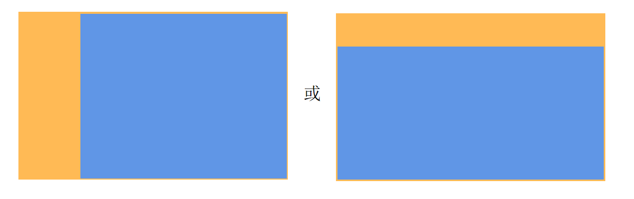 |
| RESIZE_COVER | While maintaining its aspect ratio in the final state, the component's content is scaled to cover the component's entire content box. It is always aligned with the center of the component, so that its middle part is displayed.  |
| RESIZE_COVER_TOP_LEFT | While maintaining its aspect ratio in the final state, the component's content is scaled to cover the component's entire content box. When there is remaining space in the width direction, the content is left-aligned with the component, so that its left part is displayed. When there is remaining space in the height direction, the content is top-aligned with the component, so that its top part is displayed.  |
| RESIZE_COVER_BOTTOM_RIGHT | While maintaining its aspect ratio in the final state, the component's content is scaled to cover the component's entire content box. When there is remaining space in the width direction, the content is right-aligned with the component, so that its right part is displayed. When there is remaining space in the height direction, the content is bottom-aligned with the component, so that its bottom part is displayed.  |
NOTE
- In the illustrative diagrams, the blue area indicates the content, and the orange area indicates the component content box.
- Different render fit modes create different effects during the width and height animation process. Choose the one that best fits your need.
CrownAction18+
Enumerates the crown actions.
Atomic service API: This API can be used in atomic services since API version 18.
System capability: SystemCapability.ArkUI.ArkUI.Full
| Name | Value | Description |
|---|---|---|
| BEGIN | 0 | The crown starts to rotate. |
| UPDATE | 1 | The crown is rotating. |
| END | 2 | The crown stops rotating. |
CrownSensitivity18+
Enumerates the sensitivity levels for crown rotation.
Atomic service API: This API can be used in atomic services since API version 18.
System capability: SystemCapability.ArkUI.ArkUI.Full
| Name | Value | Description |
|---|---|---|
| LOW | 0 | Low sensitivity. |
| MEDIUM | 1 | Medium sensitivity. |
| HIGH | 2 | High sensitivity. |
AxisAction18+
Enumerates the types of axis actions for axis events.
Atomic service API: This API can be used in atomic services since API version 18.
System capability: SystemCapability.ArkUI.ArkUI.Full
| Name | Value | Description |
|---|---|---|
| NONE | 0 | No axis event. |
| BEGIN | 1 | The axis event begins. |
| UPDATE | 2 | The axis event is in progress. |
| END | 3 | The axis event ends. |
| CANCEL | 4 | The axis event is canceled. |
InteractionHand15+
Defines whether an event is triggered by a left-hand or right-hand tap.
Atomic service API: This API can be used in atomic services since API version 15.
System capability: SystemCapability.ArkUI.ArkUI.Full
| Name | Value | Description |
|---|---|---|
| NONE | 0 | Unknown. |
| LEFT | 1 | Left hand. |
| RIGHT | 2 | Right hand. |
FocusDrawLevel18+
Enumerates the drawing levels of the focus box for a node.
Widget capability: This API can be used in ArkTS widgets since API version 18.
Atomic service API: This API can be used in atomic services since API version 18.
System capability: SystemCapability.ArkUI.ArkUI.Full
| Name | Value | Description |
|---|---|---|
| SELF | 0 | The focus box is drawn on the node's own layer. |
| TOP | 1 | The focus box is drawn on the topmost layer of the current instance's z-order. |