FoldSplitContainer
FoldSplitContainer is a layout container designed to manage regions for two-panel and three-panel arrangements on a foldable device across various states, including the expanded state, the hover state, and the folded state.
NOTE
This component is supported since API version 12. Updates will be marked with a superscript to indicate their earliest API version.
Modules to Import
import { FoldSplitContainer } from '@kit.ArkUI';
Child Components
Not supported
FoldSplitContainer
FoldSplitContainer({ primary: Callback<void>, secondary: Callback<void>, extra?: Callback<void>, expandedLayoutOptions: ExpandedRegionLayoutOptions, hoverModeLayoutOptions: HoverModeRegionLayoutOptions, foldedLayoutOptions: FoldedRegionLayoutOptions, animationOptions?: AnimateParam, onHoverStatusChange?: OnHoverStatusChangeHandler })
Creates a FoldSplitContainer component to manage regions for two-panel and three-panel arrangements on a foldable device across various states, including the expanded state, the hover state, and the folded state.
Decorator: @Component
Atomic service API: This API can be used in atomic services since API version 12.
System capability: SystemCapability.ArkUI.ArkUI.Full
| Name | Type | Mandatory | Decorator | Description |
|---|---|---|---|---|
| primary | ()=>void | Yes | @BuilderParam | Callback function for the primary region. |
| secondary | ()=>void | Yes | @BuilderParam | Callback function for the secondary region. |
| extra | ()=>void | No | @BuilderParam | Callback function for the extra region. If this parameter is not provided, there is no corresponding region. |
| expandedLayoutOptions | ExpandedRegionLayoutOptions | Yes | @Prop | Layout information for the expanded state. |
| hoverModeLayoutOptions | HoverModeRegionLayoutOptions | Yes | @Prop | Layout information for the hover state. |
| foldedLayoutOptions | FoldedRegionLayoutOptions | Yes | @Prop | Layout information for the folded state. |
| animationOptions | AnimateParam |null | No | @Prop | Animation settings. The value null indicates that the animation is disabled. |
| onHoverStatusChange | OnHoverStatusChangeHandler | No | - | Callback function triggered when the foldable device enters or exits the hover state. |
ExpandedRegionLayoutOptions
Defines the layout information for the expanded state.
Atomic service API: This API can be used in atomic services since API version 12.
System capability: SystemCapability.ArkUI.ArkUI.Full
| Name | Type | Mandatory | Description |
|---|---|---|---|
| isExtraRegionPerpendicular | boolean | No | Whether the extra region extends perpendicularly through the entire component from top to bottom. This setting takes effect only when extra is effective. Default value: true |
| verticalSplitRatio | number | No | Height ratio between the primary and secondary regions. Default value: PresetSplitRatio.LAYOUT_1V1 |
| horizontalSplitRatio | number | No | Width ratio between the primary and extra regions. This setting takes effect only when extra is effective. Default value: PresetSplitRatio.LAYOUT_3V2 |
| extraRegionPosition | ExtraRegionPosition | No | Position information of the extra region. This setting takes effect only when isExtraRegionPerpendicular is false. Default value: ExtraRegionPosition.top |
HoverModeRegionLayoutOptions
Defines the layout information for the hover state.
Atomic service API: This API can be used in atomic services since API version 12.
System capability: SystemCapability.ArkUI.ArkUI.Full
| Name | Type | Mandatory | Description |
|---|---|---|---|
| showExtraRegion | boolean | No | Whether to display the extra region in the half-folded state. Default value: false |
| horizontalSplitRatio | number | No | Width ratio between the primary and extra regions. This setting takes effect only when extra is effective. Default value: PresetSplitRatio.LAYOUT_3V2 |
| extraRegionPosition | ExtraRegionPosition | No | Position information of the extra region. This setting takes effect only when showExtraRegion is set. Default value: ExtraRegionPosition.top |
NOTE
- When the device is in the hover state, there is an avoid area, and layout calculations need to account for the impact of the avoid area on the layout. 2 In the hover state, the upper half screen is used for display, and the lower half is used for interaction.
FoldedRegionLayoutOptions
Defines the layout information for the folded state.
Atomic service API: This API can be used in atomic services since API version 12.
System capability: SystemCapability.ArkUI.ArkUI.Full
| Name | Type | Mandatory | Description |
|---|---|---|---|
| verticalSplitRatio | number | No | Height ratio between the primary and secondary regions. Default value: PresetSplitRatio.LAYOUT_1V1 |
OnHoverStatusChangeHandler
type OnHoverStatusChangeHandler = (status: HoverModeStatus) => void
Implements a handler for the onHoverStatusChange event.
Atomic service API: This API can be used in atomic services since API version 12.
System capability: SystemCapability.ArkUI.ArkUI.Full
Parameters
| Name | Type | Mandatory | Description |
|---|---|---|---|
| status | HoverModeStatus | Yes | Callback function triggered when the foldable device enters or exits the hover state. |
HoverModeStatus
Provides information about the device or application's folding, rotation, and window state.
Atomic service API: This API can be used in atomic services since API version 12.
System capability: SystemCapability.ArkUI.ArkUI.Full
| Name | Type | Mandatory | Description |
|---|---|---|---|
| foldStatus | display.FoldStatus | Yes | Fold status of the device. |
| isHoverMode | boolean | Yes | Whether the application is in the hover state. |
| appRotation | number | Yes | Rotation angle of the application. |
| windowStatusType | window.WindowStatusType | Yes | Window mode. |
ExtraRegionPosition
Provides the position information of the extra region.
Atomic service API: This API can be used in atomic services since API version 12.
System capability: SystemCapability.ArkUI.ArkUI.Full
| Name | Value | Description |
|---|---|---|
| TOP | 1 | The extra region is in the upper half of the component. |
| BOTTOM | 2 | The extra region is in the lower half of the component. |
PresetSplitRatio
Enumerates the split ratios.
Atomic service API: This API can be used in atomic services since API version 12.
System capability: SystemCapability.ArkUI.ArkUI.Full
| Name | Value | Description |
|---|---|---|
| LAYOUT_1V1 | 1 | 1:1. |
| LAYOUT_3V2 | 1.5 | 3:2. |
| LAYOUT_2V3 | 0.6666666666666666 | 2:3. |
Example
Example 1: Setting Up a Two-Panel Layout
This example demonstrates how to control the region for a two-panel layout on a foldable screen across different states: folded, expanded, and hover.
import { FoldSplitContainer } from '@kit.ArkUI';

@Entry
@Component
struct TwoColumns {
  @Builder
  privateRegion() {
    Text("Primary")
      .backgroundColor('rgba(255, 0, 0, 0.1)')
      .fontSize(28)
      .textAlign(TextAlign.Center)
      .height('100%')
      .width('100%')
  }

  @Builder
  secondaryRegion() {
    Text("Secondary")
      .backgroundColor('rgba(0, 255, 0, 0.1)')
      .fontSize(28)
      .textAlign(TextAlign.Center)
      .height('100%')
      .width('100%')
  }

  build() {
    RelativeContainer() {
      FoldSplitContainer({
        primary: () => {
          this.privateRegion()
        },
        secondary: () => {
          this.secondaryRegion()
        }
      })
    }
    .height('100%')
    .width('100%')
  }
}
| Folded | Expanded | Hover |
|---|---|---|
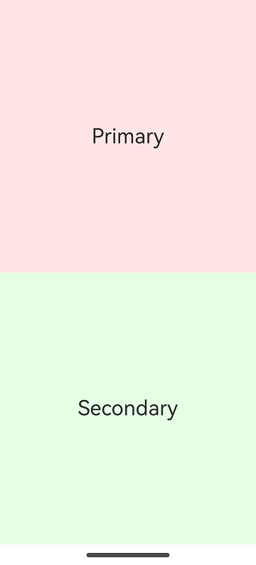 | 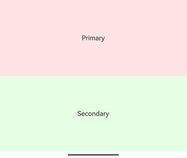 |  |
Example 2: Setting Up a Three-Panel Layout
This example demonstrates how to control the region for a three-panel layout on a foldable screen across different states: folded, expanded, and hover.
import { FoldSplitContainer } from '@kit.ArkUI';

@Entry
@Component
struct ThreeColumns {
  @Builder
  privateRegion() {
    Text("Primary")
      .backgroundColor('rgba(255, 0, 0, 0.1)')
      .fontSize(28)
      .textAlign(TextAlign.Center)
      .height('100%')
      .width('100%')
  }

  @Builder
  secondaryRegion() {
    Text("Secondary")
      .backgroundColor('rgba(0, 255, 0, 0.1)')
      .fontSize(28)
      .textAlign(TextAlign.Center)
      .height('100%')
      .width('100%')
  }

  @Builder
  extraRegion() {
    Text("Extra")
      .backgroundColor('rgba(0, 0, 255, 0.1)')
      .fontSize(28)
      .textAlign(TextAlign.Center)
      .height('100%')
      .width('100%')
  }

  build() {
    RelativeContainer() {
      FoldSplitContainer({
        primary: () => {
          this.privateRegion()
        },
        secondary: () => {
          this.secondaryRegion()
        },
        extra: () => {
          this.extraRegion()
        }
      })
    }
    .height('100%')
    .width('100%')
  }
}
| Folded | Expanded | Hover |
|---|---|---|
|  |  |
Example 3: Setting Layout Information in Expanded State
This example illustrates how to configure ExpandedRegionLayoutOptions to set the layout information for a foldable screen when it is in the expanded state.
import {
  FoldSplitContainer,
  PresetSplitRatio,
  ExtraRegionPosition,
  ExpandedRegionLayoutOptions,
  HoverModeRegionLayoutOptions,
  FoldedRegionLayoutOptions
} from '@kit.ArkUI';

@Component
struct Region {
  @Prop title: string;
  @BuilderParam content: () => void;
  @Prop compBackgroundColor: string;

  build() {
    Column({ space: 8 }) {
      Text(this.title)
        .fontSize("24fp")
        .fontWeight(600)

      Scroll() {
        this.content()
      }
      .layoutWeight(1)
      .width("100%")
    }
    .backgroundColor(this.compBackgroundColor)
    .width("100%")
    .height("100%")
    .padding(12)
  }
}

const noop = () => {
};

@Component
struct SwitchOption {
  @Prop label: string = ""
  @Prop value: boolean = false
  public onChange: (checked: boolean) => void = noop;

  build() {
    Row() {
      Text(this.label)
      Blank()
      Toggle({ type: ToggleType.Switch, isOn: this.value })
        .onChange((isOn) => {
          this.onChange(isOn);
        })
    }
    .backgroundColor(Color.White)
    .borderRadius(8)
    .padding(8)
    .width("100%")
  }
}

interface RadioOptions {
  label: string;
  value: Object|undefined|null;
  onChecked: () => void;
}

@Component
struct RadioOption {
  @Prop label: string;
  @Prop value: Object|undefined|null;
  @Prop options: Array<RadioOptions>;

  build() {
    Row() {
      Text(this.label)
      Blank()
      Column({ space: 4 }) {
        ForEach(this.options, (option: RadioOptions) => {
          Row() {
            Radio({
              group: this.label,
              value: JSON.stringify(option.value),
            })
              .checked(this.value === option.value)
              .onChange((checked) => {
                if (checked) {
                  option.onChecked();
                }
              })
            Text(option.label)
          }
        })
      }
      .alignItems(HorizontalAlign.Start)
    }
    .alignItems(VerticalAlign.Top)
    .backgroundColor(Color.White)
    .borderRadius(8)
    .padding(8)
    .width("100%")
  }
}

@Entry
@Component
struct Index {
  @State expandedRegionLayoutOptions: ExpandedRegionLayoutOptions = {
    horizontalSplitRatio: PresetSplitRatio.LAYOUT_3V2,
    verticalSplitRatio: PresetSplitRatio.LAYOUT_1V1,
    isExtraRegionPerpendicular: true,
    extraRegionPosition: ExtraRegionPosition.TOP
  };
  @State foldingRegionLayoutOptions: HoverModeRegionLayoutOptions = {
    horizontalSplitRatio: PresetSplitRatio.LAYOUT_3V2,
    showExtraRegion: false,
    extraRegionPosition: ExtraRegionPosition.TOP
  };
  @State foldedRegionLayoutOptions: FoldedRegionLayoutOptions = {
    verticalSplitRatio: PresetSplitRatio.LAYOUT_1V1
  };

  @Builder
  MajorRegion() {
    Region({
      title: "Folded state settings",
      compBackgroundColor: "rgba(255, 0, 0, 0.1)",
    }) {
      Column({ space: 4 }) {
        RadioOption({
          label: "Height ratio",
          value: this.foldedRegionLayoutOptions.verticalSplitRatio,
          options: [
            {
              label: "1:1",
              value: PresetSplitRatio.LAYOUT_1V1,
              onChecked: () => {
                this.foldedRegionLayoutOptions.verticalSplitRatio = PresetSplitRatio.LAYOUT_1V1
              }
            },
            {
              label: "2:3",
              value: PresetSplitRatio.LAYOUT_2V3,
              onChecked: () => {
                this.foldedRegionLayoutOptions.verticalSplitRatio = PresetSplitRatio.LAYOUT_2V3
              }
            },
            {
              label: "3:2",
              value: PresetSplitRatio.LAYOUT_3V2,
              onChecked: () => {
                this.foldedRegionLayoutOptions.verticalSplitRatio = PresetSplitRatio.LAYOUT_3V2
              }
            },
            {
              label: "Not set",
              value: undefined,
              onChecked: () => {
                this.foldedRegionLayoutOptions.verticalSplitRatio = undefined
              }
            }
          ]
        })
      }
      .constraintSize({ minHeight: "100%" })
    }
  }

  @Builder
  MinorRegion() {
    Region({
      title: "Hover state settings",
      compBackgroundColor: "rgba(0, 255, 0, 0.1)"
    }) {
      Column({ space: 4 }) {
        RadioOption({
          label: "Width ratio",
          value: this.foldingRegionLayoutOptions.horizontalSplitRatio,
          options: [
            {
              label: "1:1",
              value: PresetSplitRatio.LAYOUT_1V1,
              onChecked: () => {
                this.foldingRegionLayoutOptions.horizontalSplitRatio = PresetSplitRatio.LAYOUT_1V1
              }
            },
            {
              label: "2:3",
              value: PresetSplitRatio.LAYOUT_2V3,
              onChecked: () => {
                this.foldingRegionLayoutOptions.horizontalSplitRatio = PresetSplitRatio.LAYOUT_2V3
              }
            },
            {
              label: "3:2",
              value: PresetSplitRatio.LAYOUT_3V2,
              onChecked: () => {
                this.foldingRegionLayoutOptions.horizontalSplitRatio = PresetSplitRatio.LAYOUT_3V2
              }
            },
            {
              label: "Not set",
              value: undefined,
              onChecked: () => {
                this.foldingRegionLayoutOptions.horizontalSplitRatio = undefined
              }
            },
          ]
        })

        SwitchOption({
          label: "Show extra region",
          value: this.foldingRegionLayoutOptions.showExtraRegion,
          onChange: (checked) => {
            this.foldingRegionLayoutOptions.showExtraRegion = checked;
          }
        })

        if (this.foldingRegionLayoutOptions.showExtraRegion) {
          RadioOption({
            label: "Extra region location,"
            value: this.foldingRegionLayoutOptions.extraRegionPosition,
            options: [
              {
                label: "Top,"
                value: ExtraRegionPosition.TOP,
                onChecked: () => {
                  this.foldingRegionLayoutOptions.extraRegionPosition = ExtraRegionPosition.TOP
                }
              },
              {
                label: "Bottom,"
                value: ExtraRegionPosition.BOTTOM,
                onChecked: () => {
                  this.foldingRegionLayoutOptions.extraRegionPosition = ExtraRegionPosition.BOTTOM
                }
              },
              {
                label: "Not set",
                value: undefined,
                onChecked: () => {
                  this.foldingRegionLayoutOptions.extraRegionPosition = undefined
                }
              },
            ]
          })
        }
      }
      .constraintSize({ minHeight: "100%" })
    }
  }

  @Builder
  ExtraRegion() {
    Region({
      title: "Expanded state settings,"
      compBackgroundColor: "rgba(0, 0, 255, 0.1)"
    }) {
      Column({ space: 4 }) {
        RadioOption({
          label: "Width ratio,"
          value: this.expandedRegionLayoutOptions.horizontalSplitRatio,
          options: [
            {
              label: "1:1",
              value: PresetSplitRatio.LAYOUT_1V1,
              onChecked: () => {
                this.expandedRegionLayoutOptions.horizontalSplitRatio = PresetSplitRatio.LAYOUT_1V1
              }
            },
            {
              label: "2:3",
              value: PresetSplitRatio.LAYOUT_2V3,
              onChecked: () => {
                this.expandedRegionLayoutOptions.horizontalSplitRatio = PresetSplitRatio.LAYOUT_2V3
              }
            },
            {
              label: "3:2",
              value: PresetSplitRatio.LAYOUT_3V2,
              onChecked: () => {
                this.expandedRegionLayoutOptions.horizontalSplitRatio = PresetSplitRatio.LAYOUT_3V2
              }
            },
            {
              label: "Not set",
              value: undefined,
              onChecked: () => {
                this.expandedRegionLayoutOptions.horizontalSplitRatio = undefined
              }
            },
          ]
        })

        RadioOption({
          label: "Height ratio",
          value: this.expandedRegionLayoutOptions.verticalSplitRatio,
          options: [
            {
              label: "1:1",
              value: PresetSplitRatio.LAYOUT_1V1,
              onChecked: () => {
                this.expandedRegionLayoutOptions.verticalSplitRatio = PresetSplitRatio.LAYOUT_1V1
              }
            },
            {
              label: "2:3",
              value: PresetSplitRatio.LAYOUT_2V3,
              onChecked: () => {
                this.expandedRegionLayoutOptions.verticalSplitRatio = PresetSplitRatio.LAYOUT_2V3
              }
            },
            {
              label: "3:2",
              value: PresetSplitRatio.LAYOUT_3V2,
              onChecked: () => {
                this.expandedRegionLayoutOptions.verticalSplitRatio = PresetSplitRatio.LAYOUT_3V2
              }
            },
            {
              label: "Not set",
              value: undefined,
              onChecked: () => {
                this.expandedRegionLayoutOptions.verticalSplitRatio = undefined
              }
            }
          ]
        })

        SwitchOption({
          label: "Show extra region perpendicularly,"
          value: this.expandedRegionLayoutOptions.isExtraRegionPerpendicular,
          onChange: (checked) => {
            this.expandedRegionLayoutOptions.isExtraRegionPerpendicular = checked;
          }
        })

        if (!this.expandedRegionLayoutOptions.isExtraRegionPerpendicular) {
          RadioOption({
            label: "Extra region location,"
            value: this.expandedRegionLayoutOptions.extraRegionPosition,
            options: [
              {
                label: "Top,"
                value: ExtraRegionPosition.TOP,
                onChecked: () => {
                  this.expandedRegionLayoutOptions.extraRegionPosition = ExtraRegionPosition.TOP
                }
              },
              {
                label: "Bottom,"
                value: ExtraRegionPosition.BOTTOM,
                onChecked: () => {
                  this.expandedRegionLayoutOptions.extraRegionPosition = ExtraRegionPosition.BOTTOM
                }
              },
              {
                label: "Not set",
                value: undefined,
                onChecked: () => {
                  this.expandedRegionLayoutOptions.extraRegionPosition = undefined
                }
              },
            ]
          })
        }
      }
      .constraintSize({ minHeight: "100%" })
    }
  }

  build() {
    Column() {
      FoldSplitContainer({
        primary: () => {
          this.MajorRegion()
        },
        secondary: () => {
          this.MinorRegion()
        },
        extra: () => {
          this.ExtraRegion()
        },
        expandedLayoutOptions: this.expandedRegionLayoutOptions,
        hoverModeLayoutOptions: this.foldingRegionLayoutOptions,
        foldedLayoutOptions: this.foldedRegionLayoutOptions,
      })
    }
    .width("100%")
    .height("100%")
  }
}
| Folded | Expanded | Hover |
|---|---|---|
 | 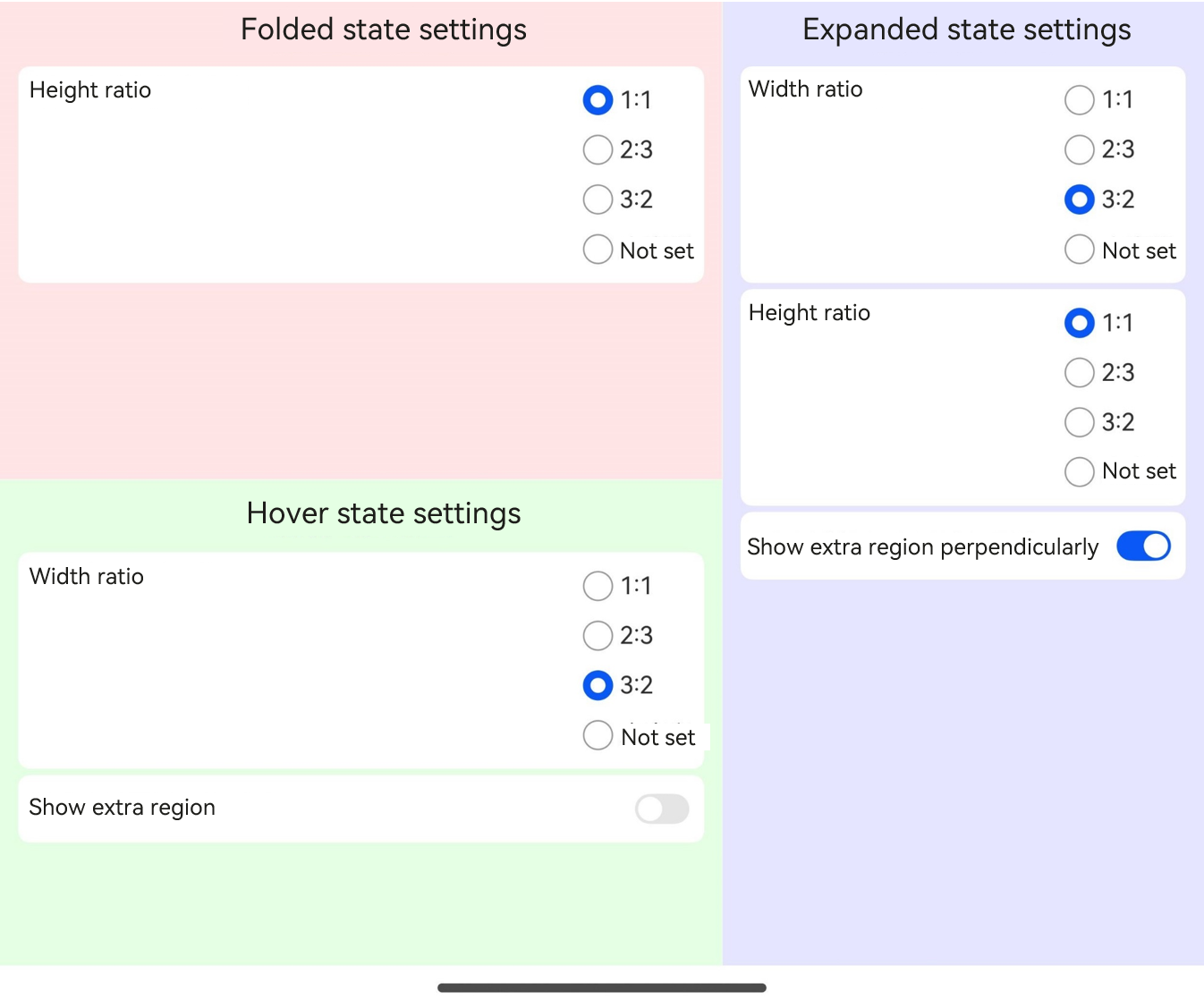 |  |
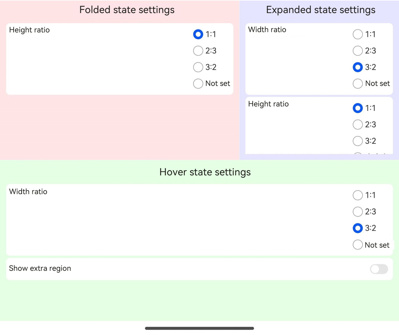 |  | |
 |  |