SegmentButton
SegmentButton is a versatile component containing a group of related items, which can be tab-style, single-select, and multi-select buttons.
NOTE
This component and its child components are supported since API version 11. Updates will be marked with a superscript to indicate their earliest API version.
Modules to Import
import { SegmentButton, SegmentButtonOptions, SegmentButtonItemOptionsArray } from '@kit.ArkUI';
Child Components
Not supported
SegmentButton
SegmentButton({ options: SegmentButtonOptions, selectedIndexes: number[], onItemClicked: Callback<number>, maxFontScale: number |Resource })
Decorator: @Component
System capability: SystemCapability.ArkUI.ArkUI.Full
| Name | Type | Mandatory | Decorator | Description |
|---|---|---|---|---|
| options | SegmentButtonOptions | Yes | @ObjectLink | Options of the SegmentButton component. Atomic service API: This API can be used in atomic services since API version 12. |
| selectedIndexes | number[] | Yes | @Link | Indexes of selected items of the SegmentButton. The index starts from 0 and increments by 1. NOTE selectedIndexes is decorated with @Link to implement parent-child two-way synchronization. If no items are selected, an empty array [] can be passed in. Atomic service API: This API can be used in atomic services since API version 12. |
| onItemClicked13+ | Callback<number> | No | - | Callback invoked when an item in the SegmentButton is clicked. The index of the clicked item is passed in as the parameter. Atomic service API: This API can be used in atomic services since API version 13. |
| maxFontScale14+ | number |Resource | Yes | @Prop | Maximum font scale for the text in the SegmentButton. Default value: 1 Value range: [1, 2] NOTE Values less than 1 are treated as 1, and values greater than 2 are treated as 2. Atomic service API: This API can be used in atomic services since API version 14. |
NOTE
The SegmentButton component does not support the universal attributes. The component takes up the maximum width allowed by the content area, and evenly allocates the width among its items. It adapts its height automatically to the content (text and image), the minimum height being 28 vp.
SegmentButtonOptions
Provides initial data and custom properties for the SegmentButton component.
Decorator Type: @Observed
Atomic service API: This API can be used in atomic services since API version 12.
System capability: SystemCapability.ArkUI.ArkUI.Full
Properties
| Name | Type | Mandatory | Description |
|---|---|---|---|
| type | 'tab' |'capsule' | Yes | Type of the SegmentButton. |
| multiply | boolean | Yes | Whether multiple items can be selected. NOTE The default value is false. true: Multiple items can be selected. false: Multiple items cannot be selected. For the SegmentButton component consisting of tab-style buttons, only one item can be selected. In this case, setting multiply to true does not take effect. |
| buttons | SegmentButtonItemOptionsArray | Yes | Button information, including the icon and text. |
| fontColor | ResourceColor | Yes | Font color of the unselected item. Default value: $r('sys.color.ohos_id_color_text_secondary') |
| selectedFontColor | ResourceColor | Yes | Font color of the selected item. Default value: $r('sys.color.ohos_id_color_text_primary') when type is "tab" and $r('sys.color.ohos_id_color_foreground_contrary') when type is "capsule" |
| fontSize | DimensionNoPercentage | Yes | Font size of the unselected item. It cannot be set in percentage. Default value: $r('sys.float.ohos_id_text_size_body2') |
| selectedFontSize | DimensionNoPercentage | Yes | Font size of the selected item. It cannot be set in percentage. Default value: $r('sys.float.ohos_id_text_size_body2') |
| fontWeight | FontWeight | Yes | Font weight of the unselected item. Default value: FontWeight.Regular |
| selectedFontWeight | FontWeight | Yes | Font weight of the selected item. Default value: FontWeight.Medium |
| backgroundColor | ResourceColor | Yes | Background color of the unselected item. Default value: $r('sys.color.ohos_id_color_button_normal') |
| selectedBackgroundColor | ResourceColor | Yes | Background color of the selected item. Default value: $r('sys.color.ohos_id_color_foreground_contrary') when type is "tab" and $r('sys.color.ohos_id_color_emphasize') when type is "capsule" |
| imageSize | SizeOptions | Yes | Image size. Default value: { width: 24, height: 24 } NOTE This property is effective only for buttons that contain icons. |
| buttonPadding | Padding |Dimension | Yes | Button margin. Default value: { top: 4, right: 8, bottom: 4, left: 8 } for icon buttons and text buttons, and { top: 6, right: 8, bottom: 6, left: 8 } for icon+text buttons. |
| textPadding | Padding |Dimension | Yes | Text padding. Default value: 0 |
| localizedButtonPadding12+ | LocalizedPadding | No | Button padding. Default value: Text-only buttons and icon-only buttons: { top: LengthMetrics.vp(4), end: LengthMetrics.vp(8), bottom: LengthMetrics.vp(4), start: LengthMetrics.vp(8) } Buttons with both an icon and text: { top: LengthMetrics.vp(6), end: LengthMetrics.vp(8), bottom: LengthMetrics.vp(6), start: LengthMetrics.vp(8) } |
| localizedTextPadding12+ | LocalizedPadding | No | Text padding. Default value: 0 |
| direction12+ | Direction | No | Layout direction. Default value: Direction.Auto |
| backgroundBlurStyle | BlurStyle | Yes | Background blur style applied between the content and the background. Default value: BlurStyle.NONE |
constructor
constructor(options: TabSegmentButtonOptions|CapsuleSegmentButtonOptions)
A constructor used to create a SegmentButtonOptions instance.
Atomic service API: This API can be used in atomic services since API version 12.
System capability: SystemCapability.ArkUI.ArkUI.Full
| Name | Type | Mandatory | Description |
|---|---|---|---|
| options | TabSegmentButtonOptions | CapsuleSegmentButtonOptions | Yes | Options of the SegmentButton component. |
tab
static tab(options: TabSegmentButtonConstructionOptions): SegmentButtonOptions
Creates a SegmentButtonOptions object for the SegmentButton component consisting of tab-style buttons.
Atomic service API: This API can be used in atomic services since API version 12.
System capability: SystemCapability.ArkUI.ArkUI.Full
| Name | Type | Mandatory | Description |
|---|---|---|---|
| options | TabSegmentButtonConstructionOptions | Yes | Options of the tab-style buttons. |
Return value
| Type | Description |
|---|---|
| SegmentButtonOptions | SegmentButtonOptions object. |
capsule
static capsule(options: CapsuleSegmentButtonConstructionOptions): SegmentButtonOptions
Creates a SegmentButtonOptions object for the SegmentButton component consisting of single-select or multi-select buttons.
Atomic service API: This API can be used in atomic services since API version 12.
System capability: SystemCapability.ArkUI.ArkUI.Full
| Name | Type | Mandatory | Description |
|---|---|---|---|
| options | CapsuleSegmentButtonConstructionOptions | Yes | Options of the single-select or multi-select buttons. |
Return value
| Type | Description |
|---|---|
| SegmentButtonOptions | SegmentButtonOptions object. |
DimensionNoPercentage
type DimensionNoPercentage = PX|VP|FP|LPX|Resource
Represents the length union type that does not support values in percentage.
Atomic service API: This API can be used in atomic services since API version 12.
System capability: SystemCapability.ArkUI.ArkUI.Full
| Type | Description |
|---|---|
| PX | Length in px. |
| VP | Length in vp. |
| FP | Length in fp. |
| LPX | Length in lpx. |
| Resource | Resource reference type, which is used to set the value of a component attribute. |
CommonSegmentButtonOptions
Defines the attributes that can be customized for the segment button.
Atomic service API: This API can be used in atomic services since API version 12.
System capability: SystemCapability.ArkUI.ArkUI.Full
Properties
| Name | Type | Mandatory | Description |
|---|---|---|---|
| fontColor | ResourceColor | No | Font color of the unselected item. Default value: $r('sys.color.ohos_id_color_text_secondary') |
| selectedFontColor | ResourceColor | No | Font color of the selected item. Default value: $r('sys.color.ohos_id_color_text_primary') when type is "tab" and $r('sys.color.ohos_id_color_foreground_contrary') when type is "capsule" |
| fontSize | DimensionNoPercentage | No | Font size of the unselected item. It cannot be set in percentage. Default value: $r('sys.float.ohos_id_text_size_body2') |
| selectedFontSize | DimensionNoPercentage | No | Font size of the selected item. It cannot be set in percentage. Default value: $r('sys.float.ohos_id_text_size_body2') |
| fontWeight | FontWeight | No | Font weight of the unselected item. Default value: FontWeight.Regular |
| selectedFontWeight | FontWeight | No | Font weight of the selected item. Default value: FontWeight.Medium |
| backgroundColor | ResourceColor | No | Background color of the unselected item. Default value: $r('sys.color.ohos_id_color_button_normal') |
| selectedBackgroundColor | ResourceColor | No | Background color of the selected item. Default value: $r('sys.color.ohos_id_color_foreground_contrary') when type is "tab" and $r('sys.color.ohos_id_color_emphasize') when type is "capsule" |
| imageSize | SizeOptions | No | Image size. Default value: { width: 24, height: 24 } NOTE This property is effective only for buttons that contain icons. |
| buttonPadding | Padding |Dimension | No | Button margin. Default value: { top: 4, right: 8, bottom: 4, left: 8 } for icon buttons and text buttons, and { top: 6, right: 8, bottom: 6, left: 8 } for icon+text buttons. |
| textPadding | Padding |Dimension | No | Text padding. Default value: 0 |
| localizedButtonPadding12+ | LocalizedPadding | No | Button padding. Default value: Text-only buttons and icon-only buttons: { top: LengthMetrics.vp(4), end: LengthMetrics.vp(8), bottom: LengthMetrics.vp(4), start: LengthMetrics.vp(8) } Buttons with both an icon and text: { top: LengthMetrics.vp(6), end: LengthMetrics.vp(8), bottom: LengthMetrics.vp(6), start: LengthMetrics.vp(8) } |
| localizedTextPadding12+ | LocalizedPadding | No | Text padding. Default value: 0 |
| direction12+ | Direction | No | Layout direction. Default value: Direction.Auto |
| backgroundBlurStyle | BlurStyle | No | Background blur style applied between the content and the background. Default value: BlurStyle.NONE |
TabSegmentButtonConstructionOptions
Represents options for creating a SegmentButton component consisting of tab-style buttons.
It inherits CommonSegmentButtonOptions.
Atomic service API: This API can be used in atomic services since API version 12.
System capability: SystemCapability.ArkUI.ArkUI.Full
Properties
| Name | Type | Mandatory | Description |
|---|---|---|---|
| buttons | ItemRestriction<SegmentButtonTextItem> | Yes | Button information. |
CapsuleSegmentButtonConstructionOptions
Represents options for creating a SegmentButton component consisting of single-select or multi-select buttons.
It inherits CommonSegmentButtonOptions.
Atomic service API: This API can be used in atomic services since API version 12.
System capability: SystemCapability.ArkUI.ArkUI.Full
Properties
| Name | Type | Mandatory | Description |
|---|---|---|---|
| buttons | SegmentButtonItemTuple | Yes | Button information. |
| multiply | boolean | No | Whether multiple items can be selected. Default value: false |
ItemRestriction
type ItemRestriction<T> = [T, T, T?, T?, T?]
Represents a tuple used to store button information.
Atomic service API: This API can be used in atomic services since API version 12.
System capability: SystemCapability.ArkUI.ArkUI.Full
| Type | Description |
|---|---|
| [T, T, T?, T?, T?] | A tuple that contains two to five elements of the same type. |
NOTE
A SegmentButton component supports two to five buttons.
SegmentButtonItemTuple
type SegmentButtonItemTuple = ItemRestriction<SegmentButtonTextItem>|ItemRestriction<SegmentButtonIconItem>|ItemRestriction<SegmentButtonIconTextItem>
Represents the tuple union type used to store button information.
Atomic service API: This API can be used in atomic services since API version 12.
System capability: SystemCapability.ArkUI.ArkUI.Full
| Type | Description |
|---|---|
| ItemRestriction<SegmentButtonTextItem> | A tuple of text-only button information. |
| ItemRestriction<SegmentButtonIconItem> | A tuple of icon-only button information. |
| ItemRestriction<SegmentButtonIconTextItem> | A tuple of icon and text button information. |
SegmentButtonItemArray
type SegmentButtonItemArray = Array<SegmentButtonTextItem>|Array<SegmentButtonIconItem>|Array<SegmentButtonIconTextItem>
Represents the array union type used to store button information.
Atomic service API: This API can be used in atomic services since API version 12.
System capability: SystemCapability.ArkUI.ArkUI.Full
| Type | Description |
|---|---|
| Array<SegmentButtonTextItem> | An array of text-only button information. |
| Array<SegmentButtonIconItem> | An array of icon-only button information. |
| Array<SegmentButtonIconTextItem> | An array of icon and text button information. |
SegmentButtonItemOptionsArray
Represents an array for storing button information.
Decorator Type: @Observed
NOTE
A SegmentButton component supports two to five buttons. As such, a SegmentButtonItemOptionsArray object stores information about only two to five buttons.
constructor
constructor(elements: SegmentButtonItemTuple)
A constructor used to create a SegmentButtonItemOptionsArray instance.
Atomic service API: This API can be used in atomic services since API version 12.
System capability: SystemCapability.ArkUI.ArkUI.Full
Parameters
| Name | Type | Mandatory | Description |
|---|---|---|---|
| elements | SegmentButtonItemTuple | Yes | Button information. |
push
push(...items: SegmentButtonItemArray): number
Adds the specified elements to the end of this array and returns the new length of the array.
Atomic service API: This API can be used in atomic services since API version 12.
System capability: SystemCapability.ArkUI.ArkUI.Full
Parameters
| Name | Type | Mandatory | Description |
|---|---|---|---|
| items | SegmentButtonItemArray | Yes | Elements to add to the end of the array. |
Return value
| Type | Description |
|---|---|
| number | Length of the array after the elements are added. |
NOTE
A SegmentButton component supports two to five buttons. As such, a SegmentButtonItemOptionsArray object stores information about only two to five buttons. If the number limit is reached, this API will not work.
pop
pop(): SegmentButtonItemOptions|undefined
Removes the last element from this array and returns that element.
Atomic service API: This API can be used in atomic services since API version 12.
System capability: SystemCapability.ArkUI.ArkUI.Full
Return value
| Type | Description |
|---|---|
| SegmentButtonItemOptions |undefined | Element removed from the array. |
NOTE
A SegmentButton component supports two to five buttons. As such, a SegmentButtonItemOptionsArray object stores information about only two to five buttons. If the number limit is reached, this API will not work.
shift
shift(): SegmentButtonItemOptions|undefined
Removes the first element from this array and returns that element.
Atomic service API: This API can be used in atomic services since API version 12.
System capability: SystemCapability.ArkUI.ArkUI.Full
Return value
| Type | Description |
|---|---|
| SegmentButtonItemOptions |undefined | Element removed from the array. |
NOTE
A SegmentButton component supports two to five buttons. As such, a SegmentButtonItemOptionsArray object stores information about only two to five buttons. If the number limit is reached, this API will not work.
unshift
unshift(...items: SegmentButtonItemArray): number
Adds the specified elements to the beginning of this array and returns the new length of the array.
Atomic service API: This API can be used in atomic services since API version 12.
System capability: SystemCapability.ArkUI.ArkUI.Full
Parameters
| Name | Type | Mandatory | Description |
|---|---|---|---|
| items | SegmentButtonItemArray | Yes | Elements to add to the beginning of the array. |
Return value
| Type | Description |
|---|---|
| number | Length of the array after the elements are added. |
NOTE
A SegmentButton component supports two to five buttons. As such, a SegmentButtonItemOptionsArray object stores information about only two to five buttons. If the number limit is reached, this API will not work.
splice
splice(start: number, deleteCount: number, ...items: SegmentButtonItemOptions[]): SegmentButtonItemOptions[]
Changes the contents of this array by removing the specified number of elements from the specified position and adding new elements in place. This API returns an array containing the removed elements.
Atomic service API: This API can be used in atomic services since API version 12.
System capability: SystemCapability.ArkUI.ArkUI.Full
Parameters
| Name | Type | Mandatory | Description |
|---|---|---|---|
| start | number | Yes | Index of the position starting from which elements are to be removed. |
| deleteCount | number | Yes | Number of elements to remove. |
| items | SegmentButtonItemOptions[] | No | Elements to add to the array. |
Return value
| Type | Description |
|---|---|
| SegmentButtonItemOptions[] | An array containing the removed elements. |
NOTE
A SegmentButton component supports two to five buttons. As such, a SegmentButtonItemOptionsArray object stores information about only two to five buttons. If the number limit is reached, this API will not work.
create
static create(elements: SegmentButtonItemTuple): SegmentButtonItemOptionsArray
Creates a SegmentButtonItemOptionsArray object.
Atomic service API: This API can be used in atomic services since API version 12.
System capability: SystemCapability.ArkUI.ArkUI.Full
Parameters
| Name | Type | Mandatory | Description |
|---|---|---|---|
| elements | SegmentButtonItemTuple | Yes | Button information. |
Return value
| Type | Description |
|---|---|
| SegmentButtonItemOptionsArray | Created SegmentButtonItemOptionsArray object. |
TabSegmentButtonOptions
Provides the options of the SegmentButton component consisting of tab-style buttons. It inherits TabSegmentButtonConstructionOptions.
Atomic service API: This API can be used in atomic services since API version 12.
System capability: SystemCapability.ArkUI.ArkUI.Full
| Name | Type | Mandatory | Description |
|---|---|---|---|
| type | 'tab' | Yes | SegmentButton component consisting of tab-style buttons. |
CapsuleSegmentButtonOptions
Provides the options of the SegmentButton component consisting of single-select or multi-select buttons. It inherits CapsuleSegmentButtonConstructionOptions.
Atomic service API: This API can be used in atomic services since API version 12.
System capability: SystemCapability.ArkUI.ArkUI.Full
| Name | Type | Mandatory | Description |
|---|---|---|---|
| type | 'capsule' | Yes | SegmentButton component consisting of single-select or multi-select buttons. |
SegmentButtonTextItem
Provides text button information.
System capability: SystemCapability.ArkUI.ArkUI.Full
| Name | Type | Mandatory | Description |
|---|---|---|---|
| text | ResourceStr | Yes | Button text. Atomic service API: This API can be used in atomic services since API version 12. |
| accessibilityLevel13+ | string | No | Accessibility level, which is used to set whether the current component can be recognized by accessibility services. The options are as follows: "auto": The component can be recognized by accessibility services. "yes": The component can be recognized by accessibility services. "no": The component cannot be recognized by accessibility services. "no-hide-descendants": Neither the component nor its child components can be recognized by accessibility services. Default value: "auto" Atomic service API: This API can be used in atomic services since API version 13. |
| accessibilityDescription13+ | ResourceStr | No | Accessibility description. You can specify further explanation of the current component, for example, possible operation consequences, especially those that cannot be learned from component attributes and accessibility text. If a component contains both text information and the accessibility description, the text is read first and then the accessibility description, when the component is selected. Atomic service API: This API can be used in atomic services since API version 13. |
SegmentButtonIconItem
Provides icon button information.
System capability: SystemCapability.ArkUI.ArkUI.Full
| Name | Type | Mandatory | Description |
|---|---|---|---|
| icon | ResourceStr | Yes | Icon of the unselected item. Atomic service API: This API can be used in atomic services since API version 12. |
| iconAccessibilityText13+ | ResourceStr | No | Accessibility text of the unselected item. Atomic service API: This API can be used in atomic services since API version 13. |
| selectedIcon | ResourceStr | Yes | Icon of the selected item. Atomic service API: This API can be used in atomic services since API version 12. |
| selectedIconAccessibilityText13+ | ResourceStr | No | Accessibility text of the selected item. Atomic service API: This API can be used in atomic services since API version 13. |
| accessibilityLevel13+ | string | No | Accessibility level, which is used to set whether the current component can be recognized by accessibility services. The options are as follows: "auto": The component can be recognized by accessibility services. "yes": The component can be recognized by accessibility services. "no": The component cannot be recognized by accessibility services. "no-hide-descendants": Neither the component nor its child components can be recognized by accessibility services. Default value: "auto" Atomic service API: This API can be used in atomic services since API version 13. |
| accessibilityDescription13+ | ResourceStr | No | Accessibility description. You can specify further explanation of the current component, for example, possible operation consequences, especially those that cannot be learned from component attributes and accessibility text. If a component contains both text information and the accessibility description, the text is read first and then the accessibility description, when the component is selected. Atomic service API: This API can be used in atomic services since API version 13. |
NOTE
For the settings to take effect, both icon and selectedIcon must be set.
SegmentButtonIconTextItem
Provides icon+text button information.
System capability: SystemCapability.ArkUI.ArkUI.Full
Properties
| Name | Type | Mandatory | Description |
|---|---|---|---|
| icon | ResourceStr | Yes | Icon of the unselected item. Atomic service API: This API can be used in atomic services since API version 12. |
| iconAccessibilityText13+ | ResourceStr | No | Accessibility text of the unselected item. Atomic service API: This API can be used in atomic services since API version 13. |
| selectedIcon | ResourceStr | Yes | Icon of the selected item. Atomic service API: This API can be used in atomic services since API version 12. |
| selectedIconAccessibilityText13+ | ResourceStr | No | Accessibility text of the selected item. Atomic service API: This API can be used in atomic services since API version 13. |
| text | ResourceStr | Yes | Button text. Atomic service API: This API can be used in atomic services since API version 12. |
| accessibilityLevel13+ | string | No | Accessibility level, which is used to set whether the current component can be recognized by accessibility services. The options are as follows: "auto": The component can be recognized by accessibility services. "yes": The component can be recognized by accessibility services. "no": The component cannot be recognized by accessibility services. "no-hide-descendants": Neither the component nor its child components can be recognized by accessibility services. Default value: "auto" Atomic service API: This API can be used in atomic services since API version 13. |
| accessibilityDescription13+ | ResourceStr | No | Accessibility description. You can specify further explanation of the current component, for example, possible operation consequences, especially those that cannot be learned from component attributes and accessibility text. If a component contains both text information and the accessibility description, the text is read first and then the accessibility description, when the component is selected. Atomic service API: This API can be used in atomic services since API version 13. |
NOTE
For the settings to take effect, both icon and selectedIcon must be set.
SegmentButtonItemOptions
Describes options of the items in the SegmentButton component.
Decorator Type: @Observed
System capability: SystemCapability.ArkUI.ArkUI.Full
Properties
| Name | Type | Mandatory | Description |
|---|---|---|---|
| icon | ResourceStr | No | Icon of the unselected item. Atomic service API: This API can be used in atomic services since API version 12. |
| iconAccessibilityText13+ | ResourceStr | No | Accessibility text of the unselected item. Atomic service API: This API can be used in atomic services since API version 13. |
| selectedIcon | ResourceStr | No | Icon of the selected item. Atomic service API: This API can be used in atomic services since API version 12. |
| selectedIconAccessibilityText13+ | ResourceStr | No | Accessibility text of the selected item. Atomic service API: This API can be used in atomic services since API version 13. |
| text | ResourceStr | No | Button text. Atomic service API: This API can be used in atomic services since API version 12. |
| accessibilityLevel13+ | string | No | Accessibility level, which is used to set whether the current component can be recognized by accessibility services. The options are as follows: "auto": The component can be recognized by accessibility services. "yes": The component can be recognized by accessibility services. "no": The component cannot be recognized by accessibility services. "no-hide-descendants": Neither the component nor its child components can be recognized by accessibility services. Default value: "auto" Atomic service API: This API can be used in atomic services since API version 13. |
| accessibilityDescription13+ | ResourceStr | No | Accessibility description. You can specify further explanation of the current component, for example, possible operation consequences, especially those that cannot be learned from component attributes and accessibility text. If a component contains both text information and the accessibility description, the text is read first and then the accessibility description, when the component is selected. Atomic service API: This API can be used in atomic services since API version 13. |
constructor
constructor(options: SegmentButtonItemOptionsConstructorOptions)
A constructor used to create a SegmentButtonItemOptions instance.
Atomic service API: This API can be used in atomic services since API version 12.
System capability: SystemCapability.ArkUI.ArkUI.Full
Parameters
| Name | Type | Mandatory | Description |
|---|---|---|---|
| options | SegmentButtonItemOptionsConstructorOptions | Yes | Options of the items in the SegmentButton component. |
SegmentButtonItemOptionsConstructorOptions
Describes the constructor parameters of SegmentButtonItemOptions.
System capability: SystemCapability.ArkUI.ArkUI.Full
Properties
| Name | Type | Mandatory | Description |
|---|---|---|---|
| icon | ResourceStr | No | Icon of the unselected item. Atomic service API: This API can be used in atomic services since API version 12. |
| iconAccessibilityText13+ | ResourceStr | No | Accessibility text of the unselected item. Atomic service API: This API can be used in atomic services since API version 13. |
| selectedIcon | ResourceStr | No | Icon of the selected item. Atomic service API: This API can be used in atomic services since API version 12. |
| selectedIconAccessibilityText13+ | ResourceStr | No | Accessibility text of the selected item. Atomic service API: This API can be used in atomic services since API version 13. |
| text | ResourceStr | No | Button text. Atomic service API: This API can be used in atomic services since API version 12. |
| accessibilityLevel13+ | string | No | Accessibility level, which is used to set whether the current component can be recognized by accessibility services. The options are as follows: "auto": The component can be recognized by accessibility services. "yes": The component can be recognized by accessibility services. "no": The component cannot be recognized by accessibility services. "no-hide-descendants": Neither the component nor its child components can be recognized by accessibility services. Default value: "auto" Atomic service API: This API can be used in atomic services since API version 13. |
| accessibilityDescription13+ | ResourceStr | No | Accessibility description. You can specify further explanation of the current component, for example, possible operation consequences, especially those that cannot be learned from component attributes and accessibility text. If a component contains both text information and the accessibility description, the text is read first and then the accessibility description, when the component is selected. Atomic service API: This API can be used in atomic services since API version 13. |
Example
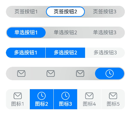
Example 1: Setting the Type of the SegmentButton component
This example demonstrates how to create two different types of SegmentButton components by configuring SegmentButtonOptions with tab and capsule types.
// xxx.ets
import {
  ItemRestriction,
  SegmentButton,
  SegmentButtonItemTuple,
  SegmentButtonOptions,
  SegmentButtonTextItem
} from '@kit.ArkUI';

@Entry
@Component
struct Index {
  @State tabOptions: SegmentButtonOptions = SegmentButtonOptions.tab({
    buttons: [{ text: 'Tab 1' }, { text: 'Tab 2' }, {
      text: 'Tab 3'
    }] as ItemRestriction<SegmentButtonTextItem>,
    backgroundBlurStyle: BlurStyle.BACKGROUND_THICK
  })
  @State singleSelectCapsuleOptions: SegmentButtonOptions = SegmentButtonOptions.capsule({
    buttons: [{ text: 'Single-select 1' }, { text: 'Single-select 2' }, { text: 'Single-select 3' }] as SegmentButtonItemTuple,
    multiply: false,
    backgroundBlurStyle: BlurStyle.BACKGROUND_THICK
  })
  @State multiplySelectCapsuleOptions: SegmentButtonOptions = SegmentButtonOptions.capsule({
    buttons: [{ text: 'Multi-select 1' }, { text: 'Multi-select 2' }, { text: 'Multi-select 3' }] as SegmentButtonItemTuple,
    multiply: true
  })
  @State iconCapsuleOptions: SegmentButtonOptions = SegmentButtonOptions.capsule({
    buttons: [
      { icon: $r('sys.media.ohos_ic_public_email'), selectedIcon: $r('sys.media.ohos_ic_public_clock') },
      { icon: $r('sys.media.ohos_ic_public_email'), selectedIcon: $r('sys.media.ohos_ic_public_clock') },
      { icon: $r('sys.media.ohos_ic_public_email'), selectedIcon: $r('sys.media.ohos_ic_public_clock') },
      { icon: $r('sys.media.ohos_ic_public_email'), selectedIcon: $r('sys.media.ohos_ic_public_clock') }
    ] as SegmentButtonItemTuple,
    multiply: false,
    backgroundBlurStyle: BlurStyle.BACKGROUND_THICK
  })
  @State iconTextCapsuleOptions: SegmentButtonOptions = SegmentButtonOptions.capsule({
    buttons: [
      { text: 'Icon 1', icon: $r('sys.media.ohos_ic_public_email'), selectedIcon: $r('sys.media.ohos_ic_public_clock') },
      { text: 'Icon 2', icon: $r('sys.media.ohos_ic_public_email'), selectedIcon: $r('sys.media.ohos_ic_public_clock') },
      { text: 'Icon 3', icon: $r('sys.media.ohos_ic_public_email'), selectedIcon: $r('sys.media.ohos_ic_public_clock') },
      { text: 'Icon 4', icon: $r('sys.media.ohos_ic_public_email'), selectedIcon: $r('sys.media.ohos_ic_public_clock') },
      { text: 'Icon 5', icon: $r('sys.media.ohos_ic_public_email'), selectedIcon: $r('sys.media.ohos_ic_public_clock') }
    ] as SegmentButtonItemTuple,
    multiply: true
  })
  @State tabSelectedIndexes: number[] = [1]
  @State singleSelectCapsuleSelectedIndexes: number[] = [0]
  @State multiplySelectCapsuleSelectedIndexes: number[] = [0, 1]
  @State singleSelectIconCapsuleSelectedIndexes: number[] = [3]
  @State multiplySelectIconTextCapsuleSelectedIndexes: number[] = [1, 2]

  build() {
    Row() {
      Column() {
        Column({ space: 25 }) {
          SegmentButton({ options: this.tabOptions,
            selectedIndexes: $tabSelectedIndexes })
          SegmentButton({ options: this.singleSelectCapsuleOptions,
            selectedIndexes: $singleSelectCapsuleSelectedIndexes })
          SegmentButton({
            options: this.multiplySelectCapsuleOptions,
            selectedIndexes: $multiplySelectCapsuleSelectedIndexes })
          SegmentButton({ options: this.iconCapsuleOptions,
            selectedIndexes: $singleSelectIconCapsuleSelectedIndexes })
          SegmentButton({ options: this.iconTextCapsuleOptions,
            selectedIndexes: $multiplySelectIconTextCapsuleSelectedIndexes })
        }.width('90%')
      }.width('100%')
    }.height('100%')
  }
}
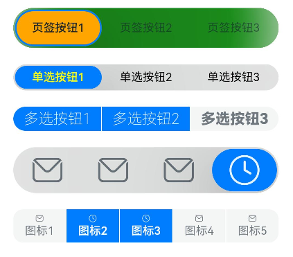
Example 2: Setting the Style of the SegmentButton component
This example demonstrates how to use CommonSegmentButtonOptions to customize the text and background style of the SegmentButton component.
// xxx.ets
import {
  ItemRestriction,
  SegmentButton,
  SegmentButtonItemTuple,
  SegmentButtonOptions,
  SegmentButtonTextItem
} from '@kit.ArkUI';

@Entry
@Component
struct Index {
  @State tabOptions: SegmentButtonOptions = SegmentButtonOptions.tab({
    buttons: [{ text: 'Tab 1' }, { text: 'Tab 2' }, {
      text: 'Tab 3'
    }] as ItemRestriction<SegmentButtonTextItem>,
    backgroundColor: 'rgb(213,213,213)',
    selectedBackgroundColor: 'rgb(112,112,112)',
    textPadding: {
      top: 10,
      right: 10,
      bottom: 10,
      left: 10
    },
  })
  @State singleSelectCapsuleOptions: SegmentButtonOptions = SegmentButtonOptions.capsule({
    buttons: [{ text: 'Single-select 1' }, { text: 'Single-select 2' }, { text: 'Single-select 3' }] as SegmentButtonItemTuple,
    multiply: false,
    fontColor: 'rgb(0,74,175)',
    selectedFontColor: 'rgb(247,247,247)',
    backgroundBlurStyle: BlurStyle.BACKGROUND_THICK
  })
  @State multiplySelectCapsuleOptions: SegmentButtonOptions = SegmentButtonOptions.capsule({
    buttons: [{ text: 'Multi-select 1' }, { text: 'Multi-select 2' }, { text: 'Multi-select 3' }] as SegmentButtonItemTuple,
    multiply: true,
    fontSize: 18,
    selectedFontSize: 18,
    fontWeight: FontWeight.Bolder,
    selectedFontWeight: FontWeight.Lighter,
  })
  @State iconCapsuleOptions: SegmentButtonOptions = SegmentButtonOptions.capsule({
    buttons: [
      { icon: $r('sys.media.ohos_ic_public_email'), selectedIcon: $r('sys.media.ohos_ic_public_clock') },
      { icon: $r('sys.media.ohos_ic_public_email'), selectedIcon: $r('sys.media.ohos_ic_public_clock') },
      { icon: $r('sys.media.ohos_ic_public_email'), selectedIcon: $r('sys.media.ohos_ic_public_clock') },
      { icon: $r('sys.media.ohos_ic_public_email'), selectedIcon: $r('sys.media.ohos_ic_public_clock') }
    ] as SegmentButtonItemTuple,
    multiply: false,
    imageSize: { width: 40, height: 40 },
    buttonPadding: {
      top: 6,
      right: 10,
      bottom: 6,
      left: 10
    },
    backgroundBlurStyle: BlurStyle.BACKGROUND_THICK
  })
  @State iconTextCapsuleOptions: SegmentButtonOptions = SegmentButtonOptions.capsule({
    buttons: [
      { text: 'Icon 1', icon: $r('sys.media.ohos_ic_public_email'), selectedIcon: $r('sys.media.ohos_ic_public_clock') },
      { text: 'Icon 2', icon: $r('sys.media.ohos_ic_public_email'), selectedIcon: $r('sys.media.ohos_ic_public_clock') },
      { text: 'Icon 3', icon: $r('sys.media.ohos_ic_public_email'), selectedIcon: $r('sys.media.ohos_ic_public_clock') },
      { text: 'Icon 4', icon: $r('sys.media.ohos_ic_public_email'), selectedIcon: $r('sys.media.ohos_ic_public_clock') },
      { text: 'Icon 5', icon: $r('sys.media.ohos_ic_public_email'), selectedIcon: $r('sys.media.ohos_ic_public_clock') }
    ] as SegmentButtonItemTuple,
    multiply: true,
    imageSize: { width: 10, height: 10 },
  })
  @State tabSelectedIndexes: number[] = [0]
  @State singleSelectCapsuleSelectedIndexes: number[] = [0]
  @State multiplySelectCapsuleSelectedIndexes: number[] = [0, 1]
  @State singleSelectIconCapsuleSelectedIndexes: number[] = [3]
  @State multiplySelectIconTextCapsuleSelectedIndexes: number[] = [1, 2]

  build() {
    Row() {
      Column() {
        Column({ space: 20 }) {
          SegmentButton({ options: this.tabOptions, selectedIndexes: $tabSelectedIndexes })
          SegmentButton({
            options: this.singleSelectCapsuleOptions,
            selectedIndexes: $singleSelectCapsuleSelectedIndexes
          })
          SegmentButton({
            options: this.multiplySelectCapsuleOptions,
            selectedIndexes: $multiplySelectCapsuleSelectedIndexes
          })
          SegmentButton({
            options: this.iconCapsuleOptions,
            selectedIndexes: $singleSelectIconCapsuleSelectedIndexes
          })
          SegmentButton({
            options: this.iconTextCapsuleOptions,
            selectedIndexes: $multiplySelectIconTextCapsuleSelectedIndexes
          })
        }.width('90%')
      }.width('100%')
    }.height('100%')
  }
}
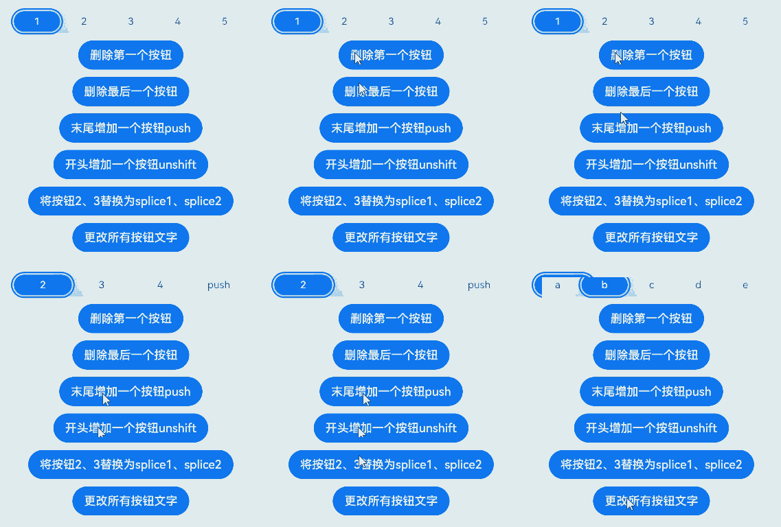
Example 3: Performing Array Operations on the SegmentButton Component
This example shows how to perform operations such as adding and removing segmented buttons using array functions like pop, shift, and unshift.
import {
  SegmentButton,
  SegmentButtonOptions,
  SegmentButtonItemOptionsArray,
  SegmentButtonItemTuple,
  SegmentButtonItemOptions
} from '@kit.ArkUI';

@Entry
@Component
struct Index {
  @State singleSelectCapsuleOptions: SegmentButtonOptions = SegmentButtonOptions.capsule({
    buttons: [{ text: '1' }, { text: '2' }, { text: '3' },
      { text: '4' }, { text: '5' }] as SegmentButtonItemTuple,
    multiply: false,
    backgroundBlurStyle: BlurStyle.BACKGROUND_THICK
  })
  @State capsuleSelectedIndexes: number[] = [0]

  build() {
    Row() {
      Column() {
        Column({ space: 10 }) {
          SegmentButton({ options: this.singleSelectCapsuleOptions,
            selectedIndexes: $capsuleSelectedIndexes })
          Button("Delete First Item")
            .onClick(() => {
              this.singleSelectCapsuleOptions.buttons.shift()
            })
          Button("Delete Last Item")
            .onClick(() => {
              this.singleSelectCapsuleOptions.buttons.pop()
            })
          Button("Add to End")
            .onClick(() => {
              this.singleSelectCapsuleOptions.buttons.push({ text: 'push' })
            })
          Button("Add to Beginning")
            .onClick(() => {
              this.singleSelectCapsuleOptions.buttons.unshift(({ text: 'unshift' }))
            })
          Button("Replace Items 2 and 3 with splice1 and splice2")
            .onClick(() => {
              this.singleSelectCapsuleOptions.buttons.splice(1, 2, new SegmentButtonItemOptions({
                text: 'splice1'
              }), new SegmentButtonItemOptions({ text: 'splice2' }))
            })
          Button("Change All Button Text")
            .onClick(() => {
              this.singleSelectCapsuleOptions.buttons =
              SegmentButtonItemOptionsArray.create([{ text: 'a' }, { text: 'b' },
                { text: 'c' }, { text: 'd' }, { text: 'e' }])
            })
        }.width('90%')
      }.width('100%')
    }.height('100%')
  }
}
Example 4: Implementing a Mirroring Effect
This example shows how to implement a mirroring effect by configuring the direction property of the SegmentButton component.
// xxx.ets
import { LengthMetrics, SegmentButton, SegmentButtonOptions } from '@kit.ArkUI'


@Entry
@Component
struct Index {
  @State tabOptions: SegmentButtonOptions = SegmentButtonOptions.tab({
    buttons: [{ text: 'Tab 1' }, { text: 'Tab 2' }, {
      text: 'Tab 3'
    }],
    direction: Direction.Rtl,
    backgroundColor: Color.Green,
    selectedBackgroundColor: Color.Orange,
    localizedTextPadding: {
      end: LengthMetrics.vp(10),
      start: LengthMetrics.vp(10)
    },
  })
  @State singleSelectCapsuleOptions: SegmentButtonOptions = SegmentButtonOptions.capsule({
    buttons: [{ text: 'Single-select 1' }, { text: 'Single-select 2' }, { text: 'Single-select 3' }],
    multiply: false,
    direction: Direction.Rtl,
    fontColor: Color.Black,
    selectedFontColor: Color.Yellow,
    backgroundBlurStyle: BlurStyle.BACKGROUND_THICK
  })
  @State multiplySelectCapsuleOptions: SegmentButtonOptions = SegmentButtonOptions.capsule({
    buttons: [{ text: 'Multi-select 1' }, { text: 'Multi-select 2' }, { text: 'Multi-select 3' }],
    multiply: true,
    direction: Direction.Rtl,
    fontSize: 18,
    selectedFontSize: 18,
    fontWeight: FontWeight.Bolder,
    selectedFontWeight: FontWeight.Lighter,
  })
  @State iconCapsuleOptions: SegmentButtonOptions = SegmentButtonOptions.capsule({
    buttons: [
      { icon: $r('sys.media.ohos_ic_public_email'), selectedIcon: $r('sys.media.ohos_ic_public_clock') },
      { icon: $r('sys.media.ohos_ic_public_email'), selectedIcon: $r('sys.media.ohos_ic_public_clock') },
      { icon: $r('sys.media.ohos_ic_public_email'), selectedIcon: $r('sys.media.ohos_ic_public_clock') },
      { icon: $r('sys.media.ohos_ic_public_email'), selectedIcon: $r('sys.media.ohos_ic_public_clock') },
      { icon: $r('sys.media.ohos_ic_public_email'), selectedIcon: $r('sys.media.ohos_ic_public_clock') }
    ],
    multiply: false,
    direction: Direction.Rtl,
    imageSize: { width: 40, height: 40 },
    localizedButtonPadding: {
      end: LengthMetrics.vp(10),
      start: LengthMetrics.vp(10)
    },
    backgroundBlurStyle: BlurStyle.BACKGROUND_THICK
  })
  @State iconTextCapsuleOptions: SegmentButtonOptions = SegmentButtonOptions.capsule({
    buttons: [
      { text: 'Icon 1', icon: $r('sys.media.ohos_ic_public_email'), selectedIcon: $r('sys.media.ohos_ic_public_clock') },
      { text: 'Icon 2', icon: $r('sys.media.ohos_ic_public_email'), selectedIcon: $r('sys.media.ohos_ic_public_clock') },
      { text: 'Icon 3', icon: $r('sys.media.ohos_ic_public_email'), selectedIcon: $r('sys.media.ohos_ic_public_clock') },
      { text: 'Icon 4', icon: $r('sys.media.ohos_ic_public_email'), selectedIcon: $r('sys.media.ohos_ic_public_clock') },
      { text: 'Icon 5', icon: $r('sys.media.ohos_ic_public_email'), selectedIcon: $r('sys.media.ohos_ic_public_clock') }
    ],
    multiply: true,
    direction: Direction.Rtl,
    imageSize: { width: 10, height: 10 },
  })
  @State tabSelectedIndexes: number[] = [0]
  @State singleSelectCapsuleSelectedIndexes: number[] = [0]
  @State multiplySelectCapsuleSelectedIndexes: number[] = [0, 1]
  @State singleSelectIconCapsuleSelectedIndexes: number[] = [3]
  @State multiplySelectIconTextCapsuleSelectedIndexes: number[] = [1, 2]

  build() {
    Row() {
      Column() {
        Column({ space: 20 }) {
          SegmentButton({ options: this.tabOptions, selectedIndexes: $tabSelectedIndexes })
          SegmentButton({
            options: this.singleSelectCapsuleOptions,
            selectedIndexes: $singleSelectCapsuleSelectedIndexes
          })
          SegmentButton({
            options: this.multiplySelectCapsuleOptions,
            selectedIndexes: $multiplySelectCapsuleSelectedIndexes
          })
          SegmentButton({
            options: this.iconCapsuleOptions,
            selectedIndexes: $singleSelectIconCapsuleSelectedIndexes
          })
          SegmentButton({
            options: this.iconTextCapsuleOptions,
            selectedIndexes: $multiplySelectIconTextCapsuleSelectedIndexes
          })
        }.width('90%')
      }.width('100%')
    }.height('100%')
  }
}

Example 5: Setting Accessibility
This example showcases how to implement accessibility features for the SegmentButton component by configuring properties such as accessibilityLevel and selectedIconAccessibilityText.
// xxx.ets
import {
  ItemRestriction,
  SegmentButton,
  SegmentButtonItemTuple,
  SegmentButtonOptions,
  SegmentButtonTextItem,
  SegmentButtonItemOptions
} from '@kit.ArkUI';

@Entry
@Component
struct Index {
  @State tabOptions: SegmentButtonOptions = SegmentButtonOptions.tab({
    buttons: [{ text: 'Tab 1', accessibilityLevel: 'yes', accessibilityDescription: 'Tab 1 usage hints' },
      { text: 'Tab 2', accessibilityLevel: 'yes', accessibilityDescription: 'Tab 2 usage hints' },
      { text: 'Tab 3', accessibilityLevel: 'yes', accessibilityDescription: 'Tab 3 usage hints'
    }] as ItemRestriction<SegmentButtonTextItem>,
    backgroundBlurStyle: BlurStyle.BACKGROUND_THICK
  })
  @State iconCapsuleOptions: SegmentButtonOptions = SegmentButtonOptions.capsule({
    buttons: [
      { icon: $r('sys.media.ohos_ic_public_email'), iconAccessibilityText: 'Accessibility text for the unselected icon',
        selectedIcon: $r('sys.media.ohos_ic_public_clock'), selectedIconAccessibilityText: 'Accessibility text for the selected icon',
      accessibilityLevel: 'yes', accessibilityDescription: 'SegmentButtonIconItem usage hints'},
      { icon: $r('sys.media.ohos_ic_public_email'), iconAccessibilityText: 'Accessibility text for the unselected icon',
        selectedIcon: $r('sys.media.ohos_ic_public_clock'), selectedIconAccessibilityText: 'Accessibility text for the selected icon',
        accessibilityLevel: 'yes', accessibilityDescription: 'SegmentButtonIconItem usage hints'},
      { icon: $r('sys.media.ohos_ic_public_email'), iconAccessibilityText: 'Accessibility text for the unselected icon',
        selectedIcon: $r('sys.media.ohos_ic_public_clock'), selectedIconAccessibilityText: 'Accessibility text for the selected icon',
        accessibilityLevel: 'yes', accessibilityDescription: 'SegmentButtonIconItem usage hints'},
      { icon: $r('sys.media.ohos_ic_public_email'), iconAccessibilityText: 'Accessibility text for the unselected icon',
        selectedIcon: $r('sys.media.ohos_ic_public_clock'), selectedIconAccessibilityText: 'Accessibility text for the selected icon',
        accessibilityLevel: 'yes', accessibilityDescription: 'SegmentButtonIconItem usage hints'}
    ] as SegmentButtonItemTuple,
    multiply: false,
    backgroundBlurStyle: BlurStyle.BACKGROUND_THICK
  })
  @State iconTextCapsuleOptions: SegmentButtonOptions = SegmentButtonOptions.capsule({
    buttons: [
      { text: 'Icon 1', icon: $r('sys.media.ohos_ic_public_email'), iconAccessibilityText: 'Accessibility text for the unselected icon',
        selectedIcon: $r('sys.media.ohos_ic_public_clock'), selectedIconAccessibilityText: 'Accessibility text for the selected icon',
        accessibilityLevel: 'yes', accessibilityDescription: 'SegmentButtonIconTextItem usage hints'},
      { text: 'Icon 1', icon: $r('sys.media.ohos_ic_public_email'), iconAccessibilityText: 'Accessibility text for the unselected icon',
        selectedIcon: $r('sys.media.ohos_ic_public_clock'), selectedIconAccessibilityText: 'Accessibility text for the selected icon',
        accessibilityLevel: 'yes', accessibilityDescription: 'SegmentButtonIconTextItem usage hints'},
      { text: 'Icon 1', icon: $r('sys.media.ohos_ic_public_email'), iconAccessibilityText: 'Accessibility text for the unselected icon',
        selectedIcon: $r('sys.media.ohos_ic_public_clock'), selectedIconAccessibilityText: 'Accessibility text for the selected icon',
        accessibilityLevel: 'yes', accessibilityDescription: 'SegmentButtonIconTextItem usage hints'},
      { text: 'Icon 1', icon: $r('sys.media.ohos_ic_public_email'), iconAccessibilityText: 'Accessibility text for the unselected icon',
        selectedIcon: $r('sys.media.ohos_ic_public_clock'), selectedIconAccessibilityText: 'Accessibility text for the selected icon',
        accessibilityLevel: 'yes', accessibilityDescription: 'SegmentButtonIconTextItem usage hints'}
    ] as SegmentButtonItemTuple,
    multiply: true
  })
  @State tabSelectedIndexes: number[] = [1]
  @State singleSelectIconCapsuleSelectedIndexes: number[] = [3]
  @State multiplySelectIconTextCapsuleSelectedIndexes: number[] = [1, 2]

  build() {
    Row() {
      Column() {
        Column({ space: 25 }) {
          SegmentButton({ options: this.tabOptions,
            selectedIndexes: $tabSelectedIndexes })
          SegmentButton({ options: this.iconCapsuleOptions,
            selectedIndexes: $singleSelectIconCapsuleSelectedIndexes })
          SegmentButton({ options: this.iconTextCapsuleOptions,
            selectedIndexes: $multiplySelectIconTextCapsuleSelectedIndexes })
          Button("Replace Items 2 and 3 with splice1 and splice2")
            .onClick(() => {
              this.iconTextCapsuleOptions.buttons.splice(1, 2, new SegmentButtonItemOptions({
                text: 'splice1', accessibilityLevel: 'yes', accessibilityDescription: 'SegmentButtonItemOptions usage hints'
              }), new SegmentButtonItemOptions({ text: 'splice2', icon: $r('sys.media.ohos_ic_public_email'),
                iconAccessibilityText: 'Accessibility text for the unselected icon', selectedIcon: $r('sys.media.ohos_ic_public_clock'),
                selectedIconAccessibilityText: 'Accessibility text for the selected icon', accessibilityLevel: 'yes',
                accessibilityDescription: 'SegmentButtonIconTextItem usage hints' }))
            })
        }.width('90%')
      }.width('100%')
    }.height('100%')
  }
}