SegmentButtonV2
SegmentButtonV2 is a component used to create tab-style, single-select, and multi-select capsule-style buttons.
NOTE
This component and its child components are supported since API version 18. Updates will be marked with a superscript to indicate their earliest API version.
Modules to Import
import { TabSegmentButtonV2, CapsuleSegmentButtonV2, MultiCapsuleSegmentButtonV2, SegmentButtonV2Items } from '@kit.ArkUI';
Child Components
Not supported
TabSegmentButtonV2
TabSegmentButtonV2({
  items: SegmentButtonV2Items,
  selectedIndex: number,
  $selectedIndex?: OnSelectedIndexChange,
  onItemClicked?: Callback<number>,
  itemMinFontScale?: number|Resource,
  itemMaxFontScale?: number|Resource,
  itemSpace?: LengthMetrics,
  itemFontSize?: LengthMetrics,
  itemSelectedFontSize?: LengthMetrics,
  itemFontColor?: ColorMetrics,
  itemSelectedFontColor?: ColorMetrics,
  itemFontWeight?: FontWeight,
  itemSelectedFontWeight?: FontWeight,
  itemBorderRadius?: LengthMetrics,
  itemSelectedBackgroundColor?: ColorMetrics,
  itemIconSize?: SizeT<LengthMetrics>,
  itemIconFillColor?: ColorMetrics,
  itemSelectedIconFillColor?: ColorMetrics,
  itemSymbolFontSize?: LengthMetrics,
  itemSymbolFontColor?: ColorMetrics,
  itemSelectedSymbolFontColor?: ColorMetrics,
  itemMinHeight?: LengthMetrics,
  itemPadding?: LocalizedPadding,
  itemShadow?: ShadowOptions|ShadowStyle,
  buttonBackgroundColor?: ColorMetrics,
  buttonBackgroundBlurStyle?: BlurStyle,
  buttonBackgroundBlurStyleOptions?: BackgroundBlurStyleOptions,
  buttonBackgroundEffect?: BackgroundEffectOptions,
  buttonBorderRadius?: LengthMetrics,
  buttonMinHeight?: LengthMetrics,
  buttonPadding?: LengthMetrics,
  languageDirection?: Direction
})
Decorator: @ComponentV2
Atomic service API: This API can be used in atomic services since API version 18.
System capability: SystemCapability.ArkUI.ArkUI.Full
Parameters
| Name | Type | Read-Only | Optional | Decorator | Description |
|---|---|---|---|---|---|
| items | SegmentButtonV2Items | Yes | No | @Require @Param | Items of the TabSegmentButtonV2 component. |
| selectedIndex | number | Yes | No | @Require @Param | Index of the selected item of the TabSegmentButtonV2 component. |
| $selectedIndex | OnSelectedIndexChange | No | Yes | @Event | Callback invoked when the selected item of the TabSegmentButtonV2 component changes. |
| onItemClicked | Callback<number> | No | Yes | @Event | Callback invoked when an item in the TabSegmentButtonV2 component is clicked. |
| buttonBackgroundColor | ColorMetrics | Yes | Yes | @Param | Background color of the TabSegmentButtonV2 component. Default value: $r('sys.color.segment_button_v2_tab_button_background') |
| buttonBackgroundBlurStyle | BlurStyle | Yes | Yes | @Param | Background blur style of the TabSegmentButtonV2 component. |
| buttonBackgroundBlurStyleOptions | BackgroundBlurStyleOptions | Yes | Yes | @Param | Background blur style options of the TabSegmentButtonV2 component. |
| buttonBackgroundEffect | BackgroundEffectOptions | Yes | Yes | @Param | Background blur effect options of the TabSegmentButtonV2 component. |
| buttonBorderRadius | LengthMetrics | Yes | Yes | @Param | Radius of the background rounded corner. Value range: [0, +∞) Default value: $r('sys.float.segment_button_v2_background_corner_radius') |
| buttonMinHeight | LengthMetrics | Yes | Yes | @Param | Minimum height of the TabSegmentButtonV2 component. Value range: [0, +∞) Default value: $r('sys.float.segment_button_v2_singleline_background_height') for text-only buttons and icon-only buttons, and $r('sys.float.segment_button_v2_doubleline_background_height') for buttons with both an icon and text. |
| buttonPadding | LengthMetrics | Yes | Yes | @Param | Padding of the TabSegmentButtonV2 component. Value range: [0, +∞) Default value: $r('sys.float.padding_level1') |
| onItemClicked | Callback<number> | Yes | Yes | @Event | Callback invoked when an item in the TabSegmentButtonV2 component is clicked. |
| itemSelectedBackgroundColor | ColorMetrics | Yes | Yes | @Param | Background color of the selected item of the TabSegmentButtonV2 component. Default value: $r('sys.color.segment_button_v2_tab_selected_item_background') |
| itemMinHeight | LengthMetrics | Yes | Yes | @Param | Minimum height of the item of the TabSegmentButtonV2 component. Value range: [0, +∞) Default value: $r('sys.float.segment_button_v2_singleline_selected_height') for text-only buttons and icon-only buttons, and $r('sys.float.segment_button_v2_doubleline_selected_height') for buttons with both an icon and text. |
| itemPadding | LocalizedPadding | Yes | Yes | @Param | Padding of the item of the TabSegmentButtonV2 component. Default value: {top: LengthMetrics.resource ($r('sys.float.padding_level2')), bottom: LengthMetrics.resource ($r('sys.float.padding_level2')), start: LengthMetrics.resource($r('sys.float.padding_level4')), end: LengthMetrics.resource($r('sys.float.padding_level4'))} |
| itemShadow | ShadowOptions |ShadowStyle | Yes | Yes | @Param | Shadow of the item of the TabSegmentButtonV2 component. Default value: ShadowStyle.OUTER_DEFAULT_XS |
| itemSpace | LengthMetrics | Yes | Yes | @Param | Space between items of the TabSegmentButtonV2 component. Value range: [0, +∞) Default value: LengthMetrics.vp(0) NOTE This parameter cannot be set in percentage. If an invalid value is set, the default value is used. |
| itemMinFontScale | number |Resource | Yes | Yes | @Param | Minimum font scale for the item of the TabSegmentButtonV2 component. Value range: [0, 1] NOTE A value less than 0 is handled as 0. A value greater than 1 is handled as 1. Abnormal values are ineffective by default. |
| itemMaxFontScale | number |Resource | Yes | Yes | @Param | Maximum font scale for the item of the TabSegmentButtonV2 component. Value range: [1, 2] Default value: 1 NOTE A value less than 1 is handled as 1. A value greater than 2 is handled as 2. Abnormal values are ineffective by default. |
| itemFontSize | LengthMetrics | Yes | Yes | @Param | Font size of the unselected item of the TabSegmentButtonV2 component. Value range: [0, +∞) Default value: 14fp NOTE This parameter cannot be set in percentage. If an invalid value is set, the default value is used. |
| itemSelectedFontSize | LengthMetrics | Yes | Yes | @Param | Font size of the selected item of the TabSegmentButtonV2 component. Value range: [0, +∞) Default value: 14fp NOTE This parameter cannot be set in percentage. If an invalid value is set, the default value is used. |
| itemFontColor | ColorMetrics | Yes | Yes | @Param | Font color of the unselected item of the TabSegmentButtonV2 component. Default value: $r('sys.color.font_secondary') |
| itemSelectedFontColor | ColorMetrics | Yes | Yes | @Param | Font color of the selected item of the TabSegmentButtonV2 component. Default value: $r('sys.color.font_primary') |
| itemFontWeight | FontWeight | Yes | Yes | @Param | Font weight of the unselected item of the TabSegmentButtonV2 component. Default value: FontWeight.Medium |
| itemSelectedFontWeight | FontWeight | Yes | Yes | @Param | Font weight of the selected item of the TabSegmentButtonV2 component. Default value: FontWeight.Medium |
| itemBorderRadius | LengthMetrics | Yes | Yes | @Param | Rounded corner radius of the item of the TabSegmentButtonV2 component. Value range: [0, +∞) Default value: $r('sys.float.segment_button_v2_selected_corner_radius') |
| itemIconSize | SizeT<LengthMetrics> | Yes | Yes | @Param | Size of the image icon of the item in the TabSegmentButtonV2 component. Value range: [0, +∞) Default value: { width: LengthMetrics.vp(24), height: LengthMetrics.vp(24) } |
| itemIconFillColor | ColorMetrics | Yes | Yes | @Param | Icon color of the unselected item of the TabSegmentButtonV2 component. Default value: $r('sys.color.font_secondary') |
| itemSelectedIconFillColor | ColorMetrics | Yes | Yes | @Param | Icon color of the selected item of the TabSegmentButtonV2 component. Default value: $r('sys.color.font_primary') |
| itemSymbolFontSize | LengthMetrics | Yes | Yes | @Param | Size of the HM Symbol icon of the item in the TabSegmentButtonV2 component. Value range: [0, +∞) Default value: 20fp NOTE This parameter cannot be set in percentage. If an invalid value is set, the default value is used. |
| itemSymbolFontColor | ColorMetrics | Yes | Yes | @Param | Color of the HM Symbol icon of the unselected items in the TabSegmentButtonV2 component. Default value: $r('sys.color.font_secondary') |
| itemSelectedSymbolFontColor | ColorMetrics | Yes | Yes | @Param | Color of the HM Symbol icon of the selected item in the TabSegmentButtonV2 component. Default value: $r('sys.color.font_primary') |
| languageDirection | Direction | Yes | Yes | @Param | Language direction of the TabSegmentButtonV2 component. Default value: Direction.Auto |
CapsuleSegmentButtonV2
CapsuleSegmentButtonV2({
  items: SegmentButtonV2Items,
  selectedIndex: number,
  $selectedIndex?: OnSelectedIndexChange,
  onItemClicked?: Callback<number>,
  itemMinFontScale?: number|Resource,
  itemMaxFontScale?: number|Resource,
  itemSpace?: LengthMetrics,
  itemFontSize?: LengthMetrics,
  itemSelectedFontSize?: LengthMetrics,
  itemFontColor?: ColorMetrics,
  itemSelectedFontColor?: ColorMetrics,
  itemFontWeight?: FontWeight,
  itemSelectedFontWeight?: FontWeight,
  itemBorderRadius?: LengthMetrics,
  itemSelectedBackgroundColor?: ColorMetrics,
  itemIconSize?: SizeT<LengthMetrics>,
  itemIconFillColor?: ColorMetrics,
  itemSelectedIconFillColor?: ColorMetrics,
  itemSymbolFontSize?: LengthMetrics,
  itemSymbolFontColor?: ColorMetrics,
  itemSelectedSymbolFontColor?: ColorMetrics,
  itemMinHeight?: LengthMetrics,
  itemPadding?: LocalizedPadding,
  itemShadow?: ShadowOptions|ShadowStyle,
  buttonBackgroundColor?: ColorMetrics,
  buttonBackgroundBlurStyle?: BlurStyle,
  buttonBackgroundBlurStyleOptions?: BackgroundBlurStyleOptions,
  buttonBackgroundEffect?: BackgroundEffectOptions,
  buttonBorderRadius?: LengthMetrics,
  buttonMinHeight?: LengthMetrics,
  buttonPadding?: LengthMetrics,
  languageDirection?: Direction
})
Decorator: @ComponentV2
Atomic service API: This API can be used in atomic services since API version 18.
System capability: SystemCapability.ArkUI.ArkUI.Full
Parameters
| Name | Type | Read-Only | Mandatory | Decorator | Description |
|---|---|---|---|---|---|
| items | SegmentButtonV2Items | Yes | No | @Require @Param | Items of the CapsuleSegmentButtonV2 component. |
| selectedIndex | number | Yes | No | @Require @Param | Index of the selected item of the CapsuleSegmentButtonV2 component. |
| $selectedIndex | OnSelectedIndexChange | No | Yes | @Event | Callback invoked when the selected item of the CapsuleSegmentButtonV2 component changes. |
| onItemClicked | Callback<number> | No | Yes | @Event | Callback invoked when an item in the CapsuleSegmentButtonV2 component is clicked. |
| buttonBackgroundColor | ColorMetrics | Yes | Yes | @Param | Background color of the CapsuleSegmentButtonV2 component. Default value: $r('sys.color.segment_button_v2_tab_button_background') |
| buttonBackgroundBlurStyle | BlurStyle | Yes | Yes | @Param | Background blur style of the CapsuleSegmentButtonV2 component. |
| buttonBackgroundBlurStyleOptions | BackgroundBlurStyleOptions | Yes | Yes | @Param | Background blur style options of the TabSegmentButtonV2 component. |
| buttonBackgroundEffect | BackgroundEffectOptions | Yes | Yes | @Param | Background blur effect options of the TabSegmentButtonV2 component. |
| buttonBorderRadius | LengthMetrics | Yes | Yes | @Param | Radius of the background rounded corner of the CapsuleSegmentButtonV2 component. Value range: [0, +∞) Default value: $r('sys.float.segment_button_v2_background_corner_radius') |
| buttonMinHeight | LengthMetrics | Yes | Yes | @Param | Minimum height of the CapsuleSegmentButtonV2 component. Value range: [0, +∞) Default value: $r('sys.float.segment_button_v2_singleline_background_height') for text-only buttons and icon-only buttons, and $r('sys.float.segment_button_v2_doubleline_background_height') for buttons with both an icon and text. |
| buttonPadding | LengthMetrics | Yes | Yes | @Param | Padding of the CapsuleSegmentButtonV2 component. Value range: [0, +∞) Default value: $r('sys.float.padding_level1') |
| onItemClicked | Callback<number> | Yes | Yes | @Event | Callback invoked when an item in the CapsuleSegmentButtonV2 component is clicked. |
| itemSelectedBackgroundColor | ColorMetrics | Yes | Yes | @Param | Background color of the selected item of the CapsuleSegmentButtonV2 component. Default value: $r('sys.color.comp_background_emphasize') |
| itemMinHeight | LengthMetrics | Yes | Yes | @Param | Minimum height of the item of the CapsuleSegmentButtonV2 component. Value range: [0, +∞) Default value: $r('sys.float.segment_button_v2_singleline_selected_height') for text-only buttons and icon-only buttons, and $r('sys.float.segment_button_v2_doubleline_selected_height') for buttons with both an icon and text. |
| itemPadding | LocalizedPadding | Yes | Yes | @Param | Padding of the item of the CapsuleSegmentButtonV2 component. Default value: {top: LengthMetrics.resource ($r('sys.float.padding_level2')), bottom: LengthMetrics.resource ($r('sys.float.padding_level2')), start: LengthMetrics.resource($r('sys.float.padding_level4')), end: LengthMetrics.resource($r('sys.float.padding_level4'))} |
| itemShadow | ShadowOptions |ShadowStyle | Yes | Yes | @Param | Shadow of the item of the CapsuleSegmentButtonV2 component. Default value: ShadowStyle.OUTER_DEFAULT_XS |
| itemSpace | LengthMetrics | Yes | Yes | @Param | Space between items of the CapsuleSegmentButtonV2 component. Value range: [0, +∞) Default value: LengthMetrics.vp(0) NOTE This parameter cannot be set in percentage. If an invalid value is set, the default value is used. |
| itemMinFontScale | number |Resource | Yes | Yes | @Param | Minimum font scale for the item of the CapsuleSegmentButtonV2 component. Value range: [0, 1] NOTE A value less than 0 is handled as 0. A value greater than 1 is handled as 1. Abnormal values are ineffective by default. |
| itemMaxFontScale | number |Resource | Yes | Yes | @Param | Maximum font scale for the item of the CapsuleSegmentButtonV2 component. Value range: [1, 2] Default value: 1 NOTE A value less than 1 is handled as 1. A value greater than 2 is handled as 2. Abnormal values are ineffective by default. |
| itemFontSize | LengthMetrics | Yes | Yes | @Param | Font size of the unselected item of the CapsuleSegmentButtonV2 component. Value range: [0, +∞) Default value: 14fp NOTE This parameter cannot be set in percentage. If an invalid value is set, the default value is used. |
| itemSelectedFontSize | LengthMetrics | Yes | Yes | @Param | Font size of the selected item of the CapsuleSegmentButtonV2 component. Value range: [0, +∞) Default value: 14fp NOTE This parameter cannot be set in percentage. If an invalid value is set, the default value is used. |
| itemFontColor | ColorMetrics | Yes | Yes | @Param | Font color of the unselected item of the CapsuleSegmentButtonV2 component. Default value: $r('sys.color.font_secondary') |
| itemSelectedFontColor | ColorMetrics | Yes | Yes | @Param | Font color of the selected item of the CapsuleSegmentButtonV2 component. Default value: $r('sys.color.font_on_primary') |
| itemFontWeight | FontWeight | Yes | Yes | @Param | Font weight of the unselected item of the CapsuleSegmentButtonV2 component. Default value: FontWeight.Medium |
| itemSelectedFontWeight | FontWeight | Yes | Yes | @Param | Font weight of the selected item of the CapsuleSegmentButtonV2 component. Default value: FontWeight.Medium |
| itemBorderRadius | LengthMetrics | Yes | Yes | @Param | Rounded corner radius of the item of the CapsuleSegmentButtonV2 component. Value range: [0, +∞) Default value: $r('sys.float.segment_button_v2_selected_corner_radius') |
| itemIconSize | SizeT<LengthMetrics> | Yes | Yes | @Param | Size of the image icon of the item in the CapsuleSegmentButtonV2 component. Value range: [0, +∞) Default value: { width: LengthMetrics.vp(24), height: LengthMetrics.vp(24) } |
| itemIconFillColor | ColorMetrics | Yes | Yes | @Param | Icon color of the unselected item of the CapsuleSegmentButtonV2 component. Default value: $r('sys.color.font_secondary') |
| itemSelectedIconFillColor | ColorMetrics | Yes | Yes | @Param | Icon color of the selected item of the CapsuleSegmentButtonV2 component. Default value: $r('sys.color.font_on_primary') |
| itemSymbolFontSize | LengthMetrics | Yes | Yes | @Param | Size of the HM Symbol icon of the item in the CapsuleSegmentButtonV2 component. Value range: [0, +∞) Default value: 20fp NOTE This parameter cannot be set in percentage. If an invalid value is set, the default value is used. |
| itemSymbolFontColor | ColorMetrics | Yes | Yes | @Param | Color of the HM Symbol icon of the unselected items in the CapsuleSegmentButtonV2 component. Default value: $r('sys.color.font_secondary') |
| itemSelectedSymbolFontColor | ColorMetrics | Yes | Yes | @Param | Color of the HM Symbol icon of the selected item in the CapsuleSegmentButtonV2 component. Default value: $r('sys.color.font_on_primary') |
| languageDirection | Direction | Yes | Yes | @Param | Language direction of the CapsuleSegmentButtonV2 component. Default value: Direction.Auto |
MultiCapsuleSegmentButtonV2
MultiCapsuleSegmentButtonV2({
  items: SegmentButtonV2Items,
  selectedIndexes: number[],
  $selectedIndexes: OnSelectedIndexesChange,
  onItemClicked?: Callback<number>,
  itemMinFontScale?: number|Resource,
  itemMaxFontScale?: number|Resource,
  itemSpace?: LengthMetrics,
  itemFontColor?: ColorMetrics,
  itemSelectedFontColor?: ColorMetrics,
  itemFontSize?: LengthMetrics,
  itemSelectedFontSize?: LengthMetrics,
  itemFontWeight?: FontWeight,
  itemSelectedFontWeight?: FontWeight,
  itemBorderRadius?: LengthMetrics,
  itemBackgroundColor?: ColorMetrics,
  itemBackgroundEffect?: BackgroundEffectOptions,
  itemBackgroundBlurStyle?: BlurStyle,
  itemBackgroundBlurStyleOptions?: BackgroundBlurStyleOptions,
  itemSelectedBackgroundColor?: ColorMetrics,
  itemIconSize?: SizeT<LengthMetrics>,
  itemIconFillColor?: ColorMetrics,
  itemSelectedIconFillColor?: ColorMetrics,
  itemSymbolFontSize?: LengthMetrics,
  itemSymbolFontColor?: ColorMetrics,
  itemSelectedSymbolFontColor?: ColorMetrics,
  itemMinHeight?: LengthMetrics,
  itemPadding?: LocalizedPadding,
  languageDirection?: Direction
})
Decorator: @ComponentV2
Atomic service API: This API can be used in atomic services since API version 18.
System capability: SystemCapability.ArkUI.ArkUI.Full
Parameters
| Name | Type | Read-Only | Mandatory | Decorator | Description |
|---|---|---|---|---|---|
| items | SegmentButtonV2Items | Yes | No | @Require @Param | Items of the MultiCapsuleSegmentButtonV2 component. |
| selectedIndexes | number[] | Yes | No | @Require @Param | Index of the selected item of the MultiCapsuleSegmentButtonV2 component. |
| $selectedIndexes | OnSelectedIndexesChange | No | Yes | @Event | Callback invoked when the selected item of the MultiCapsuleSegmentButtonV2 component changes. |
| onItemClicked | Callback<number> | No | Yes | @Event | Callback invoked when an item in the MultiCapsuleSegmentButtonV2 component is clicked. |
| itemBackgroundColor | ColorMetrics | Yes | Yes | @Param | Background color of the unselected item of the MultiCapsuleSegmentButtonV2 component. Default value: $r('sys.color.segment_button_v2_multi_capsule_button_background') |
| itemBackgroundEffect | BackgroundEffectOptions | Yes | Yes | @Param | Background effect of the unselected item of the MultiCapsuleSegmentButtonV2 component. |
| itemBackgroundBlurStyle | BlurStyle | Yes | Yes | @Param | Background blur effect of the unselected item of the MultiCapsuleSegmentButtonV2 component. |
| itemBackgroundBlurStyleOptions | BackgroundBlurStyleOptions | Yes | Yes | @Param | Background blur style options of the unselected item of the MultiCapsuleSegmentButtonV2 component. |
| itemSelectedBackgroundColor | ColorMetrics | Yes | Yes | @Param | Background color of the selected item of the MultiCapsuleSegmentButtonV2 component. Default value: $r('sys.color.comp_background_emphasize') |
| itemMinHeight | LengthMetrics | Yes | Yes | @Param | Minimum height of the item of the MultiCapsuleSegmentButtonV2 component. Value range: [0, +∞) Default value: $r('sys.float.segment_button_v2_singleline_selected_height') for text-only buttons and icon-only buttons, and $r('sys.float.segment_button_v2_doubleline_selected_height') for buttons with both an icon and text. |
| itemPadding | LocalizedPadding | Yes | Yes | @Param | Padding of the item of the MultiCapsuleSegmentButtonV2 component. Default value: {top: LengthMetrics.resource ($r('sys.float.padding_level2')), bottom: LengthMetrics.resource ($r('sys.float.padding_level2')), start: LengthMetrics.resource($r('sys.float.padding_level4')), end: LengthMetrics.resource($r('sys.float.padding_level4'))} |
| itemShadow | ShadowOptions |ShadowStyle | Yes | Yes | @Param | Shadow of the item of the MultiCapsuleSegmentButtonV2 component. Default value: ShadowStyle.OUTER_DEFAULT_XS |
| itemSpace | LengthMetrics | Yes | Yes | @Param | Space between items of the MultiCapsuleSegmentButtonV2 component. Value range: [0, +∞) Default value: LengthMetrics.vp(1) NOTE This parameter cannot be set in percentage. If an invalid value is set, the default value is used. |
| itemMinFontScale | number |Resource | Yes | Yes | @Param | Minimum font scale for the item of the MultiCapsuleSegmentButtonV2 component. Value range: [0, 1] NOTE A value less than 0 is handled as 0. A value greater than 1 is handled as 1. Abnormal values are ineffective by default. |
| itemMaxFontScale | number |Resource | Yes | Yes | @Param | Maximum font scale for the item of the MultiCapsuleSegmentButtonV2 component. Value range: [1, 2] Default value: 1 NOTE A value less than 1 is handled as 1. A value greater than 2 is handled as 2. Abnormal values are ineffective by default. |
| itemSelectedFontSize | LengthMetrics | Yes | Yes | @Param | Font size of the selected item of the MultiCapsuleSegmentButtonV2 component. Value range: [0, +∞) Default value: 14fp NOTE This parameter cannot be set in percentage. If an invalid value is set, the default value is used. |
| itemFontColor | ColorMetrics | Yes | Yes | @Param | Font color of the unselected item of the MultiCapsuleSegmentButtonV2 component. Default value: $r('sys.color.font_secondary') |
| itemSelectedFontColor | ColorMetrics | Yes | Yes | @Param | Font color of the selected item of the MultiCapsuleSegmentButtonV2 component. Default value: $r('sys.color.font_on_primary') |
| itemFontWeight | FontWeight | Yes | Yes | @Param | Font weight of the unselected item of the MultiCapsuleSegmentButtonV2 component. Default value: FontWeight.Medium |
| itemSelectedFontWeight | FontWeight | Yes | Yes | @Param | Font weight of the selected item of the MultiCapsuleSegmentButtonV2 component. Default value: FontWeight.Medium |
| itemBorderRadius | LengthMetrics | Yes | Yes | @Param | Rounded corner radius of the item of the MultiCapsuleSegmentButtonV2 component. Value range: [0, +∞) Default value: $r('sys.float.segment_button_v2_multi_corner_radius') |
| itemIconSize | SizeT<LengthMetrics> | Yes | Yes | @Param | Size of the image icon of the item in the MultiCapsuleSegmentButtonV2 component. Value range: [0, +∞) Default value: { width: LengthMetrics.vp(24), height: LengthMetrics.vp(24) } |
| itemIconFillColor | ColorMetrics | Yes | Yes | @Param | Icon color of the unselected item of the MultiCapsuleSegmentButtonV2 component. Default value: $r('sys.color.font_secondary') |
| itemSelectedIconFillColor | ColorMetrics | Yes | Yes | @Param | Icon color of the selected item of the MultiCapsuleSegmentButtonV2 component. Default value: $r('sys.color.font_on_primary') |
| itemSymbolFontSize | LengthMetrics | Yes | Yes | @Param | Size of the HM Symbol icon of the item in the MultiCapsuleSegmentButtonV2 component. Value range: [0, +∞) Default value: 20fp NOTE This parameter cannot be set in percentage. If an invalid value is set, the default value is used. |
| itemSymbolFontColor | ColorMetrics | Yes | Yes | @Param | Color of the HM Symbol icon of the unselected items in the MultiCapsuleSegmentButtonV2 component. Default value: $r('sys.color.font_secondary') |
| itemSelectedSymbolFontColor | ColorMetrics | Yes | Yes | @Param | Color of the HM Symbol icon of the selected item in the MultiCapsuleSegmentButtonV2 component. Default value: $r('sys.color.font_on_primary') |
| languageDirection | Direction | Yes | Yes | @Param | Language direction of the MultiCapsuleSegmentButtonV2 component. Default value: Direction.Auto |
SegmentButtonV2Items
Represents items of the SegmentButtonV2 component.
This parameter is inherited from Array<SegmentButtonV2Item>.
Decorator type: @ObservedV2
Atomic service API: This API can be used in atomic services since API version 18.
System capability: SystemCapability.ArkUI.ArkUI.Full
Properties
Decorator type: @ObservedV2
Atomic service API: This API can be used in atomic services since API version 18.
System capability: SystemCapability.ArkUI.ArkUI.Full
constructor
constructor(items: SegmentButtonV2ItemOptions[])
Constructs a SegmentButtonV2ItemOptions instance.
Atomic service API: This API can be used in atomic services since API version 18.
System capability: SystemCapability.ArkUI.ArkUI.Full
Parameters
| Name | Type | Mandatory | Description |
|---|---|---|---|
| items | Array<SegmentButtonV2ItemOptions> | Yes | Options of the item of the SegmentButtonV2 component. |
isHybrid
get hasHybrid()
Obtains whether there is an item with both an icon and text.
Atomic service API: This API can be used in atomic services since API version 18.
System capability: SystemCapability.ArkUI.ArkUI.Full
Return value
| Type | Description |
|---|---|
| boolean | Whether there is an item with both an icon and text. The value true indicates that there is an item with both an icon and text; the value false indicates the opposite. |
SegmentButtonV2Item
Properties
Decorator type: @ObservedV2
Atomic service API: This API can be used in atomic services since API version 18.
System capability: SystemCapability.ArkUI.ArkUI.Full
Parameters
| Name | Type | Decorator | Mandatory | Description |
|---|---|---|---|---|
| text | ResourceStr | @Trace | No | Item text of the SegmentButtonV2 component. |
| icon | ResourceStr | @Trace | No | Image icon of the item of the SegmentButtonV2 component. |
| symbol | Resource | @Trace | No | HM symbol icon of the item of the SegmentButtonV2 component. |
| enabled | boolean | @Trace | No | Whether the item of the SegmentButtonV2 component is enabled. Default value: true The value true indicates that the item is enabled; the value false indicates the opposite. |
| textModifier | TextModifier | @Trace | No | Text modifier for the item of the SegmentButtonV2 component. |
| iconModifier | ImageModifier | @Trace | No | Image icon modifier for the item of the SegmentButtonV2 component. |
| symbolModifier | SymbolGlyphModifier | @Trace | No | HM Symbol icon modifier for the item of the SegmentButtonV2 component. |
| accessibilityText | ResourceStr | @Trace | No | Accessibility text of the item of the SegmentButtonV2 component. |
| accessibilityDescription | ResourceStr | @Trace | No | Accessibility description of the item of the SegmentButtonV2 component. |
| accessibilityLevel | string | @Trace | No | Accessibility level of the SegmentButtonV2 component. |
Description
- When both symbol and icon are set, symbol has a higher display priority.
- When both symbol and symbolModifier are set with HM Symbol, symbolModifier has a higher display priority.
constructor
constructor(options: SegmentButtonV2ItemOptions)
Constructs a SegmentButtonV2ItemOptions instance.
Atomic service API: This API can be used in atomic services since API version 18.
System capability: SystemCapability.ArkUI.ArkUI.Full
Parameters
| Name | Type | Mandatory | Description |
|---|---|---|---|
| options | SegmentButtonV2ItemOptions | Yes | Options of the item of the SegmentButtonV2 component. |
isHybrid
get isHybrid()
Obtains whether the item is set with both an icon and text.
Atomic service API: This API can be used in atomic services since API version 18.
System capability: SystemCapability.ArkUI.ArkUI.Full
Return value
| Type | Description |
|---|---|
| boolean | Whether the item is set with both an icon and text. |
SegmentButtonV2ItemOptions
Represents options of the item of the SegmentButtonV2 component.
Atomic service API: This API can be used in atomic services since API version 18.
System capability: SystemCapability.ArkUI.ArkUI.Full
Parameters
Properties
| Name | Type | Mandatory | Description |
|---|---|---|---|
| text | ResourceStr | No | Item text of the SegmentButtonV2 component. |
| icon | ResourceStr | No | Image icon of the item of the SegmentButtonV2 component. |
| symbol | Resource | No | HM symbol icon of the item of the SegmentButtonV2 component. |
| enabled | boolean | No | Whether the item of the SegmentButtonV2 component is enabled. |
| textModifier | TextModifier | No | Text modifier for the item of the SegmentButtonV2 component. |
| iconModifier | ImageModifier | No | Image icon modifier for the item of the SegmentButtonV2 component. |
| symbolModifier | SymbolGlyphModifier | No | HM Symbol icon modifier for the item of the SegmentButtonV2 component. |
| accessibilityText | ResourceStr | No | Accessibility text of the item of the SegmentButtonV2 component. |
| accessibilityDescription | ResourceStr | No | Accessibility description of the item of the SegmentButtonV2 component. |
| accessibilityLevel | string | No | Accessibility level of the SegmentButtonV2 component. |
Description
- When both symbol and icon are set, symbol has a higher display priority.
- When both symbol and symbolModifier are set with HM Symbol, symbolModifier has a higher display priority.
OnSelectedIndexChange
type OnSelectedIndexChange = (selectedIndex: number) => void
Defines a callback invoked when the selected item of the SegmentButtonV2 component changes.
Atomic service API: This API can be used in atomic services since API version 18.
System capability: SystemCapability.ArkUI.ArkUI.Full
Parameters
| Name | Type | Mandatory | Description |
|---|---|---|---|
| selectedIndex | number | Yes | Index of the selected item of the SegmentButtonV2 component. |
OnSelectedIndexesChange
type OnSelectedIndexesChange = (selectedIndexes: number[]) => void
Defines a callback invoked when selected items of the SegmentButtonV2 component changes.
Atomic service API: This API can be used in atomic services since API version 18.
System capability: SystemCapability.ArkUI.ArkUI.Full
Parameters
| Name | Type | Mandatory | Description |
|---|---|---|---|
| selectedIndexes | number[] | Yes | Indexes of selected items of the SegmentButtonV2 component. |
Example
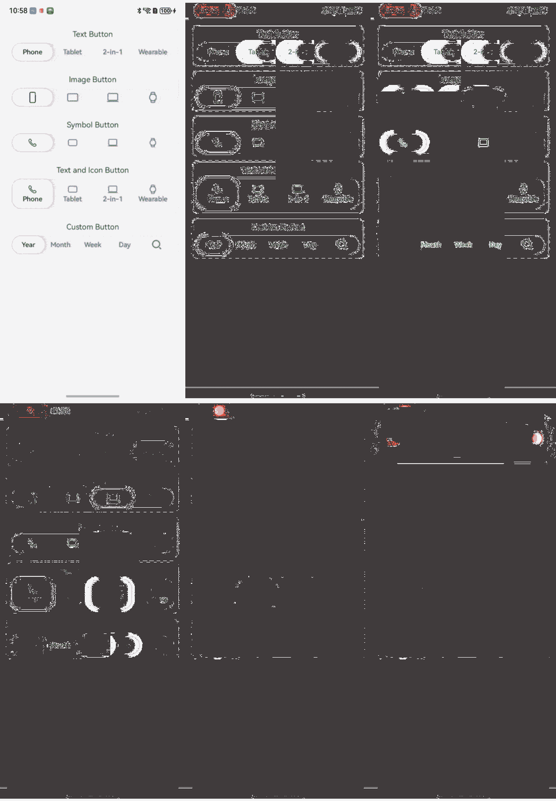
Example 1 (TabSegmentButtonV2)
The following example describes how to use the TabSegmentButtonV2 component.
import { SegmentButtonV2Items, TabSegmentButtonV2 } from '@kit.ArkUI';

@Entry
@ComponentV2
struct TabSegmentButtonV2Example {
  @Local textItems: SegmentButtonV2Items = new SegmentButtonV2Items([
    { text: 'Phone'},
    { text: 'Tablet' },
    { text: '2-in-1' },
    { text: 'Wearable' },
  ]);
  @Local textSelectedIndex: number = 0;
  @Local imageItems: SegmentButtonV2Items = new SegmentButtonV2Items([
    { icon: $r('sys.media.ohos_ic_public_device_phone') },
    { icon: $r('sys.media.ohos_ic_public_device_pad') },
    { icon: $r('sys.media.ohos_ic_public_device_matebook') },
    { icon: $r('sys.media.ohos_ic_public_device_watch') },
  ]);
  @Local imageSelectedIndex: number = 0;
  @Local symbolItems: SegmentButtonV2Items = new SegmentButtonV2Items([
    { symbol: $r('sys.symbol.phone') },
    { symbol: $r('sys.symbol.pad') },
    { symbol: $r('sys.symbol.matebook') },
    { symbol: $r('sys.symbol.watch') },
  ]);
  @Local symbolSelectedIndex: number = 0;
  @Local hybridItems: SegmentButtonV2Items = new SegmentButtonV2Items([
    { text: 'Phone', symbol: $r('sys.symbol.phone') },
    { text: 'Tablet', symbol: $r('sys.symbol.pad') },
    { text: '2-in-1', symbol: $r('sys.symbol.matebook') },
    { text: 'Wearable', symbol: $r('sys.symbol.watch') },
  ]);
  @Local hybridSelectedIndex: number = 0;
  @Local freeItems: SegmentButtonV2Items = new SegmentButtonV2Items([
    { text: 'Year' },
    { text: 'Month' },
    { text: 'Week' },
    { text: 'Day' },
    { icon: $r('sys.media.ohos_ic_public_search_filled') },
  ]);
  @Local freeSelectedIndex: number = 0;

  build() {
    Scroll() {
      Column({ space: 12 }) {
        VCard({ title: 'Text Button' }) {
          TabSegmentButtonV2({
            items: this.textItems,
            selectedIndex: this.textSelectedIndex!!,
          })
        }

        VCard({ title: 'Image Button' }) {
          TabSegmentButtonV2({
            items: this.imageItems,
            selectedIndex: this.imageSelectedIndex!!,
          })
        }

        VCard({ title: 'Symbol Button' }) {
          TabSegmentButtonV2({
            items: this.symbolItems,
            selectedIndex: this.symbolSelectedIndex!!,
          })
        }

        VCard({ title: 'Text and Icon Button' }) {
          TabSegmentButtonV2({
            items: this.hybridItems,
            selectedIndex: this.hybridSelectedIndex!!,
          })
        }

        VCard({ title: 'Custom Button' }) {
          TabSegmentButtonV2({
            items: this.freeItems,
            selectedIndex: this.freeSelectedIndex!!,
          })
        }
      }
      .constraintSize({ minHeight: '100%' })
      .justifyContent(FlexAlign.Start)
      .padding(16)
    }
    .backgroundColor('#f1f3f5')
    .width('100%')
    .height('100%')
  }
}

@Builder
function Noop() {
}

@Component
export struct VCard {
  @Prop
  title: ResourceStr;
  @BuilderParam
  content: () => void = Noop;

  build() {
    Column({ space: 8 }) {
      if (this.title) {
        Text(this.title)
          .maxLines(1)
          .textOverflow({ overflow: TextOverflow.Ellipsis })
          .constraintSize({ maxWidth: '80%' })
      }
      this.content()
    }
    .backgroundColor(Color.White)
    .borderRadius(8)
    .padding(8)
    .width('100%')
  }
}
Example 2 (CapsuleSegmentButtonV2)
The following example describes how to use the CapsuleSegmentButtonV2 button.
import { CapsuleSegmentButtonV2, SegmentButtonV2Items } from '@kit.ArkUI';

@Entry
@ComponentV2
struct CapsuleSegmentButtonV2Example {
  @Local textItems: SegmentButtonV2Items = new SegmentButtonV2Items([
    { text: 'Phone'},
    { text: 'Tablet'},
    { text: '2-in-1' },
    { text: 'Wearable' },
  ]);
  @Local textSelectedIndex: number = 0;
  @Local imageItems: SegmentButtonV2Items = new SegmentButtonV2Items([
    { icon: $r('sys.media.ohos_ic_public_device_phone') },
    { icon: $r('sys.media.ohos_ic_public_device_pad') },
    { icon: $r('sys.media.ohos_ic_public_device_matebook') },
    { icon: $r('sys.media.ohos_ic_public_device_watch') },
  ]);
  @Local imageSelectedIndex: number = 0;
  @Local symbolItems: SegmentButtonV2Items = new SegmentButtonV2Items([
    { symbol: $r('sys.symbol.phone') },
    { symbol: $r('sys.symbol.pad') },
    { symbol: $r('sys.symbol.matebook') },
    { symbol: $r('sys.symbol.watch') },
  ]);
  @Local symbolSelectedIndex: number = 0;
  @Local hybridItems: SegmentButtonV2Items = new SegmentButtonV2Items([
    { text: 'Phone', symbol: $r('sys.symbol.phone') },
    { text: 'Tablet', symbol: $r('sys.symbol.pad') },
    { text: '2-in-1', symbol: $r('sys.symbol.matebook') },
    { text: 'Wearable', symbol: $r('sys.symbol.watch') },
  ]);
  @Local hybridSelectedIndex: number = 0;
  @Local freeItems: SegmentButtonV2Items = new SegmentButtonV2Items([
    { text: 'Year' },
    { text: 'Month' },
    { text: 'Week' },
    { text: 'Day' },
    { icon: $r('sys.media.ohos_ic_public_search_filled') },
  ]);
  @Local freeSelectedIndex: number = 0;

  build() {
    Scroll() {
      Column({ space: 12 }) {
        VCard({ title: 'Text Button' }) {
          CapsuleSegmentButtonV2({
            items: this.textItems,
            selectedIndex: this.textSelectedIndex!!,
          })
        }

        VCard({ title: 'Image Button' }) {
          CapsuleSegmentButtonV2({
            items: this.imageItems,
            selectedIndex: this.imageSelectedIndex!!,
          })
        }

        VCard({ title: 'Symbol Button' }) {
          CapsuleSegmentButtonV2({
            items: this.symbolItems,
            selectedIndex: this.symbolSelectedIndex!!,
          })
        }

        VCard({ title: 'Text and Icon Button' }) {
          CapsuleSegmentButtonV2({
            items: this.hybridItems,
            selectedIndex: this.hybridSelectedIndex!!,
          })
        }

        VCard({ title: 'Custom Button' }) {
          CapsuleSegmentButtonV2({
            items: this.freeItems,
            selectedIndex: this.freeSelectedIndex!!,
          })
        }
      }
      .constraintSize({ minHeight: '100%' })
      .justifyContent(FlexAlign.Start)
      .padding(16)
    }
    .backgroundColor('#f1f3f5')
    .width('100%')
    .height('100%')
  }
}

@Builder
function Noop() {
}

@Component
export struct VCard {
  @Prop
  title: ResourceStr;
  @BuilderParam
  content: () => void = Noop;

  build() {
    Column({ space: 8 }) {
      if (this.title) {
        Text(this.title)
          .maxLines(1)
          .textOverflow({ overflow: TextOverflow.Ellipsis })
          .constraintSize({ maxWidth: '80%' })
      }
      this.content()
    }
    .backgroundColor(Color.White)
    .borderRadius(8)
    .padding(8)
    .width('100%')
  }
}

Example 3 (MultiCapsuleSegmentButtonV2)
The following example describes how to use the MultiCapsuleSegmentButtonV2 button.
import { MultiCapsuleSegmentButtonV2, SegmentButtonV2Items } from '@kit.ArkUI';

@Entry
@ComponentV2
struct MultiCapsuleSegmentButtonV2Example {
  @Local textItems: SegmentButtonV2Items = new SegmentButtonV2Items([
    { text: 'Phone'},
    { text: 'Tablet'},
    { text: '2-in-1' },
    { text: 'Wearable' },
  ]);
  @Local textSelectedIndexes: number[] = [0];
  @Local imageItems: SegmentButtonV2Items = new SegmentButtonV2Items([
    { icon: $r('sys.media.ohos_ic_public_device_phone') },
    { icon: $r('sys.media.ohos_ic_public_device_pad') },
    { icon: $r('sys.media.ohos_ic_public_device_matebook') },
    { icon: $r('sys.media.ohos_ic_public_device_watch') },
  ]);
  @Local imageSelectedIndexes: number[] = [0];
  @Local symbolItems: SegmentButtonV2Items = new SegmentButtonV2Items([
    { symbol: $r('sys.symbol.phone') },
    { symbol: $r('sys.symbol.pad') },
    { symbol: $r('sys.symbol.matebook') },
    { symbol: $r('sys.symbol.watch') },
  ]);
  @Local symbolSelectedIndexes: number[] = [0];
  @Local hybridItems: SegmentButtonV2Items = new SegmentButtonV2Items([
    { text: 'Phone', symbol: $r('sys.symbol.phone') },
    { text: 'Tablet', symbol: $r('sys.symbol.pad') },
    { text: '2-in-1', symbol: $r('sys.symbol.matebook') },
    { text: 'Wearable', symbol: $r('sys.symbol.watch') },
  ]);
  @Local hybridSelectedIndexes: number[] = [0];
  @Local freeItems: SegmentButtonV2Items = new SegmentButtonV2Items([
    { text: 'Year' },
    { text: 'Month' },
    { text: 'Week' },
    { text: 'Day' },
    { icon: $r('sys.media.ohos_ic_public_search_filled') },
  ]);
  @Local freeSelectedIndexes: number[] = [0];

  build() {
    Scroll() {
      Column({ space: 12 }) {
        VCard({ title: 'Text Button' }) {
          MultiCapsuleSegmentButtonV2({
            items: this.textItems,
            selectedIndexes: this.textSelectedIndexes!!,
          })
        }

        VCard({ title: 'Image Button' }) {
          MultiCapsuleSegmentButtonV2({
            items: this.imageItems,
            selectedIndexes: this.imageSelectedIndexes!!,
          })
        }

        VCard({ title: 'Symbol Button' }) {
          MultiCapsuleSegmentButtonV2({
            items: this.symbolItems,
            selectedIndexes: this.symbolSelectedIndexes!!,
          })
        }

        VCard({ title: 'Text and Icon Button' }) {
          MultiCapsuleSegmentButtonV2({
            items: this.hybridItems,
            selectedIndexes: this.hybridSelectedIndexes!!,
          })
        }

        VCard({ title: 'Custom Button' }) {
          MultiCapsuleSegmentButtonV2({
            items: this.freeItems,
            selectedIndexes: this.freeSelectedIndexes!!,
          })
        }
      }
      .constraintSize({ minHeight: '100%' })
      .justifyContent(FlexAlign.Start)
      .padding(16)
    }
    .backgroundColor('#f1f3f5')
    .width('100%')
    .height('100%')
  }
}

@Builder
function Noop() {
}

@Component
export struct VCard {
  @Prop
  title: ResourceStr;
  @BuilderParam
  content: () => void = Noop;

  build() {
    Column({ space: 8 }) {
      if (this.title) {
        Text(this.title)
          .maxLines(1)
          .textOverflow({ overflow: TextOverflow.Ellipsis })
          .constraintSize({ maxWidth: '80%' })
      }
      this.content()
    }
    .backgroundColor(Color.White)
    .borderRadius(8)
    .padding(8)
    .width('100%')
  }
}
