Tooltip Control
You can bind a floating tooltip to a component. The tooltip is automatically displayed when the cursor hovers over the component and hidden when the cursor moves away.
NOTE
This API is supported since API version 18. Updates will be marked with a superscript to indicate their earliest API version.
bindTips
bindTips(message: TipsMessageType, options?: TipsOptions)
Binds a tooltip to the component.
NOTE
If the enable attribute of the bound component is set to false, the tooltip can still be displayed.
Atomic service API: This API can be used in atomic services since API version 18.
System capability: SystemCapability.ArkUI.ArkUI.Full
Parameters
| Name | Type | Mandatory | Description |
|---|---|---|---|
| message | TipsMessageType | Yes | Content of the tooltip message. |
| options | TipsOptions | No | Parameters of the tooltip. Default value: { appearingTime:700, disappearingTime:300, appearingTimeWithContinuousOperation: 300, disappearingTimeWithContinuousOperation:0, enableArrow:true, arrowPointPosition:ArrowPointPosition.CENTER, arrowWidth:16vp,arrowHeight:8vp } |
TipsOptions
Defines the parameters of the tooltip.
Atomic service API: This API can be used in atomic services since API version 18.
System capability: SystemCapability.ArkUI.ArkUI.Full
| Name | Type | Mandatory | Description |
|---|---|---|---|
| appearingTime | number | No | Delay before the tooltip appears. Default value: 700. Unit: ms. |
| disappearingTime | number | No | Delay before the tooltip disappears. Default value: 300. Unit: ms. |
| appearingTimeWithContinuousOperation | number | No | Delay before the tooltip disappears when multiple tooltips are displayed consecutively. Default value: 300. Unit: ms. |
| disappearingTimeWithContinuousOperation | number | No | Delay before the tooltip disappears when multiple tooltips are displayed consecutively. Default value: 0. Unit: ms. |
| enableArrow | boolean | No | Whether to display the tooltip arrow. Default value: true. NOTE If the available space on the screen is insufficient, the tooltip will cover part of the component and the arrow will not be displayed. |
| arrowPointPosition | ArrowPointPosition | No | Position of the tooltip arrow relative to its parent component. Available positions are Start, Center, and End, in both vertical and horizontal directions. These positions are within the parent component area and do not exceed its boundaries or cover rounded corners. Default value: ArrowPointPosition.CENTER. |
| arrowWidth | Dimension | No | Width of the tooltip arrow. If the arrow width exceeds the length of the edge minus twice the size of the tooltip rounded corner, the arrow is not drawn. Default value: 16. Unit: vp. NOTE Percentage values are not supported. |
| arrowHeight | Dimension | No | Height of the tooltip arrow. Default value: 8. Unit: vp. NOTE Percentage values are not supported. |
TipsMessageType
type TipsMessageType = ResourceStr|StyledString
Provides information about the tooltip.
Atomic service API: This API can be used in atomic services since API version 18.
System capability: SystemCapability.ArkUI.ArkUI.Full
| Type | Description |
|---|---|
| ResourceStr | Type used to represent the types that can be used by input parameters of the string type. |
| StyledString | Styled string. |
Example
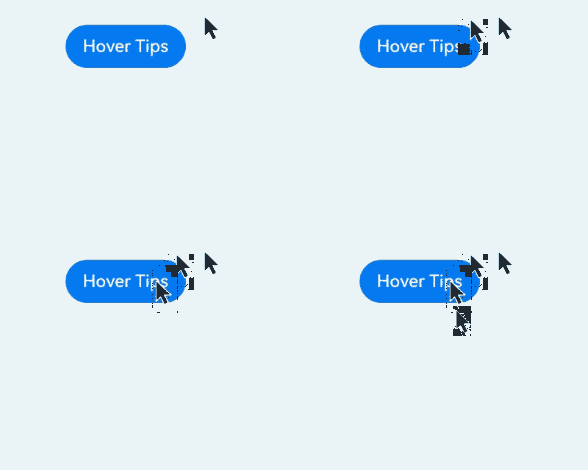
Example 1: Binding a Tooltip
This example shows how to bind a tooltip to a button using bindTooltip.
// xxx.ets
@Entry
@Component
struct TipsExample {
  build() {
    Flex({ direction: FlexDirection.Column }) {
      Button('Hover Tips')
        .bindTips("test Tips", {
          appearingTime: 700,
          disappearingTime: 300,
          appearingTimeWithContinuousOperation: 300,
          disappearingTimeWithContinuousOperation: 0,
          enableArrow:true,
        })
        .position({ x: 100, y: 250 })
    }.width('100%').padding({ top: 5 })
  }
}
Example 2: Displaying and Hiding Multiple Tooltips
This example demonstrates how to configure multiple tooltips to appear and disappear in sequence using bindTips.
// xxx.ets

@Entry
@Component
struct TipsExample {
  build() {
    Flex({ direction: FlexDirection.Column }) {
      Button('Hover Tips')
        .bindTips("test Tips", {
          appearingTime: 700,
          disappearingTime: 300,
          appearingTimeWithContinuousOperation: 300,
          disappearingTimeWithContinuousOperation: 0,
          enableArrow:true,
        })
        .position({ x: 100, y: 250 })

      Button('Hover Tips')
        .bindTips("test Tips", {
          appearingTime: 700,
          disappearingTime: 300,
          appearingTimeWithContinuousOperation: 300,
          disappearingTimeWithContinuousOperation: 0,
          enableArrow:true,
        })
        .position({ x: 100, y: 350 })


    }.width('100%').padding({ top: 5 })
  }
}
