Universal Text Attributes
Universal text attributes include text style attributes applicable to text containers.
NOTE
The APIs of this module are supported since API version 7. Updates will be marked with a superscript to indicate their earliest API version.
fontColor
fontColor(value: ResourceColor)
Sets the font color.
Widget capability: This API can be used in ArkTS widgets since API version 9.
Atomic service API: This API can be used in atomic services since API version 11.
System capability: SystemCapability.ArkUI.ArkUI.Full
Parameters
| Name | Type | Mandatory | Description |
|---|---|---|---|
| value | ResourceColor | Yes | Font color. |
fontSize
fontSize(value: number|string|Resource)
Sets the font size.
Widget capability: This API can be used in ArkTS widgets since API version 9.
Atomic service API: This API can be used in atomic services since API version 11.
System capability: SystemCapability.ArkUI.ArkUI.Full
Parameters
| Name | Type | Mandatory | Description |
|---|---|---|---|
| value | Resource |number |string | Yes | Font size. If fontSize is of the number type, the unit fp is used. The default font size is 16 fp. For the string type, numeric string values with optional units, for example, "10" or "10fp", are supported. Percentage values are not supported. |
fontStyle
fontStyle(value: FontStyle)
Sets the font style.
Widget capability: This API can be used in ArkTS widgets since API version 9.
Atomic service API: This API can be used in atomic services since API version 11.
System capability: SystemCapability.ArkUI.ArkUI.Full
Parameters
| Name | Type | Mandatory | Description |
|---|---|---|---|
| value | FontStyle | Yes | Font style. Default value: FontStyle.Normal |
fontWeight
fontWeight(value: number|FontWeight|string)
Sets the font weight. If the value is too large, the text may be clipped depending on the font.
Widget capability: This API can be used in ArkTS widgets since API version 9.
Atomic service API: This API can be used in atomic services since API version 11.
System capability: SystemCapability.ArkUI.ArkUI.Full
Parameters
| Name | Type | Mandatory | Description |
|---|---|---|---|
| value | FontWeight |number |string | Yes | Font weight. For the number type, the value range is [100, 900], at an interval of 100. The default value is 400. A larger value indicates a heavier font weight. For the string type, only strings that represent a number, for example, "400", and the following enumerated values of FontWeight are supported: "bold", "bolder", "lighter", "regular", and "medium". Default value: FontWeight.Normal |
fontFamily
fontFamily(value: string|Resource)
Sets the font family.
Widget capability: This API can be used in ArkTS widgets since API version 9.
Atomic service API: This API can be used in atomic services since API version 11.
System capability: SystemCapability.ArkUI.ArkUI.Full
Parameters
| Name | Type | Mandatory | Description |
|---|---|---|---|
| value | Resource |string | Yes | Font family. Default font: 'HarmonyOS Sans' The 'HarmonyOS Sans' font and registered custom fonts are supported for applications. Only the 'HarmonyOS Sans' font is supported for widgets. |
lineHeight
lineHeight(value: number|string|Resource)
Sets the text line height. If the value is less than or equal to 0, the line height is not limited and the font size is adaptive.
Widget capability: This API can be used in ArkTS widgets since API version 9.
Atomic service API: This API can be used in atomic services since API version 11.
System capability: SystemCapability.ArkUI.ArkUI.Full
Parameters
| Name | Type | Mandatory | Description |
|---|---|---|---|
| value | Resource |number |string | Yes | Text line height. For number values, the unit is fp. |
decoration
decoration(value: DecorationStyleInterface)
Sets the style and color for the text decorative line.
Widget capability: This API can be used in ArkTS widgets since API version 9.
Atomic service API: This API can be used in atomic services since API version 11.
System capability: SystemCapability.ArkUI.ArkUI.Full
Parameters
| Name | Type | Mandatory | Description |
|---|---|---|---|
| value | DecorationStyleInterface12+ | Yes | Style of the text decorative line. Default value: { type: TextDecorationType.None, color: Color.Black, style: TextDecorationStyle.SOLID } NOTE The style parameter cannot be used in widgets. |
Example
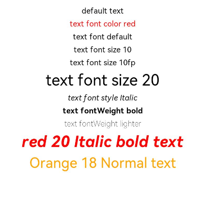
This example showcases various text styles by using the fontColor, fontSize, fontStyle, and fontWeight attributes.
// xxx.ets
@Entry
@Component
struct TextStyleExample {
  build() {
    Column({ space: 8 }) {
      Text('default text')

      Text('text font color red').fontColor(Color.Red)

      Text('text font default')
      Text('text font size 10').fontSize(10)
      Text('text font size 10fp').fontSize('10fp')
      Text('text font size 20').fontSize(20)

      Text('text font style Italic').fontStyle(FontStyle.Italic)

      Text('text fontWeight bold').fontWeight(700)
      Text('text fontWeight lighter').fontWeight(FontWeight.Lighter)

      Text('red 20 Italic bold text')
        .fontColor(Color.Red)
        .fontSize(20)
        .fontStyle(FontStyle.Italic)
        .fontWeight(FontWeight.Bold)

      Text('Orange 18 Normal text')
        .fontColor(Color.Orange)
        .fontSize(18)
        .fontStyle(FontStyle.Normal)

      Text('text lineHeight 30')
        .lineHeight(30)
        .backgroundColor(Color.Gray)

      Text('text fontFamily HarmonyOS Sans')
        .fontFamily("HarmonyOS Sans")

      Text('Underline Black SOLID decoration text')
        .decoration({
          type: TextDecorationType.Underline,
          color: Color.Black,
          style: TextDecorationStyle.SOLID
        })
      Text('Overline Red DOTTED decoration text')
        .decoration({
          type: TextDecorationType.Overline,
          color: Color.Red,
          style: TextDecorationStyle.DOTTED
        })
      Text('LineThrough Orange SOLID decoration text')
        .decoration({
          type: TextDecorationType.LineThrough,
          color: Color.Orange,
          style: TextDecorationStyle.WAVY
        })
    }.width('100%')
  }
}