ExceptionPrompt
The exception prompt component is used to show an error message when an error arises.
NOTE
This component is supported since API version 11. Updates will be marked with a superscript to indicate their earliest API version.
Modules to Import
import { ExceptionPrompt, PromptOptions, MarginType } from '@kit.ArkUI'
Child Components
Not supported
Attributes
The universal attributes are not supported.
ExceptionPrompt
ExceptionPrompt({ options: PromptOptions, onTipClick?: ()=>void, onActionTextClick?: ()=>void })
Decorator: @Component
Atomic service API: This API can be used in atomic services since API version 12.
System capability: SystemCapability.ArkUI.ArkUI.Full
Parameters
| Name | Type | Mandatory | Decorator | Description |
|---|---|---|---|---|
| options | PromptOptions | Yes | @Prop | Exception prompt configuration. |
| onTipClick | ()=>void | No | - | Callback invoked when the prompt text on the left is clicked. |
| onActionTextClick | ()=>void | No | - | Callback invoked when the icon on the right is clicked. |
PromptOptions
Defines the exception prompt options.
Atomic service API: This API can be used in atomic services since API version 12.
System capability: SystemCapability.ArkUI.ArkUI.Full
| Name | Type | Mandatory | Description |
|---|---|---|---|
| icon | ResourceStr | No | Icon style of the exception prompt. |
| symbolStyle18+ | SymbolGlyphModifier | No | Symbol icon style of the exception prompt, which has higher priority than icon. Atomic service API: This API can be used in atomic services since API version 18. |
| tip | ResourceStr | No | Text content of the exception prompt. By default, the following text resources are provided: 1. ohos_network_not_connected: displayed when no Internet connection. 2. ohos_network_connected_unstable: displayed when the Internet connection is unstable. 3. ohos_unstable_connect_server: displayed when the server fails to be connected. 4. ohos_custom_network_tips_left: displayed when an Internet connection is available but the location fails to be obtained. |
| marginType | MarginType | Yes | Margin type of the exception prompt. |
| actionText | ResourceStr | No | Text of the icon on the right of the exception prompt. |
| marginTop | Dimension | Yes | Top margin of the exception prompt. |
| isShown | boolean | No | Whether the exception prompt is displayed. true: The exception prompt is displayed. false: The exception prompt is displayed. |
MarginType
Defines the margin type.
Atomic service API: This API can be used in atomic services since API version 12.
System capability: SystemCapability.ArkUI.ArkUI.Full
| Name | Value | Description |
|---|---|---|
| DEFAULT_MARGIN | 0 | Default margin: Margin 1: referenced from ohos_id_card_margin_start. Margin 2: referenced from ohos_id_card_margin_end. |
| FIT_MARGIN | 1 | Adaptable margin: Margin 1: referenced from ohos_id_max_padding_start. Margin 2: referenced from ohos_id_max_padding_end. |
Events
The universal events are not supported.
Example
Example 1: Configuring an Exception Prompt
This example demonstrates how to configure an exception prompt, including the exception icon, text, margin, and the text content of the right-side icon button.
import { ExceptionPrompt, PromptOptions, MarginType } from '@kit.ArkUI'

@Entry
@Component
struct Index {
  @State options: PromptOptions = {
    icon: $r('sys.media.ohos_ic_public_fail'),
    tip: 'Error',
    marginType: MarginType.DEFAULT_MARGIN,
    actionText: 'Set network',
    marginTop: 80,
    isShown: true,
  }

  build() {
    Column() {
      ExceptionPrompt({
        options: this.options,
        onTipClick: () => {
          // Handle clicks on the left text to switch to a connected state.
        },
        onActionTextClick: () => {
          // Handle clicks on the Set network button to open the network settings dialog box.
        },
      })
    }
  }
}

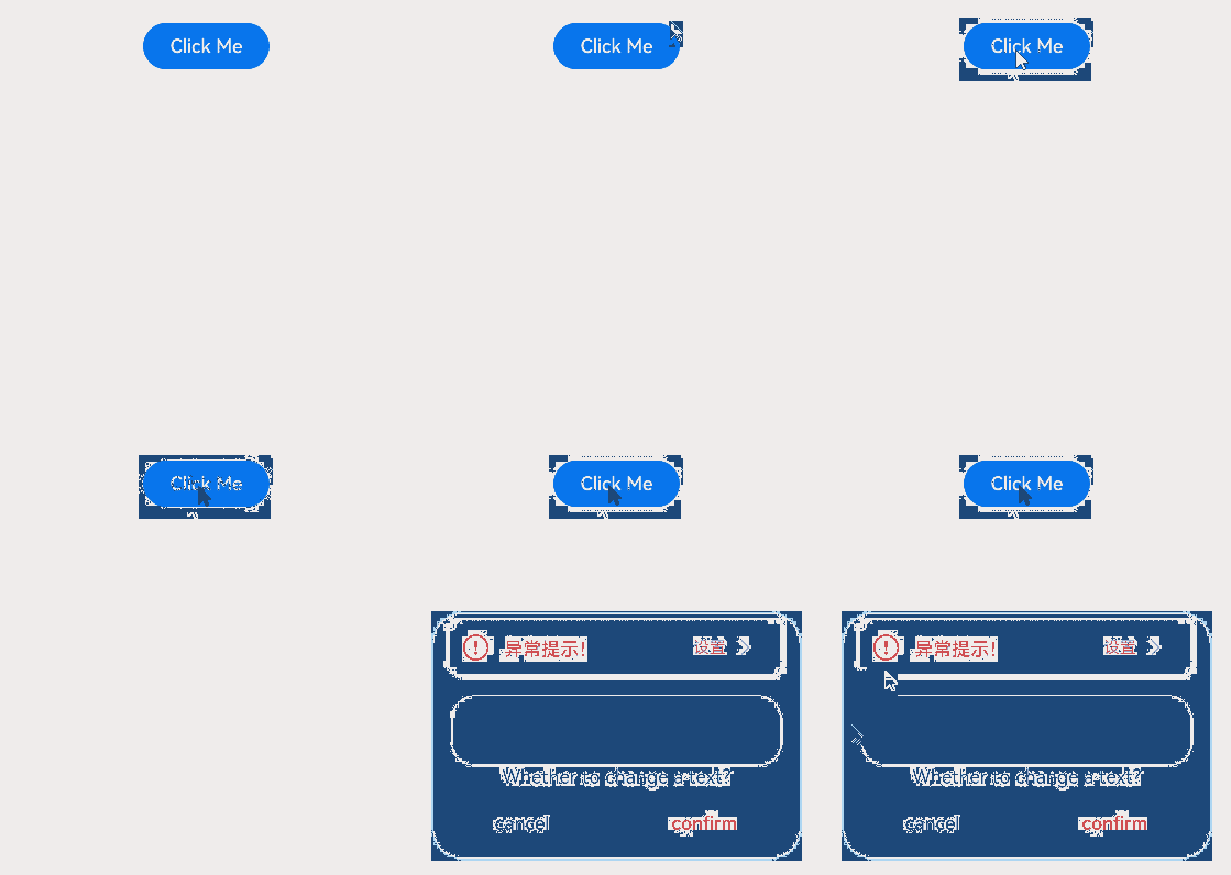
Example 2: Setting a Dialog-Type Exception Prompt
This example uses a custom dialog box to set a dialog-type exception prompt.
import { ExceptionPrompt, PromptOptions, MarginType } from '@kit.ArkUI'

@CustomDialog
struct CustomDialogExample {
  @Link textValue: string;
  @Link inputValue: string;
  @State options: PromptOptions = {
    icon: $r('sys.media.ohos_ic_public_fail'),
    tip: 'Error',
    marginType: MarginType.DEFAULT_MARGIN,
    actionText: 'Settings',
    marginTop: 5,
    isShown: true,
  };
  cancel: () => void = () => {
  };
  confirm: () => void = () => {
  };
  controller?: CustomDialogController;

  // To pass multiple other controllers into a CustomDialog to open another or several other custom dialog boxes within it,
  // place the controller pointing to itself last.
  build() {
    Column() {
      ExceptionPrompt({
        options: this.options,
      })
      TextInput({ placeholder: '', text: this.textValue }).margin({ top: 70 }).height(60).width('90%')
        .onChange((value: string) => {
          this.textValue = value;
        })
      Text('Are you sure you want to change the text?').fontSize(16).margin({ bottom: 10 })
      Flex({ justifyContent: FlexAlign.SpaceAround }) {
        Button('No')
          .onClick(() => {
            this.controller?.close();
            this.cancel();
          }).backgroundColor(0xffffff).fontColor(Color.Black)
        Button('OK')
          .onClick(() => {
            this.inputValue = this.textValue;
            this.controller?.close();
            this.confirm();
          }).backgroundColor(0xffffff).fontColor(Color.Red)
      }.margin({ bottom: 10 })
    }
  }
}

@Entry
@Component
struct Index1 {
  @State ButtonText: string = '';
  @State MAP_HEIGHT: string = '30%';
  @State duration: number = 2500;
  @State tips: string = '';
  @State actionText: string = '';
  controller: TextInputController = new TextInputController();
  cancel: () => void = () => {
  };
  confirm: () => void = () => {
  };
  @State options: PromptOptions = {
    icon: $r('sys.media.ohos_ic_public_fail'),
    tip: '',
    marginType: MarginType.DEFAULT_MARGIN,
    actionText: '',
    marginTop: 80,
    isShown: true,
  }
  @State textValue: string = '';
  @State inputValue: string = 'click me';
  dialogController: CustomDialogController|undefined = new CustomDialogController({
    builder: CustomDialogExample({
      cancel: this.onCancel,
      confirm: this.onAccept,
      textValue: $textValue,
      inputValue: $inputValue,
    }),
    cancel: this.existApp,
    autoCancel: true,
    alignment: DialogAlignment.Bottom,
    offset: { dx: 0, dy: -20 },
    gridCount: 4,
    customStyle: false,
  })

  aboutToDisappear() {
    this.dialogController = undefined; // Set dialogController to undefined.
  }

  onCancel() {
    console.info('Callback when the first button is clicked');
  }

  onAccept() {
    console.info('Callback when the second button is clicked');
  }

  existApp() {
    console.info('Click the callback in the blank area');
  }

  build() {
    Column() {
      Button('Click Me')
        .width('30%')
        .margin({ top: 420 })
        .zIndex(999)
        .onClick(() => {
          if (this.dialogController != undefined) {
            this.dialogController.open();
          }
        })
    }
    .height('100%')
    .width('100%')
  }
}
Example 3: Setting the Symbol Icon
This example demonstrates how to use symbolStyle in PromptOptions to set custom symbol icons.
import { ExceptionPrompt, MarginType, SymbolGlyphModifier } from '@kit.ArkUI'

@Entry
@Component
struct Index {
  build() {
    Column() {
      ExceptionPrompt({
        options: {
          icon: $r('sys.symbol.house'),
          tip: 'Exception prompt Exception prompt Exception prompt',
          marginType: MarginType.DEFAULT_MARGIN,
          actionText: 'Set network Set network Set network Set network',
          marginTop: 80,
          isShown: true,
        },
      })
      ExceptionPrompt({
        options: {
          icon: $r('sys.symbol.house'),
          symbolStyle: new SymbolGlyphModifier($r('sys.symbol.bell')).fontColor([Color.Red]),
          tip: 'Exception prompt Exception prompt Exception prompt',
          marginType: MarginType.DEFAULT_MARGIN,
          actionText: 'Set network Set network Set network Set network',
          marginTop: 80,
          isShown: true,
        },
      })
    }
  }
}
