harmony 鸿蒙RelativeContainer
RelativeContainer
The <RelativeContainer> component is used for element alignment in complex scenarios.
NOTE
This component is supported since API version 9. Updates will be marked with a superscript to indicate their earliest API version.
Rules
- Components in a container are aligned horizontally or vertically.
- Alignment modes in the horizontal direction can be left, middle, or right, achieved by the HorizontalAlign.Start, HorizontalAlign.Center, and HorizontalAlign.End attributes of the container, respectively.
- Alignment modes in the vertical direction can be top, center, or bottom, achieved by the VerticalAlign.Top, VerticalAlign.Center, and VerticalAlign.Bottom attributes of the container, respectively.
- A child component can set the container or another child component as the anchor.
- To show in the <RelativeContainer>, child components must have an ID. The container ID is fixed at container.
- Three positions on the child component in a specific direction can use as anchors three positions on the container or another child component in the same direction. If anchors are set for more than two positions in a single direction, then: Start and Center are preferred in the horizontal direction, and Top and Center are preferred in the vertical direction.
- The child component size set on the frontend page is not affected by the <RelativeContainer> rules. If two or more alignRules values are set for one direction of the child component, you are not advised to set the size for this direction.
- If offset is required after the alignment, it can be set through offset.
- Exceptions
- When a mutual or circular dependency occurs, none of the child components in the container are drawn.
- If anchors are set for more than two positions in a single direction but the anchor positions are reversed, the size of the child component is 0, which means that the child component is not drawn.
Child Components
Multiple child components are supported.
APIs
RelativeContainer()
Since API version 9, this API is supported in ArkTS widgets.
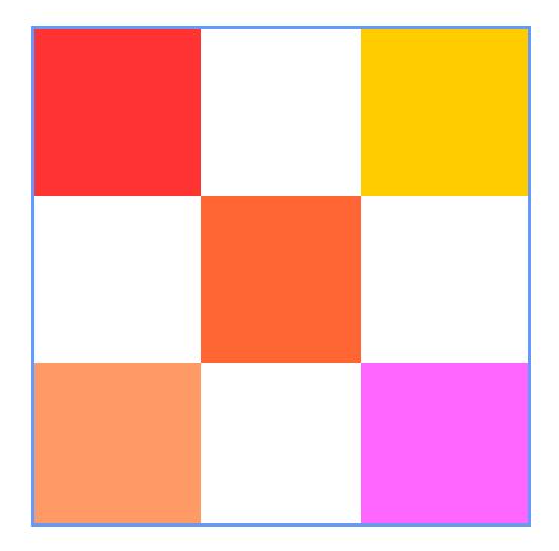
Example
@Entry
@Component
struct Index {
  build() {
    Row() {

      RelativeContainer() {
        Row().width(100).height(100)
          .backgroundColor("#FF3333")
          .alignRules({
            top: {anchor: "__container__", align: VerticalAlign.Top},
            left: {anchor: "__container__", align: HorizontalAlign.Start}
          })
          .id("row1")

        Row().width(100).height(100)
          .backgroundColor("#FFCC00")
          .alignRules({
            top: {anchor: "__container__", align: VerticalAlign.Top},
            right: {anchor: "__container__", align: HorizontalAlign.End}
          })
          .id("row2")

        Row().height(100)
          .backgroundColor("#FF6633")
          .alignRules({
            top: {anchor: "row1", align: VerticalAlign.Bottom},
            left: {anchor: "row1", align: HorizontalAlign.End},
            right: {anchor: "row2", align: HorizontalAlign.Start}
          })
          .id("row3")

        Row()
          .backgroundColor("#FF9966")
          .alignRules({
            top: {anchor: "row3", align: VerticalAlign.Bottom},
            bottom: {anchor: "__container__", align: VerticalAlign.Bottom},
            left: {anchor: "__container__", align: HorizontalAlign.Start},
            right: {anchor: "row1", align: HorizontalAlign.End}
          })
          .id("row4")

        Row()
          .backgroundColor("#FF66FF")
          .alignRules({
            top: {anchor: "row3", align: VerticalAlign.Bottom},
            bottom: {anchor: "__container__", align: VerticalAlign.Bottom},
            left: {anchor: "row2", align: HorizontalAlign.Start},
            right: {anchor: "__container__", align: HorizontalAlign.End}
          })
          .id("row5")
      }
      .width(300).height(300)
      .margin({left: 100})
      .border({width:2, color: "#6699FF"})
    }
    .height('100%')
  }
}

你可能感兴趣的鸿蒙文章
harmony 鸿蒙ArkTS-based Declarative Development Paradigm
0
赞
- 所属分类: 后端技术
- 本文标签:
热门推荐
-
2、 - 优质文章
-
3、 gate.io
-
8、 golang
-
9、 openharmony
-
10、 Vue中input框自动聚焦