Button
The <Button> component can be used to create different types of buttons.
NOTE
This component is supported since API version 7. Updates will be marked with a superscript to indicate their earliest API version.
Child Components
This component can contain only one child component.
APIs
Button
Button(options?: {type?: ButtonType, stateEffect?: boolean})
Since API version 9, this API is supported in ArkTS widgets.
Parameters
| Name | Type | Mandatory | Description |
|---|---|---|---|
| type | ButtonType | No | Button type. Default value: ButtonType.Capsule |
| stateEffect | boolean | No | Whether to enable the pressed effect on the click of the button. The value false means to disable the pressed effect. Default value: true NOTE When the pressed effect is enabled on the click of the button and the state style is set, the background color is aaplied based on the state style. |
Button
Button(label?: ResourceStr, options?: { type?: ButtonType, stateEffect?: boolean })
Creates a button component based on text content. In this case, the component cannot contain child components.
Since API version 9, this API is supported in ArkTS widgets.
Parameters
| Name | Type | Mandatory | Description |
|---|---|---|---|
| label | ResourceStr | No | Button text. |
| options | { type?: ButtonType, stateEffect?: boolean } | No | For details, see Button. |
Attributes
In addition to the universal attributes, the following attributes are supported.
| Name | Type | Description |
|---|---|---|
| type | ButtonType | Button type. Default value: ButtonType.Capsule Since API version 9, this API is supported in ArkTS widgets. |
| stateEffect | boolean | Whether to enable the pressed effect on the click of the button. The value false means to disable the pressed effect. Default value: true Since API version 9, this API is supported in ArkTS widgets. |
| labelStyle10+ | LabelStyle | Label style of the button. |
ButtonType
Since API version 9, this API is supported in ArkTS widgets.
| Name | Description |
|---|---|
| Capsule | Capsule-type button (the round corner is half of the height by default). |
| Circle | Circle button. |
| Normal | Normal button (without rounded corners by default). |
NOTE
- The rounded corner of a button is set by using borderRadius, rather than by using the border API. Only a rounded corner whose parameter is Length is supported.
- For a button of the Capsule type, the borderRadius settings do not take effect, and the radius of its rounded corner is always half of the button height or width, whichever is smaller.
- For a button of the Circle type, its radius is the value of borderRadius (if set) or the width or height (whichever is smaller).
- The button text is set using the text style attributes.
- Before setting the gradient color, you need to set backgroundColor to transparent.
LabelStyle10+
| Name | Type | Mandatory | Description |
|---|---|---|---|
| overflow | TextOverflow | No | Display mode when the label text is too long. Text is clipped at the transition between words. To clip text in the middle of a word, add zero-width spaces between characters. |
| maxLines | number | No | Maximum number of lines in the label text. By default, text is automatically folded. If this attribute is specified, the text will not exceed the specified number of lines. If there is extra text, you can use textOverflow to specify how it is displayed. |
| minFontSize | number |ResourceStr | No | Minimum font size of the label text. For the setting to take effect, this attribute must be used together with maxFontSize, maxLines, or layout constraint settings. |
| maxFontSize | number |ResourceStr | No | Maximum font size of the label text. For the setting to take effect, this attribute must be used together with minFontSize, maxLines, or layout constraint settings. |
| heightAdaptivePolicy | TextHeightAdaptivePolicy | No | How the adaptive height is determined for the label text. |
| font | Font | No | Font of the label text. |
Events
The universal events are supported.
Example
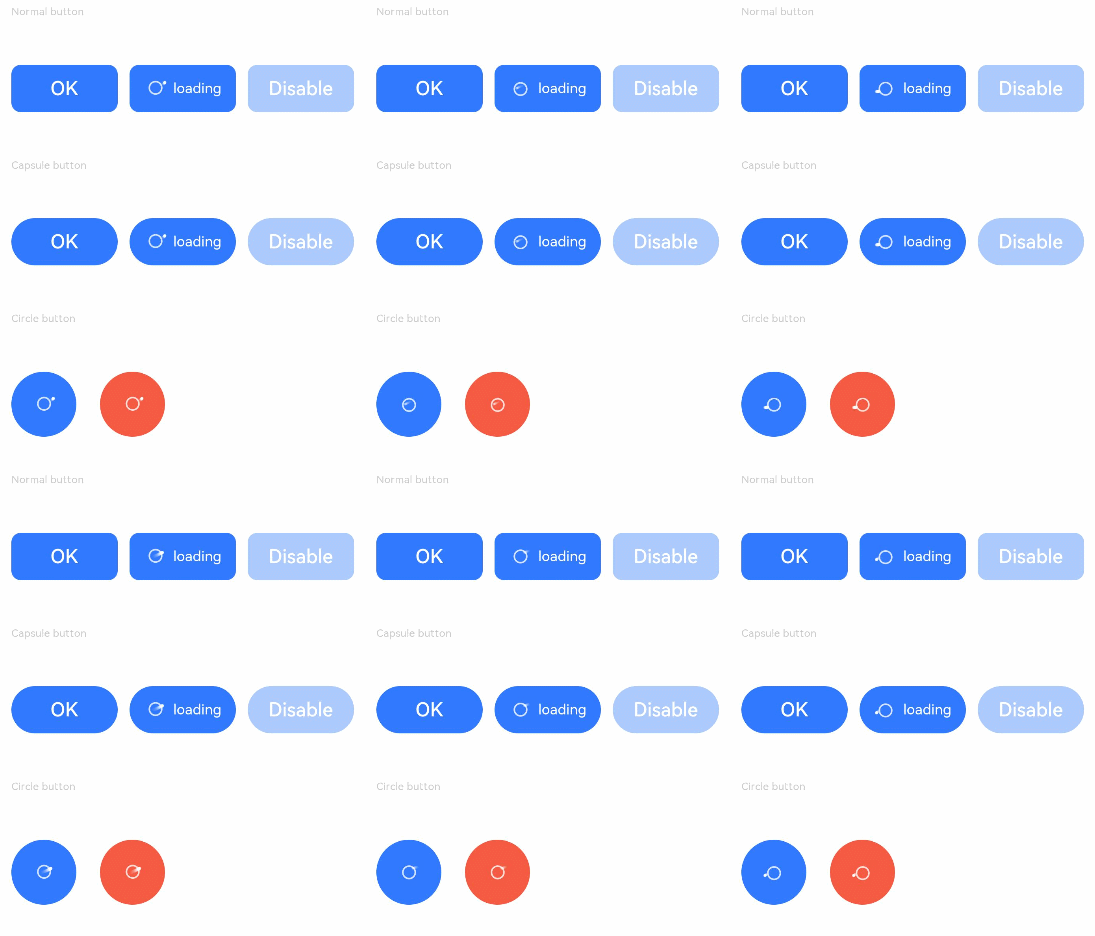
Example 1
// xxx.ets
@Entry
@Component
struct ButtonExample {
  build() {
    Flex({ direction: FlexDirection.Column, alignItems: ItemAlign.Start, justifyContent: FlexAlign.SpaceBetween }) {
      Text('Normal button').fontSize(9).fontColor(0xCCCCCC)
      Flex({ alignItems: ItemAlign.Center, justifyContent: FlexAlign.SpaceBetween }) {
        Button('OK', { type: ButtonType.Normal, stateEffect: true })
          .borderRadius(8)
          .backgroundColor(0x317aff)
          .width(90)
          .onClick(() => {
            console.log('ButtonType.Normal')
          })
        Button({ type: ButtonType.Normal, stateEffect: true }) {
          Row() {
            LoadingProgress().width(20).height(20).margin({ left: 12 }).color(0xFFFFFF)
            Text('loading').fontSize(12).fontColor(0xffffff).margin({ left: 5, right: 12 })
          }.alignItems(VerticalAlign.Center)
        }.borderRadius(8).backgroundColor(0x317aff).width(90).height(40)

        Button('Disable', { type: ButtonType.Normal, stateEffect: false }).opacity(0.4)
          .borderRadius(8).backgroundColor(0x317aff).width(90)
      }

      Text('Capsule button').fontSize(9).fontColor(0xCCCCCC)
      Flex({ alignItems: ItemAlign.Center, justifyContent: FlexAlign.SpaceBetween }) {
        Button('OK', { type: ButtonType.Capsule, stateEffect: true }).backgroundColor(0x317aff).width(90)
        Button({ type: ButtonType.Capsule, stateEffect: true }) {
          Row() {
            LoadingProgress().width(20).height(20).margin({ left: 12 }).color(0xFFFFFF)
            Text('loading').fontSize(12).fontColor(0xffffff).margin({ left: 5, right: 12 })
          }.alignItems(VerticalAlign.Center).width(90).height(40)
        }.backgroundColor(0x317aff)

        Button('Disable', { type: ButtonType.Capsule, stateEffect: false }).opacity(0.4)
          .backgroundColor(0x317aff).width(90)
      }

      Text('Circle button').fontSize(9).fontColor(0xCCCCCC)
      Flex({ alignItems: ItemAlign.Center, wrap: FlexWrap.Wrap }) {
        Button({ type: ButtonType.Circle, stateEffect: true }) {
          LoadingProgress().width(20).height(20).color(0xFFFFFF)
        }.width(55).height(55).backgroundColor(0x317aff)

        Button({ type: ButtonType.Circle, stateEffect: true }) {
          LoadingProgress().width(20).height(20).color(0xFFFFFF)
        }.width(55).height(55).margin({ left: 20 }).backgroundColor(0xF55A42)
      }
    }.height(400).padding({ left: 35, right: 35, top: 35 })
  }
}
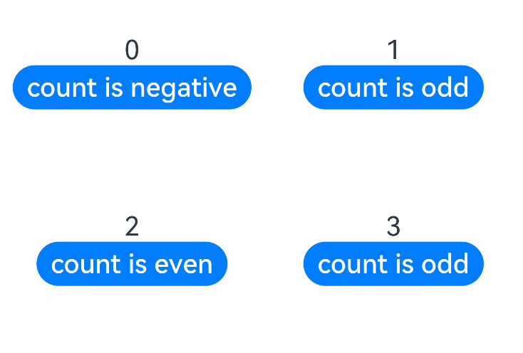
Example 2
// xxx.ets
@Entry
@Component
struct SwipeGestureExample {
  @State count: number = 0

  build() {
    Column() {
      Text(`${this.count}`)
        .fontSize(30)
        .onClick(() => {
          this.count++
        })
      if (this.count <= 0) {
        Button('count is negative').fontSize(30).height(50)
      } else if (this.count % 2 === 0) {
        Button('count is even').fontSize(30).height(50)
      } else {
        Button('count is odd').fontSize(30).height(50)
      }
    }.height('100%').width('100%').justifyContent(FlexAlign.Center)
  }
}
Example 3
// xxx.ets
@Entry
@Component
struct buttonTestDemo {
  @State txt: string = 'overflowTextOverlengthTextOverflow.Clip';
  @State widthShortSize: number = 200;

  build() {
    Row() {
      Column() {
        Button(this.txt)
          .width(this.widthShortSize)
          .height(100)
          .labelStyle({ overflow: TextOverflow.Clip,
            maxLines: 1,
            minFontSize: 20,
            maxFontSize: 20,
            font: {
              size: 20,
              weight: FontWeight.Bolder,
              family: 'cursive',
              style: FontStyle.Italic
            }
          })
          .fontSize(40)
      }
      .width('100%')
    }
    .height('100%')
  }
}

你可能感兴趣的鸿蒙文章
harmony 鸿蒙ArkTS-based Declarative Development Paradigm