DatePicker
The <DatePicker> component allows users to select a date from the given range.
NOTE
This component is supported since API version 8. Updates will be marked with a superscript to indicate their earliest API version.
Child Components
Not supported
APIs
DatePicker(options?: {start?: Date, end?: Date, selected?: Date})
Creates a date picker in the given date range.
Parameters
| Name | Type | Mandatory | Description |
|---|---|---|---|
| start | Date | No | Start date of the picker. Default value: Date('1970-1-1') |
| end | Date | No | End date of the picker. Default value: Date('2100-12-31') |
| selected | Date | No | Date of the selected item. Default value: current system date Since API version 10, this parameter supports $$ for two-way binding of variables. |
Handling in the case of exceptions
| Exception | Result |
|---|---|
| The start date is later than the end date, and the selected date is not set. | The start date, end date, and selected date are set to the default values. |
| The start date is later than the end date, and the selected date is earlier than the default start date. | The start date and end date are set to the default values, and the selected date is set to the default start date. |
| The start date is later than the end date, and the selected date is later than the default end date. | The start date and end date are set to the default values, and the selected date is set to the default end date. |
| The start date is later than the end date, and the selected date is within the range of the default start date and end date. | The start date and end date are set to the default values, and the selected date is set to the specified value. |
| The selected date is earlier than the start date. | The selected date is set to the start date. |
| The selected date is later than the end date. | The selected date is set to the end date. |
| The start date is later than the current system date, and the selected date is not set. | The selected date is set to the start date. |
| The end date is earlier than the current system date, and the selected date is not set. | The selected date is set to the end date. |
| The set date is in invalid format, for example, '1999-13-32'. | The default value is used. |
| The start date or end date is earlier than the valid date range. | The start date or end date is set to the earliest date in the valid date range. |
| The start date or end date is later than the valid date range. | The start date or end date is set to the latest date in the valid date range. |
The valid date range is from 1900-1-31 to 2100-12-31.
The exception detection and handling with the selected date comes after that with the start date and end date.
Attributes
In addition to the universal attributes, the following attributes are supported.
| Name | Type | Description |
|---|---|---|
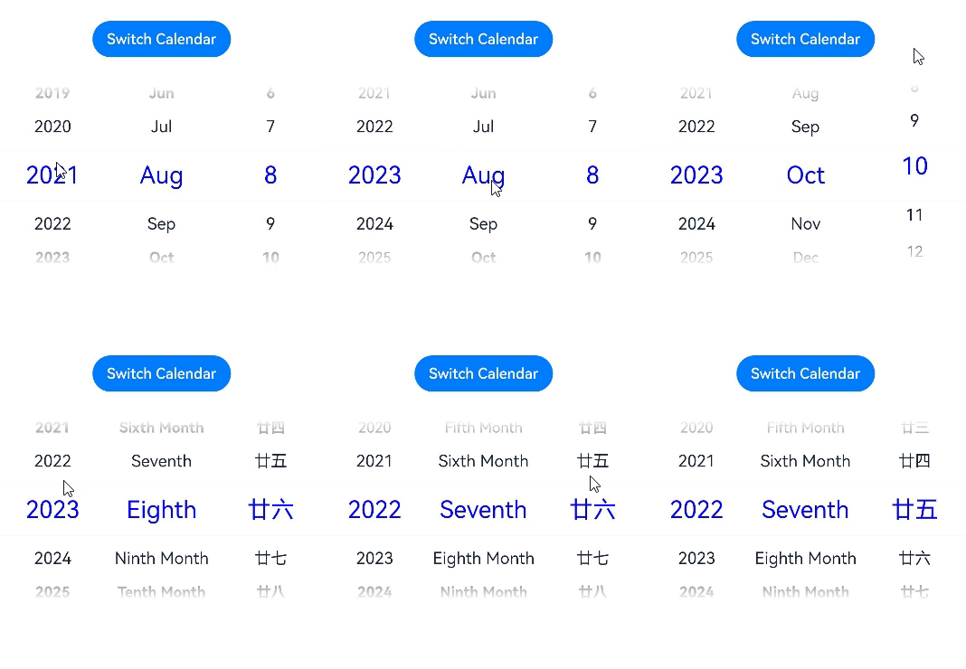
| lunar | boolean | Whether to display the lunar calendar. - true: Display the lunar calendar. - false: Do not display the lunar calendar. Default value: false |
| disappearTextStyle10+ | PickerTextStyle | Font color, font size, and font width for the top and bottom items. Default value: { color: '#ff182431', font: { size: '14fp', weight: FontWeight.Regular } } |
| textStyle10+ | PickerTextStyle | Font color, font size, and font width of all items except the top, bottom, and selected items. Default value: { color: '#ff182431', font: { size: '16fp', weight: FontWeight.Regular } } |
| selectedTextStyle10+ | PickerTextStyle | Font color, font size, and font width of the selected item. Default value: { color: '#ff007dff', font: { size: '20vp', weight: FontWeight.Medium } } |
PickerTextStyle10+
| Name | Type | Mandatory | Description |
|---|---|---|---|
| color | ResourceColor | No | Font color. |
| font | Font | No | Text style. Only the font size and font width are supported. |
Events
In addition to the universal events, the following events are supported.
| Name | Description |
|---|---|
| onChange(callback: (value: DatePickerResult) => void)(deprecated) | Triggered when a date is selected. NOTE This API is supported since API version 8 and deprecated since API version 10. You are advised to use onDateChange(callback: (value: Date) => void) instead. |
| onDateChange(callback: (value: Date) => void)10+ | Triggered when a date is selected. Date: selected time, where the year, month, and day portions are subject to the selection, the hour and minute portions are subject to the current system time, and the second portion is always 00. |
DatePickerResult
| Name | Type | Description |
|---|---|---|
| year | number | Year of the selected date. |
| month | number | Month of the selected date. The value ranges from 0 to 11. The value 0 indicates January, and 11 indicates December. |
| day | number | Day of the selected date. |
Example
// xxx.ets
@Entry
@Component
struct DatePickerExample {
  @State isLunar: boolean = false
  private selectedDate: Date = new Date('2021-08-08')

  build() {
    Column() {
      Button('Switch Calendar')
        .margin({ top: 30, bottom: 30 })
        .onClick(() => {
          this.isLunar = !this.isLunar
        })
      DatePicker({
        start: new Date('1970-1-1'),
        end: new Date('2100-1-1'),
        selected: this.selectedDate
      })
        .disappearTextStyle({color: Color.Gray, font: {size: '16fp', weight: FontWeight.Bold}})
        .textStyle({color: '#ff182431', font: {size: '18fp', weight: FontWeight.Normal}})
        .selectedTextStyle({color: '#ff0000FF', font: {size: '26fp', weight: FontWeight.Regular}})
        .lunar(this.isLunar)
        .onDateChange((value: Date) => {
          this.selectedDate = value
          console.info('select current date is: ' + value.toString())
        })

    }.width('100%')
  }
}
你可能感兴趣的鸿蒙文章
harmony 鸿蒙ArkTS-based Declarative Development Paradigm