Checkbox
The <Checkbox> component is used to enable or disable an option.
NOTE
This component is supported since API version 8. Updates will be marked with a superscript to indicate their earliest API version.
Child Components
Not supported
APIs
Checkbox(options?: {name?: string, group?: string })
Since API version 9, this API is supported in ArkTS widgets.
Parameters
| Name | Type | Mandatory | Description |
|---|---|---|---|
| name | string | No | Name of the check box. |
| group | string | No | Group name of the check box. NOTE If not used with the <CheckboxGroup> component, this parameter is invalid. |
Attributes
In addition to the universal attributes, the following attributes are supported.
| Name | Type | Description |
|---|---|---|
| select | boolean | Whether the check box is selected. Default value: false Since API version 9, this API is supported in ArkTS widgets. Since API version 10, this attribute supports $$ for two-way binding of variables. |
| selectedColor | ResourceColor | Color of the check box when it is selected. Since API version 9, this API is supported in ArkTS widgets. |
| unselectedColor10+ | ResourceColor | Border color of the check box when it is not selected. |
| mark10+ | MarkStyle | Internal icon style of the check box. |
Events
In addition to the universal events, the following attributes are supported.
| Name | Description |
|---|---|
| onChange(callback: (value: boolean) => void) | Triggered when the selected status of the check box changes. - The value true means that the check box is selected. - The value false means that the check box is not selected. Since API version 9, this API is supported in ArkTS widgets. |
MarkStyle10+
| Name | Type | Mandatory | Default Value | Description |
|---|---|---|---|---|
| strokeColor | ResourceColor | No | Color.White | Color of the internal mark. |
| size | number |string | No | - | Size of the internal mark, in vp. The default size is the same as the width of the check box. This parameter cannot be set in percentage. If it is set to an invalid value, the default value is used. |
| strokeWidth | number |string | No | 2 | Stroke width of the internal mark, in vp. This parameter cannot be set in percentage. If it is set to an invalid value, the default value is used. |
Example
Example 1
// xxx.ets
@Entry
@Component
struct CheckboxExample {

  build() {
    Row() {
      Checkbox({name: 'checkbox1',  group: 'checkboxGroup'})
        .select(true)
        .selectedColor(0xed6f21)
        .onChange((value: boolean) => {
          console.info('Checkbox1 change is'+ value)
        })
      Checkbox({name: 'checkbox2',  group: 'checkboxGroup'})
        .select(false)
        .selectedColor(0x39a2db)
        .onChange((value: boolean) => {
          console.info('Checkbox2 change is'+ value)
        })
    }
  }
}

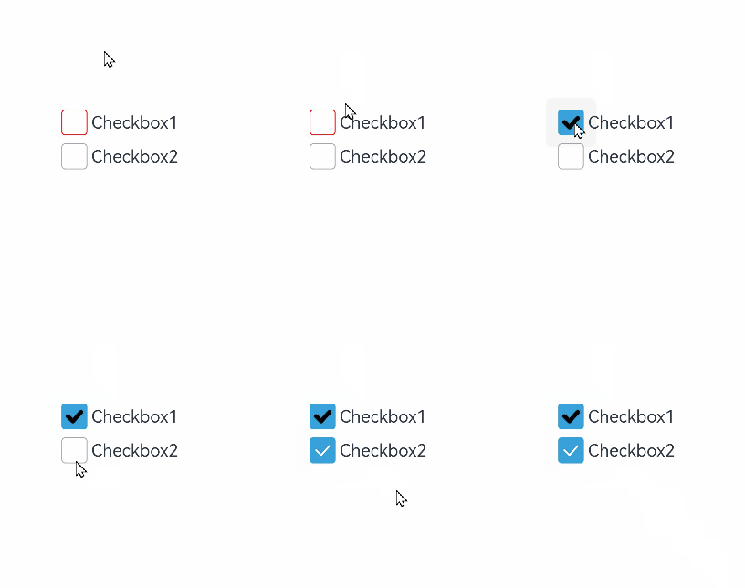
Example 2
// xxx.ets
@Entry
@Component
struct Index {

  build() {
    Row() {
      Column() {
        Flex({ justifyContent: FlexAlign.Center, alignItems: ItemAlign.Center }) {
          Checkbox({ name: 'checkbox1', group: 'checkboxGroup' })
            .selectedColor(0x39a2db)
            .onChange((value: boolean) => {
              console.info('Checkbox1 change is'+ value)
            })
            .mark({
              strokeColor:Color.Black,
              size: 50,
              strokeWidth: 5
            })
            .unselectedColor(Color.Red)
            .width(30)
            .height(30)
          Text('Checkbox1').fontSize(20)
        }
        Flex({ justifyContent: FlexAlign.Center, alignItems: ItemAlign.Center }) {
          Checkbox({ name: 'checkbox2', group: 'checkboxGroup' })
            .selectedColor(0x39a2db)
            .onChange((value: boolean) => {
              console.info('Checkbox2 change is' + value)
            })
            .width(30)
            .height(30)
          Text('Checkbox2').fontSize(20)
        }
      }
      .width('100%')
    }
    .height('100%')
  }
}
你可能感兴趣的鸿蒙文章
harmony 鸿蒙ArkTS-based Declarative Development Paradigm