Polymorphic Style
You can set state-specific styles for components.
NOTE
The APIs of this module are supported since API version 8. Updates will be marked with a superscript to indicate their earliest API version.
Attributes
| Name | Type | Description |
|---|---|---|
| stateStyles | StateStyles | Styles of the component for different states. Since API version 9, this API is supported in ArkTS widgets. |
StateStyles
Since API version 9, this API is supported in ArkTS widgets.
| Name | Type | Mandatory | Description |
|---|---|---|---|
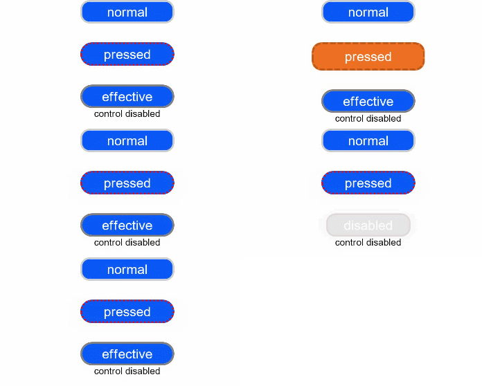
| normal | ()=>void | No | Style of the component when being stateless. |
| pressed | ()=>void | No | Style of the component in the pressed state. |
| disabled | ()=>void | No | Style of the component in the disabled state. |
| focused | ()=>void | No | Style of the component in the focused state. |
| clicked | ()=>void | No | Style of the component in the clicked state. |
| selected10+ | ()=>void | No | Style of the component in the selected state. |
Example
// xxx.ets
@Entry
@Component
struct StyleExample {
  @State isEnable: boolean = true

  @Styles pressedStyles():void {
    .backgroundColor("#ED6F21")
    .borderRadius(10)
    .borderStyle(BorderStyle.Dashed)
    .borderWidth(2)
    .borderColor("#33000000")
    .width(120)
    .height(30)
    .opacity(1)
  }

  @Styles disabledStyles():void {
    .backgroundColor("#E5E5E5")
    .borderRadius(10)
    .borderStyle(BorderStyle.Solid)
    .borderWidth(2)
    .borderColor("#2a4c1919")
    .width(90)
    .height(25)
    .opacity(1)
  }

  @Styles normalStyles():void {
    .backgroundColor("#0A59F7")
    .borderRadius(10)
    .borderStyle(BorderStyle.Solid)
    .borderWidth(2)
    .borderColor("#33000000")
    .width(100)
    .height(25)
    .opacity(1)
  }

  build() {
    Flex({ direction: FlexDirection.Column, alignItems: ItemAlign.Center }) {
      Text("normal")
        .fontSize(14)
        .fontColor(Color.White)
        .opacity(0.5)
        .stateStyles({
          normal: this.normalStyles,
        })
        .margin({ bottom: 20 })
        .textAlign(TextAlign.Center)
      Text("pressed")
        .backgroundColor("#0A59F7")
        .borderRadius(20)
        .borderStyle(BorderStyle.Dotted)
        .borderWidth(2)
        .borderColor(Color.Red)
        .width(100)
        .height(25)
        .opacity(1)
        .fontSize(14)
        .fontColor(Color.White)
        .stateStyles({
          pressed: this.pressedStyles,
        })
        .margin({ bottom: 20 })
        .textAlign(TextAlign.Center)
      Text(this.isEnable == true ? "effective" : "disabled")
        .backgroundColor("#0A59F7")
        .borderRadius(20)
        .borderStyle(BorderStyle.Solid)
        .borderWidth(2)
        .borderColor(Color.Gray)
        .width(100)
        .height(25)
        .opacity(1)
        .fontSize(14)
        .fontColor(Color.White)
        .enabled(this.isEnable)
        .stateStyles({
          disabled: this.disabledStyles,
        })
        .textAlign(TextAlign.Center)
      Text("control disabled")
        .onClick(() => {
          this.isEnable = !this.isEnable
          console.log(`${this.isEnable}`)
        })
    }
    .width(350).height(300)
  }
}
你可能感兴趣的鸿蒙文章
harmony 鸿蒙ArkTS-based Declarative Development Paradigm