harmony 鸿蒙Developing Animations
Developing Animations
Animations are classified into Static Animation and Continuous Animation.
Static Animation
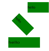
The transform attributes are the core of the static animation. A static animation can transform in the following three ways and only once in each way at a time:
translate: moves a specified component horizontally or vertically.
scale: scales a specified component horizontally or vertically to the required scale.
rotate: rotates a specified component by a specified angle along the horizontal axis, vertical axis, or center point.
For more information, see Component Methods. The following is an example:
<!-- xxx.hml -->
<div class="container">
  <text class="translate">hello</text>
  <text class="rotate">hello</text>
  <text class="scale">hello</text>
</div>
/* xxx.css */
.container {
  width: 100%;
  flex-direction: column;
  align-items: center;
}
.translate {
  height: 150px;
  width: 300px;
  margin: 50px;
  font-size: 50px;
  background-color: #008000;
  transform: translate(200px);
}
.rotate {
  height: 150px;
  width: 300px;
  margin: 50px;
  font-size: 50px;
  background-color: #008000;
  transform-origin: 200px 100px;
  transform: rotate(45deg);
}
.scale {
  height: 150px;
  width: 300px;
  margin: 50px;
  font-size: 50px;
  background-color: #008000;
  transform: scaleX(1.5);
}
Figure 1 Static animation

Continuous Animation
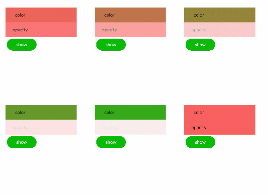
The static animation has only the start and end states. To set the transition state and conversion effect, use continuous animations.
The core of a continuous animation is animation attributes, which define the start and end states of the animation and the curve of time and speed. Animation attributes can implement the following effects:
animation-name: background color, opacity, width, height, and transformation type applied to the element after the animation is executed
animation-delay and animation-duration: element delay and duration after the animation is executed
animation-timing-function: speed curve of an animation, which makes the animation more fluent
animation-iteration-count: number of animation playback times
animation-fill-mode: whether to restore the initial state after the animation is executed
To use the animation attributes, you need to define a @keyframes rule in the .css file, set the animation transition effect in @keyframes, and invoke the effect through a style class in the .hml file. The following is an example for animation-name:
<!-- xxx.hml -->
<div class="item-container">
    <div class="item {{colorParam}}">
        <text class="txt">color</text>
    </div>
    <div class="item {{opacityParam}}">
        <text class="txt">opacity</text>
    </div>
    <input class="button" type="button" name="" value="show" onclick="showAnimation"/>
</div>
/* xxx.css */
.item-container {
  margin: 60px;
  flex-direction: column;
}
.item {
  width: 80%;
  background-color: #f76160;
}
.txt {
  text-align: center;
  width: 200px;
  height: 100px;
}
.button {
  width: 200px;
  margin: 10px;
  font-size: 30px;
  background-color: #09ba07;
}
.color {
  animation-name: Color;
  animation-duration: 8000ms;
}
.opacity {
  animation-name: Opacity;
  animation-duration: 8000ms;
}
@keyframes Color {
  from {
    background-color: #f76160;
  }
  to {
    background-color: #09ba07;
  }
}
@keyframes Opacity {
  from {
    opacity: 0.9;
  }
  to {
    opacity: 0.1;
  }
}
// xxx.js
export default {
  data: {
    colorParam: '',
    opacityParam: '',
  },
  showAnimation: function () {
    this.colorParam = '';
    this.opacityParam = '';
    this.colorParam = 'color';
    this.opacityParam = 'opacity';
  }
}
Figure 2 Continuous animation effect

你可能感兴趣的鸿蒙文章
harmony 鸿蒙Property Animation APIs
harmony 鸿蒙Property Animation Overview
- 所属分类: 后端技术
- 本文标签:
热门推荐
-
2、 - 优质文章
-
3、 gate.io
-
8、 golang
-
9、 openharmony
-
10、 Vue中input框自动聚焦