harmony 鸿蒙Basic Custom Dialog Box (CustomDialog) (Not Recommended)
Basic Custom Dialog Box (CustomDialog) (Not Recommended)
A custom dialog box is a dialog box you customize by using APIs of the CustomDialogController class. It can be used for user interactions, showing ads, award announcements, alerts, software update notifications, and more. For details, see Custom Dialog Box.
NOTE
In ArkUI, dialog boxes do not close automatically when you switch pages unless you manually call close. To enable a dialog box to be dismissed during page navigation, consider using the navigation page displayed in dialog mode or page-level dialog box.
You can specify the modality of a dialog box by setting isModal. A dialog box is modal if isModal is set to true and non-modal otherwise.
Creating a Custom Dialog Box
- Use the \@CustomDialog decorator to create a custom dialog box. You can define the content of the dialog box within the decorator. Note that CustomDialogController must be defined in @Component.
   @CustomDialog
   struct CustomDialogExample {
     controller: CustomDialogController = new CustomDialogController({
       builder: CustomDialogExample({}),
     })

     build() {
       Column() {
         Text('I am content')
           .fontSize(20)
       }.height(60).justifyContent(FlexAlign.Center)
     }
   }
- Create a builder that is bound to the decorator.
    @Entry
    @Component
    struct CustomDialogUser {
      dialogController: CustomDialogController = new CustomDialogController({
        builder: CustomDialogExample(),
      })
    }
- Click the component bound to the onClick event to display the dialog box.
   @Entry
   @Component
   struct CustomDialogUser {
     dialogController: CustomDialogController = new CustomDialogController({
       builder: CustomDialogExample(),
     })

     build() {
       Column() {
         Button('click me')
           .onClick(() => {
             this.dialogController.open()
           })
       }.width('100%').margin({ top: 5 })
     }
   }

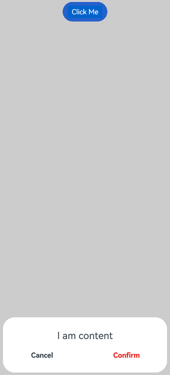
Implementing Interaction with the Custom Dialog Box
Custom dialog boxes can be used for data interactions to complete a series of operations.
- Add buttons in the \@CustomDialog decorator structure and add data functions.
   @CustomDialog
   struct CustomDialogExample {
     cancel?: () => void
     confirm?: () => void
     controller: CustomDialogController

     build() {
       Column() {
         Text('I am content').fontSize(20).margin({ top: 10, bottom: 10 })
         Flex({ justifyContent: FlexAlign.SpaceAround }) {
           Button('Cancel')
             .onClick(() => {
               this.controller.close()
               if (this.cancel) {
                 this.cancel()
               }
             }).backgroundColor(0xffffff).fontColor(Color.Black)
           Button('Obtain')
             .onClick(() => {
               this.controller.close()
               if (this.confirm) {
                 this.confirm()
               }
             }).backgroundColor(0xffffff).fontColor(Color.Red)
         }.margin({ bottom: 10 })
       }
     }
   }
- Receive the page in the builder and create corresponding function operations.
   @Entry
   @Component
   struct CustomDialogUser {
     dialogController: CustomDialogController = new CustomDialogController({
       builder: CustomDialogExample({
         cancel: ()=> { this.onCancel() },
         confirm: ()=> { this.onAccept() },
       }),
     })

     onCancel() {
       console.info('Callback when the first button is clicked')
     }

     onAccept() {
       console.info('Callback when the second button is clicked')
     }

     build() {
       Column() {
         Button('click me')
           .onClick(() => {
             this.dialogController.open()
           })
       }.width('100%').margin({ top: 5 })
     }
   }
- Use the button in the dialog box to implement route redirection and obtain the parameters passed in from the redirection target page.
   // Index.ets
   @CustomDialog
   struct CustomDialogExample {
     @Link textValue: string
     controller?: CustomDialogController
     cancel: () => void = () => {
     }
     confirm: () => void = () => {
     }

     build() {
       Column({ space: 20 }) {
         if (this.textValue != '') {
           Text(`Content of the second page: ${this.textValue}`)
             .fontSize(20)
         } else {
           Text('Obtain the content of the second page?')
             .fontSize(20)
         }
         Flex({ justifyContent: FlexAlign.SpaceAround }) {
           Button('Cancel')
             .onClick(() => {
               if (this.controller != undefined) {
                 this.controller.close()
                 this.cancel()
               }
             }).backgroundColor(0xffffff).fontColor(Color.Black)
           Button('Obtain')
             .onClick(() => {
               if (this.controller != undefined && this.textValue != '') {
                 this.controller.close()
               } else if (this.controller != undefined) {
                 this.getUIContext().getRouter().pushUrl({
                   url: 'pages/Index2'
                 })
                 this.controller.close()
               }
             }).backgroundColor(0xffffff).fontColor(Color.Red)
         }.margin({ bottom: 10 })
       }.borderRadius(10).padding({ top: 20 })
     }
   }

   @Entry
   @Component
   struct CustomDialogUser {
     @State textValue: string = ''
     dialogController: CustomDialogController|null = new CustomDialogController({
       builder: CustomDialogExample({
         cancel: () => {
           this.onCancel()
         },
         confirm: () => {
           this.onAccept()
         },
         textValue: $textValue
       })
     })

     // Set dialogController to null when the custom component is about to be destroyed.
     aboutToDisappear() {
       this.dialogController = null // Set dialogController to null.
     }

     onPageShow() {
       const params = this.getUIContext().getRouter().getParams() as Record<string, string>; // Obtain the passed parameter object.
       if (params) {
         this.dialogController?.open()
         this.textValue = params.info as string; // Obtain the value of the id attribute.
       }
     }

     onCancel() {
       console.info('Callback when the first button is clicked')
     }

     onAccept() {
       console.info('Callback when the second button is clicked')
     }

     exitApp() {
       console.info('Click the callback in the blank area')
     }

     build() {
       Column() {
         Button('Click Me')
           .onClick(() => {
             if (this.dialogController != null) {
               this.dialogController.open()
             }
           }).backgroundColor(0x317aff)
       }.width('100%').margin({ top: 5 })
     }
   }
   // Index2.ets
   @Entry
   @Component
   struct Index2 {
     @State message: string =' Back';

     build() {
       Column() {
         Button(this.message)
           .type(ButtonType.Capsule)
           .onClick(() => {
              this.getUIContext().getRouter().back({
                url: 'pages/Index',
                params: {
                info: 'Hello World'
              }
           });
         })
       }.width('100%').height('100%').margin({ top: 20 })
     }
   }
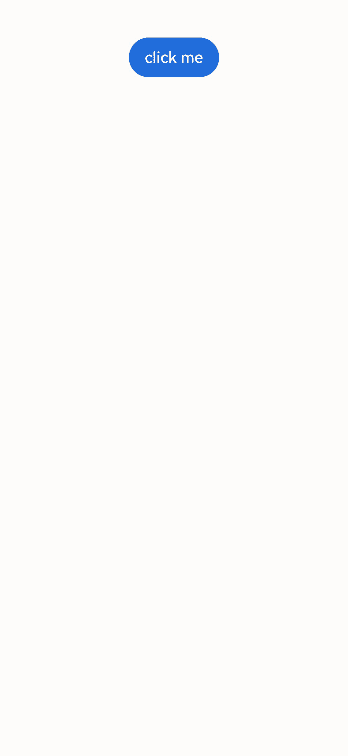
Defining the Custom Dialog Box Animation
You can define the custom dialog box animation, including its duration and speed, through openAnimation.
@CustomDialog
struct CustomDialogExample {
  controller?: CustomDialogController

  build() {
    Column() {
      Text('Whether to change a text?').fontSize(16).margin({ bottom: 10 })
    }
  }
}

@Entry
@Component
struct CustomDialogUser {
  @State textValue: string = ''
  @State inputValue: string = 'click me'
  dialogController: CustomDialogController|null = new CustomDialogController({
    builder: CustomDialogExample(),
    openAnimation: {
      duration: 1200,
      curve: Curve.Friction,
      delay: 500,
      playMode: PlayMode.Alternate,
      onFinish: () => {
        console.info('play end')
      }
    },
    autoCancel: true,
    alignment: DialogAlignment.Bottom,
    offset: { dx: 0, dy: -20 },
    gridCount: 4,
    customStyle: false,
    backgroundColor: 0xd9ffffff,
    cornerRadius: 10,
  })

  // Set dialogController to null when the custom component is about to be destroyed.
  aboutToDisappear() {
    this.dialogController = null // Set dialogController to null.
  }

  build() {
    Column() {
      Button(this.inputValue)
        .onClick(() => {
          if (this.dialogController != null) {
            this.dialogController.open()
          }
        }).backgroundColor(0x317aff)
    }.width('100%').margin({ top: 5 })
  }
}
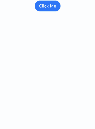
Defining the Custom Dialog Box Style
You can set style parameters, such as the width, height, background color, and shadow, for a custom dialog box.
@CustomDialog
struct CustomDialogExample {
  controller?: CustomDialogController

  build() {
    Column() {
      Text('I am content').fontSize(16).margin({ bottom: 10 })
    }
  }
}

@Entry
@Component
struct CustomDialogUser {
  @State textValue: string = ''
  @State inputValue: string = 'Click Me'
  dialogController: CustomDialogController|null = new CustomDialogController({
    builder: CustomDialogExample(),
    autoCancel: true,
    alignment: DialogAlignment.Center,
    offset: { dx: 0, dy: -20 },
    gridCount: 4,
    customStyle: false,
    backgroundColor: 0xd9ffffff,
    cornerRadius: 20,
    width: '80%',
    height: '100px',
    borderWidth: 1,
    borderStyle: BorderStyle.Dashed,// borderStyle must be used with borderWidth in pairs.
    borderColor: Color.Blue,// borderColor must be used with borderWidth in pairs.
    shadow: ({ radius: 20, color: Color.Grey, offsetX: 50, offsetY: 0}),
  })

  // Set dialogController to null when the custom component is about to be destroyed.
  aboutToDisappear() {
    this.dialogController = null // Set dialogController to null.
  }

  build() {
    Column() {
      Button(this.inputValue)
        .onClick(() => {
          if (this.dialogController != null) {
            this.dialogController.open()
          }
        }).backgroundColor(0x317aff)
    }.width('100%').margin({ top: 5 })
  }
}
Nesting a Custom Dialog Box
To nest a dialog box (dialog 2) inside another dialog box (dialog 1), it is recommended that you define dialog 2 within the parent component of dialog 1 so that you can then open dialog 2 through the callback sent from the parent component to dialog 1.
@CustomDialog
struct CustomDialogExampleTwo {
  controllerTwo?: CustomDialogController
  @State message: string = "I'm the second dialog box."
  @State showIf: boolean = false;
  build() {
    Column() {
      if (this.showIf) {
        Text("Text")
          .fontSize(30)
          .height(100)
      }
      Text(this.message)
        .fontSize(30)
        .height(100)
      Button("Create Text")
        .onClick(()=>{
          this.showIf = true;
        })
      Button('Close Second Dialog Box')
        .onClick(() => {
          if (this.controllerTwo != undefined) {
            this.controllerTwo.close()
          }
        })
        .margin(20)
    }
  }
}
@CustomDialog
struct CustomDialogExample {
  openSecondBox?: ()=>void
  controller?: CustomDialogController

  build() {
    Column() {
      Button('Open Second Dialog Box and Close This Box')
        .onClick(() => {
          this.controller!.close();
          this.openSecondBox!();
        })
        .margin(20)
    }.borderRadius(10)
  }
}
@Entry
@Component
struct CustomDialogUser {
  @State inputValue: string = 'Click Me'
  dialogController: CustomDialogController|null = new CustomDialogController({
    builder: CustomDialogExample({
      openSecondBox: ()=>{
        if (this.dialogControllerTwo != null) {
          this.dialogControllerTwo.open()
        }
      }
    }),
    cancel: this.exitApp,
    autoCancel: true,
    alignment: DialogAlignment.Bottom,
    offset: { dx: 0, dy: -20 },
    gridCount: 4,
    customStyle: false
  })
  dialogControllerTwo: CustomDialogController|null = new CustomDialogController({
    builder: CustomDialogExampleTwo(),
    alignment: DialogAlignment.Bottom,
    offset: { dx: 0, dy: -25 } })

  aboutToDisappear() {
    this.dialogController = null
    this.dialogControllerTwo = null
  }

  onCancel() {
    console.info('Callback when the first button is clicked')
  }

  onAccept() {
    console.info('Callback when the second button is clicked')
  }

  exitApp() {
    console.info('Click the callback in the blank area')
  }
  build() {
    Column() {
      Button(this.inputValue)
        .onClick(() => {
          if (this.dialogController != null) {
            this.dialogController.open()
          }
        }).backgroundColor(0x317aff)
    }.width('100%').margin({ top: 5 })
  }
}
If you define dialog 2 within dialog 1 instead, because of the parent-child relationship that exists between custom dialog boxes in terms of state management, you will not be able to create any component in dialog 2 once dialog 1 is destroyed (closed).
你可能感兴趣的鸿蒙文章
harmony 鸿蒙Atomic Service Full Screen Launch Component (FullScreenLaunchComponent)
harmony 鸿蒙Arc Button (ArcButton)
harmony 鸿蒙Frame Animation (ohos.animator)
harmony 鸿蒙Implementing Property Animation
- 所属分类: 后端技术
- 本文标签: