Slider
The <Slider> component is used to quickly adjust settings, such as the volume and brightness.
NOTE
This component is supported since API version 7. Updates will be marked with a superscript to indicate their earliest API version.
Child Components
Not supported
APIs
Slider(options?: {value?: number, min?: number, max?: number, step?: number, style?: SliderStyle, direction?: Axis, reverse?: boolean})
Since API version 9, this API is supported in ArkTS widgets.
Parameters
| Name | Type | Mandatory | Description |
|---|---|---|---|
| value | number | No | Current progress. Default value: value of min Since API version 10, this parameter supports $$ for two-way binding of variables. |
| min | number | No | Minimum value. Default value: 0 |
| max | number | No | Maximum value. Default value: 100 NOTE If the value of min is greater than or equal to the value of max, the default value 0 is used for min and the default value 100 is used for max. If the value is not within the [min, max] range, the value of min or max, whichever is closer. |
| step | number | No | Step of the slider. Default value: 1 Value range: [0.01, max] NOTE If this parameter is set to a value less than 0 or a percentage, the default value is used. |
| style | SliderStyle | No | Style of the slider thumb and track. Default value: SliderStyle.OutSet |
| direction8+ | Axis | No | Whether the slider moves horizontally or vertically. Default value: Axis.Horizontal |
| reverse8+ | boolean | No | Whether the slider values are reversed. By default, the values increase from left to right for a horizontal slider and from top to bottom for a vertical slider. Default value: false |
SliderStyle
Since API version 9, this API is supported in ArkTS widgets.
| Name | Description |
|---|---|
| OutSet | The slider is on the slider track. |
| InSet | The slider is in the slider track. |
Except touch target attributes, the universal attributes are supported.
| Name | Type | Description |
|---|---|---|
| blockColor | ResourceColor | Color of the slider. Since API version 9, this API is supported in ArkTS widgets. NOTE When SliderBlockType.DEFAULT is used, blockColor sets the color of the round slider. When SliderBlockType.IMAGE is used, blockColor does not work as the slider has no fill color.When SliderBlockType.SHAPE is used, blockColor sets the color of the slider in a custom shape. |
| trackColor | ResourceColor | Background color of the slider. Since API version 9, this API is supported in ArkTS widgets. |
| selectedColor | ResourceColor | Color of the selected part of the slider track. Since API version 9, this API is supported in ArkTS widgets. |
| showSteps | boolean | Whether to display the current step. Default value: false Since API version 9, this API is supported in ArkTS widgets. |
| showTips | value: boolean, content10+?: ResourceStr | value: whether to display a tooltip when the user drags the slider. Default value: false content: text content of the tooltip. The default value is the current percentage. Since API version 9, this API is supported in ArkTS widgets. NOTE When direction is set to Axis.Horizontal, the tooltip is displayed right above the slider. When direction is set to Axis.Vertical, the tooltip is displayed on the left of the slider. The drawing area of the tooltip is the overlay of the slider. If no margin is set for the slider or the margin is not large enough, the tooltip will be clipped. |
| trackThickness | Length | Track thickness of the slider. Default value: 4.0vp when style is set to SliderStyle.OutSet; 20.0vp when style is set to SliderStyle.InSet Since API version 9, this API is supported in ArkTS widgets. NOTE A value less than or equal to 0 evaluates to the default value. |
| blockBorderColor10+ | ResourceColor | Border color of the slider in the block direction. NOTE When SliderBlockType.DEFAULT is used, blockBorderColor sets the border color of the round slider. When SliderBlockType.IMAGE is used, blockBorderColor does not work as the slider has no border. When SliderBlockType.SHAPE is used, blockBorderColor sets the border color of the slider in a custom shape. |
| blockBorderWidth10+ | Length | Border width of the slider in the block direction. NOTE When SliderBlockType.DEFAULT is used, blockBorderWidth sets the border width of the round slider. When SliderBlockType.IMAGE is used, blockBorderWidth does not work as the slider has no border. WWhen SliderBlockType.SHAPE is used, blockBorderWidth sets the border width of the slider in a custom shape. |
| stepColor10+ | ResourceColor | Step color. |
| trackBorderRadius10+ | Length | Radius of the rounded corner of the slider track. |
| blockSize10+ | SizeOptions | Size of the slider in the block direction. |
| blockStyle10+ | SliderBlockStyle | Style of the slider in the block direction. |
| stepSize10+ | Length | Step size (diameter). |
SliderBlockStyle10+
Describes the style of the slider in the block direction.
| Name | Type | Mandatory | Description |
|---|---|---|---|
| type | SliderBlockType | Yes | Type of the slider in the block direction. Default value: SliderBlockType.DEFAULT, indicating the round slider. |
| image | ResourceStr | No | Image resource of the slider. The area size for displaying the image is subject to the blockSize attribute. Be mindful of the image size when selecting an image. |
| shape | Circle |Ellipse |Path |Rect | No | Custom shape of the slider. |
SliderBlockType10+
Enumerates the types of the slider in the block direction.
| Name | Description |
|---|---|
| DEFAULT | Round slider. |
| IMAGE | Slider with an image background. |
| SHAPE | Slider in a custom shape. |
Events
In addition to the universal events, the following attributes are supported.
| Name | Description |
|---|---|
| onChange(callback: (value: number, mode: SliderChangeMode) => void) | Invoked when the slider is dragged or clicked. value: current slider value. If the return value contains decimals, you can use the number.toFixed() API to process the data to the expected precision. mode: state triggered by the event. Since API version 9, this API is supported in ArkTS widgets. NOTE The Begin and End states are triggered when the slider is clicked with a gesture. The Moving and Click states are triggered when the value of value changes. If the coherent action is a drag action, the Click state will not be triggered. The value range of value is the steps value array. |
SliderChangeMode
Since API version 9, this API is supported in ArkTS widgets.
| Name | Value | Description |
|---|---|---|
| Begin | 0 | The user touches or presses the slider with a gesture or mouse. |
| Moving | 1 | The user is dragging the slider. |
| End | 2 | The user stops dragging the slider by lifting their finger or releasing the mouse. |
| Click | 3 | The user moves the slider by touching the slider track. |
Example
Example 1
// xxx.ets
@Entry
@Component
struct SliderExample {
  @State outSetValueOne: number = 40
  @State inSetValueOne: number = 40
  @State outSetValueTwo: number = 40
  @State inSetValueTwo: number = 40
  @State vOutSetValueOne: number = 40
  @State vInSetValueOne: number = 40
  @State vOutSetValueTwo: number = 40
  @State vInSetValueTwo: number = 40

  build() {
    Column({ space: 8 }) {
      Text('outset slider').fontSize(9).fontColor(0xCCCCCC).width('90%').margin(15)
      Row() {
        Slider({
          value: this.outSetValueOne,
          min: 0,
          max: 100,
          style: SliderStyle.OutSet
        })
          .showTips(true)
          .onChange((value: number, mode: SliderChangeMode) => {
            this.outSetValueOne = value
            console.info('value:' + value + 'mode:' + mode.toString())
          })
        // toFixed(0) converts the return value of the slider to an integer.
        Text(this.outSetValueOne.toFixed(0)).fontSize(12)
      }
      .width('80%')
      Row() {
        Slider({
          value: this.outSetValueTwo,
          step: 10,
          style: SliderStyle.OutSet
        })
          .showSteps(true)
          .onChange((value: number, mode: SliderChangeMode) => {
            this.outSetValueTwo = value
            console.info('value:' + value + 'mode:' + mode.toString())
          })
        Text(this.outSetValueTwo.toFixed(0)).fontSize(12)
      }
      .width('80%')

      Text('inset slider').fontSize(9).fontColor(0xCCCCCC).width('90%').margin(15)
      Row() {
        Slider({
          value: this.inSetValueOne,
          min: 0,
          max: 100,
          style: SliderStyle.InSet
        })
          .blockColor('#191970')
          .trackColor('#ADD8E6')
          .selectedColor('#4169E1')
          .showTips(true)
          .onChange((value: number, mode: SliderChangeMode) => {
            this.inSetValueOne = value
            console.info('value:' + value + 'mode:' + mode.toString())
          })
        Text(this.inSetValueOne.toFixed(0)).fontSize(12)
      }
      .width('80%')
      Row() {
        Slider({
          value: this.inSetValueTwo,
          step: 10,
          style: SliderStyle.InSet
        })
          .blockColor('#191970')
          .trackColor('#ADD8E6')
          .selectedColor('#4169E1')
          .showSteps(true)
          .onChange((value: number, mode: SliderChangeMode) => {
            this.inSetValueTwo = value
            console.info('value:' + value + 'mode:' + mode.toString())
          })
        Text(this.inSetValueTwo.toFixed(0)).fontSize(12)
      }
      .width('80%')

      Row() {
        Column() {
          Text('vertical outset slider').fontSize(9).fontColor(0xCCCCCC).width('50%').margin(15)
          Row() {
            Slider({
              value: this.vOutSetValueOne,
              style: SliderStyle.OutSet,
              direction: Axis.Vertical
            })
              .blockColor('#191970')
              .trackColor('#ADD8E6')
              .selectedColor('#4169E1')
              .showTips(true)
              .onChange((value: number, mode: SliderChangeMode) => {
                this.vOutSetValueOne = value
                console.info('value:' + value + 'mode:' + mode.toString())
              })
            Slider({
              value: this.vOutSetValueTwo,
              step: 10,
              style: SliderStyle.OutSet,
              direction: Axis.Vertical
            })
              .blockColor('#191970')
              .trackColor('#ADD8E6')
              .selectedColor('#4169E1')
              .showSteps(true)
              .onChange((value: number, mode: SliderChangeMode) => {
                this.vOutSetValueTwo = value
                console.info('value:' + value + 'mode:' + mode.toString())
              })
          }
        }.width('50%').height(300)

        Column() {
          Text('vertical inset slider').fontSize(9).fontColor(0xCCCCCC).width('50%').margin(15)
          Row() {
            Slider({
              value: this.vInSetValueOne,
              style: SliderStyle.InSet,
              direction: Axis.Vertical,
              reverse: true // By default, at the top of the vertical slider is the min value and at the bottom is the max value. Therefore, if you want to slide from bottom to top, set reverse to true.
            })
              .showTips(true)
              .onChange((value: number, mode: SliderChangeMode) => {
                this.vInSetValueOne = value
                console.info('value:' + value + 'mode:' + mode.toString())
              })
            Slider({
              value: this.vInSetValueTwo,
              step: 10,
              style: SliderStyle.InSet,
              direction: Axis.Vertical,
              reverse: true
            })
              .showSteps(true)
              .onChange((value: number, mode: SliderChangeMode) => {
                this.vInSetValueTwo = value
                console.info('value:' + value + 'mode:' + mode.toString())
              })
          }
        }.width('50%').height(300)
      }
    }.width('100%')
  }
}
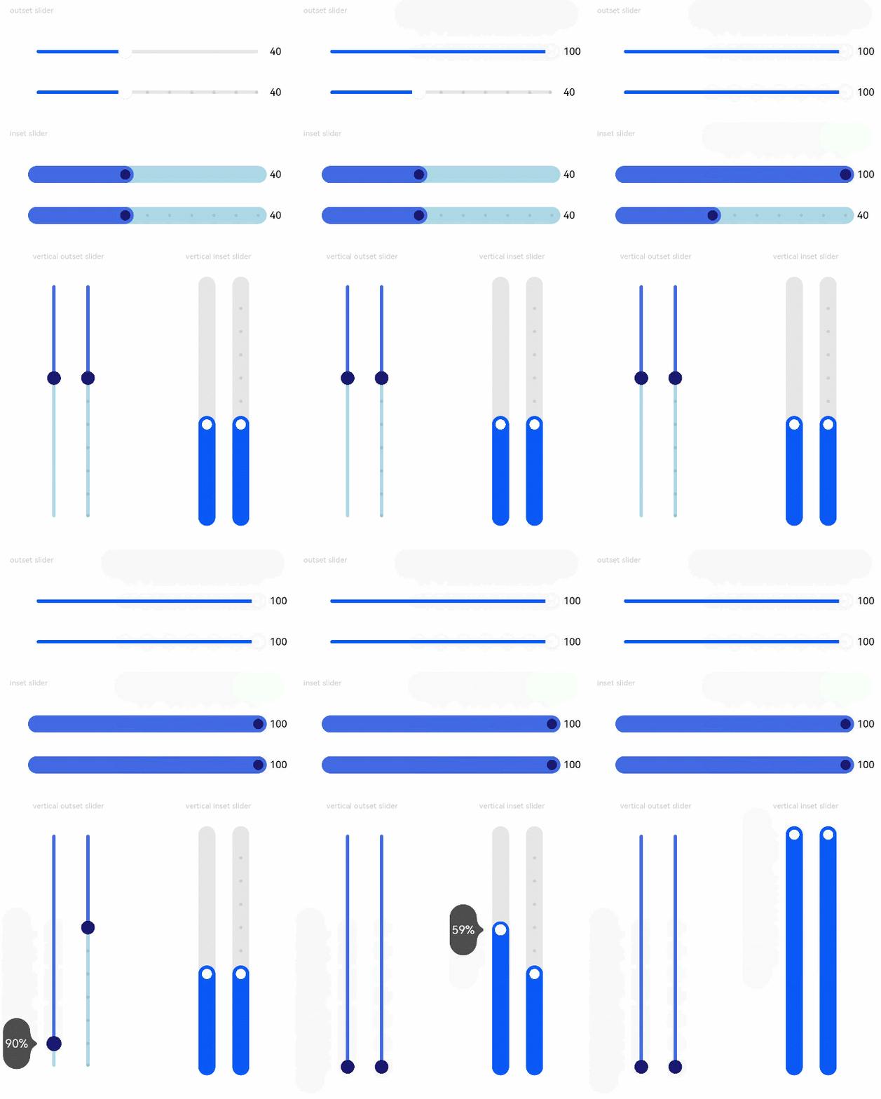
Example 2
@Entry
@Component
struct SliderExample {
  @State tipsValue: number = 40

  build() {
    Column({ space: 8 }) {
      Text('block').fontSize(9).fontColor(0xCCCCCC).margin(15).width('90%')
      Slider({ style: SliderStyle.OutSet, value: 40 })
        .blockSize({ width: 40, height: 40 })
        .blockBorderColor(Color.Red)
        .blockBorderWidth(5)
      Divider()
      Text('step').fontSize(9).fontColor(0xCCCCCC).margin(15).width('90%')
      Slider({ style: SliderStyle.InSet, value: 40, step: 10 })
        .showSteps(true)
        .stepSize(8)
        .stepColor(Color.Yellow)
      Divider()
      Text('track').fontSize(9).fontColor(0xCCCCCC).margin(15).width('90%')
      Slider({ style: SliderStyle.InSet, value: 40 })
        .trackBorderRadius(2)
      Divider()
      Text('blockStyle').fontSize(9).fontColor(0xCCCCCC).margin(15).width('90%')
      Slider({ style: SliderStyle.OutSet, value: 40 })
        .blockStyle({ type: SliderBlockType.DEFAULT })
      Slider({ style: SliderStyle.OutSet, value: 40 })
        .blockStyle({ type: SliderBlockType.IMAGE, image: $r('sys.media.ohos_app_icon') })
      Slider({ style: SliderStyle.OutSet, value: 40 })
        .blockSize({ width: '60px', height: '60px' })
        .blockColor(Color.Red)
        .blockStyle({ type: SliderBlockType.SHAPE, shape: new Path({ commands: 'M60 60 M30 30 L15 56 L45 56 Z' }) })
      Divider()
      Text('tips').fontSize(9).fontColor(0xCCCCCC).margin(15).width('90%')
      Slider({ style: SliderStyle.InSet, value: this.tipsValue })
        .showTips(true, 'value:' + this.tipsValue.toFixed())
        .onChange(value => {
          this.tipsValue = value
        })
    }
  }
}
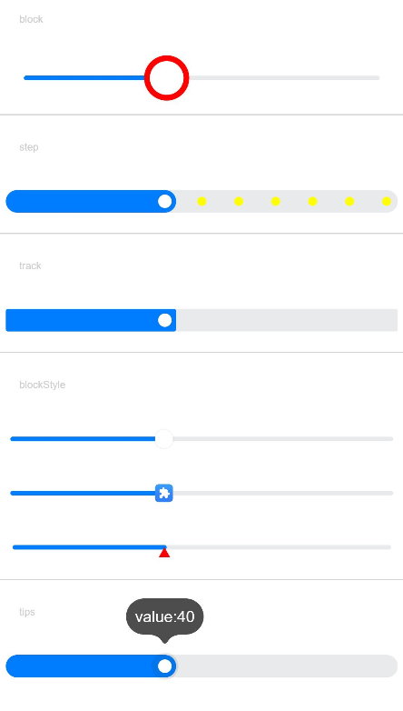
你可能感兴趣的鸿蒙文章
harmony 鸿蒙ArkTS-based Declarative Development Paradigm