harmony 鸿蒙LoadingProgress
LoadingProgress
The <LoadingProgress> component is used to create a loading animation.
NOTE
This component is supported since API version 8. Updates will be marked with a superscript to indicate their earliest API version.
Child Components
Not supported
APIs
LoadingProgress()
Creates a <LoadingProgress> component.
Since API version 9, this API is supported in ArkTS widgets.
Attributes
In addition to the universal attributes, the following attributes are supported.
| Name | Type | Description |
|---|---|---|
| color | ResourceColor | Foreground color of the <LoadingProgress> component. Default value: ’#99666666’ Since API version 9, this API is supported in ArkTS widgets. |
| enableLoading10+ | boolean | Whether to show the loading animation. Default value: true NOTE The component still takes up space in the layout when the loading animation is not shown. Unlike the universal attribute Visibility.Hidden, which hides the entire component, including borders and paddings, enableLoading=false hides the loading animation only. |
Events
The universal events are supported.
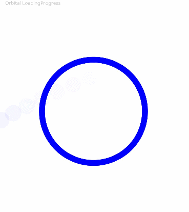
Example
// xxx.ets
@Entry
@Component
struct LoadingProgressExample {
  build() {
    Column({ space: 5 }) {
      Text('Orbital LoadingProgress ').fontSize(9).fontColor(0xCCCCCC).width('90%')
      LoadingProgress()
        .color(Color.Blue)
        .layoutWeight(1)
    }.width('100%').margin({ top: 5 })
  }
}
你可能感兴趣的鸿蒙文章
harmony 鸿蒙ArkTS-based Declarative Development Paradigm
0
赞
- 所属分类: 后端技术
- 本文标签: