Alert Dialog Box
You can set the text content and response callback for an alert dialog box.
NOTE
The APIs of this module are supported since API version 7. Updates will be marked with a superscript to indicate their earliest API version.
The functionality of this module depends on UI context. This means that the APIs of this module cannot be used where the UI context is unclear. For details, see UIContext.
Since API version 10, you can use the showAlertDialog API in UIContext to obtain the UI context.
Attributes
| Name | Type | Description |
|---|---|---|
| show | AlertDialogParamWithConfirm |AlertDialogParamWithButtons |AlertDialogParamWithOptions | Defines and displays the <AlertDialog> component. |
AlertDialogParamWithConfirm
| Name | Type | Mandatory | Description |
|---|---|---|---|
| title | ResourceStr | No | Title of the dialog box. |
| subtitle10+ | ResourceStr | No | Subtitle of the dialog box. |
| message | ResourceStr | Yes | Content of the dialog box. |
| autoCancel | boolean | No | Whether to close the dialog box when the overlay is clicked. Default value: true |
| confirm | { enabled10+?: boolean, defaultFocus10+?: boolean, style10+?: DialogButtonStyle, value: ResourceStr, fontColor?: ResourceColor, backgroundColor?: ResourceColor, action: () => void } | No | Information about the confirm button. enabled: whether to respond when the button is clicked. Default value: true defaultFocus: whether the button is the default focus. Default value: false style: button style. Default value: DialogButtonStyle.DEFAULT value: text of the button. fontColor: font color of the button. backgroundColor: background color of the button. action: callback when the button is selected. |
| cancel | () => void | No | Callback invoked when the dialog box is closed after the overlay is clicked. |
| alignment | DialogAlignment | No | Alignment mode of the dialog box in the vertical direction. Default value: DialogAlignment.Default |
| offset | Offset | No | Offset of the dialog box relative to the alignment position. Default value: { dx: 0 , dy: 0 } |
| gridCount | number | No | Number of grid columns occupied by the width of the dialog box. Default value: 4 |
| maskRect10+ | Rectangle | No | Mask area of the dialog box. Events outside the mask area are transparently transmitted, and events within the mask area are not. Default value: { x: 0, y: 0, width: '100%', height: '100%' } |
Priorities of the confirm parameters: fontColor and backgroundColor > style > defaultFocus
| backgroundColor | fontColor | style | defaultFocus | Effect |
|---|---|---|---|---|
| Green | Red | - | - | Red text on green background |
| Green | - | DialogButtonStyle.HIGHLIGHT | - | White text on green background |
| Green | - | DialogButtonStyle.DEFAULT | - | Blue text on green background |
| Green | - | - | TRUE | White text on green background |
| Green | - | - | FALSE/- | Blue text on green background |
| - | Red | DialogButtonStyle.HIGHLIGHT | - | Red text on blue background |
| - | Red | DialogButtonStyle.DEFAULT | - | Red text on white background |
| - | Red | - | TRUE | Red text on blue background |
| - | Red | - | FALSE/- | Red text on white background |
| - | - | DialogButtonStyle.HIGHLIGHT | - | White text on blue background |
| - | - | DialogButtonStyle.DEFAULT | - | Blue text on white background |
| - | - | - | TRUE | White text on blue background |
| - | - | - | FALSE/- | Blue text on white background |
AlertDialogParamWithButtons
| Name | Type | Mandatory | Description |
|---|---|---|---|
| title | ResourceStr | No | Title of the dialog box. |
| subtitle10+ | ResourceStr | No | Subtitle of the dialog box. |
| message | ResourceStr | Yes | Content of the dialog box. |
| autoCancel | boolean | No | Whether to close the dialog box when the overlay is clicked. Default value: true |
| primaryButton | { enabled10+?: boolean, defaultFocus10+?: boolean, style10+?: DialogButtonStyle, value: ResourceStr, fontColor?: ResourceColor, backgroundColor?: ResourceColor, action: () => void; } | No | Information about the confirm button. enabled: whether to respond when the button is clicked. Default value: true defaultFocus: whether the button is the default focus. Default value: false style: button style. Default value: DialogButtonStyle.DEFAULT value: text of the button. fontColor: font color of the button. backgroundColor: background color of the button. action: callback when the button is selected. |
| secondaryButton | { enabled10+?: boolean, defaultFocus10+?: boolean, style10+?: DialogButtonStyle, value: ResourceStr, fontColor?: ResourceColor, backgroundColor?: ResourceColor, action: () => void; } | No | Information about the confirm button. enabled: whether to respond when the button is clicked. Default value: true defaultFocus: whether the button is the default focus. Default value: false style: button style. Default value: DialogButtonStyle.DEFAULT value: text of the button. fontColor: font color of the button. backgroundColor: background color of the button. action: callback when the button is selected. |
| cancel | () => void | No | Callback invoked when the dialog box is closed after the overlay is clicked. |
| alignment | DialogAlignment | No | Alignment mode of the dialog box in the vertical direction. Default value: DialogAlignment.Default |
| offset | Offset | No | Offset of the dialog box relative to the alignment position. |
| gridCount | number | No | Number of grid columns occupied by the width of the dialog box. |
| maskRect10+ | Rectangle | No | Mask area of the dialog box. Events outside the mask area are transparently transmitted, and events within the mask area are not. Default value: { x: 0, y: 0, width: '100%', height: '100%' } |
AlertDialogParamWithOptions10+
| Name | Type | Mandatory | Description |
|---|---|---|---|
| title | ResourceStr | No | Title of the dialog box. |
| subtitle10+ | ResourceStr | No | Subtitle of the dialog box. |
| message | ResourceStr | Yes | Content of the dialog box. |
| autoCancel | boolean | No | Whether to close the dialog box when the overlay is clicked. Default value: true |
| cancel | () => void | No | Callback invoked when the dialog box is closed after the overlay is clicked. |
| alignment | DialogAlignment | No | Alignment mode of the dialog box in the vertical direction. Default value: DialogAlignment.Default |
| offset | Offset | No | Offset of the dialog box relative to the alignment position. |
| gridCount | number | No | Number of grid columns occupied by the width of the dialog box. |
| maskRect10+ | Rectangle | No | Mask area of the dialog box. Events outside the mask area are transparently transmitted, and events within the mask area are not. Default value: { x: 0, y: 0, width: '100%', height: '100%' } |
| buttons10+ | Array<AlertDialogButtonOptions> | No | Buttons in the dialog box. |
| buttonDirection10+ | DialogButtonDirection | No | Direction in which buttons are laid out. Default value: DialogButtonDirection.AUTO When there are more than three buttons, the Auto mode (which automatically switches to the vertical layout when there are more than two buttons) is recommended. In non-Auto mode, buttons that extend beyond the display area are clipped. |
AlertDialogButtonOptions10+
| Name | Type | Mandatory | Description |
|---|---|---|---|
| enabled | boolean | No | Whether to respond when the button is clicked. Default value: true |
| defaultFocus | boolean | No | Whether the button is the default focus. Default value: false |
| style | DialogButtonStyle | No | Style of the button. Default value: DialogButtonStyle.DEFAULT |
| value | ResourceStr | Yes | Text of the button. If the value is null, the button is not displayed. |
| fontColor | ResourceColor | No | Font color of the button. |
| backgroundColor | ResourceColor | No | Background color of the button. |
| action | () => void | Yes | Callback when the button is selected. |
DialogButtonDirection10+
| Name | Description |
|---|---|
| AUTO | Buttons are laid out horizontally when there are two or fewer buttons and vertically otherwise. |
| HORIZONTAL | Buttons are laid out horizontally. |
| VERTICAL | Buttons are laid out vertically. |
Priorities of the confirm parameters: fontColor and backgroundColor > style > defaultFocus
| backgroundColor | fontColor | style | defaultFocus | Effect |
|---|---|---|---|---|
| Green | Red | - | - | Red text on green background |
| Green | - | DialogButtonStyle.HIGHLIGHT | - | White text on green background |
| Green | - | DialogButtonStyle.DEFAULT | - | Blue text on green background |
| Green | - | - | TRUE | White text on green background |
| Green | - | - | FALSE/- | Blue text on green background |
| - | Red | DialogButtonStyle.HIGHLIGHT | - | Red text on blue background |
| - | Red | DialogButtonStyle.DEFAULT | - | Red text on white background |
| - | Red | - | TRUE | Red text on blue background |
| - | Red | - | FALSE/- | Red text on white background |
| - | - | DialogButtonStyle.HIGHLIGHT | - | White text on blue background |
| - | - | DialogButtonStyle.DEFAULT | - | Blue text on white background |
| - | - | - | TRUE | White text on blue background |
| - | - | - | FALSE/- | Blue text on white background |
DialogAlignment
| Name | Description |
|---|---|
| Top | Vertical top alignment. |
| Center | Vertical center alignment. |
| Bottom | Vertical bottom alignment. |
| Default | Default alignment. |
| TopStart8+ | Top left alignment. |
| TopEnd8+ | Top right alignment. |
| CenterStart8+ | Center left alignment. |
| CenterEnd8+ | Center right alignment. |
| BottomStart8+ | Bottom left alignment. |
| BottomEnd8+ | Bottom right alignment. |
Rectangle10+
The Rectangle type is used to represent a mask area of a dialog box.
| Name | Type | Mandatory | Description |
|---|---|---|---|
| x | Length | No | X coordinate of the mask area of the dialog box relative to the upper left corner of the window. Default value: 0vp |
| y | Length | No | Y coordinate of the mask area of the dialog box relative to the upper left corner of the window. Default value: 0vp |
| width | Length | No | Width of the mask area of the dialog box. Default value: '100%' |
| height | Length | No | Height of the mask area of the dialog box. Default value: '100%' |
NOTE
x and y can be set to a positive or negative percentage value. When x is set to '100%', the mask area is moved rightward by the window width. When x is set to '-100%', the mask area is moved leftward by the window width. When y is set to '100%', the mask area is moved downward by the window height. When y is set to '-100%', the mask area is moved upward by the window height.
width and height can be set in percentage and can only be set to positive values. If they are set to negative values, the default values are used instead.
The percentage is calculated based on the width and height of the window.
DialogButtonStyle10+
| Name | Description |
|---|---|
| DEFAULT | Blue text on white background (black background under the dark theme). |
| HIGHLIGHT | White text on blue background. |
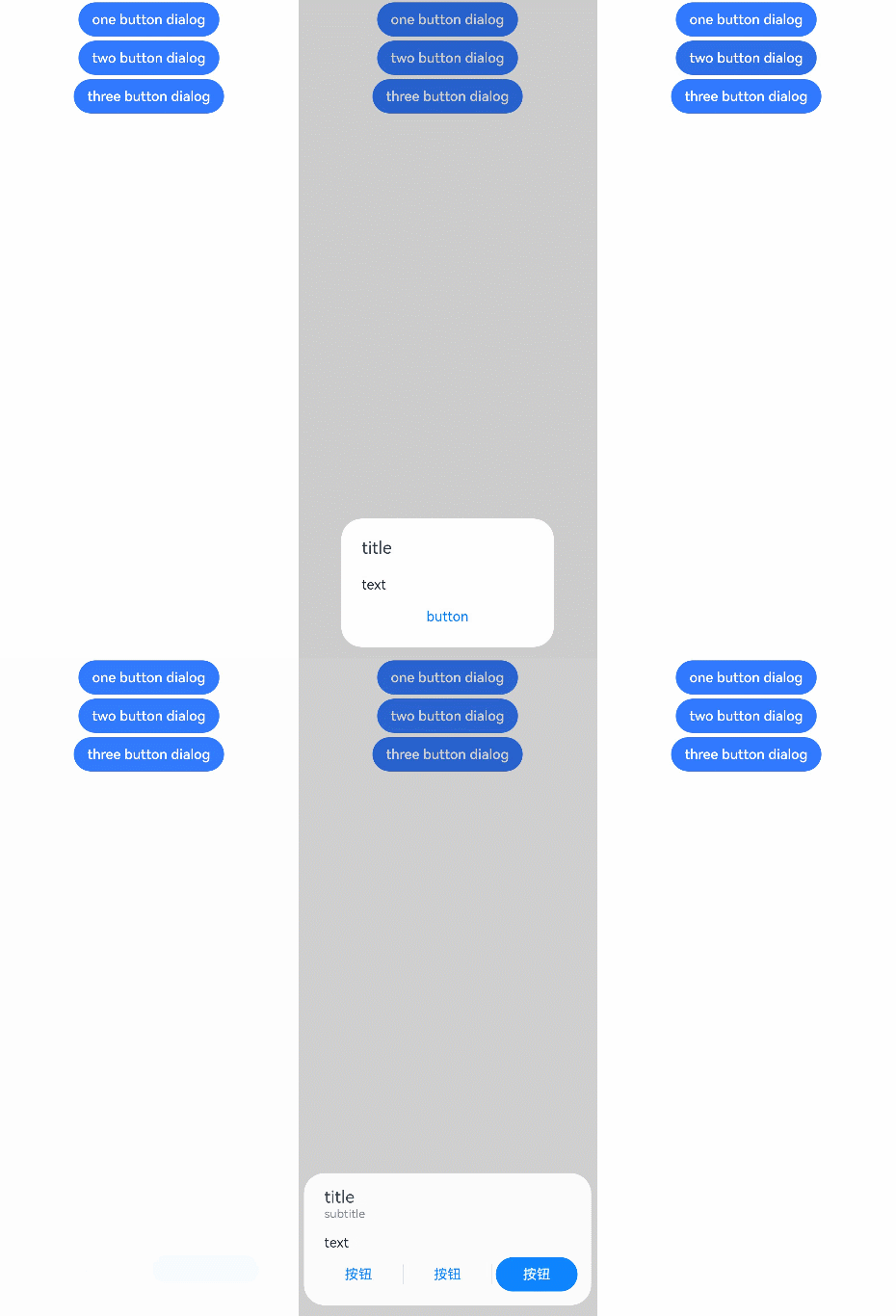
Example
// xxx.ets
@Entry
@Component
struct AlertDialogExample {
  build() {
    Column({ space: 5 }) {
      Button('one button dialog')
        .onClick(() => {
          AlertDialog.show(
            {
              title: 'title',
              message: 'text',
              autoCancel: true,
              alignment: DialogAlignment.Bottom,
              offset: { dx: 0, dy: -20 },
              gridCount: 3,
              confirm: {
                value: 'button',
                action: () => {
                  console.info('Button-clicking callback')
                }
              },
              cancel: () => {
                console.info('Closed callbacks')
              }
            }
          )
        })
        .backgroundColor(0x317aff)
      Button('two button dialog')
        .onClick(() => {
          AlertDialog.show(
            {
              title: 'title',
              subtitle: 'subtitle',
              message: 'text',
              autoCancel: true,
              alignment: DialogAlignment.Bottom,
              gridCount: 4,
              offset: { dx: 0, dy: -20 },
              primaryButton: {
                value: 'cancel',
                action: () => {
                  console.info('Callback when the first button is clicked')
                }
              },
              secondaryButton: {
                enabled: true,
                defaultFocus: true,
                style: DialogButtonStyle.HIGHLIGHT,
                value: 'ok',
                action: () => {
                  console.info('Callback when the second button is clicked')
                }
              },
              cancel: () => {
                console.info('Closed callbacks')
              }
            }
          )
        }).backgroundColor(0x317aff)
        Button('three button dialog')
        .onClick(() => {
          AlertDialog.show(
            {
              title: 'title',
              subtitle: 'subtitle',
              message: 'text',
              autoCancel: true,
              alignment: DialogAlignment.Bottom,
              gridCount: 4,
              offset: { dx: 0, dy: -20 },
              buttonDirection: DialogButtonDirection.HORIZONTAL,
              buttons: [
                {
                  value: 'Button',
                  action: () => {
                    console.info('Callback when button1 is clicked')
                  }
                },
                {
                  value: 'Button',
                  action: () => {
                    console.info('Callback when button2 is clicked')
                  }
                },
                {
                  value: 'Button',
                  enabled: true,
                  defaultFocus: true,
                  style: DialogButtonStyle.HIGHLIGHT,
                  action: () => {
                    console.info('Callback when button3 is clicked')
                  }
                },
              ],
              cancel: () => {
                console.info('Closed callbacks')
              }
            }
          )
        }).backgroundColor(0x317aff)
    }.width('100%').margin({ top: 5 })
  }
}
你可能感兴趣的鸿蒙文章
harmony 鸿蒙ArkTS-based Declarative Development Paradigm