harmony 鸿蒙<rating> Development
<rating> Development
The <rating> component provides a rating bar used for reviews and ratings. For details, see rating.
Creating a <rating> Component
Create a <rating> component in the .hml file under pages/index.
<!-- xxx.hml -->
<div class="container">
  <rating></rating>
</div>
/* xxx.css */
.container {
  width: 100%;
  height: 100%;
  display: flex;
  justify-content: center;
  align-items: center;
  background-color: #F1F3F5;
}
rating {
  width: 80%;
  height: 150px;
}

Setting the Rating Level
Use the <rating> component to set the number of stars in a rating bar and the current rating using the numstars and rating attributes, respectively.
<!-- xxx.hml -->
<div class="container">
  <rating numstars="6" rating="5">
  </rating>
</div>
/* xxx.css */
.container {
  width: 100%;
  height: 100%;
  display: flex;
  justify-content: center;
  align-items: center;
  background-color: #F1F3F5;
}
rating {
  width: 80%;
  height: 150px;
}

Setting the Rating Style
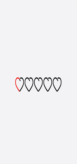
Use the <rating> component to set the background images when a rating star is unselected, selected, and partially selected using the star-background, star-foreground, and star-secondary attributes, respectively.
<!-- xxx.hml -->
<div class="container">
  <div style="width: 500px;height: 500px;align-items: center;justify-content: center;flex-direction: column;;">
    <rating numstars="5" rating="1" class="myrating" style="width: {{ratewidth}}; height:{{rateheight}};
    star-background: {{backstar}}; star-secondary: {{secstar}};star-foreground: {{forestar}};rtl-flip: true;">
    </rating>
  </div>
</div>
/* xxx.css */
.container {
  width: 100%;
  height: 100%;
  flex-direction: column;
  align-items: center;
  justify-content: center;
  background-color: #F1F3F5;
}
// index.js
export default {
  data: {
    backstar: 'common/love.png',
    secstar: 'common/love.png',
    forestar: 'common/love1.png',
    ratewidth: '400px',
    rateheight: '150px'
  },
  onInit(){
  }
}
NOTE - You must set star-background, star-secondary, and star-foreground. Otherwise, the grey rating star applies, indicating that the image source is incorrectly set.
- The star-background, star-secondary, and star-foreground attributes support only PNG and JPG images in the local path.
Binding Events
Add the change event to the <rating> component to print the current rating.
<!-- xxx.hml -->
<div class="container">
  <rating numstars="5" rating="0" onchange="showrating"></rating>
</div>
/* xxx.css */
.container {
  width: 100%;
  height: 100%;
  display: flex;
  justify-content: center;
  align-items: center;
  background-color: #F1F3F5;
}
rating {
  width: 80%;
  height: 150px;
}
// xxx.js
import promptAction from '@ohos.promptAction';
export default {
  showrating(e) {
    promptAction.showToast({
      message:'Current Rating' + e.rating
    })
  }
}

Example Scenario
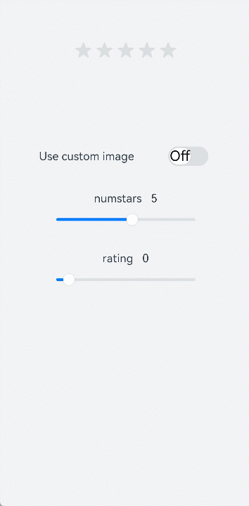
Change the switch status to toggle between the star background images and drag the slider to adjust the rating values.
<!-- xxx.hml -->
<div style="width: 100%;height:100%;flex-direction: column;align-items: center;background-color: #F1F3F5;">
  <div style="width: 500px;height: 500px;align-items: center;justify-content: center;flex-direction: column;;">
    <rating numstars="{{stars}}" rating="{{rate}}" stepsize="{{step}}" onchange="showrating" class="myrating"
    style="width: {{ratewidth}};height:{{rateheight}};star-background: {{backstar}};star-secondary: {{secstar}};
    star-foreground: {{forestar}};rtl-flip: true;"></rating>
  </div>
  <div style="flex-direction: column;width: 80%;align-items: center;">
    <div style="width: 100%;height: 100px;align-items: center;justify-content: space-around;">
      <text>Replacing a custom image</text>
      <switch checked="false" showtext="true" onchange="setstar"></switch>
    </div>
    <div style="width: 100%;height:120px;margin-top: 50px;margin-bottom: 50px;flex-direction: column;align-items: center;
    justify-content: space-around;">
      <text>numstars   {{stars}}</text>
      <slider id="sli1" min="-1" max="10" value="5" step="1" onchange="setnumstars"></slider>
    </div>
    <div style="width: 100%;height:120px;flex-direction: column;align-items: center;justify-content: space-around;">
      <text>rating   {{rate}}</text>
      <slider id="sli2" min="-1" max="10" value="0" step="1" onchange="setrating"></slider>
    </div>
  </div>
</div>
/* xxx.css */
.myrating:active {
  width: 500px;
  height: 100px;
}
switch{
  font-size: 40px;
}
// xxx.js
import promptAction from '@ohos.promptAction';
export default {
  data: {
    backstar: '',
    secstar: '',
    forestar: '',
    stars: 5,
    ratewidth: '300px',
    rateheight: '60px',
    step: 0.5,
    rate: 0
  },
  onInit(){
  },
  setstar(e) {
    if (e.checked == true) {
      this.backstar = 'common/love.png'
      this.secstar = 'common/love.png'
      this.forestar = 'common/love1.png'
    } else {
      this.backstar = ''
      this.secstar = ''
      this.forestar = ''
    }
  },
  setnumstars(e) {
    this.stars = e.progress
    this.ratewidth = 60 * parseInt(this.stars) + 'px'
  },
  setstep(e) {
    this.step = e.progress
  },
  setrating(e){
    this.rate = e.progress
  },
  showrating(e) {
    promptAction.showToast({
      message:'Current Rating' + e.rating
    })
  }
}
你可能感兴趣的鸿蒙文章
harmony 鸿蒙Property Animation APIs
harmony 鸿蒙Property Animation Overview
- 所属分类: 后端技术
- 本文标签:
热门推荐
-
2、 - 优质文章
-
3、 gate.io
-
8、 golang
-
9、 openharmony
-
10、 Vue中input框自动聚焦