harmony 鸿蒙ColumnSplit
ColumnSplit
The <ColumnSplit> component lays out child components vertically and inserts a horizontal divider between every two child components.
NOTE
This component is supported since API version 7. Updates will be marked with a superscript to indicate their earliest API version.
Child Components
Supported
APIs
ColumnSplit()
Attributes
| Name | Type | Description |
|---|---|---|
| resizeable | boolean | Whether the divider can be dragged. Default value: false |
| divider10+ | ColumnSplitDividerStyle |null | Margin of the divider. - DividerStyle: distance between the divider and the child component above or below it. - Default value: null, indicating that the top and bottom margins of the divider are 0. |
ColumnSplitDividerStyle10+
| Name | Type | Mandatory | Description |
|---|---|---|---|
| startMargin | Dimension | No | Distance between the divider and the child component above it. Default value: 0 |
| endMargin | Dimension | No | Distance between the divider and the child component below it. Default value: 0 |
NOTE
Similar to <RowSplit>, the divider of <ColumnSplit> can change the height of the upper and lower child components, but only to the extent that the resultant height falls within the maximum and minimum heights of the child components.
Universal attributes such as clip and margin are supported. If clip is not set, the default value true is used.
Example
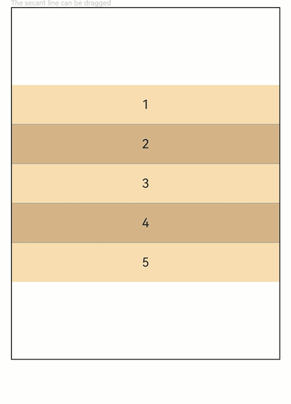
// xxx.ets
@Entry
@Component
struct ColumnSplitExample {
  build() {
    Column(){
      Text('The secant line can be dragged').fontSize(9).fontColor(0xCCCCCC).width('90%')
      ColumnSplit() {
        Text('1').width('100%').height(50).backgroundColor(0xF5DEB3).textAlign(TextAlign.Center)
        Text('2').width('100%').height(50).backgroundColor(0xD2B48C).textAlign(TextAlign.Center)
        Text('3').width('100%').height(50).backgroundColor(0xF5DEB3).textAlign(TextAlign.Center)
        Text('4').width('100%').height(50).backgroundColor(0xD2B48C).textAlign(TextAlign.Center)
        Text('5').width('100%').height(50).backgroundColor(0xF5DEB3).textAlign(TextAlign.Center)
      }
      .borderWidth(1)
      .resizeable(true) // The divider can be dragged.
      .width('90%').height('60%')
    }.width('100%')
  }
}
你可能感兴趣的鸿蒙文章
harmony 鸿蒙ArkTS-based Declarative Development Paradigm
0
赞
- 所属分类: 后端技术
- 本文标签:
热门推荐
-
2、 优质文章
-
3、 gt
-
7、 openharmony
-
9、 golang
-
10、 Vue中input框自动聚焦