harmony 鸿蒙Gradient Color
Gradient Color
Create a more gorgeous look for a component by applying a gradient color effect to it.
NOTE
The APIs of this module are supported since API version 7. Updates will be marked with a superscript to indicate their earliest API version.
Attributes
| Name | Type | Description |
|---|---|---|
| linearGradient | { angle?: number |string, direction?: GradientDirection, colors: Array<[ResourceColor, number]>, repeating?: boolean } |
Linear gradient. - angle: start angle of the linear gradient. A positive value indicates a clockwise rotation from the origin, (0, 0). Default value: 180 - direction: direction of the linear gradient. It does not take effect when angle is set. Default value: GradientDirection.Bottom - colors: array of color stops, each of which consists of a color and its stop position. - repeating: whether the colors are repeated. Default value: false Since API version 9, this API is supported in ArkTS widgets. |
| sweepGradient | { center: Point, start?: number |string, end?: number |string, rotation?: number|string, colors: Array<[ResourceColor, number]>, repeating?: boolean } |
Sweep gradient, which can sweep around the specified center point in the 0–360 degree range. If the rotation angle exceeds the range, a monochrome color instead of a gradient will be drawn. - center: center point of the sweep gradient, that is, the coordinates relative to the upper left corner of the current component. - start: start point of the sweep gradient. Default value: 0 - end: end point of the sweep gradient. Default value: 0 - rotation: rotation angle of the sweep gradient. Default value: 0 - colors: array of color stops, each of which consists of a color and its stop position. - repeating: whether the colors are repeated. Default value: false Since API version 9, this API is supported in ArkTS widgets. NOTE A value less than 0 evaluates to the value 0. A value greater than 360 evaluates to the value 1. When the data type of start, end, and rotation is string, the value “90” or “90%” is equivalent to 90. |
| radialGradient | { center: Point, radius: number |string, colors: Array<[ResourceColor, number]>, repeating?: boolean } |
Radial gradient. - center: center point of the radial gradient, that is, the coordinates relative to the upper left corner of the current component. - radius: radius of the radial gradient. Value range: [0, +∞) NOTE A value less than 0 evaluates to the value 0. - colors: array of color stops, each of which consists of a color and its stop position. - repeating: whether the colors are repeated. Default value: false Since API version 9, this API is supported in ArkTS widgets. |
NOTE
When using the colors parameter, take note of the following:
ResourceColor indicates the color, and number indicates the color’s position, which ranges from 0 to 1.0: 0 indicates the start of the container, and 1.0 indicates the end of the container. To create a gradient with multiple color stops, you are advised to set number in ascending order. If the value of number in an array is smaller than that in the previous array, it is considered as equivalent to the value in the previous array.
Example
// xxx.ets
@Entry
@Component
struct ColorGradientExample {
build() {
Column({ space: 5 }) {
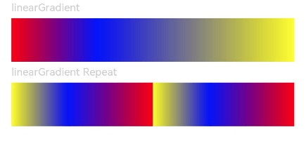
Text('linearGradient').fontSize(12).width('90%').fontColor(0xCCCCCC)
Row()
.width('90%')
.height(50)
.linearGradient({
angle: 90,
colors: [[0xff0000, 0.0], [0x0000ff, 0.3], [0xffff00, 1.0]]
})
Text('linearGradient Repeat').fontSize(12).width('90%').fontColor(0xCCCCCC)
Row()
.width('90%')
.height(50)
.linearGradient({
direction: GradientDirection.Left, // Gradient direction.
repeating: true, // Whether the gradient colors are repeated.
colors: [[0xff0000, 0.0], [0x0000ff, 0.3], [0xffff00, 0.5]] // The gradient colors are repeated because the last color stop is less than 1.
})
}
.width('100%')
.padding({ top: 5 })
}
}
@Entry
@Component
struct ColorGradientExample {
build() {
Column({ space: 5 }) {
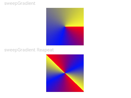
Text('sweepGradient').fontSize(12).width('90%').fontColor(0xCCCCCC)
Row()
.width(100)
.height(100)
.sweepGradient({
center: [50, 50],
start: 0,
end: 359,
colors: [[0xff0000, 0.0], [0x0000ff, 0.3], [0xffff00, 1.0]]
})
Text('sweepGradient Reapeat').fontSize(12).width('90%').fontColor(0xCCCCCC)
Row()
.width(100)
.height(100)
.sweepGradient({
center: [50, 50],
start: 0,
end: 359,
rotation: 45, // Rotation angle.
repeating: true, // Whether the gradient colors are repeated.
colors: [[0xff0000, 0.0], [0x0000ff, 0.3], [0xffff00, 0.5]] // The gradient colors are repeated because the last color stop is less than 1.
})
}
.width('100%')
.padding({ top: 5 })
}
}
// xxx.ets
@Entry
@Component
struct ColorGradientExample {
build() {
Column({ space: 5 }) {
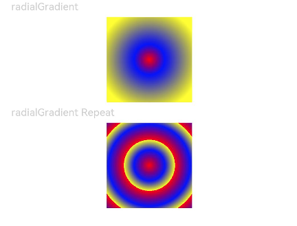
Text('radialGradient').fontSize(12).width('90%').fontColor(0xCCCCCC)
Row()
.width(100)
.height(100)
.radialGradient({
center: [50, 50],
radius: 60,
colors: [[0xff0000, 0.0], [0x0000ff, 0.3], [0xffff00, 1.0]]
})
Text('radialGradient Repeat').fontSize(12).width('90%').fontColor(0xCCCCCC)
Row()
.width(100)
.height(100)
.radialGradient({
center: [50, 50],
radius: 60,
repeating: true,
colors: [[0xff0000, 0.0], [0x0000ff, 0.3], [0xffff00, 0.5]] // The gradient colors are repeated because the last color stop is less than 1.
})
}
.width('100%')
.padding({ top: 5 })
}
}
你可能感兴趣的鸿蒙文章
harmony 鸿蒙ArkTS-based Declarative Development Paradigm
- 所属分类: 后端技术
- 本文标签: