Span
As a child of the <Text> and <RichEditor> components, the <Span> component is used to display inline text.
NOTE
This component is supported since API version 7. Updates will be marked with a superscript to indicate their earliest API version.
Since API version 10, this component can inherit the attributes of the <Text> parent component. That is, if no attribute is set for this component, it inherits the attributes (if set) of its parent component. Only the following attributes can be inherited: fontColor, fontSize, fontStyle, fontWeight, decoration, letterSpacing, textCase, and fontfamily.
Child Components
Not supported
APIs
Span(value: string|Resource)
Since API version 9, this API is supported in ArkTS widgets.
Parameters
| Name | Type | Mandatory | Description |
|---|---|---|---|
| value | string |Resource | Yes | Plain text. |
Attributes
In addition to the universal text style attributes, the following attributes are supported.
| Name | Type | Description |
|---|---|---|
| decoration | { type: TextDecorationType, color?: ResourceColor } | Style and color of the text decorative line. Default value: { type: TextDecorationType.None color: Color.Black } Since API version 9, this API is supported in ArkTS widgets. |
| letterSpacing | number |string | Letter spacing. A negative value tightens the spacing; a positive value loosens the spacing, and the letters are spread farther apart with the value. Since API version 9, this API is supported in ArkTS widgets. |
| textCase | TextCase | Text case. Default value: TextCase.Normal Since API version 9, this API is supported in ArkTS widgets. |
| font10+ | Font | Text style, covering the font size, font width, Font family, and font style. |
Events
Among all the universal events, only the click event is supported.
NOTE
As the <Span> component does not include size information, the target attribute of the ClickEvent object returned by the click event is invalid.
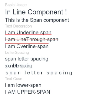
Example
// xxx.ets
@Entry
@Component
struct SpanExample {
  build() {
    Flex({ direction: FlexDirection.Column, alignItems: ItemAlign.Start, justifyContent: FlexAlign.SpaceBetween }) {
      Text('Basic Usage').fontSize(9).fontColor(0xCCCCCC)
      Text() {
        Span('In Line')
        Span(' Component')
        Span(' !')
      }

      Text() {
        Span('This is the Span component').fontSize(12).textCase(TextCase.Normal)
          .decoration({ type: TextDecorationType.None, color: Color.Red })
      }

      // Add a line under the text.
      Text('Text Decoration').fontSize(9).fontColor(0xCCCCCC)
      Text() {
        Span('I am Underline-span').decoration({ type: TextDecorationType.Underline, color: Color.Red }).fontSize(12)
      }

      Text() {
        Span('I am LineThrough-span')
          .decoration({ type: TextDecorationType.LineThrough, color: Color.Red })
          .fontSize(12)
      }

      Text() {
        Span('I am Overline-span').decoration({ type: TextDecorationType.Overline, color: Color.Red }).fontSize(12)
      }

      // Set the letter spacing.
      Text('LetterSpacing').fontSize(9).fontColor(0xCCCCCC)
      Text() {
        Span('span letter spacing')
          .letterSpacing(0)
          .fontSize(12)
      }

      Text() {
        Span('span letter spacing')
          .letterSpacing(-2)
          .fontSize(12)
      }

      Text() {
        Span('span letter spacing')
          .letterSpacing(3)
          .fontSize(12)
      }


      // Set the text case.
      Text('Text Case').fontSize(9).fontColor(0xCCCCCC)
      Text() {
        Span('I am Lower-span').fontSize(12)
          .textCase(TextCase.LowerCase)
          .decoration({ type: TextDecorationType.None })
      }

      Text() {
        Span('I am Upper-span').fontSize(12)
          .textCase(TextCase.UpperCase)
          .decoration({ type: TextDecorationType.None })
      }
    }.width('100%').height(250).padding({ left: 35, right: 35, top: 35 })
  }
}
你可能感兴趣的鸿蒙文章
harmony 鸿蒙ArkTS-based Declarative Development Paradigm