SubHeaderV2
The SubHeader component represents a subheader that signifies the top of a list or the beginning a subdivision of content and tells the user what the list or subdivision is about.
This component is implemented based on state management V2. Compared with state management V1, V2 offers a higher level of observation and management over data objects beyond the component level. You can now more easily manage subheader data and states with greater flexibility, leading to faster UI updates.
NOTE
- This component is supported since API version 18. Updates will be marked with a superscript to indicate their earliest API version.
Modules to Import
import { SubHeader } from '@kit.ArkUI'
Child Components
Not supported
Attributes
The universal attributes are not supported.
SubHeaderV2
SubHeaderV2({ icon?: SubHeaderV2IconType, title?: SubHeaderV2Title, select?: SubHeaderV2Select, operationType?: SubHeaderV2OperationType, operationItems?: SubHeaderV2OperationItem })
The SubHeader component represents a subheader that signifies the top of a list or the beginning a subdivision of content and tells the user what the list or subdivision is about.
Decorator: @ComponentV2
Atomic service API: This API can be used in atomic services since API version 18.
System capability: SystemCapability.ArkUI.ArkUI.Full
| Name | Type | Mandatory | Decorator | Description |
|---|---|---|---|---|
| icon | SubHeaderV2IconType | No | @Param | Icon. Default value: undefined |
| title | SubHeaderV2Title | No | @Param | Title of the subheader. Default value: undefined |
| select | SubHeaderV2Select | No | @Param | Content and events for selection. Default value: undefined |
| operationType | SubHeaderV2OperationType | No | @Param | Style of elements in the operation area. Default value: OperationType.BUTTON |
| operationItems | SubHeaderV2OperationItem[] | No | @Param | Items in the operation area. Default value: undefined |
| titleBuilder | SubHeaderV2TitleBuilder | No | @BuildParam | Custom content for the title area. Default value: () => void |
SubHeaderV2IconType
type SubHeaderV2IconType = ResourceStr|SymbolGlyphModifier
Defines the union type for the icon content.
Atomic service API: This API can be used in atomic services since API version 18.
System capability: SystemCapability.ArkUI.ArkUI.Full
| Type | Description |
|---|---|
| ResourceStr | Resource type for defining common icons. |
| SymbolGlyphModifier | Symbol type for defining symbol icons. |
SubHeaderV2Title
Defines the title settings for the subheader.
Decorator type: @ObservedV2
Properties
Atomic service API: This API can be used in atomic services since API version 18.
System capability: SystemCapability.ArkUI.ArkUI.Full
| Name | Type | Mandatory | Decorator | Description |
|---|---|---|---|---|
| primaryTitle | ResourceStr | No | @Trace | Primary title. Default value: undefined |
| secondaryTitle | ResourceStr | No | @Trace | Secondary title. Default value: undefined |
| primaryTitleModifier | TextModifier | No | @Trace | Text attributes of the primary title, such as the font color, font size, and font weight. Default value: undefined |
| secondaryTitleModifier | TextModifier | No | @Trace | Text attributes of the secondary title, such as the font color, font size, and font weight. Default value: undefined |
constructor
constructor(options: SubHeaderV2TitleOptions)
A constructor used to create a SubHeaderV2Title object.
Atomic service API: This API can be used in atomic services since API version 18.
System capability: SystemCapability.ArkUI.ArkUI.Full
Parameters
| Name | Type | Mandatory | Description |
|---|---|---|---|
| options | SubHeaderV2TitleOptions | Yes | Options for initializing the title. |
SubHeaderV2TitleOptions
Defines the options for initializing a SubHeaderV2Title object.
Atomic service API: This API can be used in atomic services since API version 18.
System capability: SystemCapability.ArkUI.ArkUI.Full
| Name | Type | Mandatory | Description |
|---|---|---|---|
| primaryTitle | ResourceStr | No | Primary title. Default value: undefined |
| secondaryTitle | ResourceStr | No | Secondary title. Default value: undefined |
| primaryTitleModifier | TextModifier | No | Text attributes of the primary title, such as the font color, font size, and font weight. Default value: undefined |
| secondaryTitleModifier | TextModifier | No | Text attributes of the secondary title, such as the font color, font size, and font weight. Default value: undefined |
SubHeaderV2Select
Defines the content and events for selection.
Decorator type: @ObservedV2
Properties
Atomic service API: This API can be used in atomic services since API version 18.
System capability: SystemCapability.ArkUI.ArkUI.Full
| Name | Type | Mandatory | Decorator | Description |
|---|---|---|---|---|
| options | SelectOption[] | Yes | @Trace | Options for the drop-down list box. |
| selectedIndex | number | No | @Trace | Index of the initially selected item in the drop-down list box. The index of the first item is 0. If this property is not set, the default value -1 is used, indicating that no item is selected. |
| selectedContent | string | No | @Trace | Text content of the drop-down button. Default value: '' |
| onSelect | SubHeaderV2SelectOnSelect | No | @Trace | Callback invoked when an item in the drop-down list box is selected. Default value: undefined |
| defaultFocus | boolean | No | Whether the drop-down button is the default focus. true: The drop-down button is the default focus. false: The drop-down button is not the default focus. Default value: false |
constructor
constructor(options: SubHeaderV2SelectOptions)
A constructor used to create a SubHeaderV2Select object.
Atomic service API: This API can be used in atomic services since API version 18.
System capability: SystemCapability.ArkUI.ArkUI.Full
Parameters
| Name | Type | Mandatory | Description |
|---|---|---|---|
| options | SubHeaderV2SelectOptions | Yes | Configuration options of the drop-down list box. |
SubHeaderV2SelectOptions
Defines the options for initializing a SubHeaderV2Select object.
Atomic service API: This API can be used in atomic services since API version 18.
System capability: SystemCapability.ArkUI.ArkUI.Full
| Name | Type | Mandatory | Description |
|---|---|---|---|
| options | SelectOption[] | Yes | Options for the drop-down list box. |
| selectedIndex | number | No | Index of the initially selected item in the drop-down list box. The index of the first item is 0. If this property is not set, the default value -1 is used, indicating that no item is selected. |
| selectedContent | string | No | Text content of the drop-down button. Default value: '' |
| onSelect | SubHeaderV2SelectOnSelect | No | Callback invoked when an item in the drop-down list box is selected. Default value: undefined |
| defaultFocus | boolean | No | Whether the drop-down button is the default focus. true: The drop-down button is the default focus. false: The drop-down button is not the default focus. Default value: false |
SubHeaderV2SelectOnSelect
type SubHeaderV2SelectOnSelect = (selectedIndex: number, selectedContent?: string) => void
Defines the callback invoked when an item in the drop-down list box is selected.
Atomic service API: This API can be used in atomic services since API version 18.
System capability: SystemCapability.ArkUI.ArkUI.Full
Parameters
| Type | Description |
|---|---|
| selectIndex | Index of the selected item. |
| selectContent | Text content of the selected item. |
SubHeaderV2OperationType
Defines the style of elements in the operation area.
Atomic service API: This API can be used in atomic services since API version 18.
System capability: SystemCapability.ArkUI.ArkUI.Full
| Name | Value | Description |
|---|---|---|
| TEXT_ARROW | 0 | Text button with a right arrow. |
| BUTTON | 1 | Text button without a right arrow. |
| ICON_GROUP | 2 | Icon-attached button (A maximum of three icons can be configured.) |
| LOADING | 3 | Loading animation. |
SubHeaderV2OperationItemType
type SubHeaderV2OperationItemType = ResourceStr|SymbolGlyphModifier
Defines the union type for the content of elements in the operation area.
Atomic service API: This API can be used in atomic services since API version 18.
System capability: SystemCapability.ArkUI.ArkUI.Full
| Type | Description |
|---|---|
| ResourceStr | String type for defining text display or common icons; resource type for defining common icons. |
| SymbolGlyphModifier | Symbol type for defining symbol icons. |
SubHeaderV2OperationItem
Represents an item in the operation area.
Decorator type: @ObservedV2
Properties
Atomic service API: This API can be used in atomic services since API version 18.
System capability: SystemCapability.ArkUI.ArkUI.Full
| Name | Type | Mandatory | Decorator | Description |
|---|---|---|---|---|
| content | SubHeaderV2OperationItemType | Yes | @Trace | Content of the item in the operation area. |
| action | SubHeaderV2OperationItemAction | No | @Trace | Event triggered when the item is operated. Default value: () => void |
| accessibilityText | ResourceStr | No | @Trace | Accessibility text. Default value: undefined |
| accessibilityLevel | string | No | @Trace | Accessibility level. Default value: "yes" |
| accessibilityDescription | ResourceStr | No | @Trace | Accessibility description. Default value: "Double-tap to activate" |
| defaultFocus | boolean | No | Whether to receive default focus. true: Receive default focus. false: Do not receive default focus. Default value: false |
constructor
constructor(options: SubHeaderV2OperationItemOptions)
A constructor used to create a SubHeaderV2OperationItem object.
Atomic service API: This API can be used in atomic services since API version 18.
System capability: SystemCapability.ArkUI.ArkUI.Full
Parameters
| Name | Type | Mandatory | Description |
|---|---|---|---|
| options | SubHeaderV2OperationItemOptions | Yes | Configuration options of the operation item. |
SubHeaderV2OperationItemAction
type SubHeaderV2OperationItemAction = () => void
Defines the callback for items in the operation area.
Atomic service API: This API can be used in atomic services since API version 18.
System capability: SystemCapability.ArkUI.ArkUI.Full
SubHeaderV2OperationItemOptions
Defines the options for initializing a SubHeaderV2OperationItem object.
Atomic service API: This API can be used in atomic services since API version 18.
System capability: SystemCapability.ArkUI.ArkUI.Full
| Name | Type | Mandatory | Description |
|---|---|---|---|
| content | SubHeaderV2OperationItemType | Yes | Content of the item in the operation area. |
| action | SubHeaderV2OperationItemAction | No | Event triggered when the item is operated. Default value: () => void |
| accessibilityText | ResourceStr | No | Accessibility text. Default value: undefined |
| accessibilityLevel | string | No | Accessibility level. Default value: "yes" |
| accessibilityDescription | ResourceStr | No | Accessibility description. Default value: "Double-tap to activate" |
| defaultFocus | boolean | No | Whether to receive default focus. true: Receive default focus. false: Do not receive default focus. Default value: false |
SubHeaderV2TitleBuilder
type SubHeaderV2TitleBuilder= () => void
Defines the callback used to customize the content of the title area.
Atomic service API: This API can be used in atomic services since API version 18.
System capability: SystemCapability.ArkUI.ArkUI.Full
Events
The universal events are not supported.
Example
Example 1: Implementing an Efficiency-Oriented Subheader
This example demonstrates how to implement a subheader where the left side contains an icon and a secondary title, and the right side has a text button.
import {
  SubHeaderV2OperationType,
  SubHeaderV2,
  SubHeaderV2Title,
  SubHeaderV2OperationItem,
  promptAction,
  TextModifier
} from '@kit.ArkUI'

@Entry
@ComponentV2
struct SubHeaderExample {
  @Local selectText: string = "TTTTT"
  @Local selectIndex: number = 2
  @Local flag: boolean = true;
  @Local index: number = 1;
  @Local primaryTitle: ResourceStr = 'Primary title';
  @Local secondaryTitle: ResourceStr = 'Secondary title';
  @Local subHeaderIcon: Resource = $r('sys.media.ohos_ic_public_email');
  @Local title: SubHeaderV2Title = new SubHeaderV2Title({ primaryTitle: 'Primary title' });
  @Local primaryModifier: TextModifier = new TextModifier().fontColor(Color.Red);
  @Local secondaryModifier: TextModifier = new TextModifier().fontColor(Color.Red);
  @Local subHeaderOperationType: SubHeaderV2OperationType = SubHeaderV2OperationType.BUTTON;
  @Local operationItems: SubHeaderV2OperationItem[] = [];

  aboutToAppear(): void {
    this.title = new SubHeaderV2Title({
      primaryTitle: this.primaryTitle,
      secondaryTitle: this.secondaryTitle,
    });
    this.operationItems = [new SubHeaderV2OperationItem({
      content: 'Operation',
      action: () => {
        promptAction.showToast({ message: 'demo2' })
      }
    })]
  }

  build() {
    Column() {
      Column() {
        SubHeaderV2({
          icon: this.subHeaderIcon,
          title: this.title,
          operationType: this.subHeaderOperationType,
          operationItems: this.operationItems
        });
      }
    }
  }
}

Example 2: Implementing a Double-Line Text Content-rich Subheader
This example showcases a subheader with a primary title and a secondary title on the left, and a text button with a right arrow on the right.
import {
  SubHeaderV2OperationType,
  SubHeaderV2,
  SubHeaderV2Title,
  SubHeaderV2OperationItem,
  promptAction,
  TextModifier
} from '@kit.ArkUI'

@Entry
@ComponentV2
struct SubHeaderExample {
  @Local title: SubHeaderV2Title = new SubHeaderV2Title({ primaryTitle: 'Primary title', secondaryTitle: 'Secondary title' });
  @Local primaryModifier: TextModifier = new TextModifier().fontColor(Color.Red);
  @Local secondaryModifier: TextModifier = new TextModifier().fontColor(Color.Red);
  @Local subHeaderOperationType: SubHeaderV2OperationType = SubHeaderV2OperationType.TEXT_ARROW;
  @Local operationItems: SubHeaderV2OperationItem[] = [];

  aboutToAppear(): void {
    this.title = new SubHeaderV2Title({
      primaryTitle: 'Primary title',
      secondaryTitle: 'Secondary title'
    });
    this.operationItems = [new SubHeaderV2OperationItem({
      content: 'More',
      action: () => {
        promptAction.showToast({ message: 'demo2' })
      }
    })]
  }

  build() {
    Column() {
      Column() {
        SubHeaderV2({
          title: this.title,
          operationType: this.subHeaderOperationType,
          operationItems: this.operationItems
        });
      }
    }
  }
}

Example 3: Implementing a Spinner Content-rich Subheader
This example showcases a subheader with content and events for selection on the left, and an icon-attached button on the right.
import {
  SubHeaderV2,
  SubHeaderV2OperationType,
  SubHeaderV2OperationItem,
  SubHeaderV2Title,
  SubHeaderV2Select,
  promptAction
} from '@kit.ArkUI'

@Entry
@ComponentV2
struct SubHeaderExample {
  @Local selectedValue: string = 'aaa';
  @Local selectedIndex: number = 0;
  @Local title: SubHeaderV2Title = new SubHeaderV2Title({ primaryTitle: 'Primary title', secondaryTitle: 'Secondary title' });
  @Local operationItems: SubHeaderV2OperationItem[] = [];
  @Local select: SubHeaderV2Select =
    new SubHeaderV2Select({ options: [{ value: 'aaa' }, { value: 'bbb' }, { value: 'ccc' }] });

  aboutToAppear(): void {

    this.title = new SubHeaderV2Title({
      primaryTitle: 'Primary title',
      secondaryTitle: 'Secondary title'
    });

    this.selectedValue = 'selectDemo';
    this.select = new SubHeaderV2Select({
      options: [{ value: 'aaa' }, { value: 'bbb' }, { value: 'ccc' }],
      selectedContent: this.selectedValue,
      selectedIndex: this.selectedIndex,
      onSelect: (index: number, value?: string) => {
        promptAction.showToast({ message: 'selectdemo' })
      }
    })

    this.operationItems = [
      new SubHeaderV2OperationItem({
        content: $r('sys.media.ohos_ic_public_email'),
        action: () => {
          promptAction.showToast({ message: 'demo' })
        }
      }),
      new SubHeaderV2OperationItem({
        content: $r('sys.media.ohos_ic_public_email'),
        action: () => {
          promptAction.showToast({ message: 'demo' })
        }
      }),
      new SubHeaderV2OperationItem({
        content: $r('sys.media.ohos_ic_public_email'),
        action: () => {
          promptAction.showToast({ message: 'demo' })
        }
      })]
  }

  build() {
    Column() {
      Column() {
        SubHeaderV2({
          select: this.select,
          operationType: SubHeaderV2OperationType.ICON_GROUP,
          operationItems: this.operationItems
        })
      }
    }
  }
}

Example 4: Setting the Icon Symbol for the Left Side
This example demonstrates how to set the icon symbol for the left side of the subheader.
import {
  SubHeaderV2,
  SubHeaderV2OperationType,
  SubHeaderV2OperationItem,
  SubHeaderV2Title,
  promptAction,
  SymbolGlyphModifier
} from '@kit.ArkUI'

@Entry
@ComponentV2
struct SubHeaderExample {
  @Local icon: SymbolGlyphModifier = new SymbolGlyphModifier($r('sys.symbol.ohos_wifi'));

  aboutToAppear(): void {
    this.icon = new SymbolGlyphModifier($r('sys.symbol.ohos_wifi')).fontSize(24);
    this.icon.effectStrategy(SymbolEffectStrategy.HIERARCHICAL)
  }

  build() {
    Column() {
      SubHeaderV2({
        icon: this.icon,
        title: new SubHeaderV2Title({ secondaryTitle: 'Title' }),
        operationType: SubHeaderV2OperationType.BUTTON,
        operationItems: [new SubHeaderV2OperationItem({
          content: 'Operation',
          action: () => {
            promptAction.showToast({ message: 'demo' })
          }
        })]
      })
    }
  }
}

Example 5: Setting the Icon Symbol for the Right Side
The following example shows how to set operationType to OperationType.ICON_GROUP for the right side of the subheader, with operationItem set to a symbol icon.
import {
  SubHeaderV2,
  SubHeaderV2OperationType,
  SubHeaderV2OperationItem,
  SubHeaderV2Title,
  SubHeaderV2Select,
  promptAction,
  SymbolGlyphModifier
} from '@kit.ArkUI'

@Entry
@ComponentV2
struct SubHeaderExample {
  @Local icon: SymbolGlyphModifier = new SymbolGlyphModifier($r('sys.symbol.ohos_wifi'));
  @Local selectedValue: string = 'aaa';
  @Local selectedIndex: number = 2;
  @Local title: SubHeaderV2Title = new SubHeaderV2Title({ primaryTitle: 'Primary title', secondaryTitle: 'Secondary title' });
  @Local operationItem: SubHeaderV2OperationItem[] = [];
  @Local select: SubHeaderV2Select =
    new SubHeaderV2Select({ options: [{ value: 'aaa' }, { value: 'bbb' }, { value: 'ccc' }] });

  aboutToAppear(): void {
    this.icon = new SymbolGlyphModifier($r('sys.symbol.ohos_wifi'));
    this.icon.effectStrategy(SymbolEffectStrategy.HIERARCHICAL);

    this.selectedValue = 'selectDemo';
    this.selectedIndex = 2;
    this.title = new SubHeaderV2Title({
      primaryTitle: 'Primary title',
      secondaryTitle: 'Secondary title'
    });
    this.select = new SubHeaderV2Select({
      options: [{ value: 'aaa' }, { value: 'bbb' }, { value: 'ccc' }],
      selectedContent: this.selectedValue,
      selectedIndex: this.selectedIndex,
      onSelect: (index: number, value?: string) => {
        promptAction.showToast({ message: 'demo' })
      }
    })

    this.operationItem = [
      new SubHeaderV2OperationItem({
        content: new SymbolGlyphModifier($r('sys.symbol.ohos_lungs')).fontWeight(FontWeight.Lighter),
        action: () => {
          promptAction.showToast({ message: 'demo1' })
        }
      }),
      new SubHeaderV2OperationItem({
        content: new SymbolGlyphModifier($r('sys.symbol.ohos_lungs'))
          .renderingStrategy(SymbolRenderingStrategy.MULTIPLE_COLOR)
          .fontColor([Color.Blue, Color.Grey, Color.Green])
      ,
        action: () => {
          promptAction.showToast({ message: 'demo2' })
        }
      }),
      new SubHeaderV2OperationItem({
        content: new SymbolGlyphModifier($r('sys.symbol.ohos_lungs'))
          .renderingStrategy(SymbolRenderingStrategy.MULTIPLE_OPACITY)
          .fontColor([Color.Blue, Color.Grey, Color.Green])
      ,
        action: () => {
          promptAction.showToast({ message: 'demo3' })
        }
      })]
  }

  build() {
    Column() {
      SubHeaderV2({
        select: this.select,
        operationType: SubHeaderV2OperationType.ICON_GROUP,
        operationItems: this.operationItem
      })
    }
  }
}

Example 6: Customizing Title Content
This example demonstrates how to customize the title content with a titleBuilder object for the subheader.
import {
  SubHeaderV2,
  SubHeaderV2OperationType,
  SubHeaderV2OperationItem,
  SubHeaderV2Title,
  promptAction
} from '@kit.ArkUI'

@Entry
@ComponentV2
struct SubHeaderExample {
  @Local title: SubHeaderV2Title = new SubHeaderV2Title({ primaryTitle: 'Primary title' });
  @Local operationItem: SubHeaderV2OperationItem[] = [];

  aboutToAppear(): void {
    this.title = new SubHeaderV2Title({
      primaryTitle: 'Primary title',
      secondaryTitle: 'Secondary title'
    });
    this.operationItem = [new SubHeaderV2OperationItem({
      content: 'More info',
      action: () => {
        promptAction.showToast({ message: 'demo' })
      }
    })]
  }

  @Builder
  TitleBuilder(): void {
    Text('Custom title')
      .fontSize(24)
      .fontColor(Color.Blue)
      .fontWeight(FontWeight.Bold)
  }

  build() {
    Column() {
      SubHeaderV2({
        titleBuilder: () => {
          this.TitleBuilder();
        },
        title: this.title,

        operationType: SubHeaderV2OperationType.TEXT_ARROW,
        operationItems: this.operationItem
      })
    }
  }
}

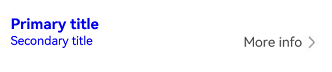
Example 7: Customizing the Title Style
This example demonstrates how to set custom font styles for the primary and secondary titles.
import {
  SubHeaderV2,
  SubHeaderV2OperationType,
  SubHeaderV2OperationItem,
  SubHeaderV2Title,
  promptAction,
  TextModifier
} from '@kit.ArkUI'

@Entry
@ComponentV2
struct SubHeaderExample {
  @Local primaryModifier: TextModifier = new TextModifier().fontColor(Color.Blue);
  @Local secondaryModifier: TextModifier = new TextModifier().fontColor(Color.Blue);
  @Local title: SubHeaderV2Title = new SubHeaderV2Title({ primaryTitle: 'Primary title' });
  @Local operationItems4: SubHeaderV2OperationItem[] = [];

  aboutToAppear(): void {
    this.title = new SubHeaderV2Title({
      primaryTitle: 'Primary title',
      primaryTitleModifier: this.primaryModifier,
      secondaryTitle: 'Secondary title',
      secondaryTitleModifier: this.secondaryModifier
    });
    this.operationItems4 = [new SubHeaderV2OperationItem({
      content: 'More info',
      action: () => {
        promptAction.showToast({ message: 'demo' })
      }
    })]
  }

  build() {
    Column() {
      SubHeaderV2({
        title: this.title,
        operationType: SubHeaderV2OperationType.TEXT_ARROW,
        operationItems: this.operationItems4
      })
    }
  }
}
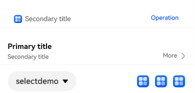
Example 8: Implementing Announcement for the Button on the Right Side
This example customizes the screen reader announcement text by setting the accessibilityText, accessibilityDescription, and accessibilityLevel properties of the button on the right side of the subheader.
import {
  SubHeaderV2OperationType,
  SubHeaderV2,
  SubHeaderV2Title,
  SubHeaderV2OperationItem,
  SubHeaderV2IconType,
  SubHeaderV2Select,
  promptAction
} from '@kit.ArkUI'

@Entry
@ComponentV2
struct SubHeaderExample {
  @Local index: number = 1;
  @Local primaryTitle: ResourceStr = 'Primary title';
  @Local secondaryTitle: ResourceStr = 'Secondary title';
  @Local subHeaderIcon: SubHeaderV2IconType|undefined = $r('sys.media.ohos_ic_public_email');
  @Local title: SubHeaderV2Title = new SubHeaderV2Title({ primaryTitle: 'Primary title' });
  @Local title2: SubHeaderV2Title = new SubHeaderV2Title({ primaryTitle: 'Primary title', secondaryTitle: 'Secondary title' });
  @Local subHeaderOperationType: SubHeaderV2OperationType = SubHeaderV2OperationType.BUTTON;
  @Local subHeaderOperationType2: SubHeaderV2OperationType = SubHeaderV2OperationType.TEXT_ARROW;
  @Local subHeaderOperationType3: SubHeaderV2OperationType = SubHeaderV2OperationType.ICON_GROUP;
  @Local operationItems: SubHeaderV2OperationItem[] = [];
  @Local selectedValue: string|undefined = 'selectDemo';
  @Local selectedIndex: number = 0;
  @Local select: SubHeaderV2Select =
    new SubHeaderV2Select({ options: [{ value: 'aaa' }, { value: 'bbb' }, { value: 'ccc' }] });

  aboutToAppear(): void {
    this.select = new SubHeaderV2Select({ options: [] });
    this.title = new SubHeaderV2Title({
      primaryTitle: this.primaryTitle,
      secondaryTitle: this.secondaryTitle,
    });
    this.operationItems = [new SubHeaderV2OperationItem({
      content: 'Operation',
      action: () => {
        promptAction.showToast({ message: 'demo2' })
      }
    })]
  }

  build() {
    Column() {
      Column() {
        SubHeaderV2({
          icon: this.subHeaderIcon,
          title: this.title,
          select: this.select,
          operationType: this.subHeaderOperationType,
          operationItems: this.operationItems
        });
        Divider().color('grey').width('100%').height('2vp')
        SubHeaderV2({
          title: this.title2,
          select: this.select,
          operationType: this.subHeaderOperationType2,
          operationItems: this.operationItems
        });
        Divider().color('grey').width('100%').height('2vp')
        SubHeaderV2({
          select: new SubHeaderV2Select({
            options: [{ value: 'aaa' }, { value: 'bbb' }, { value: 'ccc' }],
            selectedIndex: this.selectedIndex,
            selectedContent: this.selectedValue,
            onSelect: (index: number, value?: string) => {
              this.selectedIndex = index;
              this.selectedValue = value;
              promptAction.showToast({ message: this.selectedValue })
            }
          }),
          operationType: this.subHeaderOperationType3,
          operationItems: [new SubHeaderV2OperationItem({
            content: $r('sys.media.ohos_ic_public_email'),
            accessibilityText: 'Icon 1',
            accessibilityLevel: 'yes',
          }), new SubHeaderV2OperationItem({
            content: $r('sys.media.ohos_ic_public_email'),
            accessibilityText: 'Icon 2',
            accessibilityLevel: 'no',
          }), new SubHeaderV2OperationItem({
            content: $r('sys.media.ohos_ic_public_email'),
            accessibilityText: 'Icon 3',
            accessibilityDescription: 'Tap to operate icon 3',
          })]
        });
      }
      Divider().color('grey').width('100%').height('2vp')
    }
  }
}
Example 9: Implementing Announcement for the Button on the Right Side
This example customizes the screen reader announcement text by setting the accessibilityText, accessibilityDescription, and accessibilityLevel properties of the button on the right side of the subheader.
import {
  SubHeaderV2OperationType,
  SubHeaderV2,
  SubHeaderV2Title,
  SubHeaderV2OperationItem,
  promptAction,
  TextModifier
} from '@kit.ArkUI'

@Entry
@ComponentV2
struct SubHeaderExample {
  @Local selectText: string = "TTTTT"
  @Local selectIndex: number = 2
  @Local flag: boolean = true;
  @Local index: number = 1;
  @Local primaryTitle: ResourceStr = 'Primary title';
  @Local secondaryTitle: ResourceStr = 'Secondary title';
  @Local subHeaderIcon: Resource = $r('app.media.app_icon');
  @Local title: SubHeaderV2Title = new SubHeaderV2Title({ primaryTitle: 'Primary title' });
  @Local primaryModifier: TextModifier = new TextModifier().fontColor(Color.Red);
  @Local secondaryModifier: TextModifier = new TextModifier().fontColor(Color.Red);
  @Local subHeaderOperationType: SubHeaderV2OperationType = SubHeaderV2OperationType.BUTTON;
  @Local operationItems: SubHeaderV2OperationItem[] = [];

  aboutToAppear(): void {
    this.title = new SubHeaderV2Title({
      secondaryTitle: this.secondaryTitle,
    });
    this.operationItems = [new SubHeaderV2OperationItem({
      content: 'Operation',
      defaultFocus: true,
      action: () => {
        promptAction.showToast({ message: 'demo2' })
      }
    })]
  }

  build() {
    Column() {
      Column() {
        SubHeaderV2({
          icon: this.subHeaderIcon,
          title: this.title,
          operationType: this.subHeaderOperationType,
          operationItems: this.operationItems
        });
      }
    }
  }
}
