LocationButton
The LocationButton security component represents a location button that allows you to obtain temporary, precise location permissions from users with a simple button touch, eliminating the need for a permission request dialog box.
NOTE
This component is supported since API version 10. Updates will be marked with a superscript to indicate their earliest API version.
Since API version 15, the LocationButton component is deprecated. You are advised to call requestPermissionsFromUser to open a dialog box to request the required permissions from users.
Child Components
Not supported
APIs
LocationButton
LocationButton()
Creates a LocationButton component with an icon, text, and background.
You may want to learn the restrictions on security component styles to avoid authorization failures caused by incompliant styles.
Atomic service API: This API can be used in atomic services since API version 11.
System capability: SystemCapability.ArkUI.ArkUI.Full
LocationButton
LocationButton(options: LocationButtonOptions)
Creates a LocationButton component that contains the specified elements.
You may want to learn the restrictions on security component styles to avoid authorization failures caused by incompliant styles.
Atomic service API: This API can be used in atomic services since API version 11.
System capability: SystemCapability.ArkUI.ArkUI.Full
Parameters
| Name | Type | Mandatory | Description |
|---|---|---|---|
| options | LocationButtonOptions | Yes | Options of the LocationButton component. |
LocationButtonOptions
Describes the icon, text, and other specific elements for the LocationButton component.
NOTE
At least one of icon or text must be provided.
If neither icon nor text is provided, the options parameter in LocationButton will not take effect, and the created LocationButton component will use the default style:
The default value of LocationIconStyle is LINES.
The default style of LocationDescription is CURRENT_LOCATION.
The default value of ButtonType is Capsule.
The icon, text, and buttonType parameters do not support dynamic modification.
Atomic service API: This API can be used in atomic services since API version 11.
System capability: SystemCapability.ArkUI.ArkUI.Full
| Name | Type | Mandatory | Description |
|---|---|---|---|
| icon | LocationIconStyle | No | Icon style of the LocationButton component. If this parameter is not specified, there is no icon. |
| text | LocationDescription | No | Text on the LocationButton component. If this parameter is not specified, there is no text description. |
| buttonType | ButtonType | No | Background style of the LocationButton component. If this parameter is not specified, the component takes on the capsule style. |
LocationIconStyle
Atomic service API: This API can be used in atomic services since API version 11.
System capability: SystemCapability.ArkUI.ArkUI.Full
| Name | Value | Description |
|---|---|---|
| FULL_FILLED | 0 | Filled style icon. |
| LINES | 1 | Line style icon. |
LocationDescription
Atomic service API: This API can be used in atomic services since API version 11.
System capability: SystemCapability.ArkUI.ArkUI.Full
| Name | Value | Description |
|---|---|---|
| CURRENT_LOCATION | 0 | The text on the LocationButton component is Current location. |
| ADD_LOCATION | 1 | The text on the LocationButton component is Add location. |
| SELECT_LOCATION | 2 | The text on the LocationButton component is Select location. |
| SHARE_LOCATION | 3 | The text on the LocationButton component is Share location. |
| SEND_LOCATION | 4 | The text on the LocationButton component is Send location. |
| LOCATING | 5 | The text on the LocationButton component is Locate. |
| LOCATION | 6 | The text on the LocationButton component is Location. |
| SEND_CURRENT_LOCATION | 7 | The text on the LocationButton component is Send current location. |
| RELOCATION | 8 | The text on the LocationButton component is Relocate. |
| PUNCH_IN | 9 | The text on the LocationButton component is Punch in. |
| CURRENT_POSITION | 10 | The text on the LocationButton component is Current position. |
LocationButtonOnClickResult
Atomic service API: This API can be used in atomic services since API version 11.
System capability: SystemCapability.ArkUI.ArkUI.Full
| Name | Value | Description |
|---|---|---|
| SUCCESS | 0 | The LocationButton component is touched successfully. |
| TEMPORARY_AUTHORIZATION_FAILED | 1 | Temporary authorization fails after the LocationButton component is touched. |
LocationButtonCallback18+
type LocationButtonCallback = (event: ClickEvent, result: LocationButtonOnClickResult, error?: BusinessError<void>) => void
Triggered when the LocationButton component is clicked.
Atomic service API: This API can be used in atomic services since API version 18.
System capability: SystemCapability.ArkUI.ArkUI.Full
| Name | Type | Mandatory | Description |
|---|---|---|---|
| event | ClickEvent | Yes | See ClickEvent. |
| result | LocationButtonOnClickResult | Yes | Authorization result. |
| error | BusinessError<void> | No | Error code and message when the component is clicked. Error code 0 indicates successful authorization. Error code 1 indicates an internal system error. Error code 2 indicates attribute setting errors, including but not limited to: 1. The font or icon size is too small. 2. The font or icon color is too similar to the background color. 3. The font or icon color is too transparent. 4. The padding is negative. 5. The component is obscured by other components or windows. 6. The text exceeds the background range. 7. The component exceeds the window or screen bounds. 8. The component size is too large. 9. The component text is truncated and not fully displayed. 10. Related attribute settings affect the display of security components. |
Attributes
This component can only inherit the universal attributes of security components.
Events
Only the following events are supported.
onClick
onClick(event: LocationButtonCallback)
Called when a click event occurs.
Atomic service API: This API can be used in atomic services since API version 11.
System capability: SystemCapability.ArkUI.ArkUI.Full
Parameters
| Name | Type | Mandatory | Description |
|---|---|---|---|
| event | LocationButtonCallback | Yes | See LocationButtonCallback. In API versions 10 to 17, the parameter type is event: ClickEvent, result: LocationButtonOnClickResult) => void. Since API version 18, the parameter type changes into LocationButtonCallback. |
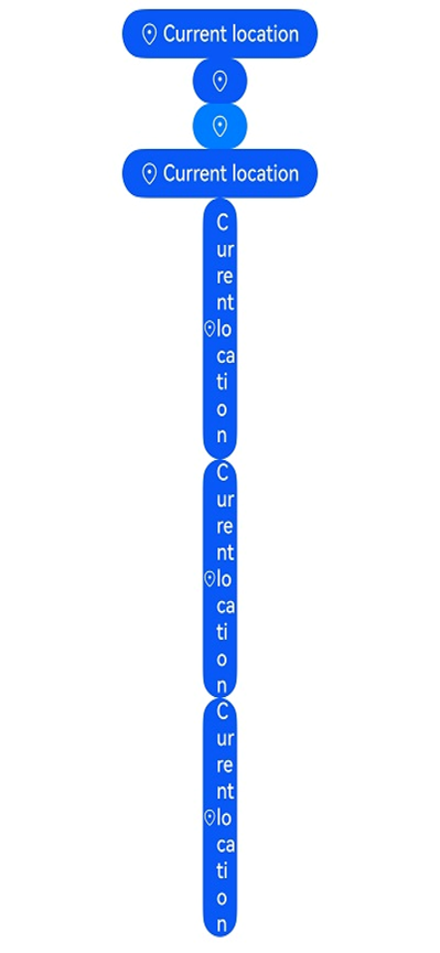
Example
// xxx.ets
import { BusinessError } from '@kit.BasicServicesKit';

@Entry
@Component
struct Index {
  handleLocationButtonClick: LocationButtonCallback =
    (event: ClickEvent, result: LocationButtonOnClickResult, error: BusinessError<void>) => {
      if (result == LocationButtonOnClickResult.SUCCESS) {
        console.info("success");
      } else {
        console.info("errCode: " + error.code);
        console.info("errMessage: " + error.message);
      }
    };

  build() {
    Row() {
      Column({ space: 10 }) {
        // Create a default button with an icon, text, and background.
        LocationButton().onClick(this.handleLocationButtonClick)
        // Whether an element is contained depends on whether the parameter corresponding to the element is specified. If buttonType is not passed in, the button uses the ButtonType.Capsule settings.
        LocationButton({ icon: LocationIconStyle.LINES })
        // Create a button with only an icon and background. If the alpha value of the most significant eight bits of the background color is less than 0x1A, the system forcibly adjusts the alpha value to 0xFF.
        LocationButton({ icon: LocationIconStyle.LINES, buttonType: ButtonType.Capsule })
          .backgroundColor(0x10007dff)
        // Create a button with an icon, text, and background. If the alpha value of the most significant eight bits of the background color is less than 0x1A, the system forcibly adjusts the alpha value to 0xFF.
        LocationButton({
          icon: LocationIconStyle.LINES,
          text: LocationDescription.CURRENT_LOCATION,
          buttonType: ButtonType.Capsule
        })
        // Create a button with an icon, text, and background. If the set width is less than the minimum allowed, the button's text will wrap to guarantee full text display.
        LocationButton({
          icon: LocationIconStyle.LINES,
          text: LocationDescription.CURRENT_LOCATION,
          buttonType: ButtonType.Capsule
        })
          .fontSize(16)
          .width(30)
        // Create a button with an icon, text, and background. If the set width is less than the minimum allowed, the button's text will wrap to guarantee full text display.
        LocationButton({
          icon: LocationIconStyle.LINES,
          text: LocationDescription.CURRENT_LOCATION,
          buttonType: ButtonType.Capsule
        })
          .fontSize(16)
          .size({ width: 30, height: 30 })
        // Create a button with an icon, text, and background. If the set width is less than the minimum allowed, the button's text will wrap to guarantee full text display.
        LocationButton({
          icon: LocationIconStyle.LINES,
          text: LocationDescription.CURRENT_LOCATION,
          buttonType: ButtonType.Capsule
        })
          .fontSize(16)
          .constraintSize({
            minWidth: 0,
            maxWidth: 30,
            minHeight: 0,
            maxHeight: 30
          })
      }.width('100%')
    }.height('100%')
  }
}