Popup
The Popup component is used to display popups in a specific style.
NOTE
This component is supported since API version 11. Updates will be marked with a superscript to indicate their earliest API version.
Use this component with the custom popup features in popup control for best results.
Modules to Import
import { Popup, PopupOptions, PopupTextOptions, PopupButtonOptions, PopupIconOptions } from '@kit.ArkUI';
Child Components
Not supported
Popup
Popup(options: PopupOptions): void
Decorator: @Builder
Atomic service API: This API can be used in atomic services since API version 12.
System capability: SystemCapability.ArkUI.ArkUI.Full
Parameters
| Name | Type | Mandatory | Description |
|---|---|---|---|
| options | PopupOptions | Yes | Parameters of the popup. |
PopupOptions
Defines the style parameters of the popup.
System capability: SystemCapability.ArkUI.ArkUI.Full
| Name | Type | Mandatory | Description |
|---|---|---|---|
| icon | PopupIconOptions | No | Icon of the popup. NOTE The icon is not displayed when size is set to an invalid value or 0. Atomic service API: This API can be used in atomic services since API version 12. |
| title | PopupTextOptions | No | Title of the popup. Atomic service API: This API can be used in atomic services since API version 12. |
| message | PopupTextOptions | Yes | Content of the popup. NOTE fontWeight is not available for messages. Atomic service API: This API can be used in atomic services since API version 12. |
| showClose | boolean |Resource | No | Whether to show the close button. Default value: true Atomic service API: This API can be used in atomic services since API version 12. |
| onClose | () => void | No | Callback for the popup close button. Atomic service API: This API can be used in atomic services since API version 12. |
| buttons | [PopupButtonOptions?,PopupButtonOptions?] | No | Buttons of the popup. A maximum of two buttons can be set. Atomic service API: This API can be used in atomic services since API version 12. |
| direction12+ | Direction | No | Layout direction. Default value: Direction.Auto Atomic service API: This API can be used in atomic services since API version 12. |
| maxWidth18+ | Dimension | No | Maximum width of the popup. This API allows you to display the popup with a custom width. Default value: 400 vp Atomic service API: This API can be used in atomic services since API version 18. |
PopupTextOptions
Defines the text parameters of the popup.
Atomic service API: This API can be used in atomic services since API version 12.
System capability: SystemCapability.ArkUI.ArkUI.Full
| Name | Type | Mandatory | Description |
|---|---|---|---|
| text | ResourceStr | Yes | Text content. |
| fontSize | number |string |Resource | No | Text font size. Default value: $r('sys.float.ohos_id_text_size_body2') The string value must be convertible to a number (for example, '10') or include a length unit (for example, '10px'); percentage-based strings are not supported. Value range of number values: (0, +∞) |
| fontColor | ResourceColor | No | Text font color. Default value: $r('sys.color.ohos_id_color_text_secondary') |
| fontWeight | number |FontWeight |string | No | Text font weight. For the number type, the value ranges from 100 to 900, at an interval of 100. A larger value indicates a heavier font weight. The default value is 400. For the string type, only strings of the number type are supported, for example, "400", "bold", "bolder", "lighter", "regular", and "medium", which correspond to the enumerated values in FontWeight. Default value: FontWeight.Regular |
PopupButtonOptions
Defines the button attributes and events.
Atomic service API: This API can be used in atomic services since API version 12.
System capability: SystemCapability.ArkUI.ArkUI.Full
| Name | Type | Mandatory | Description |
|---|---|---|---|
| text | ResourceStr | Yes | Text of the button. |
| action | () => void | No | Click callback of the button. |
| fontSize | number |string |Resource | No | Font size of the button text. Default value: $r('sys.float.ohos_id_text_size_button2') |
| fontColor | ResourceColor | No | Font color of the button text. Default value: $r('sys.color.ohos_id_color_text_primary_activated') |
PopupIconOptions
Defines the attributes of the icon (in the upper left corner).
Atomic service API: This API can be used in atomic services since API version 12.
System capability: SystemCapability.ArkUI.ArkUI.Full
| Name | Type | Mandatory | Description |
|---|---|---|---|
| image | ResourceStr | Yes | Icon content. |
| width | Dimension | No | Icon width. Default value: 32VP |
| height | Dimension | No | Icon height. Default value: 32VP |
| fillColor | ResourceColor | No | Icon fill color. NOTE This property applies only to an SVG image. |
| borderRadius | Length |BorderRadiuses | No | Rounded corner of the icon. Default value: $r('sys.float.ohos_id_corner_radius_default_s') |
Example
Example 1: Setting the Popup Style
This example demonstrates how to customize the style of a popup by configuring PopupIconOptions, PopupTextOptions, and PopupButtonOptions.
// xxx.ets
import { Popup, PopupTextOptions, PopupButtonOptions, PopupIconOptions } from '@kit.ArkUI';

@Entry
@Component
struct PopupExample {

  build() {
    Row() {
      // Define a popup.
      Popup({
        // Set the icon through PopupIconOptions.
        icon: {
          image: $r('app.media.icon'),
          width:32,
          height:32,
          fillColor:Color.White,
          borderRadius: 16
        } as PopupIconOptions,
        // Set the text through PopupTextOptions.
        title: {
          text: 'This is a popup with PopupOptions',
          fontSize: 20,
          fontColor: Color.Black,
          fontWeight: FontWeight.Normal
        } as PopupTextOptions,
        // Set the text through PopupTextOptions.
        message: {
          text: 'This is the message',
          fontSize: 15,
          fontColor: Color.Black
        } as PopupTextOptions,
        showClose: false,
        onClose: () => {
          console.info('close Button click')
        },
        // Set the button through PopupButtonOptions.
        buttons: [{
          text: 'confirm',
          action: () => {
            console.info('confirm button click')
          },
          fontSize: 15,
          fontColor: Color.Black,
        },
          {
            text: 'cancel',
            action: () => {
              console.info('cancel button click')
            },
            fontSize: 15,
            fontColor: Color.Black
          },] as [PopupButtonOptions?, PopupButtonOptions?]
      })
    }
    .width(300)
    .height(200)
    .borderWidth(2)
    .justifyContent(FlexAlign.Center)
  }
}

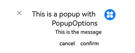
Example 2: Implementing a Mirror Effect
This example shows how to achieve a mirror effect for a popup by configuring direction.
// xxx.ets
import { Popup, PopupTextOptions, PopupButtonOptions, PopupIconOptions } from '@kit.ArkUI'

@Entry
@Component
struct PopupPage {
  @State currentDirection: Direction = Direction.Rtl

  build() {
    Column() {
      // Define a popup.
      Popup({
        // Set the icon through PopupIconOptions.
        direction: this.currentDirection,
        icon: {
          image: $r('app.media.icon'),
          width: 32,
          height: 32,
          fillColor: Color.White,
          borderRadius: 16,
        } as PopupIconOptions,
        // Set the text through PopupTextOptions.
        title: {
          text: 'This is a popup with PopupOptions',
          fontSize: 20,
          fontColor: Color.Black,
          fontWeight: FontWeight.Normal,

        } as PopupTextOptions,
        // Set the text through PopupTextOptions.
        message: {
          text: 'This is the message',
          fontSize: 15,
          fontColor: Color.Black,
        } as PopupTextOptions,
        showClose: true,
        onClose: () => {
          console.info('close Button click')
        },
        // Set the button through PopupButtonOptions.
        buttons: [{
          text: 'confirm',
          action: () => {
            console.info('confirm button click')
          },
          fontSize: 15,
          fontColor: Color.Black,

        },
          {
            text: 'cancel',
            action: () => {
              console.info('cancel button click')
            },
            fontSize: 15,
            fontColor: Color.Black,
          },] as [PopupButtonOptions?, PopupButtonOptions?],
      })

    }
    .justifyContent(FlexAlign.Center)
    .width('100%')
    .height('100%')
  }
}
Example 3: Setting the Custom Width
This example demonstrates how to set the custom width for a popup using maxWidth.
// xxx.ets
import { Popup, PopupTextOptions, PopupButtonOptions, PopupIconOptions } from '@kit.ArkUI'

@Entry
@Component
struct PopupPage {
  @State currentDirection: Direction = Direction.Rtl

  build() {
     Row() {
       // Define a popup.
       Popup({
         // Set the custom width.
         maxWidth:'50%',
         // Set the icon through PopupIconOptions.
         icon: {
           image: $r('app.media.startIcon'),
           width: 32,
           height: 32,
           fillColor: Color.White,
           borderRadius: 16,
         } as PopupIconOptions,
         // Set the text through PopupTextOptions.
         message: {
           text: 'This is the message. This is the message. This is the message. This is the message.',
           fontSize: 15,
           fontColor: Color.Black
         } as PopupTextOptions,
         showClose: false,
         onClose: () => {
           console.info('close Button click')
         },
         // Set the button through PopupButtonOptions.
         buttons: [{
           text: 'OK',
           action: () => {
             console.info('confirm button click')
           },
           fontSize: 15,
           fontColor: Color.Black,
         },
           {
             text: 'Cancel',
             action: () => {
               console.info('cancel button click')
             },
             fontSize: 15,
             fontColor: Color.Black
           },] as [PopupButtonOptions?, PopupButtonOptions?]
       })
     }
     .width(400)
     .height(200)
     .borderWidth(2)
     .justifyContent(FlexAlign.Center)
   }
}
