swiper
NOTE
This component is supported since API version 4. Updates will be marked with a superscript to indicate their earliest API version.
The <swiper> component provides a container that allows users to switch among child components using swipe gestures.
Required Permissions
None
Child Components
Supported
Attributes
In addition to the universal attributes, the following attributes are supported.
| Name | Type | Default Value | Mandatory | Description |
|---|---|---|---|---|
| index | number | 0 | No | Index of the child component currently displayed in the container. |
| autoplay | boolean | false | No | Whether to enable autoplay for child component switching. If this attribute is true, the indicator does not take effect5+. |
| interval | number | 3000 | No | Autoplay interval, in milliseconds, when autoplay is enabled. |
| indicator | boolean | true | No | Whether to enable the indicator. The default value is true. |
| digital5+ | boolean | false | No | Whether to enable the digital indicator. The default value is false. The digital indicator takes effect only when indicator is set to true. |
| indicatordisabled5+ | boolean | false | No | Whether gesture operations are disabled on the indicator. If this attribute is set to true, the indicator does not respond to clicking or dragging operations. |
| loop | boolean | true | No | Whether to enable looping. |
| duration | number | - | No | Duration of the autoplay for child component switching. |
| vertical | boolean | false | No | Whether the swipe gesture is performed vertically. A vertical swipe uses the vertical indicator. |
| cachedsize7+ | number | -1 | No | Minimum number of cached items during delayed loading of the <swiper> component. The value -1 indicates that all content is cached. |
| scrolleffect7+ | string | spring | No | Scroll effect. The options are as follows: - spring: Similar to the physical dynamic effect of a spring. When the scrollbar reaches the edge, it can continue to scroll for a distance based on the initial speed or a touch event. It rebounds after being released. - fade: Similar to the physical dynamic effect of fade. When the scrollbar reaches the edge, a wave shape fades. The fade changes according to the speed and scrolling distance. - none: No effect when the scrollbar reaches the edge. This attribute is valid only when loop is set to false. |
Styles
In addition to the universal styles, the following styles are supported.
| Name | Type | Default Value | Mandatory | Description |
|---|---|---|---|---|
| indicator-color | <color> | - | No | Fill color of the indicator. |
| indicator-selected-color | <color> | #ff007dff | No | Color of the currently selected indicator. |
| indicator-size | <length> | 4px | No | Diameter of the indicator. |
| indicator-top|left|right|bottom | <length> |<percentage> | - | No | Relative position of the indicator in the swiper. |
| next-margin7+ | <length> |<percentage> | - | No | Next margin, used to reveal a small part of the next item. |
| previous-margin7+ | <length> |<percentage> | - | No | Previous margin, used to reveal a small part of the previous item. |
Events
In addition to the universal events, the following events are supported.
| Name | Parameter | Description |
|---|---|---|
| change | { index: currentIndex } | Triggered when the index of the currently displayed component changes. |
| rotation | { value: rotationValue } | Triggered when the crown of the wearable rotates. |
| animationfinish7+ | - | Triggered when the animation is finished. |
Methods
In addition to the universal methods, the following methods are supported.
| Name | Parameter | Description |
|---|---|---|
| swipeTo | { index: number(specificLocation) } | Scrolls the child component to the position at the specified index. |
| showNext | - | Shows the next child component. |
| showPrevious | - | Shows the previous child component. |
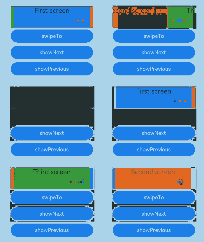
Example
<!-- xxx.hml -->
<div class="container">
  <swiper class="swiper" id="swiper" index="0" indicator="true" loop="true" digital="false" cachedsize="-1"
    scrolleffect="spring">
    <div class = "swiperContent1" >
      <text class = "text">First screen</text>
    </div>
    <div class = "swiperContent2">
      <text class = "text">Second screen</text>
    </div>
    <div class = "swiperContent3">
      <text class = "text">Third screen</text>
    </div>
  </swiper>
  <input class="button" type="button" value="swipeTo" onclick="swipeTo"></input>
  <input class="button" type="button" value="showNext" onclick="showNext"></input>
  <input class="button" type="button" value="showPrevious" onclick="showPrevious"></input>
</div>
/* xxx.css */
.container {
  flex-direction: column;
  width: 100%;
  height: 100%;
  align-items: center;
}
.swiper {
  flex-direction: column;
  align-content: center;
  align-items: center;
  width: 70%;
  height: 130px;
  border: 1px solid #000000;
  indicator-color: #cf2411;
  indicator-size: 14px;
  indicator-bottom: 20px;
  indicator-right: 30px;
  margin-top: 100px;
  next-margin:20px;
  previous-margin:20px;
}
.swiperContent1{
  height: 100%;
  width: 100%;
  justify-content: center;
  background-color: #007dff;
}
.swiperContent2{
  height: 100%;
  width: 100%;
  justify-content: center;
  background-color: #ff7500;
}
.swiperContent3{
  height: 100%;
  width: 100%;
  justify-content: center;
  background-color: #41ba41;
}
.button {
  width: 70%;
  margin: 10px;
}
.text {
  font-size: 40px;
}
// xxx.js
export default {
  swipeTo() {
    this.$element('swiper').swipeTo({index: 2});
  },
  showNext() {
    this.$element('swiper').showNext();
  },
  showPrevious() {
    this.$element('swiper').showPrevious();
  }
}
你可能感兴趣的鸿蒙文章
harmony 鸿蒙JavaScript-compatible Web-like Development Paradigm (ArkUI.Full)