image-animator
NOTE
This component is supported since API version 4. Updates will be marked with a superscript to indicate their earliest API version.
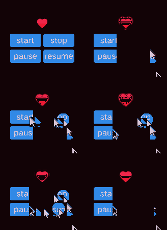
The <image-animator> component is used to provide an image frame animator.
Child Components
Not supported
Attributes
In addition to the universal attributes, the following attributes are supported.
| Name | Type | Default Value | Mandatory | Description |
|---|---|---|---|---|
| images | Array<ImageFrame> | - | Yes | Image frame information. The frame information includes the image path, size, and location. The supported image formats include PNG and JPG. Set this attribute using data binding. - Reference image resources in the HML file: images = {{images}}. - Declare the corresponding variables in the JS file: images: [{src: "/common/heart-rate01.png",duration:"100"}] Since API version 6,the duration (in milliseconds) per image frame can be set. |
| predecode6+ | number | 0 | No | Whether to enable pre-decoding. The default value 0 indicates that pre-decoding is disabled. The value 2 indicates that two images following the currently playing frame will be cached in advance to improve performance. |
| iteration | number |string | infinite | No | Number of times that the frame animation is played. number indicates a fixed number of playback operations, and infinite indicates an unlimited number of playback operations. |
| reverse | boolean | false | No | Playback sequence. The value false indicates that images are played from the first one to the last one, and true indicates that images are played from the last one to the first one. |
| fixedsize | boolean | true | No | Whether the image size is the same as the component size. true: The image size is the same as the component size. In this case, the width, height, top, and left attributes of the image are invalid. false: The width, height, top, and left attributes of each image must be set separately. |
| duration | string | - | Yes | Single video playback duration. The unit can be s (standing for seconds) or ms. The default unit is ms. If the value is 0, no image is played. The value change takes effect only at the start of the next cycle. If image-specific durations have been set, the settings of this attribute do not take effect. |
| fillmode5+ | string | forwards | No | Status of the frame animation after its playback is complete. Available values are as follows: - none: Restores to the initial status. - forwards: Retains the ending status defined for the last key frame. |
Table 1 ImageFrame
| Name | Type | Default Value | Mandatory | Description |
|---|---|---|---|---|
| src | <uri> | - | Yes | Image path. The image format can be SVG, PNG, JPG, or HEIF. |
| width | <length> | 0 | No | Image width. |
| height | <length> | 0 | No | Image height. |
| top | <length> | 0 | No | Vertical coordinate of the image relative to the upper left corner of the component. |
| left | <length> | 0 | No | Horizontal coordinate of the image relative to the upper left corner of the component. |
| duration6+ | number | - | No | Playback duration of each image frame, in milliseconds. |
Styles
The universal styles are supported.
Events
In addition to the universal events, the following events are supported.
| Name | Parameter | Description |
|---|---|---|
| start | - | Triggered when the frame animation starts. |
| pause | - | Triggered when the frame animation pauses. |
| stop | - | Triggered when the frame animation stops. |
| resume | - | Triggered when the frame animation resumes. |
Methods
In addition to the universal methods, the following methods are supported.
| Name | Parameter | Description |
|---|---|---|
| start | - | Starts to play the frame animation of an image. If this method is called again, the playback starts from the first frame. |
| pause | - | Pauses the frame animation playback of an image. |
| stop | - | Stops the frame animation playback of an image. |
| resume | - | Resumes the frame animation playback of an image. |
| getState | - | Obtains the playback state. Available values are as follows: - playing - paused - stopped |
Example
<!-- xxx.hml -->
<div class="container">
  <image-animator class="animator" ref="animator" images="{{frames}}" duration="1s" />
  <div class="btn-box">
    <input class="btn" type="button" value="start" @click="handleStart" />
    <input class="btn" type="button" value="stop" @click="handleStop" />
    <input class="btn" type="button" value="pause" @click="handlePause" />
    <input class="btn" type="button" value="resume" @click="handleResume" />
  </div>
</div>
/* xxx.css */
.container {
  flex-direction: column;
  justify-content: center;
  align-items: center;
  left: 0px;
  top: 0px;
  width: 454px;
  height: 454px;
}
.animator {
  width: 70px;
  height: 70px;
}
.btn-box {
  width: 264px;
  height: 120px;
  flex-wrap: wrap;
  justify-content: space-around;
  align-items: center;
}
.btn {
  border-radius: 8px;
  width: 120px;
  margin-top: 8px;
}
//xxx.js
export default {
  data: {
    frames: [
      {
        src: "/common/asserts/heart78.png",
      },
      {
        src: "/common/asserts/heart79.png",
      },
      {
        src: "/common/asserts/heart80.png",
      },
      {
        src: "/common/asserts/heart81.png",
      },
      {
        src: "/common/asserts/heart82.png",
      },
      {
        src: "/common/asserts/heart83.png",
      },
      {
        src: "/common/asserts/heart84.png",
      },
      {
        src: "/common/asserts/heart85.png",
      },
      {
        src: "/common/asserts/heart86.png",
      },
      {
        src: "/common/asserts/heart87.png",
      },
      {
        src: "/common/asserts/heart88.png",
      },
      {
        src: "/common/asserts/heart89.png",
      },
      {
        src: "/common/asserts/heart90.png",
      },
      {
        src: "/common/asserts/heart91.png",
      },
      {
        src: "/common/asserts/heart92.png",
      },
      {
        src: "/common/asserts/heart93.png",
      },
      {
        src: "/common/asserts/heart94.png",
      },
      {
        src: "/common/asserts/heart95.png",
      },
      {
        src: "/common/asserts/heart96.png",
      },
    ],
  },
  handleStart() {
    this.$refs.animator.start();
  },
  handlePause() {
    this.$refs.animator.pause();
  },
  handleResume() {
    this.$refs.animator.resume();
  },
  handleStop() {
    this.$refs.animator.stop();
  },
};
你可能感兴趣的鸿蒙文章
harmony 鸿蒙JavaScript-compatible Web-like Development Paradigm (ArkUI.Full)