Rating
The Rating component provides a rating bar.
NOTE
This component is supported since API version 7. Updates will be marked with a superscript to indicate their earliest API version.
Child Components
Not supported
APIs
Rating(options?: RatingOptions)
Widget capability: This API can be used in ArkTS widgets since API version 9.
Atomic service API: This API can be used in atomic services since API version 11.
System capability: SystemCapability.ArkUI.ArkUI.Full
Parameters
| Name | Type | Mandatory | Description |
|---|---|---|---|
| options | RatingOptions | No | Rating bar options. |
Attributes
stars
stars(value: number)
Sets the total number of ratings (stars). If the value set is less than or equal to 0, the default value is used.
Widget capability: This API can be used in ArkTS widgets since API version 9.
Atomic service API: This API can be used in atomic services since API version 11.
System capability: SystemCapability.ArkUI.ArkUI.Full
Parameters
| Name | Type | Mandatory | Description |
|---|---|---|---|
| value | number | Yes | Total number of ratings. Default value: 5 |
stars18+
stars(starCount: Optional<number>)
Sets the total number of ratings (stars). If the value set is less than or equal to 0, the default value is used. Compared to stars, this API supports the undefined type for the starCount parameter.
Widget capability: This API can be used in ArkTS widgets since API version 18.
Atomic service API: This API can be used in atomic services since API version 18.
System capability: SystemCapability.ArkUI.ArkUI.Full
Parameters
| Name | Type | Mandatory | Description |
|---|---|---|---|
| starCount | Optional<number> | Yes | Total number of ratings. If starCount is set to undefined, the default value 5 is used. |
stepSize
stepSize(value: number)
Sets the step for rating. A value less than 0.1 evaluates to the default value.
Widget capability: This API can be used in ArkTS widgets since API version 9.
Atomic service API: This API can be used in atomic services since API version 11.
System capability: SystemCapability.ArkUI.ArkUI.Full
Parameters
| Name | Type | Mandatory | Description |
|---|---|---|---|
| value | number | Yes | Step for rating. Default value: 0.5 Value range: [0.1, stars] |
stepSize18+
stepSize(size: Optional<number>)
Sets the step for rating. A value less than 0.1 evaluates to the default value. Compared to stepSize, this API supports the undefined type for the size parameter.
Widget capability: This API can be used in ArkTS widgets since API version 18.
Atomic service API: This API can be used in atomic services since API version 18.
System capability: SystemCapability.ArkUI.ArkUI.Full
Parameters
| Name | Type | Mandatory | Description |
|---|---|---|---|
| size | Optional<number> | Yes | Step for rating. If size is set to undefined, the default value 0.5 is used. Value range: [0.1, stars] |
starStyle
starStyle(options: StarStyleOptions)
Sets the star style. For details about the supported image types, see Image.
Local and online images are supported, but not PixelMap and Resource objects.
By default, the image is loaded in asynchronous mode. Synchronous loading is not supported.
Widget capability: This API can be used in ArkTS widgets since API version 9.
Atomic service API: This API can be used in atomic services since API version 11.
System capability: SystemCapability.ArkUI.ArkUI.Full
Parameters
| Name | Type | Mandatory | Description |
|---|---|---|---|
| options | StarStyleOptions | Yes | Star style. NOTE If the path specified for backgroundUri, foregroundUri, or secondaryUri is incorrect, no image is displayed. If backgroundUri or foregroundUri is set to undefined or an empty string, the Rating component loads the default star image source. If secondaryUri is set to undefined or an empty string or is not set, backgroundUri is prioritized, which is equivalent to where only foregroundUri and backgroundUri are set. |
starStyle18+
starStyle(options: Optional<StarStyleOptions>)
Sets the star style. For details about the supported image types, see Image.
Local and online images are supported, but not PixelMap and Resource objects.
By default, the image is loaded in asynchronous mode. Synchronous loading is not supported.
Compared to starStyle, this API supports the undefined type for the options parameter.
Widget capability: This API can be used in ArkTS widgets since API version 18.
Atomic service API: This API can be used in atomic services since API version 18.
System capability: SystemCapability.ArkUI.ArkUI.Full
Parameters
| Name | Type | Mandatory | Description |
|---|---|---|---|
| options | Optional<StarStyleOptions> | Yes | Star style. NOTE If the path specified for backgroundUri, foregroundUri, or secondaryUri is incorrect, no image is displayed. If backgroundUri or foregroundUri is set to undefined or an empty string, the Rating component loads the default star image source. If secondaryUri is set to undefined or an empty string or is not set, backgroundUri is prioritized, which is equivalent to where only foregroundUri and backgroundUri are set. |
NOTE
The drawing area of each rating image is [width/stars, height], wherein width and height indicate the width and height of the Rating component, respectively.
To specify the drawing area as a square, you are advised to customize the width and height in this format: [height * stars, height], width = height * stars.
contentModifier12+
contentModifier(modifier: ContentModifier<RatingConfiguration>)
Creates a content modifier.
Atomic service API: This API can be used in atomic services since API version 12.
System capability: SystemCapability.ArkUI.ArkUI.Full
Parameters
| Name | Type | Mandatory | Description |
|---|---|---|---|
| modifier | ContentModifier<RatingConfiguration> | Yes | Content modifier to apply to the current component. modifier: content modifier. You need a custom class to implement the ContentModifier API. |
contentModifier18+
contentModifier(modifier: Optional<ContentModifier<RatingConfiguration>>)
Creates a content modifier. Compared to contentModifier, this API supports the undefined type for the modifier parameter.
Atomic service API: This API can be used in atomic services since API version 18.
System capability: SystemCapability.ArkUI.ArkUI.Full
Parameters
| Name | Type | Mandatory | Description |
|---|---|---|---|
| modifier | Optional<ContentModifier<RatingConfiguration>> | Yes | Content modifier to apply to the current component. modifier: content modifier. You need a custom class to implement the ContentModifier API. If modifier is set to undefined, no content modifier is used. |
Events
onChange
onChange(callback:(value: number) => void)
Triggered when the rating value changes.
Widget capability: This API can be used in ArkTS widgets since API version 9.
Atomic service API: This API can be used in atomic services since API version 11.
System capability: SystemCapability.ArkUI.ArkUI.Full
Parameters
| Name | Type | Mandatory | Description |
|---|---|---|---|
| value | number | Yes | Rating value. |
onChange18+
onChange(callback:Optional<OnRatingChangeCallback>)
Triggered when the rating value changes. Compared to onChange, this API supports the undefined type for the callback parameter.
Widget capability: This API can be used in ArkTS widgets since API version 18.
Atomic service API: This API can be used in atomic services since API version 18.
System capability: SystemCapability.ArkUI.ArkUI.Full
Parameters
| Name | Type | Mandatory | Description |
|---|---|---|---|
| callback | Optional<OnRatingChangeCallback> | Yes | Triggered when the rating value changes. If callback is set to undefined, the callback function is not used. |
OnRatingChangeCallback18+
type OnRatingChangeCallback = (rating: number) => void
Triggered when the rating value changes.
Atomic service API: This API can be used in atomic services since API version 18.
System capability: SystemCapability.ArkUI.ArkUI.Full
Parameters
| Name | Type | Mandatory | Description |
|---|---|---|---|
| rating | number | Yes | Rating value. |
Sequential Keyboard Navigation Specifications
| Key | Description |
|---|---|
| Tab | Switch the focus between components. |
| Left and right arrow keys | Increase or decrease the rating on preview at the specified step, without changing the actual rating. |
| Home | Move the focus to the first star, without changing the actual rating. |
| End | Move the focus to the last star, without changing the actual rating. |
| Space/Enter | Submit the rating result based on the current rating. |
RatingConfiguration12+
You need a custom class to implement the ContentModifier API.
Atomic service API: This API can be used in atomic services since API version 12.
System capability: SystemCapability.ArkUI.ArkUI.Full
| Name | Type | Read Only | Optional | Description |
|---|---|---|---|---|
| rating | number | No | No | Value to rate. Default value: 0 Value range: [0, stars] Values less than 0 are treated as 0, and values greater than the value of stars are treated as the value of stars. This parameter supports two-way binding through $$. This parameter supports two-way binding through !!. |
| indicator | boolean | No | No | Whether the rating bar is used as an indicator. true: The rating bar is used as an indicator. false: The rating bar is not used as an indicator. Default value: false |
| stars | number | No | No | Total number of ratings. Default value: 5 |
| stepSize | number | No | No | Step of an operation. Default value: 0.5 |
| triggerChange | Callback<number> | No | No | Callback triggered when the rating value changes. |
RatingOptions18+
Widget capability: This API can be used in ArkTS widgets since API version 18.
Atomic service API: This API can be used in atomic services since API version 18.
System capability: SystemCapability.ArkUI.ArkUI.Full
| Name | Type | Mandatory | Description |
|---|---|---|---|
| rating7+ | number | Yes | Value to rate. Default value: 0 Value range: [0, stars] Values less than 0 are treated as 0, and values greater than the value of stars are treated as the value of stars. This parameter supports two-way binding through $$. Widget capability: This API can be used in ArkTS widgets since API version 9. Atomic service API: This API can be used in atomic services since API version 11. |
| indicator7+ | boolean | No | Whether the component is used only as an indicator. Default value: false NOTE When indicator is set to true, the default component height is 12.0 vp, and the component width is calculated as follows: Height x Value of stars. When indicator is set to false, the default component height is 28.0 vp, and the component width is calculated as follows: Height x Value of stars. Widget capability: This API can be used in ArkTS widgets since API version 9. Atomic service API: This API can be used in atomic services since API version 11. |
StarStyleOptions18+
Widget capability: This API can be used in ArkTS widgets since API version 18.
Atomic service API: This API can be used in atomic services since API version 18.
System capability: SystemCapability.ArkUI.ArkUI.Full
| Name | Type | Mandatory | Description |
|---|---|---|---|
| backgroundUri7+ | string | Yes | Image path for the unselected star. You can use the default system image or a custom image. Widget capability: This API can be used in ArkTS widgets since API version 9. Atomic service API: This API can be used in atomic services since API version 11. |
| foregroundUri7+ | string | Yes | Image path for the selected star. You can use the default system image or a custom image. Widget capability: This API can be used in ArkTS widgets since API version 9. Atomic service API: This API can be used in atomic services since API version 11. |
| secondaryUri7+ | string | No | Image path for the partially selected star. You can use the default system image or a custom image. Widget capability: This API can be used in ArkTS widgets since API version 9. Atomic service API: This API can be used in atomic services since API version 11. |
Example
Example 1: Setting the Default Rating Style
This example demonstrates how to set the default star rating style.
// xxx.ets
@Entry
@Component
struct RatingExample {
  @State rating: number = 3.5

  build() {
    Column() {
      Column() {
        Rating({ rating: this.rating, indicator: false })
          .stars(5)
          .stepSize(0.5)
          .margin({ top: 24 })
          .onChange((value: number) => {
            this.rating = value
          })
        Text('current score is ' + this.rating)
          .fontSize(16)
          .fontColor('rgba(24,36,49,0.60)')
          .margin({ top: 16 })
      }.width(360).height(113).backgroundColor('#FFFFFF').margin({ top: 68 })

      Row() {
        Image('common/testImage.jpg')
          .width(40)
          .height(40)
          .borderRadius(20)
          .margin({ left: 24 })
        Column() {
          Text('Yue')
            .fontSize(16)
            .fontColor('#182431')
            .fontWeight(500)
          Row() {
            Rating({ rating: 3.5, indicator: false }).margin({ top: 1, right: 8 })
            Text('2021/06/02')
              .fontSize(10)
              .fontColor('#182431')
          }
        }.margin({ left: 12 }).alignItems(HorizontalAlign.Start)

        Text('1st Floor')
          .fontSize(10)
          .fontColor('#182431')
          .position({ x: 295, y: 8 })
      }.width(360).height(56).backgroundColor('#FFFFFF').margin({ top: 64 })
    }.width('100%').height('100%').backgroundColor('#F1F3F5')
  }
}

Example 2: Customizing the Rating Style
This example demonstrates how to configure starStyle to use custom image links for stars.
// xxx.ets
@Entry
@Component
struct RatingExample {
  @State rating: number = 3.5

  build() {
    Column() {
      Rating({ rating: this.rating, indicator: false })
        .stars(5)
        .stepSize(0.5)
        .starStyle({
          backgroundUri: '/common/imag1.png', // The common folder is at the same level as pages.
          foregroundUri: '/common/imag2.png',
          secondaryUri: '/common/imag3.png'
        })
        .margin({ top: 24 })
        .onChange((value: number) => {
          this.rating = value
        })
      Text('current score is ' + this.rating)
        .fontSize(16)
        .fontColor('rgba(24,36,49,0.60)')
        .margin({ top: 16 })
    }.width('100%').height('100%').backgroundColor('#F1F3F5')
  }
}

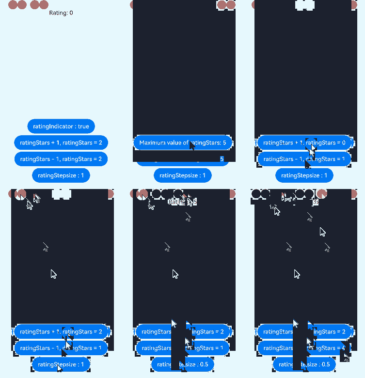
Example 3: Implementing a Custom Rating Bar
This example implements a custom rating bar, with each circle representing 0.5 point. If ratingIndicator is set to true, the rating bar is used only as an indicator, and the rating cannot be changed. if it is set to false, the rating can be changed. ratingStars sets the rating value. ratingStepsize sets the step for rating.
// xxx.ets
class MyRatingStyle implements ContentModifier<RatingConfiguration> {
  name: string = ""
  style: number = 0
  constructor(value1: string, value2: number) {
    this.name = value1
    this.style = value2
  }
  applyContent() : WrappedBuilder<[RatingConfiguration]> {
    return wrapBuilder(buildRating)
  }
}

@Builder function buildRating(config: RatingConfiguration) {
  Column() {
    Row() {
      Circle({ width: 25, height: 25 })
        .fill(config.rating >= 0.4 ? Color.Black : Color.Red)
        .onClick((event: ClickEvent) => {
          if (!config.indicator) {
            if (config.stepSize = 0.5) {
              config.triggerChange(0.5);
              return
            }
            if (config.stepSize = 1) {
              config.triggerChange(1);
              return
            }
          }
        }).visibility(config.stars >= 1 ? Visibility.Visible : Visibility.Hidden)
      Circle({ width: 25, height: 25 })
        .fill(config.rating >= 0.9 ? Color.Black : Color.Red)
        .onClick((event: ClickEvent) => {
          if (!config.indicator) {
            config.triggerChange(1);
          }
        }).visibility(config.stars >= 1 ? Visibility.Visible : Visibility.Hidden)
      Circle({ width: 25, height: 25 })
        .fill(config.rating >= 1.4 ? Color.Black : Color.Red)
        .onClick((event: ClickEvent) => {
          if (!config.indicator) {
            if (config.stepSize = 0.5) {
              config.triggerChange(1.5);
              return
            }
            if (config.stepSize = 1) {
              config.triggerChange(2);
              return
            }
          }
        }).visibility(config.stars >= 2 ? Visibility.Visible : Visibility.Hidden).margin({left:10})
      Circle({ width: 25, height: 25 })
        .fill(config.rating >= 1.9 ? Color.Black : Color.Red)
        .onClick((event: ClickEvent) => {
          if (!config.indicator) {
            config.triggerChange(2);
          }
        }).visibility(config.stars >= 2 ? Visibility.Visible : Visibility.Hidden)
      Circle({ width: 25, height: 25 })
        .fill(config.rating >= 2.4 ? Color.Black : Color.Red)
        .onClick((event: ClickEvent) => {
          if (!config.indicator) {
            if (config.stepSize = 0.5) {
              config.triggerChange(2.5);
              return
            }
            if (config.stepSize = 1) {
              config.triggerChange(3);
              return
            }
          }
        }).visibility(config.stars >= 3 ? Visibility.Visible : Visibility.Hidden).margin({left:10})
      Circle({ width: 25, height: 25 })
        .fill(config.rating >= 2.9 ? Color.Black : Color.Red)
        .onClick((event: ClickEvent) => {
          if (!config.indicator) {
            config.triggerChange(3);
          }
        }).visibility(config.stars >= 3 ? Visibility.Visible : Visibility.Hidden)
      Circle({ width: 25, height: 25 })
        .fill(config.rating >= 3.4 ? Color.Black : Color.Red)
        .onClick((event: ClickEvent) => {
          if (!config.indicator) {
            if (config.stepSize = 0.5) {
              config.triggerChange(3.5);
              return
            }
            if (config.stepSize = 1) {
              config.triggerChange(4);
              return
            }
          }
        }).visibility(config.stars >= 4 ? Visibility.Visible : Visibility.Hidden).margin({left:10})
      Circle({ width: 25, height: 25 })
        .fill(config.rating >= 3.9 ? Color.Black : Color.Red)
        .onClick((event: ClickEvent) => {
          if (!config.indicator) {
            config.triggerChange(4);
          }
        }).visibility(config.stars >= 4 ? Visibility.Visible : Visibility.Hidden)
      Circle({ width: 25, height: 25 })
        .fill(config.rating >= 4.4 ? Color.Black : Color.Red)
        .onClick((event: ClickEvent) => {
          if (!config.indicator) {
            if (config.stepSize = 0.5) {
              config.triggerChange(4.5);
              return
            }
            if (config.stepSize = 1) {
              config.triggerChange(5);
              return
            }
          }
        }).visibility(config.stars >= 5 ? Visibility.Visible : Visibility.Hidden).margin({left:10})
      Circle({ width: 25, height: 25 })
        .fill(config.rating >= 4.9 ? Color.Black : Color.Red)
        .onClick((event: ClickEvent) => {
          if (!config.indicator) {
            config.triggerChange(5);
          }
        }).visibility(config.stars >= 5 ? Visibility.Visible : Visibility.Hidden)
    }
    Text("Rating: "+ config.rating)
  }
}

@Entry
@Component
struct ratingExample {
  @State rating: number = 0;
  @State ratingIndicator: boolean = true;
  @State ratingStars: number = 0;
  @State ratingStepsize: number = 0.5;
  @State ratingEnabled: boolean = true;
  build() {
    Row() {
      Column() {
        Rating({
          rating: 0,
          indicator: this.ratingIndicator
        })
          .stepSize(this.ratingStepsize)
          .stars(this.ratingStars)
          .backgroundColor(Color.Transparent)
          .width('100%')
          .height(50)
          .onChange((value: number) => {
            console.info('Rating change is'+ value);
            this.rating = value
          })
          .contentModifier(new MyRatingStyle("hello", 3))
        Button(this.ratingIndicator ? "ratingIndicator : true" : "ratingIndicator : false")
          .onClick((event) => {
            if (this.ratingIndicator) {
              this.ratingIndicator = false
            } else {
              this.ratingIndicator = true
            }
          }).margin({top : 5})

        Button(this.ratingStars < 5 ? "ratingStars + 1, ratingStars = " + this.ratingStars : "Maximum value of ratingStars: 5")
          .onClick((event) => {
            if (this.ratingStars < 5) {
              this.ratingStars += 1
            }
          }).margin({top : 5})

        Button(this.ratingStars > 0 ? "ratingStars - 1, ratingStars = " + this.ratingStars : "Values less than or equal to 0 are handled as 5")
          .onClick((event) => {
            if (this.ratingStars > 0) {
              this.ratingStars -= 1
            }
          }).margin({top : 5})

        Button(this.ratingStepsize == 0.5 ? "ratingStepsize : 0.5" : "ratingStepsize : 1")
          .onClick((event) => {
            if (this.ratingStepsize == 0.5) {
              this.ratingStepsize = 1
            } else {
              this.ratingStepsize = 0.5
            }
          }).margin({top : 5})
      }
      .width('100%')
      .height('100%')
      .justifyContent(FlexAlign.Center)
    }
    .height('100%')
  }
}