Toggle
The Toggle component provides a clickable element in the check box, button, or switch type.
NOTE
This component is supported since API version 8. Updates will be marked with a superscript to indicate their earliest API version.
Child Components
This component can contain child components only when ToggleType is set to Button.
APIs
Toggle(options: ToggleOptions)
Widget capability: This API can be used in ArkTS widgets since API version 9.
Atomic service API: This API can be used in atomic services since API version 11.
System capability: SystemCapability.ArkUI.ArkUI.Full
Parameters
| Name | Type | Mandatory | Description |
|---|---|---|---|
| options | ToggleOptions | Yes | Options of the toggle. |
ToggleOptions18+
Widget capability: This API can be used in ArkTS widgets since API version 18.
Atomic service API: This API can be used in atomic services since API version 18.
System capability: SystemCapability.ArkUI.ArkUI.Full
| Name | Type | Mandatory | Description |
|---|---|---|---|
| type8+ | ToggleType | Yes | Type of the toggle. Default value: ToggleType.Switch Widget capability: This API can be used in ArkTS widgets since API version 9. Atomic service API: This API can be used in atomic services since API version 11. |
| isOn8+ | boolean | No | Whether the toggle is turned on. The value true means that the toggle is turned on, and false means the opposite. Default value: false This parameter supports two-way binding through $$. This parameter supports two-way binding through the !! syntax. Widget capability: This API can be used in ArkTS widgets since API version 9. Atomic service API: This API can be used in atomic services since API version 11. |
ToggleType
Widget capability: This API can be used in ArkTS widgets since API version 9.
Atomic service API: This API can be used in atomic services since API version 11.
System capability: SystemCapability.ArkUI.ArkUI.Full
| Name | Description |
|---|---|
| Checkbox | Check box type. NOTE Since API version 11, the default style of the Checkbox component is changed from rounded square to circle. The default value of the universal attribute margin is as follows: { top: '14px', right: '14px', bottom: '14px', left: '14px' }. Default size: {width:'20vp', height:'20vp'} |
| Button | Button type. The set string, if any, will be displayed inside the button. The default height is 28 vp, and there is no default width. |
| Switch | Switch type. NOTE The default value of the universal attribute margin is as follows: { top: '6px', right: '14px', bottom: '6px', left: '14px' }. Default size: {width:'36vp', height:'20vp'} |
Attributes
In addition to the universal attributes, the following attributes are supported.
selectedColor
selectedColor(value: ResourceColor)
Sets the background color of the component when it is turned on.
Widget capability: This API can be used in ArkTS widgets since API version 9.
Atomic service API: This API can be used in atomic services since API version 11.
System capability: SystemCapability.ArkUI.ArkUI.Full
Parameters
| Name | Type | Mandatory | Description |
|---|---|---|---|
| value | ResourceColor | Yes | Background color of the component when it is turned on. Default value: When ToggleType is set to Switch, the default value is $r('sys.color.ohos_id_color_component_activated'). When ToggleType is set to Checkbox, the default value is $r('sys.color.ohos_id_color_component_activated'). When ToggleType is set to Button, the default value is $r('sys.color.ohos_id_color_component_activated') with the opacity of $r('sys.color.ohos_id_color_text_highlight_bg'). |
switchPointColor
switchPointColor(color: ResourceColor)
Sets the color of the circular slider when the component is of the Switch type. This attribute is valid only when type is set to ToggleType.Switch.
Widget capability: This API can be used in ArkTS widgets since API version 9.
Atomic service API: This API can be used in atomic services since API version 11.
System capability: SystemCapability.ArkUI.ArkUI.Full
Parameters
| Name | Type | Mandatory | Description |
|---|---|---|---|
| color | ResourceColor | Yes | Color of the circular slider when the component is of the Switch type. Default value: $r('sys.color.ohos_id_color_foreground_contrary') |
switchStyle12+
switchStyle(value: SwitchStyle)
Sets the style for the component of the Switch type. This attribute is valid only when type is set to ToggleType.Switch.
Atomic service API: This API can be used in atomic services since API version 12.
System capability: SystemCapability.ArkUI.ArkUI.Full
Parameters
| Name | Type | Mandatory | Description |
|---|---|---|---|
| value | SwitchStyle | Yes | Style of the component of the Switch type. |
contentModifier12+
contentModifier(modifier: ContentModifier<ToggleConfiguration>)
Creates a content modifier.
Atomic service API: This API can be used in atomic services since API version 12.
System capability: SystemCapability.ArkUI.ArkUI.Full
Parameters
| Name | Type | Mandatory | Description |
|---|---|---|---|
| modifier | ContentModifier<ToggleConfiguration> | Yes | Content modifier to apply to the current component. modifier: content modifier. You need a custom class to implement the ContentModifier API. |
SwitchStyle12+
Atomic service API: This API can be used in atomic services since API version 12.
System capability: SystemCapability.ArkUI.ArkUI.Full
| Name | Type | Mandatory | Description |
|---|---|---|---|
| pointRadius | number | Resource | No | Radius of the circular slider when the component is of the Switch type. The unit is vp. NOTE This parameter cannot be set in percentage. The value specified is used only when it is greater than or equal to 0. If the value is not specified or the specified one is less than 0, the radius is set using the following formula: (Component height (in vp)/2) - (2 vp x Component height (in vp)/20 vp) |
| unselectedColor | ResourceColor | No | Background color of the component when it is of the Switch type and is disabled. Default value: 0x337F7F7F |
| pointColor | ResourceColor | No | Color of the circular slider when the component is of the Switch type. Default value: $r('sys.color.ohos_id_color_foreground_contrary') |
| trackBorderRadius | number | Resource | No | Radius of the slider track border corners when the component is of the Switch type. The unit is vp. NOTE This parameter cannot be set in percentage. If the value specified is less than 0, the radius is set using the default value formula. If the value specified is greater than half of the component height, the latter is used. In other cases, the value specified is used. If the value is not specified or the specified one is less than 0, the radius is set using the default value formula. Default value formula: Component height (in vp)/2 |
Events
In addition to the universal events, the following events are supported.
onChange
onChange(callback: (isOn: boolean) => void)
Triggered when the toggle status changes.
Widget capability: This API can be used in ArkTS widgets since API version 9.
Atomic service API: This API can be used in atomic services since API version 11.
System capability: SystemCapability.ArkUI.ArkUI.Full
Parameters
| Name | Type | Mandatory | Description |
|---|---|---|---|
| isOn | boolean | Yes | Whether the toggle is on. true: The toggle is on. false: The toggle is off. |
ToggleConfiguration12+
You need a custom class to implement the ContentModifier API.
Atomic service API: This API can be used in atomic services since API version 12.
System capability: SystemCapability.ArkUI.ArkUI.Full
| Name | Type | Read-Only | Optional | Description |
|---|---|---|---|---|
| isOn | boolean | No | No | Whether the toggle is turned on. Default value: false The value true means that the toggle is turned on, and false means the opposite. |
| enabled | boolean | No | No | Whether the toggle is enabled. When enabled, the toggle allows state switching. Default value: true The value true means that the toggle is enabled, and false means the opposite. |
| triggerChange | Callback<boolean> | No | No | Callback invoked when the toggle's state changes. Whether the toggle is on. true: The toggle is on. The value true means the state changes from off to on, and false means the state changes from on to off. |
Example
Example 1: Setting the Toggle Style
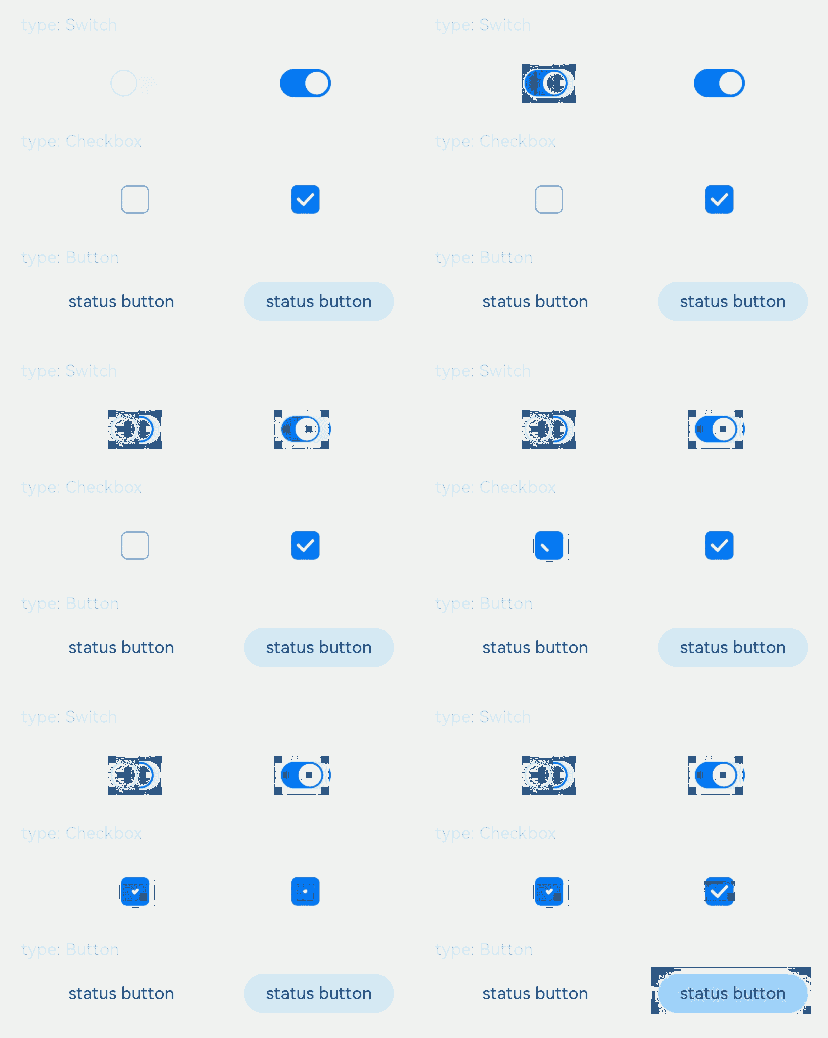
This example demonstrates how to configure the style for different types of toggles (checkbox, switch, and button) using ToggleType.
// xxx.ets
@Entry
@Component
struct ToggleExample {
  build() {
    Column({ space: 10 }) {
      Text('type: Switch').fontSize(12).fontColor(0xcccccc).width('90%')
      Flex({ justifyContent: FlexAlign.SpaceEvenly, alignItems: ItemAlign.Center }) {
        Toggle({ type: ToggleType.Switch, isOn: false })
          .selectedColor('#007DFF')
          .switchPointColor('#FFFFFF')
          .onChange((isOn: boolean) => {
            console.info('Component status:' + isOn);
          })

        Toggle({ type: ToggleType.Switch, isOn: true })
          .selectedColor('#007DFF')
          .switchPointColor('#FFFFFF')
          .onChange((isOn: boolean) => {
            console.info('Component status:' + isOn);
          })
      }

      Text('type: Checkbox').fontSize(12).fontColor(0xcccccc).width('90%')
      Flex({ justifyContent: FlexAlign.SpaceEvenly, alignItems: ItemAlign.Center }) {
        Toggle({ type: ToggleType.Checkbox, isOn: false })
          .size({ width: 20, height: 20 })
          .selectedColor('#007DFF')
          .onChange((isOn: boolean) => {
            console.info('Component status:' + isOn);
          })

        Toggle({ type: ToggleType.Checkbox, isOn: true })
          .size({ width: 20, height: 20 })
          .selectedColor('#007DFF')
          .onChange((isOn: boolean) => {
            console.info('Component status:' + isOn);
          })
      }

      Text('type: Button').fontSize(12).fontColor(0xcccccc).width('90%')
      Flex({ justifyContent: FlexAlign.SpaceEvenly, alignItems: ItemAlign.Center }) {
        Toggle({ type: ToggleType.Button, isOn: false }) {
          Text('status button').fontColor('#182431').fontSize(12)
        }.width(106)
        .selectedColor('rgba(0,125,255,0.20)')
        .onChange((isOn: boolean) => {
          console.info('Component status:' + isOn);
        })

        Toggle({ type: ToggleType.Button, isOn: true }) {
          Text('status button').fontColor('#182431').fontSize(12)
        }.width(106)
        .selectedColor('rgba(0,125,255,0.20)')
        .onChange((isOn: boolean) => {
          console.info('Component status:' + isOn);
        })
      }
    }.width('100%').padding(24)
  }
}
Example 2: Customizing the Toggle Style
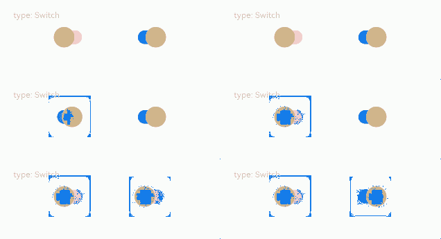
This example implements a toggle of the Switch type with custom settings, including the radius and color of the circular slider, background color in the off state, and radius of the slider track border corners.
// xxx.ets
@Entry
@Component
struct ToggleExample {
  build() {
    Column({ space: 10 }) {
      Text('type: Switch').fontSize(12).fontColor(0xcccccc).width('90%')
      Flex({ justifyContent: FlexAlign.SpaceEvenly, alignItems: ItemAlign.Center }) {
        Toggle({ type: ToggleType.Switch, isOn: false })
          .selectedColor('#007DFF')
          .switchStyle({
            pointRadius: 15,
            trackBorderRadius: 10,
            pointColor: '#D2B48C',
            unselectedColor: Color.Pink })
          .onChange((isOn: boolean) => {
            console.info('Component status:' + isOn);
          })

        Toggle({ type: ToggleType.Switch, isOn: true })
          .selectedColor('#007DFF')
          .switchStyle({
            pointRadius: 15,
            trackBorderRadius: 10,
            pointColor: '#D2B48C',
            unselectedColor: Color.Pink })
          .onChange((isOn: boolean) => {
            console.info('Component status:' + isOn);
          })
      }
    }.width('100%').padding(24)
  }
}
Example 3: Implementing a Custom Toggle Style
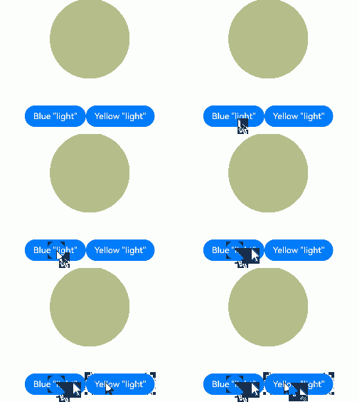
This example implements a toggle in a custom style. When you click the Blue button, the circle background turns blue. When you click the Yellow button, the circle background turns yellow.
// xxx.ets
class MySwitchStyle implements ContentModifier<ToggleConfiguration> {
  selectedColor: Color = Color.White;
  lamp: string = 'string';

  constructor(selectedColor: Color, lamp: string) {
    this.selectedColor = selectedColor;
    this.lamp = lamp;
  }

  applyContent(): WrappedBuilder<[ToggleConfiguration]> {
    return wrapBuilder(buildSwitch);
  }
}

@Builder
function buildSwitch(config: ToggleConfiguration) {
  Column({ space: 50 }) {
    Circle({ width: 150, height: 150 })
      .fill(config.isOn ? (config.contentModifier as MySwitchStyle).selectedColor : Color.Blue)
    Row() {
      Button('Blue ' + JSON.stringify((config.contentModifier as MySwitchStyle).lamp))
        .onClick(() => {
          config.triggerChange(false);
        })
      Button('Yellow ' + JSON.stringify((config.contentModifier as MySwitchStyle).lamp))
        .onClick(() => {
          config.triggerChange(true);
        })
    }
  }
}

@Entry
@Component
struct Index {
  build() {
    Column({ space: 50 }) {
      Toggle({ type: ToggleType.Switch })
        .enabled(true)
        .contentModifier(new MySwitchStyle(Color.Yellow, 'light'))
        .onChange((isOn: boolean) => {
          console.info('Switch Log:' + isOn);
        })
    }.height('100%').width('100%')
  }
}