swiper
The <Swiper> component provides a container that allows users to switch among child components using swipe gestures.
NOTE
The APIs of this module are supported since API version 8. Updates will be marked with a superscript to indicate their earliest API version.
Attributes
In addition to the universal attributes, the following attributes are supported.
| Name | Type | Default Value | Mandatory | Description |
|---|---|---|---|---|
| index | number | 0 | No | Index of the child component currently displayed in the container. |
| indicator | boolean | true | No | Whether to enable the indicator. The default value is true. |
| digital | boolean | false | No | Whether to enable the digital indicator. The default value is false. The digital indicator takes effect only when indicator is set to true. |
| loop | boolean | true | No | Whether to enable looping. |
| duration | number | - | No | Duration of the autoplay for child component switching. |
| vertical | boolean | false | No | Whether the swipe gesture is performed vertically. A vertical swipe uses the vertical indicator. |
Styles
In addition to the universal styles, the following styles are supported.
| Name | Type | Default Value | Mandatory | Description |
|---|---|---|---|---|
| indicator-color | <color> | - | No | Fill color of the indicator. |
| indicator-selected-color | <color> | - | No | Color of the currently selected indicator. |
| indicator-size | <length> | 4px | No | Diameter of the indicator. |
| indicator-top|left|right|bottom | <length> |<percentage> | - | No | Relative position of the indicator in the swiper. |
Events
The universal events are supported.
Example
<!-- xxx.hml -->
<swiper class="container" index="{{index}}">
  <div class="swiper-item primary-item">
    <text>1</text>
  </div>
  <div class="swiper-item warning-item">
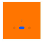
    <text>2</text>
  </div>
  <div class="swiper-item success-item">
    <text>3</text>
  </div>
</swiper>
/* xxx.css */
.container {
  left: 0px;
  top: 0px;
  width: 454px;
  height: 454px;
}
.swiper-item {
  width: 454px;
  height: 454px;
  justify-content: center;
  align-items: center;
}
.primary-item {
  background-color: #007dff;
}
.warning-item {
  background-color: #ff7500;
}
.success-item {
  background-color: #41ba41;
}
{
  "data": {
    "index": 1
  }
}
4 x 4 widget