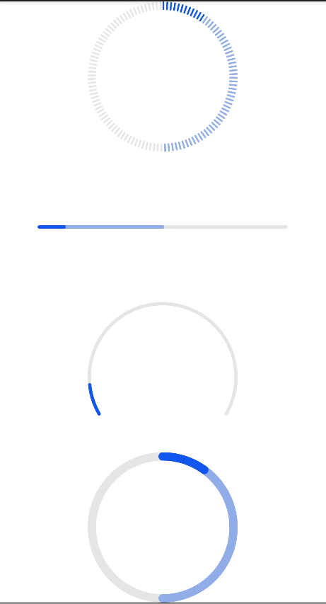
progress
The <Progress> component is used to provide a progress bar that displays the progress of content loading or an operation.
NOTE
The APIs of this module are supported since API version 8. Updates will be marked with a superscript to indicate their earliest API version.
Child Components
Not supported
Attributes
In addition to the universal attributes, the following attributes are supported.
| Name | Type | Default Value | Mandatory | Description |
|---|---|---|---|---|
| type | string | horizontal | No | Type of the progress bar, which cannot be changed dynamically. Available values are as follows: - horizontal: linear progress bar. - circular: loading progress bar. - ring: ring progress bar. - scale-ring: ring progress bar with a scale. - arc: arc progress bar. - eclipse: eclipse progress bar. |
Different types of progress bars support different attributes.
-
When the type is horizontal, ring, or scale-ring, the following attributes are supported. |Name|Type|Default Value|Mandatory|Description| |--------|--------|--------|--------|--------| |percent|number|0|No|Current progress. The value ranges from 0 to 100.| |secondarypercent(Rich)|number|0|No|Secondary progress. The value ranges from 0 to 100.|
-
When the type is ring or scale-ring, the following attributes are supported. |Name|Type|Default Value|Mandatory|Description| |--------|--------|--------|--------|--------| |clockwise|boolean|true|No|Whether the ring progress bar moves in a clockwise direction.|
-
When the type is arc, the following attributes are supported. |Name|Type|Default Value|Mandatory|Description| |--------|--------|--------|--------|--------| |percent|number|0|No|Current progress. The value ranges from 0 to 100.|
Styles
In addition to the universal styles, the following styles are supported.
When the type is horizontal, the following styles are supported.
| Name | Type | Default Value | Mandatory | Description |
|---|---|---|---|---|
| color | <color> | #ff007dff | No | Color of the progress bar. |
| stroke-width | <length> | 4px | No | Stroke width of the progress bar. |
| background-color | <color> | - | No | Background color of the progress bar. |
| secondary-color | <color> | - | No | Color of the secondary progress bar. |
When the type is circular, the following styles are supported.
| Name | Type | Default Value | Mandatory | Description |
|---|---|---|---|---|
| color | <color> | - | No | Color of the dot on the loading progress bar. |
When the type is ring or scale-ring, the following styles are supported.
| Name | Type | Default Value | Mandatory | Description |
|---|---|---|---|---|
| color | <color> | <linear-gradient> | - | No | Color of the ring progress bar. The ring type supports the linear gradient defined by two colors, for example, color = linear-gradient(#ff0000, #00ff00). |
| background-color | <color> | - | No | Background color of the ring progress bar. |
| secondary-color | <color> | - | No | Color of the secondary ring progress bar. |
| stroke-width | <length> | 10px | No | Width of the ring progress bar. |
| scale-width | <length> | - | No | Scale thickness of the ring progress bar with a scale. This style takes effect only when the type is scale-ring. |
| scale-number | number | 120 | No | Number of scales of the ring progress bar with a scale. This style takes effect only when the type is scale-ring. |
When the type is arc, the following styles are supported.
| Name | Type | Default Value | Mandatory | Description |
|---|---|---|---|---|
| color | <color> | - | No | Color of the arc progress bar. |
| background-color | <color> | - | No | Background color of the arc progress bar. |
| stroke-width | <length> | - | No | Stroke width of the arc progress bar. A larger width value means that the progress bar is closer to the center of the circle. The width is always within the radius range. |
| start-angle | <deg> | 240 | No | Start angle of the arc progress bar, which starts from the direction of zero o'clock. The value ranges from 0 to 360 degrees (clockwise). |
| total-angle | <deg> | 240 | No | Total length of the arc progress bar. The value ranges from –360 to 360. A negative number indicates anticlockwise. |
| center-x | <length> | - | No | Center of the arc progress bar (with the upper left corner of this widget as the coordinate origin). This style must be used together with center-y and radius. |
| center-y | <length> | - | No | Center of the arc progress bar (with the upper left corner of this widget as the coordinate origin). This style must be used together with center-x and radius. |
| radius | <length> | - | No | Radius of the arc progress bar. This style must be used together with center-x and center-y. |
Events
The universal events are supported.
Example
<!--xxx.hml -->
<div class="container">
  <progress class="min-progress" type="scale-ring"  percent= "10" secondarypercent="50"></progress>
  <progress class="min-progress" type="horizontal" percent= "10" secondarypercent="50"></progress>
  <progress class="min-progress" type="arc" percent= "10"></progress>
  <progress class="min-progress" type="ring" percent= "10" secondarypercent="50"></progress>
</div>
/* xxx.css */
.container {
  flex-direction: column;
  height: 100%;
  width: 100%;
  align-items: center;
}
.min-progress {
  width: 300px;
  height: 300px;
}
4 x 4 widget