qrcode
The <qrcode> component is used to generate and display a QR code.
NOTE
This component is supported since API version 5. Updates will be marked with a superscript to indicate their earliest API version.
Child Components
Not supported
Attributes
| Name | Type | Default Value | Mandatory | Description |
|---|---|---|---|---|
| value | string | - | Yes | Content used to generate the QR code. The maximum length is 256. |
| id | string | - | No | Unique ID of the component. |
| style | string | - | No | Style declaration of the component. |
| class | string | - | No | Style class of the component, which is used to refer to a style table. |
| ref | string | - | No | Reference information of child elements, which is registered with the parent component on $refs. |
Events
| Name | Parameter | Description |
|---|---|---|
| click | - | Triggered when the component is clicked. |
| longpress | - | Triggered when the component is long pressed. |
| swipe5+ | SwipeEvent | Triggered when a user quickly swipes on the component. |
Styles
| Name | Type | Default Value | Mandatory | Description |
|---|---|---|---|---|
| color | <color> | #000000 | No | Color of the QR code. |
| background-color | <color> | #ffffff | No | Background color of the QR code. |
| width | <length> |<percentage>5+ | - | No | Component width. If this attribute is not set, the default value 0 is used. |
| height | <length> |<percentage>5+ | - | No | Component height. If this attribute is not set, the default value 0 is used. |
| padding | <length> | 0 | No | Shorthand attribute to set the padding for all sides. The attribute can have one to four values: - If you set only one value, it specifies the padding for all the four sides. - If you set two values, the first value specifies the top and bottom padding, and the second value specifies the left and right padding. - If you set three values, the first value specifies the top padding, the second value specifies the left and right padding, and the third value specifies the bottom padding. - If you set four values, they respectively specify the padding for top, right, bottom, and left sides (in clockwise order). |
| padding-[left|top|right|bottom] | <length> | 0 | No | Left, top, right, and bottom padding. |
| margin | <length> |<percentage>5+ | 0 | No | Shorthand attribute to set the margin for all sides. The attribute can have one to four values: - If you set only one value, it specifies the margin for all the four sides. - If you set two values, the first value specifies the top and bottom margins, and the second value specifies the left and right margins. - If you set three values, the first value specifies the top margin, the second value specifies the left and right margins, and the third value specifies the bottom margin. - If you set four values, they respectively specify the margin for top, right, bottom, and left sides (in clockwise order). |
| margin-[left|top|right|bottom] | <length> |<percentage>5+ | 0 | No | Left, top, right, and bottom margins. |
| border-width | <length> | 0 | No | Shorthand attribute to set the margin for all sides. |
| border-color | <color> | black | No | Shorthand attribute to set the color for all borders. |
| border-radius | <length> | - | No | Radius of round-corner borders. |
| display | string | flex | No | How and whether to display the box containing an element. Available values are as follows: - flex: flexible layout - none: not rendered |
| [left|top] | <length> |<percentage>6+ | - | No | Edge of the element. - left: left edge position of the element. This attribute defines the offset between the left edge of the margin area of a positioned element and left edge of its containing block. - top: top edge position of the element. This attribute defines the offset between the top edge of a positioned element and that of a block included in the element. |
NOTE
If the values of width and height are different, the smaller value is used as the length of the QR code. The generated QR code is center displayed.
The minimum values of width and height are 200 px.
Example
<!-- xxx.hml -->
<div class="container">
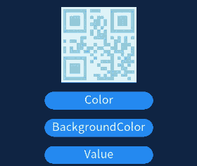
    <qrcode value="{{qr_value}}" class="qrCode" style="color: {{qr_col}};background-color: {{qr_bcol}};"></qrcode>
    <input type="button" onclick="changeColor" class="button">Color</input>
    <input type="button" onclick="changeBackgroundColor" class="button">BackgroundColor</input>
    <input type="button" onclick="changeValue" class="button">Value</input>
</div>
/* xxx.css */
.container {
  width: 100%;
  height: 100%;
  flex-direction: column;
  justify-content: center;
  align-items: center;
}
.qrCode {
  width: 200px;
  height: 200px;
}
.button {
  width: 30%;
  height: 10%;
  margin-top: 5%;
}
// xxx.js
export default {
    data: {
        qr_col: '#87ceeb',
        qr_bcol: '#f0ffff',
        qr_value: 'value'
    },
    changeColor() {
        if (this.qr_col == '#87ceeb') {
            this.qr_col = '#fa8072';
        } else {
            this.qr_col = '#87ceeb';
        }
    },
    changeBackgroundColor() {
        if (this.qr_bcol == '#f0ffff') {
            this.qr_bcol = '#ffffe0';
        } else {
            this.qr_bcol = '#f0ffff';
        }
    },
    changeValue() {
        if (this.qr_value == 'value') {
            this.qr_value = 'change';
        } else {
            this.qr_value = 'value';
        }
    }
}
你可能感兴趣的鸿蒙文章
harmony 鸿蒙JavaScript-compatible Web-like Development Paradigm (ArkUI.Lite)