chart
The <chart> component displays line charts and bar charts.
NOTE
This component is supported since API version 4. Updates will be marked with a superscript to indicate their earliest API version.
Child Components
Not supported
Attributes
| Name | Type | Mandatory | Description |
|---|---|---|---|
| type | string | No | Chart type. Dynamic modification is not supported. Available values include: - bar: bar chart - line: line chart Default value: line |
| options | ChartOptions | Yes | Chart parameters. You can set the minimum value, maximum value, scale, and line width of the x-axis or y-axis, whether to display the x-axis and y-axis, and whether the line is smooth. Dynamic modification is not supported. |
| datasets | Array<ChartDataset> | Yes | Data sets. You can set multiple datasets and their background colors. |
| id | string | No | Unique ID of the component. |
| style | string | No | Style declaration of the component. |
| class | string | No | Style class of the component, which is used to refer to a style table. |
| ref | string | No | Reference information of child elements, which is registered with the parent component on $refs. |
Table 1 ChartOptions
| Name | Type | Mandatory | Description |
|---|---|---|---|
| xAxis | ChartAxis | Yes | X-axis parameters. You can set the minimum value, maximum value, and scale of the x-axis, and whether to display the x-axis. |
| yAxis | ChartAxis | Yes | Y-axis parameters. You can set the minimum value, maximum value, and scale of the y-axis, and whether to display the y-axis. |
| series | ChartSeries | No | Data series parameters which cover the following: - Line style, such as the line width and whether the line is smooth. - Style and size of the white point at the start of the line. NOTE Only line charts support this attribute. |
Table 2 ChartDataset
| Name | Type | Default Value | Mandatory | Description |
|---|---|---|---|---|
| backgroundColor(deprecated) | <color> | #ff6384 | No | Color of a line or bar. This attribute is not recommended. |
| strokeColor | <color> | #ff6384 | No | Line color. Only line charts support this attribute. |
| fillColor | <color> | #ff6384 | No | Fill color. For line charts, the value indicates the gradient color to fill. |
| data | Array<number> | - | Yes | Data of the drawn line or bar. |
| gradient | boolean | false | No | Whether to display the gradient color. Only line charts support this attribute. |
Table 3 ChartAxis
| Name | Type | Default Value | Mandatory | Description |
|---|---|---|---|---|
| min | number | 0 | No | Minimum value of the axis. Negative numbers are not supported. Only line charts support this attribute. |
| max | number | 100 | No | Maximum value of the axis. Negative numbers are not supported. Only line charts support this attribute. |
| axisTick | number | 10 | No | Number of scales displayed on the axis. NOTE The value ranges from 1 to 20. The display effect depends on the calculation result of Number of pixels occupied by the image width/(max-min). Lite wearables support integer calculation, and an error may occur in the case of inexhaustible division. Specifically, a segment of space may be left at the end of the x-axis. In the bar chart, the number of bars in each group of data is the same as the number of scales, and the bars are displayed at the scales. |
| display | boolean | false | No | Whether to display the axis. |
| color | <color> | #c0c0c0 | No | Axis color. |
Table 4 ChartSeries
| Name | Type | Mandatory | Description |
|---|---|---|---|
| lineStyle | ChartLineStyle | No | Line style, such as the line width and whether the line is smooth. |
| headPoint | PointStyle | No | Style and size of the white point at the start of the line. |
| topPoint | PointStyle | No | Style and size of the top point. |
| bottomPoint | PointStyle | No | Style and size of the bottom point. |
| loop | ChartLoop | No | Whether to start drawing again when the screen is looped. |
Table 5 ChartLineStyle
| Name | Type | Default Value | Mandatory | Description |
|---|---|---|---|---|
| width | <length> | 1px | No | Line width. |
| smooth | boolean | false | No | Whether the line is smooth. |
Table 6 PointStyle
| Name | Type | Default Value | Mandatory | Description |
|---|---|---|---|---|
| shape | string | circle | No | Shape of the highlight point. Available values are as follows: - circle |
| size | <length> | 5px | No | Size of the highlight point. |
| strokeWidth | <length> | 1px | No | Stroke width. |
| strokeColor | <color> | #ff0000 | No | Stroke color. |
| fillColor | <color> | #ff0000 | No | Fill color. |
| display | boolean | true | No | Whether to display the highlight spot. |
Table 7 ChartLoop
| Name | Type | Default Value | Mandatory | Description |
|---|---|---|---|---|
| margin | <length> | 1 | No | Number of erased points (horizontal distance between the latest drawn point and the earliest point). You are not advised to use margin together with topPoint, bottomPoint, or headPoint for mini-, small- and standard-system devices. If you do so, there is a possibility that the point is in the erase area and invisible. |
Methods
| Methods | Parameter | Description |
|---|---|---|
| append | { serial: number, // Set the data subscript of the line chart to be updated. data: Array<number>, // Set the new data. } | Dynamically add data to an existing data series. The target series is specified based on serial, which is the subscript of the datasets array and starts from 0. datasets[index].data is not updated. Only line charts support this attribute. The value is incremented by 1 based on the horizontal coordinate and is related to the xAxis min/max setting. |
Events
| Name | Parameter | Description |
|---|---|---|
| click | - | Triggered when the component is clicked. |
| longpress | - | Triggered when the component is long pressed. |
| swipe5+ | SwipeEvent | Triggered when a user quickly swipes on the component. |
Styles
| Name | Type | Default Value | Mandatory | Description |
|---|---|---|---|---|
| width | <length> |<percentage>5+ | - | No | Component width. If this attribute is not set, the default value 0 is used. |
| height | <length> |<percentage>5+ | - | No | Component height. If this attribute is not set, the default value 0 is used. |
| padding | <length> | 0 | No | Shorthand attribute to set the padding for all sides. The attribute can have one to four values: - If you set only one value, it specifies the padding for all the four sides. - If you set two values, the first value specifies the top and bottom padding, and the second value specifies the left and right padding. - If you set three values, the first value specifies the top padding, the second value specifies the left and right padding, and the third value specifies the bottom padding. - If you set four values, they respectively specify the padding for top, right, bottom, and left sides (in clockwise order). |
| padding-[left|top|right|bottom] | <length> | 0 | No | Left, top, right, and bottom padding. |
| margin | <length> |<percentage>5+ | 0 | No | Shorthand attribute to set the margin for all sides. The attribute can have one to four values: - If you set only one value, it specifies the margin for all the four sides. - If you set two values, the first value specifies the top and bottom margins, and the second value specifies the left and right margins. - If you set three values, the first value specifies the top margin, the second value specifies the left and right margins, and the third value specifies the bottom margin. - If you set four values, they respectively specify the margin for top, right, bottom, and left sides (in clockwise order). |
| margin-[left|top|right|bottom] | <length> |<percentage>5+ | 0 | No | Left, top, right, and bottom margins. |
| border-width | <length> | 0 | No | Shorthand attribute to set the margin for all sides. |
| border-color | <color> | black | No | Shorthand attribute to set the color for all borders. |
| border-radius | <length> | - | No | Radius of round-corner borders. |
| background-color | <color> | - | No | Background color. |
| display | string | flex | No | How and whether to display the box containing an element. Available values are as follows: - flex: flexible layout - none: not rendered |
| [left|top] | <length> |<percentage>6+ | - | No | Edge of the element. - left: left edge position of the element. This attribute defines the offset between the left edge of the margin area of a positioned element and left edge of its containing block. - top: top edge position of the element. This attribute defines the offset between the top edge of a positioned element and that of a block included in the element. |
Example
-
Line chart
<!-- xxx.hml -->
<div class="container">
  <chart class="chart" type="line" ref="linechart" options="{{lineOps}}" datasets="{{lineData}}"></chart>
  <input class="button" type="button" value="Add data" onclick="addData"/>
</div>
/* xxx.css */ .container { flex-direction: column; justify-content: center; align-items: center; width: 454px; height: 454px; background-color: white; } .chart { width: 300px; height: 300px; } .button { width: 280px; border-radius: 0px; }// xxx.js export default { data: { lineData: [ { strokeColor: '#0081ff', fillColor: '#cce5ff', data: [763, 550, 551, 554, 731, 654, 525, 696, 595, 628, 791, 505, 613, 575, 475, 553, 491, 680, 657, 716], gradient: false, } ], lineOps: { xAxis: { min: 0, max: 20, display: false, }, yAxis: { min: 0, max: 1000, display: false, }, series: { lineStyle: { width: "5px", smooth: true, }, headPoint: { shape: "circle", size: 10, strokeWidth: 5, fillColor: '#ffffff', strokeColor: '#007aff', display: true, }, loop: { margin: 2, gradient: true, } } }, }, addData() { this.$refs.linechart.append({ serial: 0, data: [Math.floor(Math.random() * 400) + 400] }) } }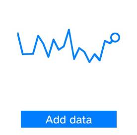
-
Bar chart
<!-- xxx.hml -->
<div class="container">
  <chart class="chart" type="bar" id="bar-chart" options="{{barOps}}" datasets="{{barData}}"></chart>
</div>
/* xxx.css */ .container { flex-direction: column; justify-content: center; align-items: center; width: 454px; height: 454px; background-color: white; } .chart { width: 300px; height: 300px; }// xxx.js export default { data: { barData: [ { fillColor: '#f07826', data: [763, 550, 551, 554, 731, 654, 525, 696, 595, 628], }, { fillColor: '#cce5ff', data: [535, 776, 615, 444, 694, 785, 677, 609, 562, 410], }, { fillColor: '#ff88bb', data: [673, 500, 574, 483, 702, 583, 437, 506, 693, 657], }, ], barOps: { xAxis: { min: 0, max: 20, display: false, axisTick: 10 }, yAxis: { min: 0, max: 1000, display: false, }, }, } }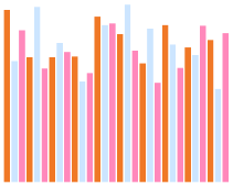
你可能感兴趣的鸿蒙文章
harmony 鸿蒙JavaScript-compatible Web-like Development Paradigm (ArkUI.Lite)