Configuring In-Application Theme Skinning
Overview
For applications developed with ArkTS, you can switch themes within the application, such as toggling between dark and light modes or changing the skin. Note that this feature is limited to in-application use and does not apply at the UIAbility or window level. It is not available for the C-API and Node-API.
Customizing Theme Colors
To implement theme skinning for your application, you must define custom theme colors. Use CustomTheme to specify the colors you wish to modify. Properties of CustomTheme are optional: Only overridden properties are applied, and the rest inherits from the system's default settings. For details, see System Default Token Color Values. The following is an example of how to define custom theme colors:
  import { CustomColors, CustomTheme } from '@kit.ArkUI'

  export class AppColors implements CustomColors {
    // Custom theme colors
    brand: ResourceColor = '#FF75D9';
  }

  export class AppTheme implements CustomTheme {
    public colors: AppColors = new AppColors()
  }

  export let gAppTheme: CustomTheme = new AppTheme()
Setting Custom Theme Colors for Application Components
-
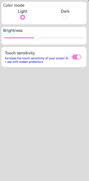
To apply custom theme colors to your application components, set them at the page entry point. Ensure that ThemeControl is executed before the page is built. Use the onWillApplyTheme callback function to allow custom components to access the currently active Theme object.
import { Theme, ThemeControl } from '@kit.ArkUI' import { gAppTheme } from './AppTheme' // Execute ThemeControl before the page builds. ThemeControl.setDefaultTheme(gAppTheme) @Entry @Component struct DisplayPage { @State menuItemColor: ResourceColor = $r('sys.color.background_primary') onWillApplyTheme(theme: Theme) { this.menuItemColor = theme.colors.backgroundPrimary; } build() { Column() { List({ space: 10 }) { ListItem() { Column({ space: '5vp' }) { Text('Color mode') .margin({ top: '5vp', left: '14fp' }) .width('100%') Row() { Column() { Text('Light') .fontSize('16fp') .textAlign(TextAlign.Start) .alignSelf(ItemAlign.Center) Radio({ group: 'light or dark', value: 'light' }) .checked(true) } .width('50%') Column() { Text('Dark') .fontSize('16fp') .textAlign(TextAlign.Start) .alignSelf(ItemAlign.Center) Radio({ group: 'light or dark', value: 'dark' }) } .width('50%') } } .width('100%') .height('90vp') .borderRadius('10vp') .backgroundColor(this.menuItemColor) } ListItem() { Column() { Text('Brightness') .width('100%') .margin({ top: '5vp', left: '14fp' }) Slider({ value: 40, max: 100 }) } .width('100%') .height('70vp') .borderRadius('10vp') .backgroundColor(this.menuItemColor) } ListItem() { Column() { Row() { Column({ space: '5vp' }) { Text('Touch sensitivity') .fontSize('16fp') .textAlign(TextAlign.Start) .width('100%') Text('Increase the touch sensitivity of your screen' + ' for use with screen protectors') .fontSize('12fp') .fontColor(Color.Blue) .textAlign(TextAlign.Start) .width('100%') } .alignSelf(ItemAlign.Center) .margin({ left: '14fp' }) .width('75%') Toggle({ type: ToggleType.Switch, isOn: true }) .margin({ right: '14fp' }) .alignSelf(ItemAlign.Center) } .width('100%') .height('80vp') } .width('100%') .borderRadius('10vp') .backgroundColor(this.menuItemColor) } } } .padding('10vp') .backgroundColor('#dcdcdc') .width('100%') .height('100%') } } -
To set ThemeControl in a UIAbility, you need to use setDefaultTheme in the onWindowStageCreate() API.
  import {AbilityConstant, UIAbility, Want } from '@kit.AbilityKit';
  import { hilog } from '@kit.PerformanceAnalysisKit';
  import { window, CustomColors, ThemeControl } from '@kit.ArkUI';

  class AppColors implements CustomColors {
    fontPrimary = 0xFFD53032
    iconOnPrimary = 0xFFD53032
    iconFourth = 0xFFD53032
  }

  const abilityThemeColors = new AppColors();

  export default class EntryAbility extends UIAbility {
    onCreate(want: Want, launchParam: AbilityConstant.LaunchParam) {
      hilog.info(0x0000, 'testTag', '%{public}s', 'Ability onCreate');
    }

    onDestroy() {
      hilog.info(0x0000, 'testTag', '%{public}s', 'Ability onDestroy');
    }

    onWindowStageCreate(windowStage: window.WindowStage) {
      // The main window is created. Set a main page for this ability.
      hilog.info(0x0000, 'testTag', '%{public}s', 'Ability onWindowStageCreate');

      windowStage.loadContent('pages/Index', (err, data) => {
        if (err.code) {
          hilog.error(0x0000, 'testTag', 'Failed to load the content. Cause: %{public}s', JSON.stringify(err) ?? '');
          return;
        }
        hilog.info(0x0000, 'testTag', 'Succeeded in loading the content. Data: %{public}s', JSON.stringify(data) ?? '');
        // Call setDefaultTheme in the onWindowStageCreate() API.
        ThemeControl.setDefaultTheme({ colors: abilityThemeColors })
        hilog.info(0x0000, 'testTag', '%{public}s', 'ThemeControl.setDefaultTheme done');
      });
    }

  }
NOTE
If the parameter for setDefaultTheme is undefined, the default value is used. See System Default Token Color Values for the default color values associated with the tokens.
Setting a Custom Theme Style for Specific Application Pages
Use WithTheme to apply the color scheme of a custom theme to the default styles of components within the scope This way, the colors of components within the WithTheme scope align with the theme's color scheme.
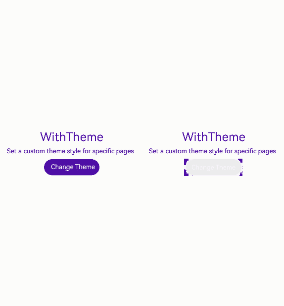
In the example below, components within the scope are styled with a custom theme using WithTheme({ theme: this.myTheme }). You can switch to a different theme style by updating this.myTheme. The onWillApplyTheme callback function allows custom components to access the currently active Theme object.
  import { CustomColors, CustomTheme, Theme } from '@kit.ArkUI'

  class AppColors implements CustomColors {
    fontPrimary: ResourceColor = $r('app.color.brand_purple')
    backgroundEmphasize: ResourceColor = $r('app.color.brand_purple')
  }

  class AppColorsSec implements CustomColors {
    fontPrimary: ResourceColor = $r('app.color.brand')
    backgroundEmphasize: ResourceColor = $r('app.color.brand')
  }

  class AppTheme implements CustomTheme {
    public colors: AppColors = new AppColors()
  }

  class AppThemeSec implements CustomTheme {
    public colors: AppColors = new AppColorsSec()
  }

  @Entry
  @Component
  struct DisplayPage {
    @State customTheme: CustomTheme = new AppTheme()
    @State message: string = 'Set a custom theme style for specific pages'
    count = 0;

    build() {
      WithTheme({ theme: this.customTheme }) {
        Row(){
          Column() {
            Text('WithTheme')
              .fontSize(30)
              .margin({bottom: 10})
            Text(this.message)
              .margin({bottom: 10})
            Button('Change Theme').onClick(() => {
              this.count++;
              if (this.count > 1) {
                this.count = 0;
              }
              switch (this.count) {
                case 0:
                  this.customTheme = new AppTheme();
                  break;
                case 1:
                  this.customTheme = new AppThemeSec();
                  break;
              }
            })
          }
          .width('100%')
        }
        .height('100%')
        .width('100%')
      }
    }
  }
Setting the Color Mode for Application Pages
Use WithTheme to set the color mode.
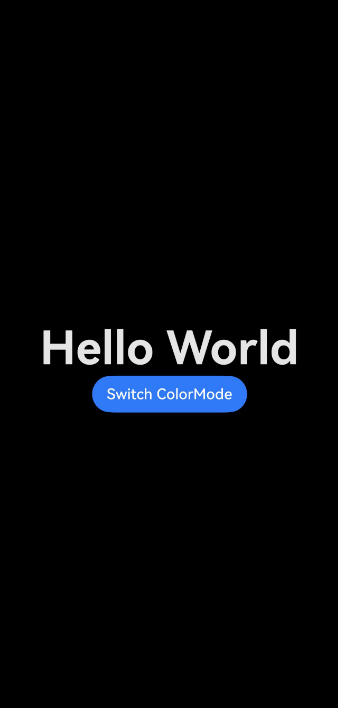
Within the WithTheme scope, component styles adapt to the specified color mode by accessing the corresponding system and application resource values. This means that the color schemes of components are adjusted according to the chosen color mode.
In the example below, components within the scope are set to dark mode using WithTheme({ colorMode: ThemeColorMode.DARK }).
For the light and dark modes to take effect, add a dark.json resource file.

Example of the dark.json file content:
  {
    "color": [
      {
        "name": "start_window_background",
        "value": "#FFFFFF"
      }
    ]
  }
  @Entry
  @Component
  struct DisplayPage {
    @State message: string = 'Hello World';
    @State colorMode: ThemeColorMode = ThemeColorMode.DARK;

    build() {
      WithTheme({ colorMode: this.colorMode }) {
        Row() {
          Column() {
            Text(this.message)
              .fontSize(50)
              .fontWeight(FontWeight.Bold)
            Button('Switch ColorMode').onClick(() => {
              if (this.colorMode === ThemeColorMode.LIGHT) {
                this.colorMode = ThemeColorMode.DARK;
              } else if (this.colorMode === ThemeColorMode.DARK) {
                this.colorMode = ThemeColorMode.LIGHT;
              }
            })
          }
          .width('100%')
        }
        .backgroundColor($r('sys.color.background_primary'))
        .height('100%')
        .expandSafeArea([SafeAreaType.SYSTEM], [SafeAreaEdge.TOP, SafeAreaEdge.END, SafeAreaEdge.BOTTOM, SafeAreaEdge.START])
      }
    }
  }
System Default Token Color Values
| Token | Category | Light | Dark | ||
|---|---|---|---|---|---|
| theme.colors.brand | Brand color. | #ff0a59f7 |  | #ff317af7 |  |
| theme.colors.warning | Alert color. | #ffe84026 |  | #ffd94838 |  |
| theme.colors.alert | Warning color. | #ffed6f21 |  | #ffdb6b42 |  |
| theme.colors.confirm | Confirmation color. | #ff64bb5c |  | #ff5ba854 |  |
| theme.colors.fontPrimary | Primary text color. | #e5000000 |  | #e5ffffff |  |
| theme.colors.fontSecondary | Secondary text color. | #99000000 |  | #99ffffff |  |
| theme.colors.fontTertiary | Tertiary text color. | #66000000 |  | #66ffffff |  |
| theme.colors.fontFourth | Quaternary text color. | #33000000 |  | #33ffffff |  |
| theme.colors.fontEmphasize | Highlight text color. | #ff0a59f7 | | #ff317af7 | |
| theme.colors.fontOnPrimary | Primary text invert color. | #ffffffff |  | #ff000000 |  |
| theme.colors.fontOnSecondary | Secondary text invert color. | #99ffffff | | #99000000 | |
| theme.colors.fontOnTertiary | Tertiary text invert color. | #66ffffff | | #66000000 | |
| theme.colors.fontOnFourth | Quaternary text invert color. | #33ffffff | | #33000000 | |
| theme.colors.iconPrimary | Primary icon color. | #e5000000 | | #e5ffffff | |
| theme.colors.iconSecondary | Secondary icon color. | #99000000 | | #99ffffff | |
| theme.colors.iconTertiary | Tertiary icon color. | #66000000 | | #66ffffff | |
| theme.colors.iconFourth | Quaternary icon color. | #33000000 | | #33ffffff | |
| theme.colors.iconEmphasize | Emphasis icon color. | #ff0a59f7 | | #ff317af7 | |
| theme.colors.iconSubEmphasize | Emphasis auxiliary icon color. | #660a59f7 |  | #66317af7 |  |
| theme.colors.iconOnPrimary | Primary icon invert color. | #ffffffff | | #ff000000 | |
| theme.colors.iconOnSecondary | Secondary icon invert color. | #99ffffff | | #99000000 | |
| theme.colors.iconOnTertiary | Tertiary icon invert color. | #66ffffff | | #66000000 | |
| theme.colors.iconOnFourth | Quaternary icon invert color. | #33ffffff | | #33000000 | |
| theme.colors.backgroundPrimary | Primary background color (solid, opaque). | #ffffffff | | #ffe5e5e5 |  |
| theme.colors.backgroundSecondary | Secondary background color (solid, opaque). | #fff1f3f5 |  | #ff191a1c |  |
| theme.colors.backgroundTertiary | Tertiary background color (solid, opaque). | #ffe5e5ea |  | #ff202224 |  |
| theme.colors.backgroundFourth | Quaternary background color (solid, opaque). | #ffd1d1d6 |  | #ff2e3033 |  |
| theme.colors.backgroundEmphasize | Emphasis background color (solid, opaque). | #ff0a59f7 | | #ff317af7 | |
| theme.colors.compForegroundPrimary | Foreground. | #ff000000 | | #ffe5e5e5 | |
| theme.colors.compBackgroundPrimary | White background. | #ffffffff | | #ffffffff | |
| theme.colors.compBackgroundPrimaryTran | White transparent background. | #ffffffff | | #33ffffff | |
| theme.colors.compBackgroundPrimaryContrary | Always-on background. | #ffffffff | | #ffe5e5e5 | |
| theme.colors.compBackgroundGray | Gray background. | #fff1f3f5 | | #ffe5e5ea | |
| theme.colors.compBackgroundSecondary | Secondary background. | #19000000 |  | #19ffffff |  |
| theme.colors.compBackgroundTertiary | Tertiary background. | #0c000000 |  | #0cffffff |  |
| theme.colors.compBackgroundEmphasize | Emphasis background. | #ff0a59f7 | | #ff317af7 | |
| theme.colors.compBackgroundNeutral | Black, neutral, emphasis background. | #ff000000 | | #ffffffff | |
| theme.colors.compEmphasizeSecondary | 20% emphasis background. | #330a59f7 |  | #33317af7 |  |
| theme.colors.compEmphasizeTertiary | 10% emphasis background. | #190a59f7 |  | #19317af7 |  |
| theme.colors.compDivider | Divider color. | #33000000 | | #33ffffff | |
| theme.colors.compCommonContrary | Common invert color. | #ffffffff | | #ff000000 | |
| theme.colors.compBackgroundFocus | Background color in the focused state. | #fff1f3f5 | | #ff000000 | |
| theme.colors.compFocusedPrimary | Primary inverted color in the focused state. | #e5000000 | | #e5ffffff | |
| theme.colors.compFocusedSecondary | Secondary inverted color in the focused state. | #99000000 | | #99ffffff | |
| theme.colors.compFocusedTertiary | Tertiary inverted color in the focused state. | #66000000 | | #66ffffff | |
| theme.colors.interactiveHover | Common interactive color for the hover state. | #0c000000 | | #0cffffff | |
| theme.colors.interactivePressed | Common interactive color for the pressed state. | #19000000 | | #19ffffff | |
| theme.colors.interactiveFocus | Common interactive color for the focused state. | #ff0a59f7 | | #ff317af7 | |
| theme.colors.interactiveActive | Common interactive color for the active state. | #ff0a59f7 | | #ff317af7 | |
| theme.colors.interactiveSelect | Common interactive color for the selected state. | #33000000 | | #33ffffff | |
| theme.colors.interactiveClick | Common interactive color for the clicked state. | #19000000 | | #19ffffff | |
你可能感兴趣的鸿蒙文章
harmony 鸿蒙Atomic Service Full Screen Launch Component (FullScreenLaunchComponent)
harmony 鸿蒙Arc Button (ArcButton)
harmony 鸿蒙Frame Animation (ohos.animator)
harmony 鸿蒙Implementing Property Animation