Border
The border attributes are used to set border styles for components.
NOTE
The APIs of this module are supported since API version 7. Updates will be marked with a superscript to indicate their earliest API version.
border
border(value: BorderOptions)
Sets the border.
Widget capability: This API can be used in ArkTS widgets since API version 9.
Atomic service API: This API can be used in atomic services since API version 11.
System capability: SystemCapability.ArkUI.ArkUI.Full
Parameters
| Name | Type | Mandatory | Description |
|---|---|---|---|
| value | BorderOptions | Yes | Unified border style. NOTE The default value is 0, indicating that the border is not displayed. The border of a component is displayed above the content of its child components since API version 9. |
borderStyle
borderStyle(value: BorderStyle|EdgeStyles)
Sets the border style.
Widget capability: This API can be used in ArkTS widgets since API version 9.
Atomic service API: This API can be used in atomic services since API version 11.
System capability: SystemCapability.ArkUI.ArkUI.Full
Parameters
| Name | Type | Mandatory | Description |
|---|---|---|---|
| value | BorderStyle |EdgeStyles9+ | Yes | Border style. Default value: BorderStyle.Solid |
borderWidth
borderWidth(value: Length|EdgeWidths|LocalizedEdgeWidths)
Sets the border width.
Widget capability: This API can be used in ArkTS widgets since API version 9.
Atomic service API: This API can be used in atomic services since API version 11.
System capability: SystemCapability.ArkUI.ArkUI.Full
Parameters
| Name | Type | Mandatory | Description |
|---|---|---|---|
| value | Length |EdgeWidths9+ |LocalizedEdgeWidths12+ | Yes | Border width. Percentage values are not supported. |
borderColor
borderColor(value: ResourceColor|EdgeColors|LocalizedEdgeColors)
Sets the border color.
Widget capability: This API can be used in ArkTS widgets since API version 9.
Atomic service API: This API can be used in atomic services since API version 11.
System capability: SystemCapability.ArkUI.ArkUI.Full
Parameters
| Name | Type | Mandatory | Description |
|---|---|---|---|
| value | ResourceColor |EdgeColors9+ |LocalizedEdgeColors12+ | Yes | Border color. Default value: Color.Black |
borderRadius
borderRadius(value: Length|BorderRadiuses|LocalizedBorderRadiuses)
Sets the radius of the border rounded corners. The radius is restricted by the component size. The maximum value is half of the component width or height.
Widget capability: This API can be used in ArkTS widgets since API version 9.
Atomic service API: This API can be used in atomic services since API version 11.
System capability: SystemCapability.ArkUI.ArkUI.Full
Parameters
| Name | Type | Mandatory | Description |
|---|---|---|---|
| value | Length |BorderRadiuses9+ |LocalizedBorderRadiuses12+ | Yes | Radius of the border rounded corners. The value can be expressed as a percentage of the component's width. |
BorderOptions
Widget capability: This API can be used in ArkTS widgets since API version 9.
Atomic service API: This API can be used in atomic services since API version 11.
| Name | Type | Mandatory | Description |
|---|---|---|---|
| width | Length |EdgeWidths9+ |LocalizedEdgeWidths12+ | No | Border width. |
| color | ResourceColor |EdgeColors9+ |LocalizedEdgeColors12+ | No | Border color. |
| radius | Length |BorderRadiuses9+ |LocalizedBorderRadiuses12+ | No | Radius of the border rounded corners. |
| style | BorderStyle |EdgeStyles9+ | No | Sets the border. |
| dashGap12+ | LengthMetrics |EdgeWidths |LocalizedEdgeWidths | No | Gap between dashed line segments. It takes effect when the border style is set to dashed. Percentage values are not supported. |
| dashWidth12+ | LengthMetrics |EdgeWidths |LocalizedEdgeWidths | No | Width of dashed line segments. It takes effect when the border style is set to dashed. Percentage values are not supported. |
EdgeWidths9+
To reference this object, at least one parameter must be passed.
Widget capability: This API can be used in ArkTS widgets since API version 9.
Atomic service API: This API can be used in atomic services since API version 11.
| Name | Type | Mandatory | Description |
|---|---|---|---|
| left | Length | No | Width of the left border. |
| right | Length | No | Width of the right border. |
| top | Length | No | Width of the top border. |
| bottom | Length | No | Width of the bottom border. |
LocalizedEdgeWidths12+
Represents the edge widths in different directions of a component.
To reference this object, at least one parameter must be passed.
Widget capability: This API can be used in ArkTS widgets since API version 12.
| Name | Type | Mandatory | Description |
|---|---|---|---|
| start | LengthMetrics | No | Width of the left border. Width of the right border for right-to-left scripts. |
| end | LengthMetrics | No | Width of the right border. Width of the left border for right-to-left scripts. |
| top | LengthMetrics | No | Width of the top border. |
| bottom | LengthMetrics | No | Width of the bottom border. |
EdgeColors9+
To reference this object, at least one parameter must be passed.
Widget capability: This API can be used in ArkTS widgets since API version 9.
Atomic service API: This API can be used in atomic services since API version 11.
| Name | Type | Mandatory | Description |
|---|---|---|---|
| left | ResourceColor | No | Color of the left border. |
| right | ResourceColor | No | Color of the right border. |
| top | ResourceColor | No | Color of the top border. |
| bottom | ResourceColor | No | Color of the bottom border. |
LocalizedEdgeColors12+
Describes the edge colors of a component.
To reference this object, at least one parameter must be passed.
Widget capability: This API can be used in ArkTS widgets since API version 12.
Atomic service API: This API can be used in atomic services since API version 12.
| Name | Type | Mandatory | Description |
|---|---|---|---|
| start | ResourceColor | No | Color of the left border. Color of the right border for right-to-left scripts. |
| end | ResourceColor | No | Color of the right border. Color of the left border for right-to-left scripts. |
| top | ResourceColor | No | Color of the top border. |
| bottom | ResourceColor | No | Color of the bottom border. |
BorderRadiuses9+
To reference this object, at least one parameter must be passed.
Widget capability: This API can be used in ArkTS widgets since API version 9.
Atomic service API: This API can be used in atomic services since API version 11.
| Name | Type | Mandatory | Description |
|---|---|---|---|
| topLeft | Length | No | Radius of the upper left rounded corner. |
| topRight | Length | No | Radius of the upper right rounded corner. |
| bottomLeft | Length | No | Radius of the lower left rounded corner. |
| bottomRight | Length | No | Radius of the lower right rounded corner. |
LocalizedBorderRadiuses12+
Describes the corner radius of a component's border.
To reference this object, at least one parameter must be passed.
Widget capability: This API can be used in ArkTS widgets since API version 12.
Atomic service API: This API can be used in atomic services since API version 12.
| Name | Type | Mandatory | Description |
|---|---|---|---|
| topStart | LengthMetrics12+ | No | Radius of the upper left rounded corner. Radius of the upper right rounded corner for right-to-left scripts. |
| topEnd | LengthMetrics12+ | No | Radius of the upper right rounded corner. Radius of the upper left rounded corner for right-to-left scripts. |
| bottomStart | LengthMetrics12+ | No | Radius of the lower left rounded corner. Radius of the lower right rounded corner for right-to-left scripts. |
| bottomEnd | LengthMetrics12+ | No | Radius of the lower right rounded corner. Radius of the lower left rounded corner for right-to-left scripts. |
EdgeStyles9+
To reference this object, at least one parameter must be passed.
Widget capability: This API can be used in ArkTS widgets since API version 9.
Atomic service API: This API can be used in atomic services since API version 11.
| Name | Type | Mandatory | Description |
|---|---|---|---|
| left | BorderStyle | No | Style of the left border. |
| right | BorderStyle | No | Style of the right border. |
| top | BorderStyle | No | Style of the top border. |
| bottom | BorderStyle | No | Style of the bottom border. |
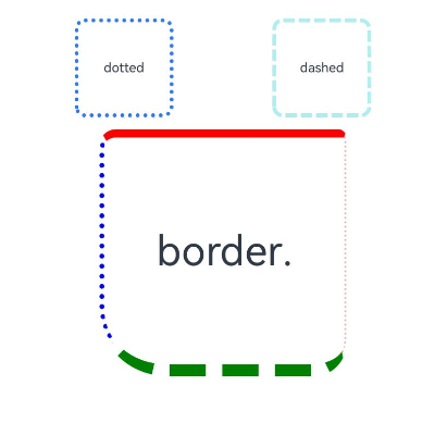
Example
Example 1
// xxx.ets
@Entry
@Component
struct BorderExample {
  build() {
    Column() {
      Flex({ justifyContent: FlexAlign.SpaceAround, alignItems: ItemAlign.Center }) {
        // Dashed border
        Text('dashed')
          .borderStyle(BorderStyle.Dashed).borderWidth(5).borderColor(0xAFEEEE).borderRadius(10)
          .width(120).height(120).textAlign(TextAlign.Center).fontSize(16)
        // Dotted border
        Text('dotted')
          .border({ width: 5, color: 0x317AF7, radius: 10, style: BorderStyle.Dotted })
          .width(120).height(120).textAlign(TextAlign.Center).fontSize(16)
      }.width('100%').height(150)

      Text('.border')
        .fontSize(50)
        .width(300)
        .height(300)
        .border({
          width: { left: 3, right: 6, top: 10, bottom: 15 },
          color: { left: '#e3bbbb', right: Color.Blue, top: Color.Red, bottom: Color.Green },
          radius: { topLeft: 10, topRight: 20, bottomLeft: 40, bottomRight: 80 },
          style: {
            left: BorderStyle.Dotted,
            right: BorderStyle.Dotted,
            top: BorderStyle.Solid,
            bottom: BorderStyle.Dashed
          }
        }).textAlign(TextAlign.Center)
    }
  }
}

Example 2
// xxx.ets
// The width, radius, and color attributes of border use the LocalizedEdgeWidths and LocalizedEdgeColors types.

import { LengthMetrics } from '@kit.ArkUI';
@Entry
@Component
struct BorderExample {
  build() {
    Column() {
      Flex({ justifyContent: FlexAlign.SpaceAround, alignItems: ItemAlign.Center }) {
        // Dashed border
        Text('dashed')
          .borderStyle(BorderStyle.Dashed)
          .borderWidth(5)
          .borderColor(0xAFEEEE)
          .borderRadius(10)
          .width(120)
          .height(120)
          .textAlign(TextAlign.Center)
          .fontSize(16)
        // Dotted border
        Text('dotted')
          .border({ width: 5, color: 0x317AF7, radius: 10, style: BorderStyle.Dotted })
          .width(120)
          .height(120)
          .textAlign(TextAlign.Center)
          .fontSize(16)
      }.width('100%').height(150)

      Text('.border')
        .fontSize(50)
        .width(300)
        .height(300)
        .border({
          width: {
            start: LengthMetrics.vp(3),
            end: LengthMetrics.vp(6),
            top: LengthMetrics.vp(10),
            bottom: LengthMetrics.vp(15)
          },
          color: { start: '#e3bbbb', end: Color.Blue, top: Color.Red, bottom: Color.Green },
          radius: {
            topStart: LengthMetrics.vp(10),
            topEnd: LengthMetrics.vp(20),
            bottomStart: LengthMetrics.vp(40),
            bottomEnd: LengthMetrics.vp(80)
          },
          style: {
            left: BorderStyle.Dotted,
            right: BorderStyle.Dotted,
            top: BorderStyle.Solid,
            bottom: BorderStyle.Dashed
          }
        })
        .textAlign(TextAlign.Center)
    }
  }
}
The following shows how the example is represented with left-to-right scripts.

The following shows how the example is represented with right-to-left scripts.