Alert Dialog Box (AlertDialog)
You can set the text content and response callback for an alert dialog box.
NOTE
The APIs of this module are supported since API version 7. Updates will be marked with a superscript to indicate their earliest API version.
The functionality of this module depends on UI context. This means that the APIs of this module cannot be used where the UI context is unclear. For details, see UIContext.
Since API version 10, you can use the showAlertDialog API in UIContext, which ensures that the alert dialog box is shown in the intended UI instance.
AlertDialog
show
static show(value: AlertDialogParamWithConfirm|AlertDialogParamWithButtons|AlertDialogParamWithOptions)
Shows an alert dialog box.
Atomic service API: This API can be used in atomic services since API version 11.
System capability: SystemCapability.ArkUI.ArkUI.Full
Parameters
| Name | Type | Mandatory | Description |
|---|---|---|---|
| value | AlertDialogParamWithConfirm |AlertDialogParamWithButtons |AlertDialogParamWithOptions10+ | Yes | Options of the alert dialog box. |
AlertDialogParam
System capability: SystemCapability.ArkUI.ArkUI.Full
| Name | Type | Mandatory | Description |
|---|---|---|---|
| title | ResourceStr | No | Title of the dialog box. Atomic service API: This API can be used in atomic services since API version 11. |
| subtitle10+ | ResourceStr | No | Subtitle of the dialog box. Atomic service API: This API can be used in atomic services since API version 11. |
| message | ResourceStr | Yes | Content of the dialog box. Atomic service API: This API can be used in atomic services since API version 11. |
| autoCancel | boolean | No | Whether to close the dialog box when the overlay is clicked. The value true means to close the dialog box when the overlay is clicked, and false means the opposite. Default value: true Atomic service API: This API can be used in atomic services since API version 11. |
| cancel | VoidCallback | No | Callback invoked when the dialog box is closed after the overlay is clicked. Atomic service API: This API can be used in atomic services since API version 11. |
| alignment | DialogAlignment | No | Alignment mode of the dialog box in the vertical direction. Default value: DialogAlignment.Default Atomic service API: This API can be used in atomic services since API version 11. NOTE If showInSubWindow is set to true in UIExtension, the dialog box is aligned with the host window based on UIExtension. |
| offset | Offset | No | Offset of the dialog box relative to the alignment position. Default value: { dx: 0 , dy: 0 } Atomic service API: This API can be used in atomic services since API version 11. |
| gridCount | number | No | Number of grid columns occupied by the width of the dialog box. Default value: 4 Value range: an integer no less than 0 Atomic service API: This API can be used in atomic services since API version 11. |
| maskRect10+ | Rectangle | No | Mask area of the dialog box. Events outside the mask area are transparently transmitted, and events within the mask area are not. Default value: { x: 0, y: 0, width: '100%', height: '100%' } NOTE maskRect does not take effect when showInSubWindow is set to true. Atomic service API: This API can be used in atomic services since API version 11. |
| showInSubWindow11+ | boolean | No | Whether to show the dialog box in a subwindow when the dialog box needs to be displayed outside the main window. Default value: false NOTE A dialog box whose showInSubWindow attribute is true cannot trigger the display of another dialog box whose showInSubWindow attribute is also true. Atomic service API: This API can be used in atomic services since API version 12. |
| isModal11+ | boolean | No | Whether the dialog box is a modal. A modal dialog box has a mask applied, while a non-modal dialog box does not. Default value: true Atomic service API: This API can be used in atomic services since API version 12. |
| backgroundColor11+ | ResourceColor | No | Background color of the dialog box. Default value: Color.Transparent NOTE When backgroundColor is set to a non-transparent color, backgroundBlurStyle must be set to BlurStyle.NONE; otherwise, the color display may not meet the expected effect. Atomic service API: This API can be used in atomic services since API version 12. |
| backgroundBlurStyle11+ | BlurStyle | No | Background blur style of the dialog box. Default value: BlurStyle.COMPONENT_ULTRA_THICK NOTE Setting this parameter to BlurStyle.NONE disables the background blur. When backgroundBlurStyle is set to a value other than NONE, do not set backgroundColor. If you do, the color display may not produce the expected visual effect. Atomic service API: This API can be used in atomic services since API version 12. |
| backgroundBlurStyleOptions18+ | BackgroundBlurStyleOptions | No | Options for customizing the background blur style. Atomic service API: This API can be used in atomic services since API version 18. |
| backgroundEffect18+ | BackgroundEffectOptions | No | Options for customizing the background effect. Atomic service API: This API can be used in atomic services since API version 18. |
| onWillDismiss12+ | Callback<DismissDialogAction> | No | Callback for interactive closure of the dialog box. NOTE 1. If this callback is registered, the dialog box will not be closed immediately after the user touches the mask or the Back button, presses the Esc key, or swipes left or right on the screen. The reason parameter in the callback is used to determine whether the dialog box can be closed. The reason returned by the component does not support the value CLOSE_BUTTON. 2. In the onWillDismiss callback, another onWillDismiss callback is not allowed. Atomic service API: This API can be used in atomic services since API version 12. |
| cornerRadius12+ | Dimension |BorderRadiuses |LocalizedBorderRadiuses | No | Radius of the rounded corners of the background. You can set separate radiuses for the four rounded corners. Default value: { topLeft: '32vp', topRight: '32vp', bottomLeft: '32vp', bottomRight: '32vp' } The radius of the rounded corners is subject to the component size. Its maximum value is half of the component width or height. If the value is negative, the default value is used. When set to a percentage, the value defines the radius as a percentage of the parent component's width or height. NOTE When cornerRadius is of type LocalizedBorderRadiuses, the layout order can be dynamically adjusted based on the user's language settings. Atomic service API: This API can be used in atomic services since API version 12. |
| transition12+ | TransitionEffect | No | Transition effect for the entrance and exit of the dialog box. NOTE 1. If this parameter is not set, the default effect is used. 2. Touching the Back button during the entrance animation pauses the entrance animation and starts the exit animation. The final effect is one obtained after the curves of the entrance and exit animations are combined. 3. Touching the Back button during the exit animation does not affect the animation playback. Touching the Back button again closes the application. Atomic service API: This API can be used in atomic services since API version 12. |
| width12+ | Dimension | No | Width of the dialog box. NOTE - Default maximum width of the dialog box: 400 vp - When this parameter is set to a percentage, the reference width of the dialog box is the width of the window where the dialog box is located. You can decrease or increase the width as needed. Atomic service API: This API can be used in atomic services since API version 12. |
| height12+ | Dimension | No | Height of the dialog box. NOTE - Default maximum height of the dialog box: 0.9 x (Window height – Safe area) - When this parameter is set to a percentage, the reference height of the dialog box is the height of the window where the dialog box is located minus the safe area. You can decrease or increase the height as needed. Atomic service API: This API can be used in atomic services since API version 12. |
| borderWidth12+ | Dimension |EdgeWidths |LocalizedEdgeWidths | No | You can set the width for all four sides or set separate widths for individual sides. Default value: 0 When set to a percentage, the value defines the border width as a percentage of the parent dialog box's width. If the left and right borders are greater than its width, or the top and bottom borders are greater than its height, the dialog box may not display as expected. NOTE When borderWidth is of type LocalizedEdgeWidths, the layout order can be dynamically adjusted based on the user's language settings. Atomic service API: This API can be used in atomic services since API version 12. |
| borderColor12+ | ResourceColor |EdgeColors |LocalizedEdgeColors | No | Border color of the dialog box. Default value: Color.Black borderColor must be used with borderWidth in pairs. NOTE When borderColor is of type LocalizedEdgeColors, the layout order can be dynamically adjusted based on the user's language settings. Atomic service API: This API can be used in atomic services since API version 12. |
| borderStyle12+ | BorderStyle |EdgeStyles | No | Border style of the dialog box. Default value: BorderStyle.Solid borderStyle must be used with borderWidth in pairs. Atomic service API: This API can be used in atomic services since API version 12. |
| shadow12+ | ShadowOptions |ShadowStyle | No | Shadow of the dialog box. Default value on 2-in-1 devices: ShadowStyle.OUTER_FLOATING_MD when the dialog box is focused and ShadowStyle.OUTER_FLOATING_SM otherwise Atomic service API: This API can be used in atomic services since API version 12. |
| textStyle12+ | TextStyle | No | Text style of the message in the dialog box. Atomic service API: This API can be used in atomic services since API version 12. |
| enableHoverMode14+ | boolean | No | Whether to enable the hover state. Default value: false, meaning not to enable the hover state. Atomic service API: This API can be used in atomic services since API version 14. |
| hoverModeArea14+ | HoverModeAreaType | No | Display area of the dialog box in the hover state. Default value: HoverModeAreaType.BOTTOM_SCREEN Atomic service API: This API can be used in atomic services since API version 14. |
| onWillAppear18+ | Callback<void> | No | Event callback when the dialog box is about to appear. NOTE 1. The normal timing sequence is as follows: onWillAppear > onDidAppear > onWillDisappear > onDidDisappear. 2. You can set the callback event for changing the dialog box display effect in onWillAppear. The settings take effect next time the dialog box appears. Atomic service API: This API can be used in atomic services since API version 18. |
| onDidAppear18+ | Callback<void> | No | Event callback when the dialog box appears. NOTE 1. The normal timing sequence is as follows: onWillAppear > onDidAppear > onWillDisappear > onDidDisappear. 2. You can set the callback event for changing the dialog box display effect in onDidAppear. The settings take effect next time the dialog box appears. 3. If the dialog is dismissed before its entrance animation is finished, the animation will be interrupted, and onDidAppear will not be triggered. Atomic service API: This API can be used in atomic services since API version 18. |
| onWillDisappear18+ | Callback<void> | No | Event callback when the dialog box is about to disappear. NOTE 1. The normal timing sequence is as follows: onWillAppear > onDidAppear > onWillDisappear > onDidDisappear. Atomic service API: This API can be used in atomic services since API version 18. |
| onDidDisappear18+ | Callback<void> | No | Event callback when the dialog box disappears. NOTE 1. The normal timing sequence is as follows: onWillAppear > onDidAppear > onWillDisappear > onDidDisappear. Atomic service API: This API can be used in atomic services since API version 18. |
| levelMode15+ | LevelMode | No | Display level of the dialog box. NOTE - Default value: LevelMode.OVERLAY - This parameter takes effect only when showInSubWindow is set to false. Atomic service API: This API can be used in atomic services since API version 15. |
| levelUniqueId15+ | number | No | Unique ID of the node under the display level for the page-level dialog box. NOTE - This parameter takes effect only when levelMode is set to LevelMode.EMBEDDED. Atomic service API: This API can be used in atomic services since API version 15. |
| immersiveMode15+ | ImmersiveMode | No | Overlay effect for the page-level dialog box. NOTE - Default value: ImmersiveMode.DEFAULT - This parameter takes effect only when levelMode is set to LevelMode.EMBEDDED. Atomic service API: This API can be used in atomic services since API version 15. |
| levelOrder18+ | LevelOrder | No | Display order of the dialog box. NOTE - Default value: LevelOrder.clamp(0) - Dynamic updating is not supported. Atomic service API: This API can be used in atomic services since API version 18. |
LevelOrder18+
type LevelOrder = LevelOrder
Defines the display order of the dialog box.
Atomic service API: This API can be used in atomic services since API version 18.
System capability: SystemCapability.ArkUI.ArkUI.Full
| Type | Description |
|---|---|
| LevelOrder | Display order of the dialog box. |
AlertDialogParamWithConfirm
Inherits from AlertDialogParam.
Atomic service API: This API can be used in atomic services since API version 11.
System capability: SystemCapability.ArkUI.ArkUI.Full
| Name | Type | Mandatory | Description |
|---|---|---|---|
| confirm | AlertDialogButtonBaseOptions | No | Information about the confirm button. When the dialog box has focus and focus has not been shifted using the Tab key, the button responds to the Enter key by default, and multiple dialog boxes can gain focus consecutively to respond automatically. The default response to the Enter key does not work when defaultFocus is set to true. |
Priorities of the confirm parameters: fontColor and backgroundColor > style > defaultFocus
| backgroundColor | fontColor | style | defaultFocus | Effect |
|---|---|---|---|---|
| Green | Red | - | - | Red text on green background |
| Green | - | DialogButtonStyle.HIGHLIGHT | - | White text on green background |
| Green | - | DialogButtonStyle.DEFAULT | - | Blue text on green background |
| Green | - | - | TRUE | White text on green background |
| Green | - | - | FALSE/- | Blue text on green background |
| - | Red | DialogButtonStyle.HIGHLIGHT | - | Red text on blue background |
| - | Red | DialogButtonStyle.DEFAULT | - | Red text on white background |
| - | Red | - | TRUE | Red text on blue background |
| - | Red | - | FALSE/- | Red text on white background |
| - | - | DialogButtonStyle.HIGHLIGHT | - | White text on blue background |
| - | - | DialogButtonStyle.DEFAULT | - | Blue text on white background |
| - | - | - | TRUE | White text on blue background |
| - | - | - | FALSE/- | Blue text on white background |
AlertDialogParamWithButtons
Inherits from AlertDialogParam.
Atomic service API: This API can be used in atomic services since API version 11.
System capability: SystemCapability.ArkUI.ArkUI.Full
| Name | Type | Mandatory | Description |
|---|---|---|---|
| primaryButton | AlertDialogButtonBaseOptions | Yes | Information about the confirm button. When the dialog box has focus and focus has not been shifted using the Tab key, the button responds to the Enter key by default, and multiple dialog boxes can gain focus consecutively to respond automatically. The default response to the Enter key does not work when defaultFocus is set to true. |
| secondaryButton | AlertDialogButtonBaseOptions | Yes | Information about the confirm button. |
AlertDialogParamWithOptions10+
Inherits from AlertDialogParam.
Atomic service API: This API can be used in atomic services since API version 11.
System capability: SystemCapability.ArkUI.ArkUI.Full
| Name | Type | Mandatory | Description |
|---|---|---|---|
| buttons | Array<AlertDialogButtonOptions> | Yes | Buttons in the dialog box. |
| buttonDirection | DialogButtonDirection | No | Direction in which buttons are laid out. Default value: DialogButtonDirection.AUTO When there are more than three buttons, the Auto mode (which automatically switches to the vertical layout when there are more than two buttons) is recommended. In non-Auto mode, buttons that extend beyond the display area are clipped. |
AlertDialogButtonOptions10+
Inherits from AlertDialogButtonBaseOptions.
System capability: SystemCapability.ArkUI.ArkUI.Full
| Name | Type | Mandatory | Description |
|---|---|---|---|
| primary12+ | boolean | No | Whether the button responds to the Enter key by default when the dialog box has focus and the Tab key is not pressed for sequential focus navigation. If there are multiple buttons, set this parameter to true for only one button. Otherwise, no button will respond. Multiple dialog boxes can automatically gain focus and respond to user interactions in a sequential manner. This parameter does not take effect when defaultFocus is set to true. Atomic service API: This API can be used in atomic services since API version 12. |
AlertDialogButtonBaseOptions18+
Atomic service API: This API can be used in atomic services since API version 18.
System capability: SystemCapability.ArkUI.ArkUI.Full
| Name | Type | Mandatory | Description |
|---|---|---|---|
| enabled10+ | boolean | No | Whether to respond when the button is clicked. Default value: true true: Respond when the button is clicked. false: Do not respond when the button is clicked. Atomic service API: This API can be used in atomic services since API version 11. |
| defaultFocus10+ | boolean | No | Whether the button is the default focus. Default value: false Atomic service API: This API can be used in atomic services since API version 11. |
| style10+ | DialogButtonStyle | No | Style of the button. Default value: DialogButtonStyle.DEFAULT Atomic service API: This API can be used in atomic services since API version 11. |
| value10+ | ResourceStr | Yes | Text of the button. If the value is null, the button is not displayed. Atomic service API: This API can be used in atomic services since API version 11. |
| fontColor10+ | ResourceColor | No | Font color of the button. Atomic service API: This API can be used in atomic services since API version 11. |
| backgroundColor10+ | ResourceColor | No | Background color of the button. Atomic service API: This API can be used in atomic services since API version 11. |
| action10+ | VoidCallback | Yes | Callback upon button clicking. Atomic service API: This API can be used in atomic services since API version 11. |
DialogButtonDirection10+
Atomic service API: This API can be used in atomic services since API version 11.
System capability: SystemCapability.ArkUI.ArkUI.Full
| Name | Value | Description |
|---|---|---|
| AUTO | 0 | Buttons are laid out horizontally when there are two or fewer buttons and vertically otherwise. |
| HORIZONTAL | 1 | Buttons are laid out horizontally. |
| VERTICAL | 2 | Buttons are laid out vertically. |
DialogAlignment
Atomic service API: This API can be used in atomic services since API version 11.
System capability: SystemCapability.ArkUI.ArkUI.Full
| Name | Description |
|---|---|
| Top | Vertical top alignment. |
| Center | Vertical center alignment. |
| Bottom | Vertical bottom alignment. |
| Default | Default alignment. |
| TopStart8+ | Top left alignment. |
| TopEnd8+ | Top right alignment. |
| CenterStart8+ | Center left alignment. |
| CenterEnd8+ | Center right alignment. |
| BottomStart8+ | Bottom left alignment. |
| BottomEnd8+ | Bottom right alignment. |
Rectangle8+
The Rectangle type is used to represent a mask area of a dialog box.
Widget capability: This API can be used in ArkTS widgets since API version 9.
Atomic service API: This API can be used in atomic services since API version 11.
System capability: SystemCapability.ArkUI.ArkUI.Full
| Name | Type | Mandatory | Description |
|---|---|---|---|
| x | Length | No | X coordinate of the mask area of the dialog box relative to the upper left corner of the window. Default value: 0vp |
| y | Length | No | Y coordinate of the mask area of the dialog box relative to the upper left corner of the window. Default value: 0vp |
| width | Length | No | Width of the mask area of the dialog box. Default value: '100%' |
| height | Length | No | Height of the mask area of the dialog box. Default value: '100%' |
NOTE
x and y can be set to a positive or negative percentage value. When x is set to '100%', the mask area is moved rightward by the window width. When x is set to '-100%', the mask area is moved leftward by the window width. When y is set to '100%', the mask area is moved downward by the window height. When y is set to '-100%', the mask area is moved upward by the window height.
width and height can be set in percentage and can only be set to positive values. If they are set to negative values, the default values are used instead.
The percentage is calculated based on the width and height of the window.
DismissDialogAction12+
Provides information about the action to dismiss the dialog box.
Atomic service API: This API can be used in atomic services since API version 12.
System capability: SystemCapability.ArkUI.ArkUI.Full
Properties
| Name | Type | Readable | Writable | Description |
|---|---|---|---|---|
| dismiss | Callback<void> | No | No | Callback for closing the dialog box. This API is called only when the dialog box needs to be exited. |
| reason | DismissReason | No | No | Reason why the dialog box cannot be closed. You must specify whether to close the dialog box for each of the listed actions. |
TextStyle12+
Atomic service API: This API can be used in atomic services since API version 12.
System capability: SystemCapability.ArkUI.ArkUI.Full
| Name | Type | Mandatory | Description |
|---|---|---|---|
| wordBreak | WordBreak | No | Word break rule. Default value: WordBreak.BREAK_ALL |
Example
Example 1: Displaying Dialog Boxes with Different Numbers of Buttons
NOTE
To avoid confusion with AlertDialog instances, it is recommended that you obtain a UIContext instance using the getUIContext API, and then use the showAlertDialog API to invoke the instance's AlertDialog.show() method.
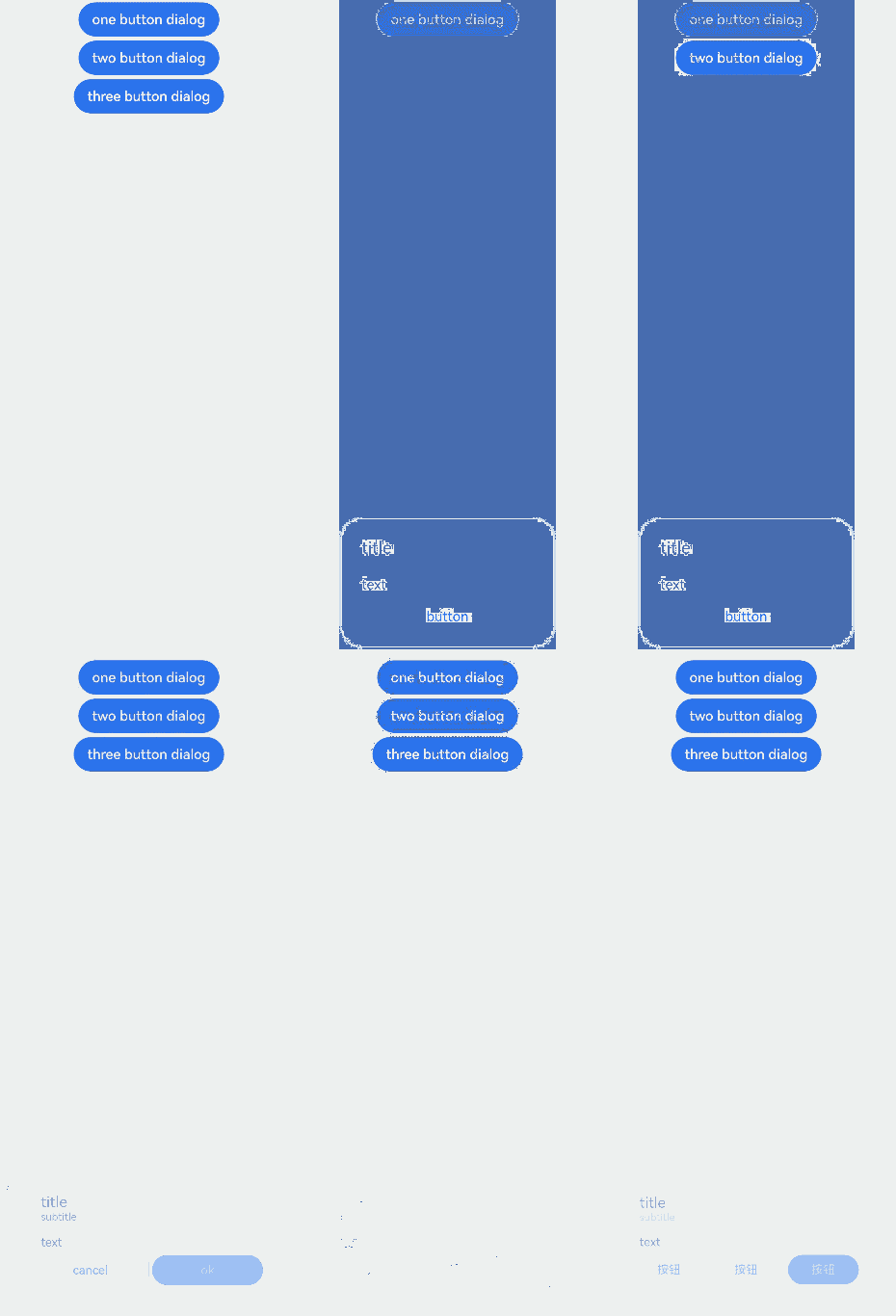
This example demonstrates how to display dialog boxes with one, two, and three buttons.
// xxx.ets
@Entry
@Component
struct AlertDialogExample {
  build() {
    Column({ space: 5 }) {
      Button('one button dialog')
        .onClick(() => {
          // You are advised to use this.getUIContext().showAlertDialog().
          AlertDialog.show(
            {
              title: 'title',
              message: 'text',
              autoCancel: true,
              alignment: DialogAlignment.Bottom,
              offset: { dx: 0, dy: -20 },
              gridCount: 3,
              confirm: {
                value: 'button',
                action: () => {
                  console.info('Button-clicking callback')
                }
              },
              cancel: () => {
                console.info('Closed callbacks')
              },
              onWillDismiss:(dismissDialogAction: DismissDialogAction)=> {
                console.info("reason=" + JSON.stringify(dismissDialogAction.reason))
                console.log("dialog onWillDismiss")
                if (dismissDialogAction.reason == DismissReason.PRESS_BACK) {
                  dismissDialogAction.dismiss()
                }
                if (dismissDialogAction.reason == DismissReason.TOUCH_OUTSIDE) {
                  dismissDialogAction.dismiss()
                }
              }
            }
          )
        })
        .backgroundColor(0x317aff)
      Button('two button dialog')
        .onClick(() => {
          // You are advised to use this.getUIContext().showAlertDialog().
          AlertDialog.show(
            {
              title: 'title',
              subtitle: 'subtitle',
              message: 'text',
              autoCancel: true,
              alignment: DialogAlignment.Bottom,
              gridCount: 4,
              offset: { dx: 0, dy: -20 },
              primaryButton: {
                value: 'cancel',
                action: () => {
                  console.info('Callback when the first button is clicked')
                }
              },
              secondaryButton: {
                enabled: true,
                defaultFocus: true,
                style: DialogButtonStyle.HIGHLIGHT,
                value: 'ok',
                action: () => {
                  console.info('Callback when the second button is clicked')
                }
              },
              cancel: () => {
                console.info('Closed callbacks')
              },
              onWillDismiss:(dismissDialogAction: DismissDialogAction)=> {
                console.info("reason=" + JSON.stringify(dismissDialogAction.reason))
                console.log("dialog onWillDismiss")
                if (dismissDialogAction.reason == DismissReason.PRESS_BACK) {
                  dismissDialogAction.dismiss()
                }
                if (dismissDialogAction.reason == DismissReason.TOUCH_OUTSIDE) {
                  dismissDialogAction.dismiss()
                }
              }
            }
          )
        }).backgroundColor(0x317aff)
        Button('three button dialog')
        .onClick(() => {
          // You are advised to use this.getUIContext().showAlertDialog().
          AlertDialog.show(
            {
              title: 'title',
              subtitle: 'subtitle',
              message: 'text',
              autoCancel: true,
              alignment: DialogAlignment.Bottom,
              gridCount: 4,
              offset: { dx: 0, dy: -20 },
              buttonDirection: DialogButtonDirection.HORIZONTAL,
              buttons: [
                {
                  value: 'Button',
                  action: () => {
                    console.info('Callback when button1 is clicked')
                  }
                },
                {
                  value: 'Button',
                  action: () => {
                    console.info('Callback when button2 is clicked')
                  }
                },
                {
                  value: 'Button',
                  enabled: true,
                  defaultFocus: true,
                  style: DialogButtonStyle.HIGHLIGHT,
                  action: () => {
                    console.info('Callback when button3 is clicked')
                  }
                },
              ],
              cancel: () => {
                console.info('Closed callbacks')
              },
              onWillDismiss:(dismissDialogAction: DismissDialogAction)=> {
                console.info("reason=" + JSON.stringify(dismissDialogAction.reason))
                console.log("dialog onWillDismiss")
                if (dismissDialogAction.reason == DismissReason.PRESS_BACK) {
                  dismissDialogAction.dismiss()
                }
                if (dismissDialogAction.reason == DismissReason.TOUCH_OUTSIDE) {
                  dismissDialogAction.dismiss()
                }
              }
            }
          )
        }).backgroundColor(0x317aff)
    }.width('100%').margin({ top: 5 })
  }
}
Example 2: Opening a Dialog Box Outside the Main Window
This example demonstrates how to configure a dialog box to display outside the main window on a 2-in-1 device by setting showInSubWindow to true.
NOTE
To avoid confusion with AlertDialog instances, it is recommended that you obtain a UIContext instance using the getUIContext API, and then use the showAlertDialog API to invoke the instance's AlertDialog.show() method.
// xxx.ets
@Entry
@Component
struct AlertDialogExample {
  build() {
    Column({ space: 5 }) {
      Button('one button dialog')
        .onClick(() => {
          // You are advised to use this.getUIContext().showAlertDialog().
          AlertDialog.show(
            {
              title: 'title',
              subtitle: 'subtitle',
              message: 'text',
              autoCancel: true,
              alignment: DialogAlignment.Center,
              gridCount: 4,
              showInSubWindow: true,
              isModal: true,
              offset: { dx: 0, dy: -20 },
              buttonDirection: DialogButtonDirection.HORIZONTAL,
              buttons: [
                {
                  value: 'Button',
                  action: () => {
                    console.info('Callback when button1 is clicked')
                  }
                },
                {
                  value: 'Button',
                  action: () => {
                    console.info('Callback when button2 is clicked')
                  }
                },
                {
                  value: 'Button',
                  enabled: true,
                  defaultFocus: true,
                  style: DialogButtonStyle.HIGHLIGHT,
                  action: () => {
                    console.info('Callback when button3 is clicked')
                  }
                },
              ],
              cancel: () => {
                console.info('Closed callbacks')
              },
              onWillDismiss: (dismissDialogAction: DismissDialogAction) => {
                console.info("reason=" + JSON.stringify(dismissDialogAction.reason))
                console.log("dialog onWillDismiss")
                if (dismissDialogAction.reason == DismissReason.PRESS_BACK) {
                  dismissDialogAction.dismiss()
                }
                if (dismissDialogAction.reason == DismissReason.TOUCH_OUTSIDE) {
                  dismissDialogAction.dismiss()
                }
              }
            })
        })
    }.width('100%').margin({ top: 5 }).backgroundColor(0x317aff)
  }
}

Example 3: Setting the Dialog Box Animation
This example illustrates how to use the transition API to create custom animation effects for the dialog box's appearance and disappearance.
NOTE
To avoid confusion with AlertDialog instances, it is recommended that you obtain a UIContext instance using the getUIContext API, and then use the showAlertDialog API to invoke the instance's AlertDialog.show() method.
// xxx.ets
@Entry
@Component
struct AlertDialogExample {
  build() {
    Column({ space: 5 }) {
      Button('AlertDialog Set Duration')
        .onClick(()=>{
            // You are advised to use this.getUIContext().showAlertDialog().
            AlertDialog.show(
              {
                title: 'AlertDialog 1',
                message: 'Set Animation Duration open 3 second, close 100ms',
                autoCancel: true,
                alignment: DialogAlignment.Top,
                offset: { dx: 0, dy: -20 },
                gridCount: 3,
                transition:TransitionEffect.asymmetric(TransitionEffect.OPACITY
                  .animation({ duration: 3000, curve: Curve.Sharp }).combine(TransitionEffect.scale({x: 1.5, y: 1.5}).animation({duration: 3000, curve: Curve.Sharp})),
                  TransitionEffect.OPACITY.animation({ duration: 100, curve: Curve.Smooth })
                    .combine(TransitionEffect.scale({x: 0.5, y: 0.5}).animation({duration: 100, curve: Curve.Smooth}))),
                confirm: {
                  value: 'button',
                  action: () => {
                    console.info('Button-clicking callback')
                  }
                },
                cancel: () => {
                  console.info('Closed callbacks')
                }
              }
            )
        })
        .backgroundColor(0x317aff).height("88px")
    }.width('100%').margin({ top: 5 })
  }
}

Example 4: Setting the Dialog Box Style
This example demonstrates how to set styles of an alert dialog box, including the width, height, background color, and shadow.
NOTE
To avoid confusion with AlertDialog instances, it is recommended that you obtain a UIContext instance using the getUIContext API, and then use the showAlertDialog API to invoke the instance's AlertDialog.show() method.
// xxx.ets
@Entry
@Component
struct AlertDialogExample {
  build() {
    Column({ space: 5 }) {
      Button('one button dialog')
        .onClick(() => {
          // You are advised to use this.getUIContext().showAlertDialog().
          AlertDialog.show(
            {
              title: 'title',
              message: 'text',
              autoCancel: true,
              alignment: DialogAlignment.Center,
              offset: { dx: 0, dy: -20 },
              gridCount: 3,
              width: 300,
              height: 200,
              cornerRadius: 20,
              borderWidth: 1,
              borderStyle: BorderStyle.Dashed,// borderStyle must be used with borderWidth in pairs.
              borderColor: Color.Blue,// borderColor must be used with borderWidth in pairs.
              backgroundColor: Color.White,
              shadow: ({ radius: 20, color: Color.Grey, offsetX: 50, offsetY: 0}),
              textStyle: { wordBreak: WordBreak.BREAK_ALL },
              confirm: {
                value: 'button',
                action: () => {
                  console.info('Button-clicking callback')
                }
              },
              cancel: () => {
                console.info('Closed callbacks')
              },
              onWillDismiss:(dismissDialogAction: DismissDialogAction)=> {
                console.info("reason=" + JSON.stringify(dismissDialogAction.reason))
                console.log("dialog onWillDismiss")
                if (dismissDialogAction.reason == DismissReason.PRESS_BACK) {
                  dismissDialogAction.dismiss()
                }
                if (dismissDialogAction.reason == DismissReason.TOUCH_OUTSIDE) {
                  dismissDialogAction.dismiss()
                }
              }
            }
          )
        })
        .backgroundColor(0x317aff)
    }.width('100%').margin({ top: 5 })
  }
}

Example 5: Configuring a Dialog Box in the Hover State
This example demonstrates how to set the layout area of a dialog box in hover mode on a foldable device.
@Entry
@Component
struct AlertDialogExample {
  build() {
    Column({ space: 5 }) {
      Button('one button dialog')
        .onClick(() => {
          AlertDialog.show(
            {
              title: 'title',
              message: 'text',
              autoCancel: true,
              alignment: DialogAlignment.Bottom,
              gridCount: 3,
              confirm: {
                value: 'button',
                action: () => {
                  console.info('Button-clicking callback')
                }
              },
              cancel: () => {
                console.info('Closed callbacks')
              },
              onWillDismiss:(dismissDialogAction: DismissDialogAction)=> {
                console.info("reason=" + JSON.stringify(dismissDialogAction.reason));
                console.log("dialog onWillDismiss");
                if (dismissDialogAction.reason == DismissReason.PRESS_BACK) {
                  dismissDialogAction.dismiss();
                }
                if (dismissDialogAction.reason == DismissReason.TOUCH_OUTSIDE) {
                  dismissDialogAction.dismiss();
                }
              },
              enableHoverMode: true,
              hoverModeArea: HoverModeAreaType.TOP_SCREEN
            }
          )
        })
        .backgroundColor(0x317aff)
    }.width('100%').margin({ top: 5 })
  }
}
