GridRow
The responsive grid layout provides rules for layout design and resolves issues of dynamic layout across devices with different sizes, thereby ensuring layout consistency across layouts on different devices.
The GridRow component is used in a grid layout, together with its child component GridCol.
NOTE
This component is supported since API version 9. Updates will be marked with a superscript to indicate their earliest API version.
Child Components
This component can contain the GridCol child component.
APIs
GridRow(option?: GridRowOptions)
Widget capability: This API can be used in ArkTS widgets since API version 9.
Atomic service API: This API can be used in atomic services since API version 11.
System capability: SystemCapability.ArkUI.ArkUI.Full
Parameters
| Name | Type | Mandatory | Description |
|---|---|---|---|
| option | GridRowOptions | No | Child component options of the grid layout. |
GridRowOptions
Widget capability: This API can be used in ArkTS widgets since API version 9.
Atomic service API: This API can be used in atomic services since API version 11.
System capability: SystemCapability.ArkUI.ArkUI.Full
| Name | Type | Mandatory | Description |
|---|---|---|---|
| columns | number |GridRowColumnOption | No | Number of columns in the grid layout. Default value: 12 |
| gutter | Length |GutterOption | No | Gutter of the grid layout. Default value: 0 |
| breakpoints | BreakPoints | No | Array of breakpoints for the breakpoint value and the corresponding reference based on the window or container size. Default value: { value: ["320vp", "600vp", "840vp"], reference: BreakpointsReference.WindowSize } |
| direction | GridRowDirection | No | Arrangement direction of the grid layout. Default value: GridRowDirection.Row |
GutterOption
Provides the gutter options for the grid layout to define the spacing between child components in different directions.
Widget capability: This API can be used in ArkTS widgets since API version 9.
Atomic service API: This API can be used in atomic services since API version 11.
System capability: SystemCapability.ArkUI.ArkUI.Full
| Name | Type | Mandatory | Description |
|---|---|---|---|
| x | Length |GridRowSizeOption | No | Horizontal spacing between grid child components. |
| y | Length |GridRowSizeOption | No | Vertical spacing between grid child components. |
GridRowColumnOption
Describes the numbers of grid columns for devices with different grid sizes.
Widget capability: This API can be used in ArkTS widgets since API version 9.
Atomic service API: This API can be used in atomic services since API version 11.
System capability: SystemCapability.ArkUI.ArkUI.Full
| Name | Type | Mandatory | Description |
|---|---|---|---|
| xs | number | No | Number of grid columns on the device where the grid size is xs. |
| sm | number | No | Number of grid columns on the device where the grid size is sm. |
| md | number | No | Number of grid columns on the device where the grid size is md. |
| lg | number | No | Number of grid columns on the device where the grid size is lg. |
| xl | number | No | Number of grid columns on the device where the grid size is xl. |
| xxl | number | No | Number of grid columns on the device where the grid size is xxl. |
NOTE
In the GridRow component, you can define the value range of breakpoints. A maximum of six breakpoints are supported, which are xs, sm, md, lg, xl, and xxl. The breakpoint names cannot be modified. Assume that the input array is [n0, n1, n2, n3, n4], then the value ranges of breakpoints are as follows.
| Breakpoint | Value Range |
|---|---|
| xs | [0, n0) |
| sm | [n0, n1) |
| md | [n1, n2) |
| lg | [n2, n3) |
| xl | [n3, n4) |
| xxl | [n4, INF) |
GridRowSizeOption
Describes the gutter sizes for different device width types.
Widget capability: This API can be used in ArkTS widgets since API version 9.
Atomic service API: This API can be used in atomic services since API version 11.
System capability: SystemCapability.ArkUI.ArkUI.Full
| Name | Type | Mandatory | Description |
|---|---|---|---|
| xs | Length | No | Gutter size for minimum device width. |
| sm | Length | No | Gutter size for small device width. |
| md | Length | No | Gutter size for medium device width. |
| lg | Length | No | Gutter size for large device width. |
| xl | Length | No | Gutter size for extra large device width. |
| xxl | Length | No | Gutter size for extra extra large device width. |
BreakPoints
Sets breakpoints for the responsive grid container.
Widget capability: This API can be used in ArkTS widgets since API version 9.
Atomic service API: This API can be used in atomic services since API version 11.
System capability: SystemCapability.ArkUI.ArkUI.Full
| Name | Type | Mandatory | Description |
|---|---|---|---|
| value | Array<string> | No | Array of monotonically increasing breakpoints. Default value: ["320vp", "600vp", "840vp"] |
| reference | BreakpointsReference | No | Breakpoint switching reference. Default value: BreakpointsReference.WindowSize |
  // Enable the xs, sm, and md breakpoints.
  breakpoints: {value: ["100vp", "200vp"]}
  // Enable four breakpoints: xs, sm, md, and lg. The breakpoint range must be monotonically increasing.
  breakpoints: {value: ["320vp", "600vp", "840vp"]}
  // Enable five breakpoints: xs, sm, md, lg, and xl. The number of breakpoint ranges cannot exceed the number of breakpoints minus 1.
  breakpoints: {value: ["320vp", "600vp", "840vp", "1080vp"]}
BreakpointsReference
Widget capability: This API can be used in ArkTS widgets since API version 9.
Atomic service API: This API can be used in atomic services since API version 11.
System capability: SystemCapability.ArkUI.ArkUI.Full
| Name | Description |
|---|---|
| WindowSize | The window is used as a reference. |
| ComponentSize | The container is used as a reference. |
GridRowDirection
Widget capability: This API can be used in ArkTS widgets since API version 9.
Atomic service API: This API can be used in atomic services since API version 11.
System capability: SystemCapability.ArkUI.ArkUI.Full
| Name | Description |
|---|---|
| Row | Grid elements are arranged in the row direction. |
| RowReverse | Grid elements are arranged in the reverse row direction. |
NOTE
- Grid elements can be arranged only in the Row or RowReverse direction, but not in the Column or ColumnReverse direction.
- The location and size of a grid child component can be calculated only based on span and offset. If the span values of child components add up to a number greater than the allowed number of columns, the grid will automatically wraps lines.
- If the span value of a single child component exceeds the maximum number of columns, the maximum number of columns is used.
- If a child component takes up more than the total number of columns according to its offset and span settings, it will be placed in a new row.
- Below is the display effect of Item1: GridCol({span: 6}), Item2: GridCol({ span: 8, offset:11}).
| 1 | 2 | 3 | 4 | 5 | 6 | 7 | 8 | 9 | 10 | 11 | 12 |
|---|---|---|---|---|---|---|---|---|---|---|---|
| $\circ$ | $\circ$ | $\circ$ | $\circ$ | $\circ$ | $\circ$ | - | - | - | - | - | - |
| - | - | - | - | - | |||||||
| $\circ$ | $\circ$ | $\circ$ | $\circ$ | $\circ$ | $\circ$ | $\circ$ | $\circ$ |
Attributes
In addition to the universal attributes, the following attributes are supported.
alignItems10+
alignItems(value: ItemAlign)
Sets the alignment mode of the GridCol components along the vertical main axis of the GridRow component. The alignment mode of the GridCol component can also be set using alignSelf(ItemAlign). If both of the preceding methods are used, the setting of alignSelf(ItemAlign) prevails.
Widget capability: This API can be used in ArkTS widgets since API version 10.
Atomic service API: This API can be used in atomic services since API version 11.
System capability: SystemCapability.ArkUI.ArkUI.Full
Parameters
| Name | Type | Mandatory | Description |
|---|---|---|---|
| value | ItemAlign | Yes | Alignment mode of the GridCol components along the vertical main axis of the GridRow component. Default value: ItemAlign.Start NOTE ItemAlign supports the following enums: ItemAlign.Start, ItemAlign.Center, ItemAlign.End, and ItemAlign.Stretch. |
Events
onBreakpointChange
onBreakpointChange(callback: (breakpoints: string) => void)
Triggered when the breakpoint changes.
Widget capability: This API can be used in ArkTS widgets since API version 9.
Atomic service API: This API can be used in atomic services since API version 11.
System capability: SystemCapability.ArkUI.ArkUI.Full
Parameters
| Name | Type | Mandatory | Description |
|---|---|---|---|
| breakpoints | string | No | Breakpoint change. The value can be "xs", "sm", "md", "lg", "xl", or "xxl". |
Example
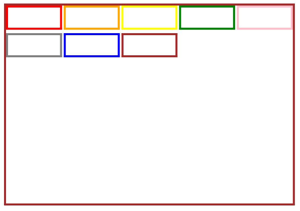
This example shows the basic usage of the responsive grid layout.
// xxx.ets
@Entry
@Component
struct GridRowExample {
  @State bgColors: Color[] = [Color.Red, Color.Orange, Color.Yellow, Color.Green, Color.Pink, Color.Grey, Color.Blue, Color.Brown]
  @State currentBp: string = 'unknown'

  build() {
    Column() {
      GridRow({
        columns: 5,
        gutter: { x: 5, y: 10 },
        breakpoints: { value: ["400vp", "600vp", "800vp"],
          reference: BreakpointsReference.WindowSize },
        direction: GridRowDirection.Row
      }) {
        ForEach(this.bgColors, (color: Color) => {
          GridCol({ span: { xs: 1, sm: 2, md: 3, lg: 4 }, offset: 0, order: 0 }) {
            Row().width("100%").height("20vp")
          }.borderColor(color).borderWidth(2)
        })
      }.width("100%").height("100%")
      .onBreakpointChange((breakpoint) => {
        this.currentBp = breakpoint
      })
    }.width('80%').margin({ left: 10, top: 5, bottom: 5 }).height(200)
    .border({ color: '#880606', width: 2 })
  }
}