Gradient Styles
NOTE
This component is supported since API version 4. Updates will be marked with a superscript to indicate their earliest API version.
Gradient styles are commonly supported and can be set in the style attribute or a .css file. Gradients enable smooth transition between two or more specified colors.
This framework supports two gradient styles: linear gradient and repeating linear gradient.
Linear Gradient/Repeating Linear Gradient
To use the gradient style, you need to specify the transition direction and transition color.
Transition Direction
The available values are as follows:
-
direction: gradient by direction.
-
angle: gradient by angle.
background: linear-gradient(direction/angle, color, color, ...);
background: repeating-linear-gradient(direction/angle, color, color, ...);
Transition Color
The color can be specified in any of the following formats: #ff0000, #ffff0000, rgb (255, 0, 0), and rgba (255, 0, 0, 1). At least two colors must be specified.
Parameters
| Style | Type | Default Value | Mandatory | Description |
|---|---|---|---|---|
| direction | to <side-or-corner> <side-or-corner> = [left |right] |[top |bottom] | to bottom (gradient from top to bottom) | No | Transition direction, for example, to left (gradient from right to left) or to bottom right (gradient from the top left to the bottom right). |
| angle | <deg> | 180deg | No | Transition direction, which is the angle between the gradient line and the y-axis (in the clockwise direction), with the geometric center of the element being the origin of coordinates and the horizontal axis being the x-axis. |
| color | <color> [<length>|<percentage>] | - | Yes | Colors among which smooth transitions are rendered. |
Example
-
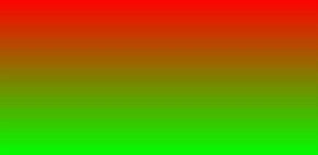
Gradient from top to bottom (default)
#gradient {
  height: 300px;
  width: 600px;
  /* Gradient starts from red at the top to green at the bottom. */
  background: linear-gradient(red, #00ff00);
}
-
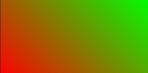
Gradient at an angle of 45°
/* Gradient at an angle of 45°, changing from red to green */
  background: linear-gradient(45deg, rgb(255,0,0),rgb(0, 255, 0));
-
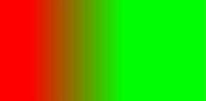
Gradient from left to right
/* Gradient from left to right, which is available in the 270 px width between the left 90 px and the left 360 px (600*0.6) */
background: linear-gradient(to right, rgb(255,0,0) 90px, rgb(0, 255, 0) 60%);
-
Repeating gradient
/* Repeating gradient from left to right, the area of which is 30 px (60 – 30) and the opacity is 0.5 */
background: repeating-linear-gradient(to right, rgba(255, 255, 0, 1) 30px,rgba(0, 0, 255, .5) 60px);

你可能感兴趣的鸿蒙文章
harmony 鸿蒙JavaScript-compatible Web-like Development Paradigm (ArkUI.Full)