OffscreenCanvasRenderingContext2D
OffscreenCanvasRenderingContext2D allows you to perform offscreen drawing on a canvas. This involves drawing content such as rectangles, images, and text in a buffer first, converting that content into an image, and then rendering the image onto the canvas. Because offscreen drawing uses the CPU for rendering, it can be slower than GPU-accelerated drawing. If the drawing speed is a critical concern, avoid using offscreen drawing.
NOTE
The APIs of this module are supported since API version 8. Updates will be marked with a superscript to indicate their earliest API version.
APIs
OffscreenCanvasRenderingContext2D(width: number, height: number, settings?: RenderingContextSettings, unit?: LengthMetricsUnit)
Widget capability: This API can be used in ArkTS widgets since API version 9.
Atomic service API: This API can be used in atomic services since API version 11.
System capability: SystemCapability.ArkUI.ArkUI.Full
Parameters
| Name | Type | Mandatory | Description |
|---|---|---|---|
| width | number | Yes | Width of the offscreen canvas. Default unit: vp |
| height | number | Yes | Height of the offscreen canvas. Default unit: vp |
| settings | RenderingContextSettings | No | Settings of the OffscreenCanvasRenderingContext2D object. Default value: null |
| unit12+ | LengthMetricsUnit | No | Unit mode of the OffscreenCanvasRenderingContext2D object. The value cannot be dynamically changed once set. The configuration method is the same as that of CanvasRenderingContext2D. Default value: DEFAULT |
Attributes
Widget capability: This API can be used in ArkTS widgets since API version 9.
Atomic service API: This API can be used in atomic services since API version 11.
System capability: SystemCapability.ArkUI.ArkUI.Full
| Name | Type | Read Only | Optional | Description |
|---|---|---|---|---|
| fillStyle | string |number10+ |CanvasGradient |CanvasPattern | No | No | Style to fill an area. - When the type is string, this attribute indicates the color of the fill area. For details about the color format, see the description for the string type in ResourceColor. Default value: '#000000' - When the type is number, this attribute indicates the color of the fill area. Fully transparent colors are not supported. For details about the color format, see the description for the number type in ResourceColor. Default value: 0x000000 - When the type is CanvasGradient, this attribute indicates a gradient object, which is created using the createLinearGradient API. - When the type is CanvasPattern, this attribute indicates a pattern, which is created using the createPattern API. |
| lineWidth | number | No | No | Line width. Default value: 1 (px) Default unit: vp The value cannot be 0 or a negative number. If it is set to 0 or a negative number, the default value is used instead. |
| strokeStyle | string |number10+ |CanvasGradient |CanvasPattern | No | No | Stroke color. - When the type is string, this attribute indicates the stroke color. For details about the color format, see the description for the string type in ResourceColor. Default value: '#000000' - When the type is number, this attribute indicates the stroke color. Fully transparent colors are not supported. For details about the color format, see the description for the number type in ResourceColor. Default value: 0x000000 - When the type is CanvasGradient, this attribute indicates a gradient object, which is created using the createLinearGradient API. - When the type is CanvasPattern, this attribute indicates a pattern, which is created using the createPattern API. |
| lineCap | CanvasLineCap | No | No | Style of the line endpoints. The options are as follows: - butt: The endpoints of the line are squared off. - round: The endpoints of the line are rounded. - square: The endpoints of the line are squared off, and each endpoint has added a rectangle whose length is the same as the line thickness and whose width is half of the line thickness. Default value: 'butt' |
| lineJoin | CanvasLineJoin | No | No | Style of the shape used to join line segments. The options are as follows: - round: The intersection is a sector, whose radius at the rounded corner is equal to the line width. - bevel: The intersection is a triangle. The rectangular corner of each line is independent. - miter: The intersection has a miter corner by extending the outside edges of the lines until they meet. You can view the effect of this attribute in miterLimit. Default value: 'miter' |
| miterLimit | number | No | No | Maximum miter length. The miter length is the distance between the inner corner and the outer corner where two lines meet. Default value: 10 (px) Unit: px The value cannot be 0 or a negative number. If it is set to 0 or a negative number, the default value is used instead. |
| font | string | No | No | Font style. Syntax: ctx.font='font-style font-weight font-size font-family' - (Optional) font-style: font style. Available values are normal and italic. - (Optional) font-weight: font weight. Available values are as follows: normal, bold, bolder, lighter, 100, 200, 300, 400, 500, 600, 700, 800, 900. - (Optional) font-size: font size and line height. The unit can be px or vp and must be specified. - (Optional) font-family: font family. Available values are sans-serif, serif, and monospace. Custom fonts are also supported but can only be used on the main thread. They are not supported in worker threads or in DevEco Studio Previewer. For details, see the custom font example. Default value: 'normal normal 14px sans-serif' |
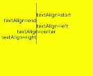
| textAlign | CanvasTextAlign | No | No | Text alignment mode. Available values are as follows: - left: The text is left-aligned. - right: The text is right-aligned. - center: The text is center-aligned. - start: The text is aligned with the start bound. - end: The text is aligned with the end bound. NOTE In the ltr layout mode, the value 'start' equals 'left'. In the rtl layout mode, the value 'start' equals 'right'. Default value: 'start' |
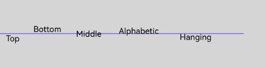
| textBaseline | CanvasTextBaseline | No | No | Horizontal alignment mode of text. Available values are as follows: - alphabetic: The text baseline is the normal alphabetic baseline. - top: The text baseline is on the top of the text bounding box. - hanging: The text baseline is a hanging baseline over the text. - middle: The text baseline is in the middle of the text bounding box. 'ideographic': The text baseline is the ideographic baseline. If a character exceeds the alphabetic baseline, the ideographic baseline is located at the bottom of the excess character. - bottom: The text baseline is at the bottom of the text bounding box. Its difference from the ideographic baseline is that the ideographic baseline does not consider letters in the next line. Default value: 'alphabetic' |
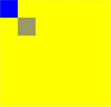
| globalAlpha | number | No | No | Opacity. The value ranges from 0.0 (completely transparent) to 1.0 (completely opaque). If the set value is less than 0.0, 0.0 will be used. If the set value is greater than 1.0, 1.0 will be used. Default value: 1.0 |
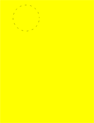
| lineDashOffset | number | No | No | Offset of the dashed line. The precision is float. Default value: 0.0 Unit: vp |
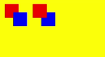
| globalCompositeOperation | string | No | No | Composition operation type. Available values are as follows: 'source-over', 'source-atop', 'source-in', 'source-out', 'destination-over', 'destination-atop', 'destination-in', 'destination-out', 'lighter', 'copy', and 'xor'. - Default value: 'source-over' |
| shadowBlur | number | No | No | Blur level during shadow drawing. A larger value indicates a more blurred effect. The precision is float, and the value must be greater than or equal to 0. Default value: 0.0 Unit: px The value cannot be a negative number. If it is set to a negative number, the default value is used instead. |
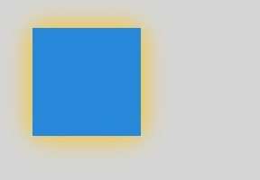
| shadowColor | string | No | No | Shadow color. For details about the color format, see the description for the string type in ResourceColor. Default value: transparent black |
| shadowOffsetX | number | No | No | X-axis shadow offset relative to the original object. Default value: 0.0 Default unit: vp |
| shadowOffsetY | number | No | No | Y-axis shadow offset relative to the original object. Default value: 0.0 Default unit: vp |
| imageSmoothingEnabled | boolean | No | No | Whether to adjust the image smoothness during image drawing. The value true means to enable this feature, and false means the opposite. Default value: true |
| imageSmoothingQuality | ImageSmoothingQuality | No | No | Quality of image smoothing. This attribute works only when imageSmoothingEnabled is set to true. Available values are as follows: - 'low': low quality. - 'medium': medium quality. - 'high': high quality. Default value: 'low' |
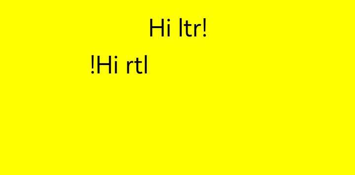
| direction | CanvasDirection | No | No | Text direction used for drawing text. Available values are as follows: - 'inherit' The default layout direction is used. - 'ltr': The text direction is from left to right. - 'rtl': The text direction is from right to left. Default value: 'inherit' |
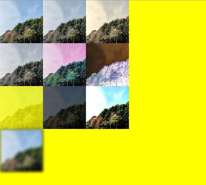
| filter | string | No | No | Filter effect for an image. You can combine any number of filter effects. Available values are as follows: - 'none': no filter effect. - 'blur(<length>)': applies the Gaussian blur for the image. The value must be greater than or equal to 0. The unit can be px, vp, or rem. The default unit is vp, and the default value is blur(0px). - 'brightness([<number>|<percentage>])': applies a linear multiplication to the image to make it look brighter or darker. The value can be a number or percentage. It must be greater than or equal to 0. The default value is brightness(1). - 'contrast([<number>|<percentage>])': adjusts the image contrast. The value can be a number or percentage. It must be greater than or equal to 0. The default value is contrast(1). - 'grayscale([<number>|<percentage>])': converts the image to a grayscale image. The value can be a number or percentage. The value range is [0, 1]. The default value is grayscale(0). - 'hue-rotate(<angle>)': applies hue rotation to the image. The value ranges from 0deg to 360deg. The default value is hue-rotate (0deg). - 'invert([<number>|<percentage>])': inverts the input image. The value can be a number or percentage. The value range is [0, 1]. The default value is invert (0). - 'opacity([<number>|<percentage>])': sets the opacity of the image. The value can be a number or percentage. The value range is [0, 1]. The default value is opacity(1). - 'saturate([<number>|<percentage>])': sets the saturation of the image. The value can be a number or percentage. It must be greater than or equal to 0. The default value is saturate(1). - 'sepia([<number>|<percentage>])': converts the image to dark brown. The value can be a number or percentage. The value range is [0, 1]. The default value is sepia(0). |
NOTE For fillStyle, shadowColor, and strokeStyle, the value format of the string type is 'rgb(255, 255, 255)', 'rgba(255, 255, 255, 1.0)', '#FFFFFF'.
fillStyle
// xxx.ets
@Entry
@Component
struct FillStyleExample {
  private settings: RenderingContextSettings = new RenderingContextSettings(true)
  private context: CanvasRenderingContext2D = new CanvasRenderingContext2D(this.settings)
  private offCanvas: OffscreenCanvas = new OffscreenCanvas(600, 600)

  build() {
    Flex({ direction: FlexDirection.Column, alignItems: ItemAlign.Center, justifyContent: FlexAlign.Center }) {
      Canvas(this.context)
        .width('100%')
        .height('100%')
        .backgroundColor('#ffff00')
        .onReady(() =>{
          let offContext = this.offCanvas.getContext("2d", this.settings)
          offContext.fillStyle = '#0000ff'
          offContext.fillRect(20, 20, 150, 100)
          let image = this.offCanvas.transferToImageBitmap()
          this.context.transferFromImageBitmap(image)
        })
    }
    .width('100%')
    .height('100%')
  }
}
// xxx.ets
@Entry
@Component
struct FillStyleExample {
  private settings: RenderingContextSettings = new RenderingContextSettings(true)
  private context: CanvasRenderingContext2D = new CanvasRenderingContext2D(this.settings)
  private offCanvas: OffscreenCanvas = new OffscreenCanvas(600, 600)

  build() {
    Flex({ direction: FlexDirection.Column, alignItems: ItemAlign.Center, justifyContent: FlexAlign.Center }) {
      Canvas(this.context)
        .width('100%')
        .height('100%')
        .backgroundColor('#ffff00')
        .onReady(() =>{
          let offContext = this.offCanvas.getContext("2d", this.settings)
          offContext.fillStyle = 0x0000FF
          offContext.fillRect(20, 20, 150, 100)
          let image = this.offCanvas.transferToImageBitmap()
          this.context.transferFromImageBitmap(image)
        })
    }
    .width('100%')
    .height('100%')
  }
}

lineWidth
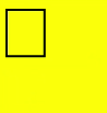
// xxx.ets
@Entry
@Component
struct LineWidthExample {
  private settings: RenderingContextSettings = new RenderingContextSettings(true)
  private context: CanvasRenderingContext2D = new CanvasRenderingContext2D(this.settings)
  private offCanvas: OffscreenCanvas = new OffscreenCanvas(600, 600)

  build() {
    Flex({ direction: FlexDirection.Column, alignItems: ItemAlign.Center, justifyContent: FlexAlign.Center }) {
      Canvas(this.context)
        .width('100%')
        .height('100%')
        .backgroundColor('#ffff00')
        .onReady(() =>{
          let offContext = this.offCanvas.getContext("2d", this.settings)
          offContext.lineWidth = 5
          offContext.strokeRect(25, 25, 85, 105)
          let image = this.offCanvas.transferToImageBitmap()
          this.context.transferFromImageBitmap(image)
      })
    }
    .width('100%')
    .height('100%')
  }
}
strokeStyle
// xxx.ets
@Entry
@Component
struct StrokeStyleExample {
  private settings: RenderingContextSettings = new RenderingContextSettings(true)
  private context: CanvasRenderingContext2D = new CanvasRenderingContext2D(this.settings)
  private offCanvas: OffscreenCanvas = new OffscreenCanvas(600, 600)

  build() {
    Flex({ direction: FlexDirection.Column, alignItems: ItemAlign.Center, justifyContent: FlexAlign.Center }) {
      Canvas(this.context)
        .width('100%')
        .height('100%')
        .backgroundColor('#ffff00')
        .onReady(() =>{
          let offContext = this.offCanvas.getContext("2d", this.settings)
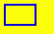
          offContext.lineWidth = 10
          offContext.strokeStyle = '#0000ff'
          offContext.strokeRect(25, 25, 155, 105)
          let image = this.offCanvas.transferToImageBitmap()
          this.context.transferFromImageBitmap(image)
        })
    }
    .width('100%')
    .height('100%')
  }
}
// xxx.ets
@Entry
@Component
struct StrokeStyleExample {
  private settings: RenderingContextSettings = new RenderingContextSettings(true)
  private context: CanvasRenderingContext2D = new CanvasRenderingContext2D(this.settings)
  private offCanvas: OffscreenCanvas = new OffscreenCanvas(600, 600)

  build() {
    Flex({ direction: FlexDirection.Column, alignItems: ItemAlign.Center, justifyContent: FlexAlign.Center }) {
      Canvas(this.context)
        .width('100%')
        .height('100%')
        .backgroundColor('#ffff00')
        .onReady(() =>{
          let offContext = this.offCanvas.getContext("2d", this.settings)
          offContext.lineWidth = 10
          offContext.strokeStyle = 0x0000ff
          offContext.strokeRect(25, 25, 155, 105)
          let image = this.offCanvas.transferToImageBitmap()
          this.context.transferFromImageBitmap(image)
        })
    }
    .width('100%')
    .height('100%')
  }
}
lineCap
// xxx.ets
@Entry
@Component
struct LineCapExample {
  private settings: RenderingContextSettings = new RenderingContextSettings(true)
  private context: CanvasRenderingContext2D = new CanvasRenderingContext2D(this.settings)
  private offCanvas: OffscreenCanvas = new OffscreenCanvas(600, 600)

  build() {
    Flex({ direction: FlexDirection.Column, alignItems: ItemAlign.Center, justifyContent: FlexAlign.Center }) {
      Canvas(this.context)
        .width('100%')
        .height('100%')
        .backgroundColor('#ffff00')
        .onReady(() =>{
          let offContext = this.offCanvas.getContext("2d", this.settings)
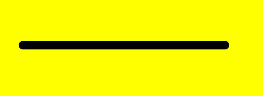
          offContext.lineWidth = 8
          offContext.beginPath()
          offContext.lineCap = 'round'
          offContext.moveTo(30, 50)
          offContext.lineTo(220, 50)
          offContext.stroke()
          let image = this.offCanvas.transferToImageBitmap()
          this.context.transferFromImageBitmap(image)
        })
    }
    .width('100%')
    .height('100%')
  }
}
lineJoin
// xxx.ets
@Entry
@Component
struct LineJoinExample {
  private settings: RenderingContextSettings = new RenderingContextSettings(true)
  private context: CanvasRenderingContext2D = new CanvasRenderingContext2D(this.settings)
  private offCanvas: OffscreenCanvas = new OffscreenCanvas(600, 600)

  build() {
    Flex({ direction: FlexDirection.Column, alignItems: ItemAlign.Center, justifyContent: FlexAlign.Center }) {
      Canvas(this.context)
        .width('100%')
        .height('100%')
        .backgroundColor('#ffff00')
        .onReady(() =>{
          let offContext = this.offCanvas.getContext("2d", this.settings)
          offContext.beginPath()
          offContext.lineWidth = 8
          offContext.lineJoin = 'miter'
          offContext.moveTo(30, 30)
          offContext.lineTo(120, 60)
          offContext.lineTo(30, 110)
          offContext.stroke()
          let image = this.offCanvas.transferToImageBitmap()
          this.context.transferFromImageBitmap(image)
      })
    }
    .width('100%')
    .height('100%')
  }
}
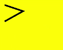
miterLimit
// xxx.ets
@Entry
@Component
struct MiterLimit {
  private settings: RenderingContextSettings = new RenderingContextSettings(true)
  private context: CanvasRenderingContext2D = new CanvasRenderingContext2D(this.settings)
  private offCanvas: OffscreenCanvas = new OffscreenCanvas(600, 600)

  build() {
    Flex({ direction: FlexDirection.Column, alignItems: ItemAlign.Center, justifyContent: FlexAlign.Center }) {
      Canvas(this.context)
        .width('100%')
        .height('100%')
        .backgroundColor('#ffff00')
        .onReady(() =>{
          let offContext = this.offCanvas.getContext("2d", this.settings)
          offContext.lineWidth = 8
          offContext.lineJoin = 'miter'
          offContext.miterLimit = 3
          offContext.moveTo(30, 30)
          offContext.lineTo(60, 35)
          offContext.lineTo(30, 37)
          offContext.stroke()
          let image = this.offCanvas.transferToImageBitmap()
          this.context.transferFromImageBitmap(image)
      })
    }
    .width('100%')
    .height('100%')
  }
}
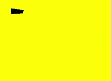
font
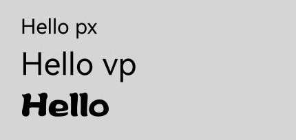
Before using the font property to load custom fonts, you must first register the custom font in the EntryAbility.ets file located in the src/main/ets/entryability/ directory. The following is an example of how to do this.
The value of familyName must be a continuous string without spaces, for example, "customFont". Otherwise, the font property will fail to load the custom font.
The familySrc path should point to the font file located in the font folder, which is at the same level as the pages folder.
onWindowStageCreate(windowStage: window.WindowStage): void {
  windowStage.loadContent('pages/Index', (err) => {
    windowStage.getMainWindow().then(res => {
      const uiCtc = res.getUIContext()
      uiCtc.getFont().registerFont({
        familyName: 'customFont',
        familySrc: '/font/myFont.ttf'
      })
    })
  });
}
// xxx.ets
@Entry
@Component
struct Fonts {
  private settings: RenderingContextSettings = new RenderingContextSettings(true)
  private context: CanvasRenderingContext2D = new CanvasRenderingContext2D(this.settings)
  private offCanvas: OffscreenCanvas = new OffscreenCanvas(600, 600)

  build() {
    Flex({ direction: FlexDirection.Column, alignItems: ItemAlign.Center, justifyContent: FlexAlign.Center }) {
      Canvas(this.context)
        .width('100%')
        .height('100%')
        .backgroundColor('rgb(213,213,213)')
        .onReady(() =>{
          let offContext = this.offCanvas.getContext("2d", this.settings)
          offContext.font = '30px sans-serif'
          offContext.fillText("Hello px", 20, 60)
          offContext.font = '30vp sans-serif'
          offContext.fillText("Hello vp", 20, 100)
          // Use a custom font by specifying its familyName.
          offContext.font = '30vp customFont'
          offContext.fillText("Hello", 20, 140)
          let image = this.offCanvas.transferToImageBitmap()
          this.context.transferFromImageBitmap(image)
        })
    }
    .width('100%')
    .height('100%')
  }
}
textAlign
// xxx.ets
@Entry
@Component
struct CanvasExample {
  private settings: RenderingContextSettings = new RenderingContextSettings(true)
  private context: CanvasRenderingContext2D = new CanvasRenderingContext2D(this.settings)
  private offCanvas: OffscreenCanvas = new OffscreenCanvas(600, 600)

  build() {
    Flex({ direction: FlexDirection.Column, alignItems: ItemAlign.Center, justifyContent: FlexAlign.Center }) {
      Canvas(this.context)
        .width('100%')
        .height('100%')
        .backgroundColor('#ffff00')
        .onReady(() =>{
        let offContext = this.offCanvas.getContext("2d", this.settings)
        offContext.strokeStyle = '#0000ff'
        offContext.moveTo(140, 10)
        offContext.lineTo(140, 160)
        offContext.stroke()

        offContext.font = '18px sans-serif'

        offContext.textAlign = 'start'
        offContext.fillText('textAlign=start', 140, 60)
        offContext.textAlign = 'end'
        offContext.fillText('textAlign=end', 140, 80)
        offContext.textAlign = 'left'
        offContext.fillText('textAlign=left', 140, 100)
        offContext.textAlign = 'center'
        offContext.fillText('textAlign=center',140, 120)
        offContext.textAlign = 'right'
        offContext.fillText('textAlign=right',140, 140)
        let image = this.offCanvas.transferToImageBitmap()
        this.context.transferFromImageBitmap(image)
      })
    }
    .width('100%')
    .height('100%')
  }
}
textBaseline
// xxx.ets
@Entry
@Component
struct TextBaseline {
  private settings: RenderingContextSettings = new RenderingContextSettings(true)
  private context: CanvasRenderingContext2D = new CanvasRenderingContext2D(this.settings)
  private offCanvas: OffscreenCanvas = new OffscreenCanvas(600, 600)

  build() {
    Flex({ direction: FlexDirection.Column, alignItems: ItemAlign.Center, justifyContent: FlexAlign.Center }) {
      Canvas(this.context)
        .width('100%')
        .height('100%')
        .backgroundColor('rgb(213,213,213)')
        .onReady(() => {
          let offContext = this.offCanvas.getContext("2d", this.settings)
          offContext.strokeStyle = '#0000ff'
          offContext.moveTo(0, 120)
          offContext.lineTo(400, 120)
          offContext.stroke()

          offContext.font = '20px sans-serif'

          offContext.textBaseline = 'top'
          offContext.fillText('Top', 10, 120)
          offContext.textBaseline = 'bottom'
          offContext.fillText('Bottom', 55, 120)
          offContext.textBaseline = 'middle'
          offContext.fillText('Middle', 125, 120)
          offContext.textBaseline = 'alphabetic'
          offContext.fillText('Alphabetic', 195, 120)
          offContext.textBaseline = 'hanging'
          offContext.fillText('Hanging', 295, 120)
          let image = this.offCanvas.transferToImageBitmap()
          this.context.transferFromImageBitmap(image)
      })
    }
    .width('100%')
    .height('100%')
  }
}
globalAlpha
// xxx.ets
@Entry
@Component
struct GlobalAlpha {
  private settings: RenderingContextSettings = new RenderingContextSettings(true)
  private context: CanvasRenderingContext2D = new CanvasRenderingContext2D(this.settings)
  private offCanvas: OffscreenCanvas = new OffscreenCanvas(600, 600)

  build() {
    Flex({ direction: FlexDirection.Column, alignItems: ItemAlign.Center, justifyContent: FlexAlign.Center }) {
      Canvas(this.context)
        .width('100%')
        .height('100%')
        .backgroundColor('#ffff00')
        .onReady(() =>{
          let offContext = this.offCanvas.getContext("2d", this.settings)
          offContext.fillStyle = 'rgb(0,0,255)'
          offContext.fillRect(0, 0, 50, 50)
          offContext.globalAlpha = 0.4
          offContext.fillStyle = 'rgb(0,0,255)'
          offContext.fillRect(50, 50, 50, 50)
          let image = this.offCanvas.transferToImageBitmap()
          this.context.transferFromImageBitmap(image)
      })
    }
    .width('100%')
    .height('100%')
  }
}
lineDashOffset
// xxx.ets
@Entry
@Component
struct LineDashOffset {
  private settings: RenderingContextSettings = new RenderingContextSettings(true)
  private context: CanvasRenderingContext2D = new CanvasRenderingContext2D(this.settings)
  private offCanvas: OffscreenCanvas = new OffscreenCanvas(600, 600)

  build() {
    Flex({ direction: FlexDirection.Column, alignItems: ItemAlign.Center, justifyContent: FlexAlign.Center }) {
      Canvas(this.context)
        .width('100%')
        .height('100%')
        .backgroundColor('#ffff00')
        .onReady(() =>{
          let offContext = this.offCanvas.getContext("2d", this.settings)
          offContext.arc(100, 75, 50, 0, 6.28)
          offContext.setLineDash([10,20])
          offContext.lineDashOffset = 10.0
          offContext.stroke()
          let image = this.offCanvas.transferToImageBitmap()
          this.context.transferFromImageBitmap(image)
      })
    }
    .width('100%')
    .height('100%')
  }
}
globalCompositeOperation
| Name | Description |
|---|---|
| source-over | Displays the new drawing above the existing drawing. This attribute is used by default. |
| source-atop | Displays the new drawing on the top of the existing drawing. |
| source-in | Displays the new drawing inside the existing drawing. |
| source-out | Displays part of the new drawing that is outside of the existing drawing. |
| destination-over | Displays the existing drawing above the new drawing. |
| destination-atop | Displays the existing drawing on the top of the new drawing. |
| destination-in | Displays the existing drawing inside the new drawing. |
| destination-out | Displays the existing drawing outside the new drawing. |
| lighter | Displays both the new and existing drawing. |
| copy | Displays the new drawing and neglects the existing drawing. |
| xor | Combines the new drawing and existing drawing using the XOR operation. |
// xxx.ets
@Entry
@Component
struct GlobalCompositeOperation {
  private settings: RenderingContextSettings = new RenderingContextSettings(true)
  private context: CanvasRenderingContext2D = new CanvasRenderingContext2D(this.settings)
  private offCanvas: OffscreenCanvas = new OffscreenCanvas(600, 600)

  build() {
    Flex({ direction: FlexDirection.Column, alignItems: ItemAlign.Center, justifyContent: FlexAlign.Center }) {
      Canvas(this.context)
        .width('100%')
        .height('100%')
        .backgroundColor('#ffff00')
        .onReady(() =>{
          let offContext = this.offCanvas.getContext("2d", this.settings)
          offContext.fillStyle = 'rgb(255,0,0)'
          offContext.fillRect(20, 20, 50, 50)
          offContext.globalCompositeOperation = 'source-over'
          offContext.fillStyle = 'rgb(0,0,255)'
          offContext.fillRect(50, 50, 50, 50)
          offContext.fillStyle = 'rgb(255,0,0)'
          offContext.fillRect(120, 20, 50, 50)
          offContext.globalCompositeOperation = 'destination-over'
          offContext.fillStyle = 'rgb(0,0,255)'
          offContext.fillRect(150, 50, 50, 50)
          let image = this.offCanvas.transferToImageBitmap()
          this.context.transferFromImageBitmap(image)
      })
    }
    .width('100%')
    .height('100%')
  }
}
shadowBlur
// xxx.ets
@Entry
@Component
struct ShadowBlur {
  private settings: RenderingContextSettings = new RenderingContextSettings(true)
  private context: CanvasRenderingContext2D = new CanvasRenderingContext2D(this.settings)
  private offCanvas: OffscreenCanvas = new OffscreenCanvas(600, 600)

  build() {
    Flex({ direction: FlexDirection.Column, alignItems: ItemAlign.Center, justifyContent: FlexAlign.Center }) {
      Canvas(this.context)
        .width('100%')
        .height('100%')
        .backgroundColor('rgb(213,213,213)')
        .onReady(() =>{
          let offContext = this.offCanvas.getContext("2d", this.settings)
          offContext.shadowBlur = 30
          offContext.shadowColor = 'rgb(0,0,0)'
          offContext.fillStyle = 'rgb(39,135,217)'
          offContext.fillRect(20, 20, 100, 80)
          let image = this.offCanvas.transferToImageBitmap()
          this.context.transferFromImageBitmap(image)
      })
    }
    .width('100%')
    .height('100%')
  }
}
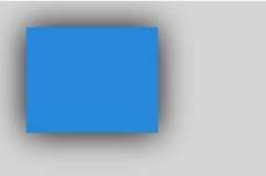
shadowColor
// xxx.ets
@Entry
@Component
struct ShadowColor {
  private settings: RenderingContextSettings = new RenderingContextSettings(true)
  private context: CanvasRenderingContext2D = new CanvasRenderingContext2D(this.settings)
  private offCanvas: OffscreenCanvas = new OffscreenCanvas(600, 600)

  build() {
    Flex({ direction: FlexDirection.Column, alignItems: ItemAlign.Center, justifyContent: FlexAlign.Center }) {
      Canvas(this.context)
        .width('100%')
        .height('100%')
        .backgroundColor('rgb(213,213,213)')
        .onReady(() => {
          let offContext = this.offCanvas.getContext("2d", this.settings)
          offContext.shadowBlur = 30
          offContext.shadowColor = 'rgb(255,192,0)'
          offContext.fillStyle = 'rgb(39,135,217)'
          offContext.fillRect(30, 30, 100, 100)
          let image = this.offCanvas.transferToImageBitmap()
          this.context.transferFromImageBitmap(image)
      })
    }
    .width('100%')
    .height('100%')
  }
}
shadowOffsetX
// xxx.ets
@Entry
@Component
struct ShadowOffsetX {
  private settings: RenderingContextSettings = new RenderingContextSettings(true)
  private context: CanvasRenderingContext2D = new CanvasRenderingContext2D(this.settings)
  private offCanvas: OffscreenCanvas = new OffscreenCanvas(600, 600)

  build() {
    Flex({ direction: FlexDirection.Column, alignItems: ItemAlign.Center, justifyContent: FlexAlign.Center }) {
      Canvas(this.context)
        .width('100%')
        .height('100%')
        .backgroundColor('#ffff00')
        .onReady(() =>{
          let offContext = this.offCanvas.getContext("2d", this.settings)
          offContext.shadowBlur = 10
          offContext.shadowOffsetX = 20
          offContext.shadowColor = 'rgb(0,0,0)'
          offContext.fillStyle = 'rgb(255,0,0)'
          offContext.fillRect(20, 20, 100, 80)
          let image = this.offCanvas.transferToImageBitmap()
          this.context.transferFromImageBitmap(image)
      })
    }
    .width('100%')
    .height('100%')
  }
}
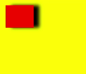
shadowOffsetY
// xxx.ets
@Entry
@Component
struct ShadowOffsetY {
  private settings: RenderingContextSettings = new RenderingContextSettings(true)
  private context: CanvasRenderingContext2D = new CanvasRenderingContext2D(this.settings)
  private offCanvas: OffscreenCanvas = new OffscreenCanvas(600, 600)

  build() {
    Flex({ direction: FlexDirection.Column, alignItems: ItemAlign.Center, justifyContent: FlexAlign.Center }) {
      Canvas(this.context)
        .width('100%')
        .height('100%')
        .backgroundColor('#ffff00')
        .onReady(() =>{
          let offContext = this.offCanvas.getContext("2d", this.settings)
          offContext.shadowBlur = 10
          offContext.shadowOffsetY = 20
          offContext.shadowColor = 'rgb(0,0,0)'
          offContext.fillStyle = 'rgb(255,0,0)'
          offContext.fillRect(30, 30, 100, 100)
          let image = this.offCanvas.transferToImageBitmap()
          this.context.transferFromImageBitmap(image)
      })
    }
    .width('100%')
    .height('100%')
  }
}
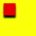
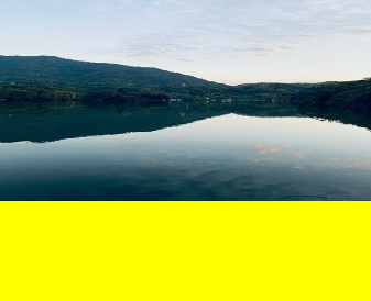
imageSmoothingEnabled
// xxx.ets
@Entry
@Component
struct ImageSmoothingEnabled {
  private settings: RenderingContextSettings = new RenderingContextSettings(true)
  private context: CanvasRenderingContext2D = new CanvasRenderingContext2D(this.settings)
  private img:ImageBitmap = new ImageBitmap("common/images/icon.jpg")
  private offCanvas: OffscreenCanvas = new OffscreenCanvas(600, 600)

  build() {
    Flex({ direction: FlexDirection.Column, alignItems: ItemAlign.Center, justifyContent: FlexAlign.Center }) {
      Canvas(this.context)
        .width('100%')
        .height('100%')
        .backgroundColor('#ffff00')
        .onReady(() =>{
          let offContext = this.offCanvas.getContext("2d", this.settings)
          offContext.imageSmoothingEnabled = false
          offContext.drawImage(this.img,0,0,400,200)
          let image = this.offCanvas.transferToImageBitmap()
          this.context.transferFromImageBitmap(image)
      })
    }
    .width('100%')
    .height('100%')
  }
}
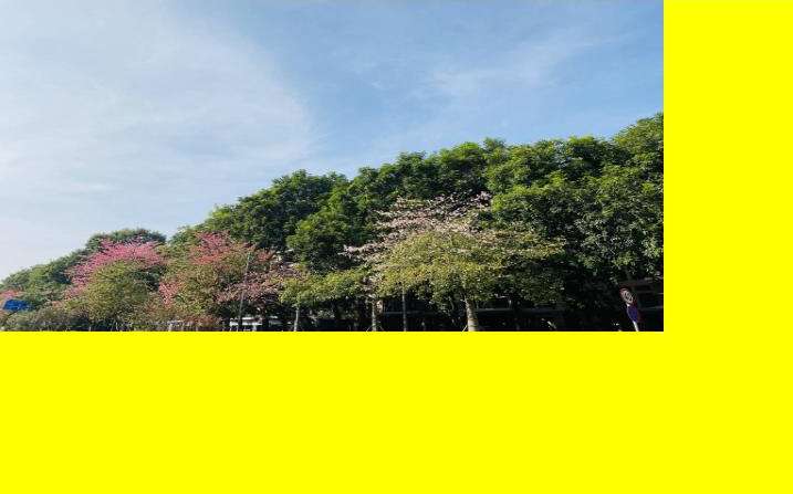
imageSmoothingQuality
  // xxx.ets
  @Entry
  @Component
  struct ImageSmoothingQualityDemoOff {
    private settings: RenderingContextSettings = new RenderingContextSettings(true);
    private context: CanvasRenderingContext2D = new CanvasRenderingContext2D(this.
settings);
    private offCanvas: OffscreenCanvas = new OffscreenCanvas(600, 600)
    private img:ImageBitmap = new ImageBitmap("common/images/example.jpg");

    build() {
      Flex({ direction: FlexDirection.Column, alignItems: ItemAlign.Center,
justifyContent: FlexAlign.Center }) {
        Canvas(this.context)
          .width('100%')
          .height('100%')
          .backgroundColor('#ffff00')
          .onReady(() =>{
            let offContext = this.offCanvas.getContext("2d", this.settings)
            let offctx = offContext
            offctx.imageSmoothingEnabled = true
            offctx.imageSmoothingQuality = 'high'
            offctx.drawImage(this.img, 0, 0, 400, 200)

            let image = this.offCanvas.transferToImageBitmap()
            this.context.transferFromImageBitmap(image)
          })
      }
      .width('100%')
      .height('100%')
    }
  }
direction
  // xxx.ets
  @Entry
  @Component
  struct DirectionDemoOff {
    private settings: RenderingContextSettings = new RenderingContextSettings(true);
    private context: CanvasRenderingContext2D = new CanvasRenderingContext2D(this.
settings);
    private offCanvas: OffscreenCanvas = new OffscreenCanvas(600, 600)

    build() {
      Flex({ direction: FlexDirection.Column, alignItems: ItemAlign.Center,
justifyContent: FlexAlign.Center }) {
        Canvas(this.context)
          .width('100%')
          .height('100%')
          .backgroundColor('#ffff00')
          .onReady(() =>{
            let offContext = this.offCanvas.getContext("2d", this.settings)
            let offctx = offContext
            offctx.font = '48px serif';
            offctx.textAlign = 'start'
            offctx.fillText("Hi ltr!", 200, 50);

            offctx.direction = "rtl";
            offctx.fillText("Hi rtl!", 200, 100);

            let image = offctx.transferToImageBitmap()
            this.context.transferFromImageBitmap(image)
          })
      }
      .width('100%')
      .height('100%')
    }
  }
filter
  // xxx.ets
  @Entry
  @Component
  struct FilterDemoOff {
    private settings: RenderingContextSettings = new RenderingContextSettings(true);
    private context: CanvasRenderingContext2D = new CanvasRenderingContext2D(this.settings);
    private offCanvas: OffscreenCanvas = new OffscreenCanvas(600, 600)
    private img: ImageBitmap = new ImageBitmap("common/images/example.jpg");

    build() {
      Flex({ direction: FlexDirection.Column, alignItems: ItemAlign.Center, justifyContent: FlexAlign.Center }) {
        Canvas(this.context)
          .width('100%')
          .height('100%')
          .onReady(() => {
            let offContext = this.offCanvas.getContext("2d", this.settings)
            let img = this.img

            offContext.drawImage(img, 0, 0, 100, 100);

            offContext.filter = 'grayscale(50%)';
            offContext.drawImage(img, 100, 0, 100, 100);

            offContext.filter = 'sepia(60%)';
            offContext.drawImage(img, 200, 0, 100, 100);

            offContext.filter = 'saturate(30%)';
            offContext.drawImage(img, 0, 100, 100, 100);

            offContext.filter = 'hue-rotate(90degree)';
            offContext.drawImage(img, 100, 100, 100, 100);

            offContext.filter = 'invert(100%)';
            offContext.drawImage(img, 200, 100, 100, 100);

            offContext.filter = 'opacity(25%)';
            offContext.drawImage(img, 0, 200, 100, 100);

            offContext.filter = 'brightness(0.4)';
            offContext.drawImage(img, 100, 200, 100, 100);

            offContext.filter = 'contrast(200%)';
            offContext.drawImage(img, 200, 200, 100, 100);

            offContext.filter = 'blur(5px)';
            offContext.drawImage(img, 0, 300, 100, 100);

            // Applying multiple filters
            offContext.filter = 'opacity(50%) contrast(200%) grayscale(50%)';
            offContext.drawImage(img, 100, 300, 100, 100);

            let image = this.offCanvas.transferToImageBitmap()
            this.context.transferFromImageBitmap(image)
          })
      }
      .width('100%')
      .height('100%')
    }
  }
Methods
fillRect
fillRect(x: number, y: number, w: number, h: number): void
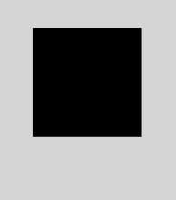
Fills a rectangle on the canvas.
Widget capability: This API can be used in ArkTS widgets since API version 9.
Atomic service API: This API can be used in atomic services since API version 11.
System capability: SystemCapability.ArkUI.ArkUI.Full
Parameters
| Name | Type | Mandatory | Description |
|---|---|---|---|
| x | number | Yes | X coordinate of the upper left corner of the rectangle. Default unit: vp |
| y | number | Yes | Y coordinate of the upper left corner of the rectangle. Default unit: vp |
| w | number | Yes | Width of the rectangle. Default unit: vp |
| h | number | Yes | Height of the rectangle. Default unit: vp |
Example
// xxx.ets
@Entry
@Component
struct FillRect {
  private settings: RenderingContextSettings = new RenderingContextSettings(true)
  private context: CanvasRenderingContext2D = new CanvasRenderingContext2D(this.settings)
  private offCanvas: OffscreenCanvas = new OffscreenCanvas(600, 600)

  build() {
    Flex({ direction: FlexDirection.Column, alignItems: ItemAlign.Center, justifyContent: FlexAlign.Center }) {
      Canvas(this.context)
        .width('100%')
        .height('100%')
        .backgroundColor('rgb(213,213,213)')
        .onReady(() =>{
          let offContext = this.offCanvas.getContext("2d", this.settings)
          offContext.fillRect(30,30,100,100)
          let image = this.offCanvas.transferToImageBitmap()
          this.context.transferFromImageBitmap(image)
       })
      }
    .width('100%')
    .height('100%')
  }
}
strokeRect
strokeRect(x: number, y: number, w: number, h: number): void
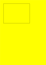
Draws an outlined rectangle on the canvas.
Widget capability: This API can be used in ArkTS widgets since API version 9.
Atomic service API: This API can be used in atomic services since API version 11.
System capability: SystemCapability.ArkUI.ArkUI.Full
Parameters
| Name | Type | Mandatory | Description |
|---|---|---|---|
| x | number | Yes | X coordinate of the upper left corner of the rectangle. Default unit: vp |
| y | number | Yes | Y coordinate of the upper left corner of the rectangle. Default unit: vp |
| width | number | Yes | Width of the rectangle. Default unit: vp |
| height | number | Yes | Height of the rectangle. Default unit: vp |
Example
// xxx.ets
@Entry
@Component
struct StrokeRect {
  private settings: RenderingContextSettings = new RenderingContextSettings(true)
  private context: CanvasRenderingContext2D = new CanvasRenderingContext2D(this.settings)
  private offCanvas: OffscreenCanvas = new OffscreenCanvas(600, 600)

  build() {
    Flex({ direction: FlexDirection.Column, alignItems: ItemAlign.Center, justifyContent: FlexAlign.Center }) {
      Canvas(this.context)
        .width('100%')
        .height('100%')
        .backgroundColor('#ffff00')
        .onReady(() =>{
          let offContext = this.offCanvas.getContext("2d", this.settings)
          offContext.strokeRect(30, 30, 200, 150)
          let image = this.offCanvas.transferToImageBitmap()
          this.context.transferFromImageBitmap(image)
      })
    }
    .width('100%')
    .height('100%')
  }
}
clearRect
clearRect(x: number, y: number, w: number, h: number): void
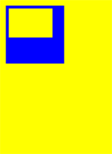
Clears the content in a rectangle on the canvas.
Widget capability: This API can be used in ArkTS widgets since API version 9.
Atomic service API: This API can be used in atomic services since API version 11.
System capability: SystemCapability.ArkUI.ArkUI.Full
Parameters
| Name | Type | Mandatory | Description |
|---|---|---|---|
| x | number | Yes | X coordinate of the upper left corner of the rectangle. Default unit: vp |
| y | number | Yes | Y coordinate of the upper left corner of the rectangle. Default unit: vp |
| width | number | Yes | Width of the rectangle. Default unit: vp |
| height | number | Yes | Height of the rectangle. Default unit: vp |
Example
// xxx.ets
@Entry
@Component
struct ClearRect {
  private settings: RenderingContextSettings = new RenderingContextSettings(true)
  private context: CanvasRenderingContext2D = new CanvasRenderingContext2D(this.settings)
  private offCanvas: OffscreenCanvas = new OffscreenCanvas(600, 600)

  build() {
    Flex({ direction: FlexDirection.Column, alignItems: ItemAlign.Center, justifyContent: FlexAlign.Center }) {
      Canvas(this.context)
        .width('100%')
        .height('100%')
        .backgroundColor('#ffff00')
        .onReady(() =>{
          let offContext = this.offCanvas.getContext("2d", this.settings)
          offContext.fillStyle = 'rgb(0,0,255)'
          offContext.fillRect(20,20,200,200)
          offContext.clearRect(30,30,150,100)
          let image = this.offCanvas.transferToImageBitmap()
          this.context.transferFromImageBitmap(image)
      })
    }
    .width('100%')
    .height('100%')
  }
}
fillText
fillText(text: string, x: number, y: number, maxWidth?: number): void
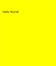
Draws filled text on the canvas.
Widget capability: This API can be used in ArkTS widgets since API version 9.
Atomic service API: This API can be used in atomic services since API version 11.
System capability: SystemCapability.ArkUI.ArkUI.Full
Parameters
| Name | Type | Mandatory | Description |
|---|---|---|---|
| text | string | Yes | Text to draw. |
| x | number | Yes | X coordinate of the lower left corner of the text. Default unit: vp |
| y | number | Yes | Y coordinate of the lower left corner of the text. Default unit: vp |
| maxWidth | number | No | Maximum width allowed for the text. Default unit: vp Default value: no width restriction |
Example
// xxx.ets
@Entry
@Component
struct FillText {
  private settings: RenderingContextSettings = new RenderingContextSettings(true)
  private context: CanvasRenderingContext2D = new CanvasRenderingContext2D(this.settings)
  private offCanvas: OffscreenCanvas = new OffscreenCanvas(600, 600)

  build() {
    Flex({ direction: FlexDirection.Column, alignItems: ItemAlign.Center, justifyContent: FlexAlign.Center }) {
      Canvas(this.context)
        .width('100%')
        .height('100%')
        .backgroundColor('#ffff00')
        .onReady(() =>{
          let offContext = this.offCanvas.getContext("2d", this.settings)
          offContext.font = '30px sans-serif'
          offContext.fillText("Hello World!", 20, 100)
          let image = this.offCanvas.transferToImageBitmap()
          this.context.transferFromImageBitmap(image)
      })
    }
    .width('100%')
    .height('100%')
  }
}
strokeText
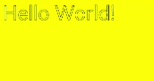
strokeText(text: string, x: number, y: number, maxWidth?: number): void
Draws a text stroke on the canvas.
Widget capability: This API can be used in ArkTS widgets since API version 9.
Atomic service API: This API can be used in atomic services since API version 11.
System capability: SystemCapability.ArkUI.ArkUI.Full
Parameters
| Name | Type | Mandatory | Description |
|---|---|---|---|
| text | string | Yes | Text to draw. |
| x | number | Yes | X coordinate of the lower left corner of the text. Default unit: vp |
| y | number | Yes | Y coordinate of the lower left corner of the text. Default unit: vp |
| maxWidth | number | No | Maximum width of the text. Default unit: vp Default value: no width restriction |
Example
// xxx.ets
@Entry
@Component
struct StrokeText {
  private settings: RenderingContextSettings = new RenderingContextSettings(true)
  private context: CanvasRenderingContext2D = new CanvasRenderingContext2D(this.settings)
  private offCanvas: OffscreenCanvas = new OffscreenCanvas(600, 600)

  build() {
    Flex({ direction: FlexDirection.Column, alignItems: ItemAlign.Center, justifyContent: FlexAlign.Center }) {
      Canvas(this.context)
        .width('100%')
        .height('100%')
        .backgroundColor('#ffff00')
        .onReady(() =>{
          let offContext = this.offCanvas.getContext("2d", this.settings)
          offContext.font = '55px sans-serif'
          offContext.strokeText("Hello World!", 20, 60)
          let image = this.offCanvas.transferToImageBitmap()
          this.context.transferFromImageBitmap(image)
      })
    }
    .width('100%')
    .height('100%')
  }
}
measureText
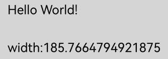
measureText(text: string): TextMetrics
Returns a TextMetrics object used to obtain the width of specified text.
Widget capability: This API can be used in ArkTS widgets since API version 9.
Atomic service API: This API can be used in atomic services since API version 11.
System capability: SystemCapability.ArkUI.ArkUI.Full
Parameters
| Name | Type | Mandatory | Description |
|---|---|---|---|
| text | string | Yes | Text to be measured. |
Return value
| Type | Description |
|---|---|
| TextMetrics | TextMetrics object. |
Example
// xxx.ets
@Entry
@Component
struct MeasureText {
  private settings: RenderingContextSettings = new RenderingContextSettings(true)
  private context: CanvasRenderingContext2D = new CanvasRenderingContext2D(this.settings)
  private offCanvas: OffscreenCanvas = new OffscreenCanvas(600, 600)

  build() {
    Flex({ direction: FlexDirection.Column, alignItems: ItemAlign.Center, justifyContent: FlexAlign.Center }) {
      Canvas(this.context)
        .width('100%')
        .height('100%')
        .backgroundColor('#ffff00')
        .onReady(() => {
          let offContext = this.offCanvas.getContext("2d", this.settings)
          offContext.font = '50px sans-serif'
          offContext.fillText("Hello World!", 20, 100)
          offContext.fillText("width:" + offContext.measureText("Hello World!").width, 20, 200)
          let image = this.offCanvas.transferToImageBitmap()
          this.context.transferFromImageBitmap(image)
      })
    }
    .width('100%')
    .height('100%')
  }
}
stroke
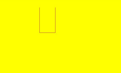
stroke(): void
Strokes (outlines) this path.
Widget capability: This API can be used in ArkTS widgets since API version 9.
Atomic service API: This API can be used in atomic services since API version 11.
System capability: SystemCapability.ArkUI.ArkUI.Full
Example
// xxx.ets
@Entry
@Component
struct Stroke {
  private settings: RenderingContextSettings = new RenderingContextSettings(true)
  private context: CanvasRenderingContext2D = new CanvasRenderingContext2D(this.settings)
  private offCanvas: OffscreenCanvas = new OffscreenCanvas(600, 600)

  build() {
    Flex({ direction: FlexDirection.Column, alignItems: ItemAlign.Center, justifyContent: FlexAlign.Center }) {
      Canvas(this.context)
        .width('100%')
        .height('100%')
        .backgroundColor('#ffff00')
        .onReady(() => {
          let offContext = this.offCanvas.getContext("2d", this.settings)
          offContext.moveTo(125, 25)
          offContext.lineTo(125, 105)
          offContext.lineTo(175, 105)
          offContext.lineTo(175, 25)
          offContext.strokeStyle = 'rgb(255,0,0)'
          offContext.stroke()
          let image = this.offCanvas.transferToImageBitmap()
          this.context.transferFromImageBitmap(image)
        })
    }
    .width('100%')
    .height('100%')
  }
}
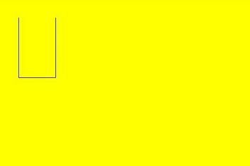
stroke(path: Path2D): void
Strokes (outlines) a specified path.
Widget capability: This API can be used in ArkTS widgets since API version 9.
Atomic service API: This API can be used in atomic services since API version 11.
System capability: SystemCapability.ArkUI.ArkUI.Full
Parameters
| Name | Type | Mandatory | Description |
|---|---|---|---|
| path | Path2D | Yes | A Path2D path to draw. |
Example
// xxx.ets
@Entry
@Component
struct Stroke {
  private settings: RenderingContextSettings = new RenderingContextSettings(true)
  private context: CanvasRenderingContext2D = new CanvasRenderingContext2D(this.settings)
  private offCanvas: OffscreenCanvas = new OffscreenCanvas(600, 600)
  private path2Da: Path2D = new Path2D()

  build() {
    Flex({ direction: FlexDirection.Column, alignItems: ItemAlign.Center, justifyContent: FlexAlign.Center }) {
      Canvas(this.context)
        .width('100%')
        .height('100%')
        .backgroundColor('#ffff00')
        .onReady(() => {
          let offContext = this.offCanvas.getContext("2d", this.settings)
          this.path2Da.moveTo(25, 25)
          this.path2Da.lineTo(25, 105)
          this.path2Da.lineTo(75, 105)
          this.path2Da.lineTo(75, 25)
          offContext.strokeStyle = 'rgb(0,0,255)'
          offContext.stroke(this.path2Da)
          let image = this.offCanvas.transferToImageBitmap()
          this.context.transferFromImageBitmap(image)
        })
    }
    .width('100%')
    .height('100%')
  }
}
beginPath
beginPath(): void
Creates a drawing path.
Widget capability: This API can be used in ArkTS widgets since API version 9.
Atomic service API: This API can be used in atomic services since API version 11.
System capability: SystemCapability.ArkUI.ArkUI.Full
Example
// xxx.ets
@Entry
@Component
struct BeginPath {
  private settings: RenderingContextSettings = new RenderingContextSettings(true)
  private context: CanvasRenderingContext2D = new CanvasRenderingContext2D(this.settings)
  private offCanvas: OffscreenCanvas = new OffscreenCanvas(600, 600)

  build() {
    Flex({ direction: FlexDirection.Column, alignItems: ItemAlign.Center, justifyContent: FlexAlign.Center }) {
      Canvas(this.context)
        .width('100%')
        .height('100%')
        .backgroundColor('rgb(213,213,213)')
        .onReady(() => {
          let offContext = this.offCanvas.getContext("2d", this.settings)
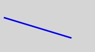
          offContext.beginPath()
          offContext.lineWidth = 6
          offContext.strokeStyle = '#0000ff'
          offContext.moveTo(15, 80)
          offContext.lineTo(280, 160)
          offContext.stroke()
          let image = this.offCanvas.transferToImageBitmap()
          this.context.transferFromImageBitmap(image)
        })
    }
    .width('100%')
    .height('100%')
  }
}
moveTo
moveTo(x: number, y: number): void
Moves a drawing path to a target position on the canvas.
Widget capability: This API can be used in ArkTS widgets since API version 9.
Atomic service API: This API can be used in atomic services since API version 11.
System capability: SystemCapability.ArkUI.ArkUI.Full
Parameters
| Name | Type | Mandatory | Description |
|---|---|---|---|
| x | number | Yes | X coordinate of the target position. Default unit: vp |
| y | number | Yes | Y coordinate of the target position. Default unit: vp |
Example
// xxx.ets
@Entry
@Component
struct MoveTo {
  private settings: RenderingContextSettings = new RenderingContextSettings(true)
  private context: CanvasRenderingContext2D = new CanvasRenderingContext2D(this.settings)
  private offCanvas: OffscreenCanvas = new OffscreenCanvas(600, 600)

  build() {
    Flex({ direction: FlexDirection.Column, alignItems: ItemAlign.Center, justifyContent: FlexAlign.Center }) {
      Canvas(this.context)
        .width('100%')
        .height('100%')
        .backgroundColor('#ffff00')
        .onReady(() =>{
          let offContext = this.offCanvas.getContext("2d", this.settings)
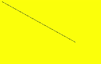
          offContext.beginPath()
          offContext.moveTo(10, 10)
          offContext.lineTo(280, 160)
          offContext.stroke()
          let image = this.offCanvas.transferToImageBitmap()
          this.context.transferFromImageBitmap(image)
        })
    }
    .width('100%')
    .height('100%')
  }
}
lineTo
lineTo(x: number, y: number): void
Connects the current point to a target position using a straight line.
Widget capability: This API can be used in ArkTS widgets since API version 9.
Atomic service API: This API can be used in atomic services since API version 11.
System capability: SystemCapability.ArkUI.ArkUI.Full
Parameters
| Name | Type | Mandatory | Description |
|---|---|---|---|
| x | number | Yes | X coordinate of the target position. Default unit: vp |
| y | number | Yes | Y coordinate of the target position. Default unit: vp |
Example
// xxx.ets
@Entry
@Component
struct LineTo {
  private settings: RenderingContextSettings = new RenderingContextSettings(true)
  private context: CanvasRenderingContext2D = new CanvasRenderingContext2D(this.settings)
  private offCanvas: OffscreenCanvas = new OffscreenCanvas(600, 600)

  build() {
    Flex({ direction: FlexDirection.Column, alignItems: ItemAlign.Center, justifyContent: FlexAlign.Center }) {
      Canvas(this.context)
        .width('100%')
        .height('100%')
        .backgroundColor('#ffff00')
        .onReady(() =>{
          let offContext = this.offCanvas.getContext("2d", this.settings)
          offContext.beginPath()
          offContext.moveTo(10, 10)
          offContext.lineTo(280, 160)
          offContext.stroke()
          let image = this.offCanvas.transferToImageBitmap()
          this.context.transferFromImageBitmap(image)
        })
    }
    .width('100%')
    .height('100%')
  }
}
closePath
closePath(): void
Draws a closed path.
Widget capability: This API can be used in ArkTS widgets since API version 9.
Atomic service API: This API can be used in atomic services since API version 11.
System capability: SystemCapability.ArkUI.ArkUI.Full
Example
// xxx.ets
@Entry
@Component
struct ClosePath {
  private settings: RenderingContextSettings = new RenderingContextSettings(true)
  private context: CanvasRenderingContext2D = new CanvasRenderingContext2D(this.settings)
  private offCanvas: OffscreenCanvas = new OffscreenCanvas(600, 600)

  build() {
    Flex({ direction: FlexDirection.Column, alignItems: ItemAlign.Center, justifyContent: FlexAlign.Center }) {
      Canvas(this.context)
        .width('100%')
        .height('100%')
        .backgroundColor('#ffff00')
        .onReady(() =>{
            let offContext = this.offCanvas.getContext("2d", this.settings)
            offContext.beginPath()
            offContext.moveTo(30, 30)
            offContext.lineTo(110, 30)
            offContext.lineTo(70, 90)
            offContext.closePath()
            offContext.stroke()
            let image = this.offCanvas.transferToImageBitmap()
            this.context.transferFromImageBitmap(image)
        })
    }
    .width('100%')
    .height('100%')
  }
}

createPattern
createPattern(image: ImageBitmap, repetition: string|null): CanvasPattern|null
Creates a pattern for image filling based on a specified source image and repetition mode.
Widget capability: This API can be used in ArkTS widgets since API version 9.
Atomic service API: This API can be used in atomic services since API version 11.
System capability: SystemCapability.ArkUI.ArkUI.Full
Parameters
| Name | Type | Mandatory | Description |
|---|---|---|---|
| image | ImageBitmap | Yes | Source image. For details, see ImageBitmap. |
| repetition | string |null | Yes | Repetition mode. The value can be 'repeat', 'repeat-x', 'repeat-y', 'no-repeat', 'clamp', or 'mirror'. |
Return value
| Type | Description |
|---|---|
| CanvasPattern |null | Created pattern for image filling based on a specified source image and repetition mode. |
Example
// xxx.ets
@Entry
@Component
struct CreatePattern {
  private settings: RenderingContextSettings = new RenderingContextSettings(true)
  private context: CanvasRenderingContext2D = new CanvasRenderingContext2D(this.settings)
  private img:ImageBitmap = new ImageBitmap("common/images/example.jpg")
  private offCanvas: OffscreenCanvas = new OffscreenCanvas(600, 600)

  build() {
    Flex({ direction: FlexDirection.Column, alignItems: ItemAlign.Center, justifyContent: FlexAlign.Center }) {
      Canvas(this.context)
        .width('100%')
        .height('100%')
        .backgroundColor('rgb(213,213,213)')
        .onReady(() => {
          let offContext = this.offCanvas.getContext("2d", this.settings)
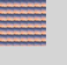
          let pattern = offContext.createPattern(this.img, 'repeat')
          offContext.fillStyle = pattern as CanvasPattern
          offContext.fillRect(0, 0, 200, 200)
          let image = this.offCanvas.transferToImageBitmap()
          this.context.transferFromImageBitmap(image)
        })
    }
    .width('100%')
    .height('100%')
  }
}
bezierCurveTo
bezierCurveTo(cp1x: number, cp1y: number, cp2x: number, cp2y: number, x: number, y: number): void
Draws a cubic bezier curve on the canvas.
Widget capability: This API can be used in ArkTS widgets since API version 9.
Atomic service API: This API can be used in atomic services since API version 11.
System capability: SystemCapability.ArkUI.ArkUI.Full
Parameters
| Name | Type | Mandatory | Description |
|---|---|---|---|
| cp1x | number | Yes | X coordinate of the first parameter of the bezier curve. Default unit: vp |
| cp1y | number | Yes | Y coordinate of the first parameter of the bezier curve. Default unit: vp |
| cp2x | number | Yes | X coordinate of the second parameter of the bezier curve. Default unit: vp |
| cp2y | number | Yes | Y coordinate of the second parameter of the bezier curve. Default unit: vp |
| x | number | Yes | X coordinate of the end point on the bezier curve. Default unit: vp |
| y | number | Yes | Y coordinate of the end point on the bezier curve. Default unit: vp |
Example
// xxx.ets
@Entry
@Component
struct BezierCurveTo {
  private settings: RenderingContextSettings = new RenderingContextSettings(true)
  private context: CanvasRenderingContext2D = new CanvasRenderingContext2D(this.settings)
  private offCanvas: OffscreenCanvas = new OffscreenCanvas(600, 600)

  build() {
    Flex({ direction: FlexDirection.Column, alignItems: ItemAlign.Center, justifyContent: FlexAlign.Center }) {
      Canvas(this.context)
        .width('100%')
        .height('100%')
        .backgroundColor('#ffff00')
        .onReady(() =>{
          let offContext = this.offCanvas.getContext("2d", this.settings)
          offContext.beginPath()
          offContext.moveTo(10, 10)
          offContext.bezierCurveTo(20, 100, 200, 100, 200, 20)
          offContext.stroke()
          let image = this.offCanvas.transferToImageBitmap()
          this.context.transferFromImageBitmap(image)
        })
    }
    .width('100%')
    .height('100%')
  }
}
quadraticCurveTo
quadraticCurveTo(cpx: number, cpy: number, x: number, y: number): void
Draws a quadratic curve on the canvas.
Widget capability: This API can be used in ArkTS widgets since API version 9.
Atomic service API: This API can be used in atomic services since API version 11.
System capability: SystemCapability.ArkUI.ArkUI.Full
Parameters
| Name | Type | Mandatory | Description |
|---|---|---|---|
| cpx | number | Yes | X coordinate of the bezier curve parameter. Default unit: vp |
| cpy | number | Yes | Y coordinate of the bezier curve parameter. Default unit: vp |
| x | number | Yes | X coordinate of the end point on the bezier curve. Default unit: vp |
| y | number | Yes | Y coordinate of the end point on the bezier curve. Default unit: vp |
Example
// xxx.ets
@Entry
@Component
struct QuadraticCurveTo {
  private settings: RenderingContextSettings = new RenderingContextSettings(true)
  private context: CanvasRenderingContext2D = new CanvasRenderingContext2D(this.settings)
  private offCanvas: OffscreenCanvas = new OffscreenCanvas(600, 600)

  build() {
    Flex({ direction: FlexDirection.Column, alignItems: ItemAlign.Center, justifyContent: FlexAlign.Center }) {
      Canvas(this.context)
        .width('100%')
        .height('100%')
        .backgroundColor('rgb(213,213,213)')
        .onReady(() => {
          let offContext = this.offCanvas.getContext("2d", this.settings)
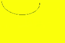
          offContext.beginPath()
          offContext.moveTo(20, 20)
          offContext.quadraticCurveTo(100, 100, 200, 20)
          offContext.stroke()
          let image = this.offCanvas.transferToImageBitmap()
          this.context.transferFromImageBitmap(image)
      })
    }
    .width('100%')
    .height('100%')
  }
}
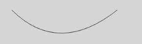
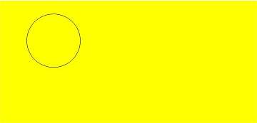
arc
arc(x: number, y: number, radius: number, startAngle: number, endAngle: number, counterclockwise?: boolean): void
Draws an arc on the canvas.
Widget capability: This API can be used in ArkTS widgets since API version 9.
Atomic service API: This API can be used in atomic services since API version 11.
System capability: SystemCapability.ArkUI.ArkUI.Full
Parameters
| Name | Type | Mandatory | Description |
|---|---|---|---|
| x | number | Yes | X coordinate of the center point of the arc. Default unit: vp |
| y | number | Yes | Y coordinate of the center point of the arc. Default unit: vp |
| radius | number | Yes | Radius of the arc. Default unit: vp |
| startAngle | number | Yes | Start radian of the arc. Default unit: radian |
| endAngle | number | Yes | End radian of the arc. Default unit: radian |
| counterclockwise | boolean | No | Whether to draw the arc counterclockwise. true: Draw the arc counterclockwise. false: Draw the arc clockwise. Default value: false |
Example
// xxx.ets
@Entry
@Component
struct Arc {
  private settings: RenderingContextSettings = new RenderingContextSettings(true)
  private context: CanvasRenderingContext2D = new CanvasRenderingContext2D(this.settings)
  private offCanvas: OffscreenCanvas = new OffscreenCanvas(600, 600)

  build() {
    Flex({ direction: FlexDirection.Column, alignItems: ItemAlign.Center, justifyContent: FlexAlign.Center }) {
      Canvas(this.context)
        .width('100%')
        .height('100%')
        .backgroundColor('#ffff00')
        .onReady(() =>{
          let offContext = this.offCanvas.getContext("2d", this.settings)
          offContext.beginPath()
          offContext.arc(100, 75, 50, 0, 6.28)
          offContext.stroke()
          let image = this.offCanvas.transferToImageBitmap()
          this.context.transferFromImageBitmap(image)
        })
    }
    .width('100%')
    .height('100%')
  }
}
arcTo
arcTo(x1: number, y1: number, x2: number, y2: number, radius: number): void
Creates a circular arc using the given control points and radius.
Widget capability: This API can be used in ArkTS widgets since API version 9.
Atomic service API: This API can be used in atomic services since API version 11.
System capability: SystemCapability.ArkUI.ArkUI.Full
Parameters
| Name | Type | Mandatory | Description |
|---|---|---|---|
| x1 | number | Yes | X coordinate of the first control point. Default unit: vp |
| y1 | number | Yes | Y coordinate of the first control point. Default unit: vp |
| x2 | number | Yes | X coordinate of the second control point. Default unit: vp |
| y2 | number | Yes | Y coordinate of the second control point. Default unit: vp |
| radius | number | Yes | Radius of the arc. Default unit: vp |
Example
// xxx.ets
@Entry
@Component
struct ArcTo {
  private settings: RenderingContextSettings = new RenderingContextSettings(true)
  private context: CanvasRenderingContext2D = new CanvasRenderingContext2D(this.settings)
  private offCanvas: OffscreenCanvas = new OffscreenCanvas(600, 600)

  build() {
    Flex({ direction: FlexDirection.Column, alignItems: ItemAlign.Center, justifyContent: FlexAlign.Center }) {
      Canvas(this.context)
        .width('100%')
        .height('100%')
        .backgroundColor('#ffff00')
        .onReady(() =>{
          let offContext = this.offCanvas.getContext("2d", this.settings)

          // Tangent
          offContext.beginPath()
          offContext.strokeStyle = '#808080'
          offContext.lineWidth = 1.5;
          offContext.moveTo(360, 20);
          offContext.lineTo(360, 170);
          offContext.lineTo(110, 170);
          offContext.stroke();

          // Arc
          offContext.beginPath()
          offContext.strokeStyle = '#000000'
          offContext.lineWidth = 3;
          offContext.moveTo(360, 20)
          offContext.arcTo(360, 170, 110, 170, 150)
          offContext.stroke()

          // Start point
          offContext.beginPath();
          offContext.fillStyle = '#00ff00';
          offContext.arc(360, 20, 4, 0, 2 * Math.PI);
          offContext.fill();

          // Control points
          offContext.beginPath();
          offContext.fillStyle = '#ff0000';
          offContext.arc(360, 170, 4, 0, 2 * Math.PI);
          offContext.arc(110, 170, 4, 0, 2 * Math.PI);
          offContext.fill();

          let image = this.offCanvas.transferToImageBitmap()
          this.context.transferFromImageBitmap(image)
        })
    }
    .width('100%')
    .height('100%')
  }
}
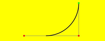
In this example, the arc created by arcTo() is black, and the two tangents of the arc are gray. The control points are marked in red, and the start point is indicated in green.
You can visualize two tangents: One tangent extends from the start point to the first control point, and the other tangent extends from the first control point to the second control point. The arcTo() API creates an arc between these two tangents, ensuring that the arc is tangent to both lines at the points of contact.
ellipse
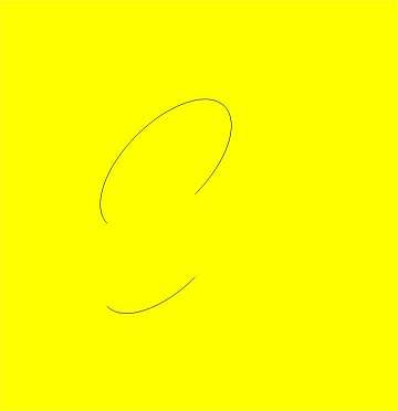
ellipse(x: number, y: number, radiusX: number, radiusY: number, rotation: number, startAngle: number, endAngle: number, counterclockwise?: boolean): void
Draws an ellipse in the specified rectangular region on the canvas.
Widget capability: This API can be used in ArkTS widgets since API version 9.
Atomic service API: This API can be used in atomic services since API version 11.
System capability: SystemCapability.ArkUI.ArkUI.Full
Parameters
| Name | Type | Mandatory | Description |
|---|---|---|---|
| x | number | Yes | X coordinate of the ellipse center. Default unit: vp |
| y | number | Yes | Y coordinate of the ellipse center. Default unit: vp |
| radiusX | number | Yes | Radius of the ellipse on the x-axis. Default unit: vp |
| radiusY | number | Yes | Radius of the ellipse on the y-axis. Default unit: vp |
| rotation | number | Yes | Rotation angle of the ellipse. Unit: radian |
| startAngle | number | Yes | Angle of the start point for drawing the ellipse. Unit: radian |
| endAngle | number | Yes | Angle of the end point for drawing the ellipse. Unit: radian |
| counterclockwise | boolean | No | Whether to draw the ellipse counterclockwise. true: Draw the ellipse counterclockwise. false: Draw the ellipse clockwise. Default value: false |
Example
// xxx.ets
@Entry
@Component
struct CanvasExample {
  private settings: RenderingContextSettings = new RenderingContextSettings(true)
  private context: CanvasRenderingContext2D = new CanvasRenderingContext2D(this.settings)
  private offCanvas: OffscreenCanvas = new OffscreenCanvas(600, 600)
  build() {
    Flex({ direction: FlexDirection.Column, alignItems: ItemAlign.Center, justifyContent: FlexAlign.Center }) {
      Canvas(this.context)
        .width('100%')
        .height('100%')
        .backgroundColor('#ffff00')
        .onReady(() =>{
          let offContext = this.offCanvas.getContext("2d", this.settings)
          offContext.beginPath()
          offContext.ellipse(200, 200, 50, 100, Math.PI * 0.25, Math.PI * 0.5, Math.PI * 2, false)
          offContext.stroke()
          offContext.beginPath()
          offContext.ellipse(200, 300, 50, 100, Math.PI * 0.25, Math.PI * 0.5, Math.PI * 2, true)
          offContext.stroke()
          let image = this.offCanvas.transferToImageBitmap()
          this.context.transferFromImageBitmap(image)
        })
    }
    .width('100%')
    .height('100%')
  }
}
rect
rect(x: number, y: number, w: number, h: number): void
Creates a rectangle on the canvas.
Widget capability: This API can be used in ArkTS widgets since API version 9.
Atomic service API: This API can be used in atomic services since API version 11.
System capability: SystemCapability.ArkUI.ArkUI.Full
Parameters
| Name | Type | Mandatory | Description |
|---|---|---|---|
| x | number | Yes | X coordinate of the upper left corner of the rectangle. Default unit: vp |
| y | number | Yes | Y coordinate of the upper left corner of the rectangle. Default unit: vp |
| w | number | Yes | Width of the rectangle. Default unit: vp |
| h | number | Yes | Height of the rectangle. Default unit: vp |
Example
// xxx.ets
@Entry
@Component
struct CanvasExample {
  private settings: RenderingContextSettings = new RenderingContextSettings(true)
  private context: CanvasRenderingContext2D = new CanvasRenderingContext2D(this.settings)
  private offCanvas: OffscreenCanvas = new OffscreenCanvas(600, 600)

  build() {
    Flex({ direction: FlexDirection.Column, alignItems: ItemAlign.Center, justifyContent: FlexAlign.Center }) {
      Canvas(this.context)
        .width('100%')
        .height('100%')
        .backgroundColor('#ffff00')
        .onReady(() =>{
          let offContext = this.offCanvas.getContext("2d", this.settings)
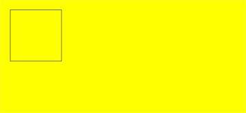
          offContext.rect(20, 20, 100, 100) // Create a 100*100 rectangle at (20, 20)
          offContext.stroke()
          let image = this.offCanvas.transferToImageBitmap()
          this.context.transferFromImageBitmap(image)
        })
    }
    .width('100%')
    .height('100%')
  }
}
fill
fill(fillRule?: CanvasFillRule): void
Fills the area inside a closed path on the canvas.
Widget capability: This API can be used in ArkTS widgets since API version 9.
Atomic service API: This API can be used in atomic services since API version 11.
System capability: SystemCapability.ArkUI.ArkUI.Full
Parameters
| Name | Type | Mandatory | Description |
|---|---|---|---|
| fillRule | CanvasFillRule | No | Rule by which to determine whether a point is inside or outside the area to fill. The options are "nonzero" and "evenodd". Default value: "nonzero" |
// xxx.ets
@Entry
@Component
struct Fill {
  private settings: RenderingContextSettings = new RenderingContextSettings(true)
  private context: CanvasRenderingContext2D = new CanvasRenderingContext2D(this.settings)
  private offCanvas: OffscreenCanvas = new OffscreenCanvas(600, 600)

  build() {
    Flex({ direction: FlexDirection.Column, alignItems: ItemAlign.Center, justifyContent: FlexAlign.Center }) {
      Canvas(this.context)
        .width('100%')
        .height('100%')
        .backgroundColor('#ffff00')
        .onReady(() =>{
          let offContext = this.offCanvas.getContext("2d", this.settings)
          offContext.fillStyle = '#000000'
          offContext.rect(20, 20, 100, 100) // Create a 100*100 rectangle at (20, 20)
          offContext.fill()
          let image = this.offCanvas.transferToImageBitmap()
          this.context.transferFromImageBitmap(image)
        })
    }
    .width('100%')
    .height('100%')
  }
}

fill(path: Path2D, fillRule?: CanvasFillRule): void
Fills the area inside a closed path on the canvas.
Widget capability: This API can be used in ArkTS widgets since API version 9.
Atomic service API: This API can be used in atomic services since API version 11.
System capability: SystemCapability.ArkUI.ArkUI.Full
Parameters
| Name | Type | Mandatory | Description |
|---|---|---|---|
| path | Path2D | Yes | A Path2D path to fill. |
| fillRule | CanvasFillRule | No | Rule by which to determine whether a point is inside or outside the area to fill. The options are "nonzero" and "evenodd". Default value: "nonzero" |
Example
// xxx.ets
@Entry
@Component
struct Fill {
  private settings: RenderingContextSettings = new RenderingContextSettings(true)
  private context: CanvasRenderingContext2D = new CanvasRenderingContext2D(this.settings)
  private offCanvas: OffscreenCanvas = new OffscreenCanvas(600, 600)

  build() {
    Flex({ direction: FlexDirection.Column, alignItems: ItemAlign.Center, justifyContent: FlexAlign.Center }) {
      Canvas(this.context)
        .width('100%')
        .height('100%')
        .backgroundColor('#ffff00')
        .onReady(() =>{
          let offContext = this.offCanvas.getContext("2d", this.settings)
          let region = new Path2D()
          region.moveTo(30, 90)
          region.lineTo(110, 20)
          region.lineTo(240, 130)
          region.lineTo(60, 130)
          region.lineTo(190, 20)
          region.lineTo(270, 90)
          region.closePath()
          // Fill path
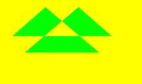
          offContext.fillStyle = '#00ff00'
          offContext.fill(region, "evenodd")
          let image = this.offCanvas.transferToImageBitmap()
          this.context.transferFromImageBitmap(image)
        })
    }
    .width('100%')
    .height('100%')
  }
}
clip
clip(fillRule?: CanvasFillRule): void
Sets the current path to a clipping path.
Widget capability: This API can be used in ArkTS widgets since API version 9.
Atomic service API: This API can be used in atomic services since API version 11.
System capability: SystemCapability.ArkUI.ArkUI.Full
Parameters
| Name | Type | Mandatory | Description |
|---|---|---|---|
| fillRule | CanvasFillRule | No | Rule by which to determine whether a point is inside or outside the area to clip. The options are "nonzero" and "evenodd". Default value: "nonzero" |
Example
// xxx.ets
@Entry
@Component
struct Clip {
  private settings: RenderingContextSettings = new RenderingContextSettings(true)
  private context: CanvasRenderingContext2D = new CanvasRenderingContext2D(this.settings)
  private offCanvas: OffscreenCanvas = new OffscreenCanvas(600, 600)

  build() {
    Flex({ direction: FlexDirection.Column, alignItems: ItemAlign.Center, justifyContent: FlexAlign.Center }) {
      Canvas(this.context)
        .width('100%')
        .height('100%')
        .backgroundColor('#ffff00')
        .onReady(() =>{
          let offContext = this.offCanvas.getContext("2d", this.settings)
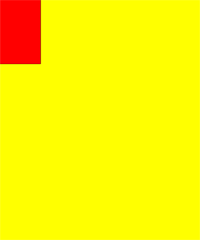
          offContext.rect(0, 0, 100, 200)
          offContext.stroke()
          offContext.clip()
          offContext.fillStyle = "rgb(255,0,0)"
          offContext.fillRect(0, 0, 200, 200)
          let image = this.offCanvas.transferToImageBitmap()
          this.context.transferFromImageBitmap(image)
        })
    }
    .width('100%')
    .height('100%')
  }
}
clip(path: Path2D, fillRule?: CanvasFillRule): void
Sets a closed path to a clipping path.
Widget capability: This API can be used in ArkTS widgets since API version 9.
Atomic service API: This API can be used in atomic services since API version 11.
System capability: SystemCapability.ArkUI.ArkUI.Full
Parameters
| Name | Type | Mandatory | Description |
|---|---|---|---|
| path | Path2D | Yes | A Path2D path to clip. |
| fillRule | CanvasFillRule | No | Rule by which to determine whether a point is inside or outside the area to clip. The options are "nonzero" and "evenodd". Default value: "nonzero" |
Example
// xxx.ets
@Entry
@Component
struct Clip {
  private settings: RenderingContextSettings = new RenderingContextSettings(true)
  private context: CanvasRenderingContext2D = new CanvasRenderingContext2D(this.settings)
  private offCanvas: OffscreenCanvas = new OffscreenCanvas(600, 600)

  build() {
    Flex({ direction: FlexDirection.Column, alignItems: ItemAlign.Center, justifyContent: FlexAlign.Center }) {
      Canvas(this.context)
        .width('100%')
        .height('100%')
        .backgroundColor('#ffff00')
        .onReady(() =>{
          let offContext = this.offCanvas.getContext("2d", this.settings)
          let region = new Path2D()
          region.moveTo(30, 90)
          region.lineTo(110, 20)
          region.lineTo(240, 130)
          region.lineTo(60, 130)
          region.lineTo(190, 20)
          region.lineTo(270, 90)
          region.closePath()
          offContext.clip(region,"evenodd")
          offContext.fillStyle = "rgb(0,255,0)"
          offContext.fillRect(0, 0, 600, 600)
          let image = this.offCanvas.transferToImageBitmap()
          this.context.transferFromImageBitmap(image)
        })
    }
    .width('100%')
    .height('100%')
  }
}
reset12+
reset(): void
Resets this OffscreenCanvasRenderingContext2D object to its default state and clears the background buffer, drawing state stack, defined paths, and styles.
Atomic service API: This API can be used in atomic services since API version 12.
System capability: SystemCapability.ArkUI.ArkUI.Full
Example
// xxx.ets
@Entry
@Component
struct Reset {
  private settings: RenderingContextSettings = new RenderingContextSettings(true)
  private context: CanvasRenderingContext2D = new CanvasRenderingContext2D(this.settings)
  private offCanvas: OffscreenCanvas = new OffscreenCanvas(600, 600)

  build() {
    Flex({ direction: FlexDirection.Column, alignItems: ItemAlign.Center, justifyContent: FlexAlign.Center }) {
      Canvas(this.context)
        .width('100%')
        .height('100%')
        .backgroundColor('#ffff00')
        .onReady(() =>{
          let offContext = this.offCanvas.getContext("2d", this.settings)
          offContext.fillStyle = '#0000ff'
          offContext.fillRect(20, 20, 150, 100)
          offContext.reset()
          offContext.fillRect(20, 150, 150, 100)
          let image = this.offCanvas.transferToImageBitmap()
          this.context.transferFromImageBitmap(image)
        })
    }
    .width('100%')
    .height('100%')
  }
}
saveLayer12+
saveLayer(): void
Saves this layer.
Atomic service API: This API can be used in atomic services since API version 12.
System capability: SystemCapability.ArkUI.ArkUI.Full
Example
// xxx.ets
@Entry
@Component
struct saveLayer {
  private settings: RenderingContextSettings = new RenderingContextSettings(true)
  private context: CanvasRenderingContext2D = new CanvasRenderingContext2D(this.settings)
  private offCanvas: OffscreenCanvas = new OffscreenCanvas(600, 600)

  build() {
    Flex({ direction: FlexDirection.Column, alignItems: ItemAlign.Center, justifyContent: FlexAlign.Center }) {
      Canvas(this.context)
        .width('100%')
        .height('100%')
        .backgroundColor('#ffff00')
        .onReady(() => {
          let offContext = this.offCanvas.getContext("2d", this.settings)
          offContext.fillStyle = "#0000ff"
          offContext.fillRect(50,100,300,100)
          offContext.fillStyle = "#00ffff"
          offContext.fillRect(50,150,300,100)
          offContext.globalCompositeOperation = 'destination-over'
          offContext.saveLayer()
          offContext.globalCompositeOperation = 'source-over'
          offContext.fillStyle = "#ff0000"
          offContext.fillRect(100,50,100,300)
          offContext.fillStyle = "#00ff00"
          offContext.fillRect(150,50,100,300)
          offContext.restoreLayer()
          let image = this.offCanvas.transferToImageBitmap()
          this.context.transferFromImageBitmap(image)
        })
    }
    .width('100%')
    .height('100%')
  }
}
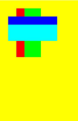
restoreLayer12+
restoreLayer(): void
Restores the image transformation and cropping state to the state before saveLayer, and then draws the layer onto the canvas. For the sample code, see the code for saveLayer.
Atomic service API: This API can be used in atomic services since API version 12.
System capability: SystemCapability.ArkUI.ArkUI.Full
resetTransform
resetTransform(): void
Resets the current transform to the identity matrix.
Widget capability: This API can be used in ArkTS widgets since API version 9.
Atomic service API: This API can be used in atomic services since API version 11.
System capability: SystemCapability.ArkUI.ArkUI.Full
Example
// xxx.ets
@Entry
@Component
struct ResetTransform {
  private settings: RenderingContextSettings = new RenderingContextSettings(true)
  private context: CanvasRenderingContext2D = new CanvasRenderingContext2D(this.settings)
  private offCanvas: OffscreenCanvas = new OffscreenCanvas(600, 600)

  build() {
    Flex({ direction: FlexDirection.Column, alignItems: ItemAlign.Center, justifyContent: FlexAlign.Center }) {
      Canvas(this.context)
        .width('100%')
        .height('100%')
        .backgroundColor('#ffff00')
        .onReady(() => {
          let offContext = this.offCanvas.getContext("2d", this.settings)
          offContext.setTransform(1,0.5, -0.5, 1, 10, 10)
          offContext.fillStyle = 'rgb(0,0,255)'
          offContext.fillRect(0, 0, 100, 100)
          offContext.resetTransform()
          offContext.fillStyle = 'rgb(255,0,0)'
          offContext.fillRect(0, 0, 100, 100)
          let image = this.offCanvas.transferToImageBitmap()
          this.context.transferFromImageBitmap(image)
        })
    }
    .width('100%')
    .height('100%')
  }
}
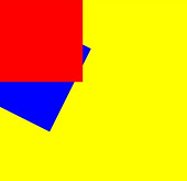
rotate
rotate(angle: number): void
Rotates a canvas clockwise around its coordinate axes.
Widget capability: This API can be used in ArkTS widgets since API version 9.
Atomic service API: This API can be used in atomic services since API version 11.
System capability: SystemCapability.ArkUI.ArkUI.Full
Parameters
| Name | Type | Mandatory | Description |
|---|---|---|---|
| angle | number | Yes | Clockwise rotation angle. You can convert degrees to radians using the following formula: degree * Math.PI/180. Unit: radian |
Example
// xxx.ets
@Entry
@Component
struct Rotate {
  private settings: RenderingContextSettings = new RenderingContextSettings(true)
  private context: CanvasRenderingContext2D = new CanvasRenderingContext2D(this.settings)
  private offCanvas: OffscreenCanvas = new OffscreenCanvas(600, 600)

  build() {
    Flex({ direction: FlexDirection.Column, alignItems: ItemAlign.Center, justifyContent: FlexAlign.Center }) {
      Canvas(this.context)
        .width('100%')
        .height('100%')
        .backgroundColor('#ffff00')
        .onReady(() =>{
          let offContext = this.offCanvas.getContext("2d", this.settings)
          offContext.rotate(45 * Math.PI / 180)
          offContext.fillRect(70, 20, 50, 50)
          let image = this.offCanvas.transferToImageBitmap()
          this.context.transferFromImageBitmap(image)
        })
    }
    .width('100%')
    .height('100%')
  }
}
scale
scale(x: number, y: number): void
Scales the canvas based on scale factors.
Widget capability: This API can be used in ArkTS widgets since API version 9.
Atomic service API: This API can be used in atomic services since API version 11.
System capability: SystemCapability.ArkUI.ArkUI.Full
Parameters
| Name | Type | Mandatory | Description |
|---|---|---|---|
| x | number | Yes | Horizontal scale factor. |
| y | number | Yes | Vertical scale factor. |
Example
// xxx.ets
@Entry
@Component
struct Scale {
  private settings: RenderingContextSettings = new RenderingContextSettings(true)
  private context: CanvasRenderingContext2D = new CanvasRenderingContext2D(this.settings)
  private offCanvas: OffscreenCanvas = new OffscreenCanvas(600, 600)

  build() {
    Flex({ direction: FlexDirection.Column, alignItems: ItemAlign.Center, justifyContent: FlexAlign.Center }) {
      Canvas(this.context)
        .width('100%')
        .height('100%')
        .backgroundColor('#ffff00')
        .onReady(() =>{
          let offContext = this.offCanvas.getContext("2d", this.settings)
          offContext.lineWidth = 3
          offContext.strokeRect(30, 30, 50, 50)
          offContext.scale(2, 2) // Scale to 200%
          offContext.strokeRect(30, 30, 50, 50)
          let image = this.offCanvas.transferToImageBitmap()
          this.context.transferFromImageBitmap(image)
        })
    }
    .width('100%')
    .height('100%')
  }
}
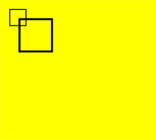
transform
transform(a: number, b: number, c: number, d: number, e: number, f: number): void
Defines a transformation matrix. To transform a graph, you only need to set parameters of the matrix. The coordinates of the graph are multiplied by the matrix values to obtain new coordinates of the transformed graph. You can use the matrix to implement multiple transform effects.
Widget capability: This API can be used in ArkTS widgets since API version 9.
Atomic service API: This API can be used in atomic services since API version 11.
System capability: SystemCapability.ArkUI.ArkUI.Full
NOTE The following formulas calculate the coordinates of a transformed graph. x and y represent the coordinates before transformation, and x' and y' represent the coordinates after transformation.
x' = scaleX * x + skewY * y + translateX
y' = skewX * x + scaleY * y + translateY
Parameters
| Name | Type | Mandatory | Description |
|---|---|---|---|
| a | number | Yes | scaleX: x-axis scale. |
| b | number | Yes | skewY: y-axis skew. |
| c | number | Yes | skewX: x-axis skew. |
| d | number | Yes | scaleY: y-axis scale. |
| e | number | Yes | translateX: distance to translate on the x-axis. Default unit: vp |
| f | number | Yes | translateY: distance to translate on the y-axis. Default unit: vp |
Example
// xxx.ets
@Entry
@Component
struct Transform {
  private settings: RenderingContextSettings = new RenderingContextSettings(true)
  private context: CanvasRenderingContext2D = new CanvasRenderingContext2D(this.settings)
  private offCanvas: OffscreenCanvas = new OffscreenCanvas(600, 600)

  build() {
    Flex({ direction: FlexDirection.Column, alignItems: ItemAlign.Center, justifyContent: FlexAlign.Center }) {
      Canvas(this.context)
        .width('100%')
        .height('100%')
        .backgroundColor('rgb(213,213,213)')
        .onReady(() => {
          let offContext = this.offCanvas.getContext("2d", this.settings)
          offContext.fillStyle = 'rgb(0,0,0)'
          offContext.fillRect(0, 0, 100, 100)
          offContext.transform(1, 0.5, -0.5, 1, 10, 10)
          offContext.fillStyle = 'rgb(255,0,0)'
          offContext.fillRect(0, 0, 100, 100)
          offContext.transform(1, 0.5, -0.5, 1, 10, 10)
          offContext.fillStyle = 'rgb(0,0,255)'
          offContext.fillRect(0, 0, 100, 100)
          let image = this.offCanvas.transferToImageBitmap()
          this.context.transferFromImageBitmap(image)
        })
    }
    .width('100%')
    .height('100%')
  }
}
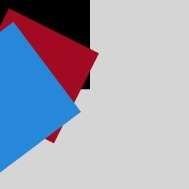
setTransform
setTransform(a: number, b: number, c: number, d: number, e: number, f: number): void
Resets the existing transformation matrix and creates a new transformation matrix by using the same parameters as the transform() API.
Widget capability: This API can be used in ArkTS widgets since API version 9.
Atomic service API: This API can be used in atomic services since API version 11.
System capability: SystemCapability.ArkUI.ArkUI.Full
Parameters
| Name | Type | Mandatory | Description |
|---|---|---|---|
| a | number | Yes | scaleX: x-axis scale. |
| b | number | Yes | skewY: y-axis skew. |
| c | number | Yes | skewX: x-axis skew. |
| d | number | Yes | scaleY: y-axis scale. |
| e | number | Yes | translateX: distance to translate on the x-axis. Default unit: vp |
| f | number | Yes | translateY: distance to translate on the y-axis. Default unit: vp |
Example
// xxx.ets
@Entry
@Component
struct SetTransform {
  private settings: RenderingContextSettings = new RenderingContextSettings(true)
  private context: CanvasRenderingContext2D = new CanvasRenderingContext2D(this.settings)
  private offCanvas: OffscreenCanvas = new OffscreenCanvas(600, 600)

  build() {
    Flex({ direction: FlexDirection.Column, alignItems: ItemAlign.Center, justifyContent: FlexAlign.Center }) {
      Canvas(this.context)
        .width('100%')
        .height('100%')
        .backgroundColor('#ffff00')
        .onReady(() =>{
          let offContext = this.offCanvas.getContext("2d", this.settings)
          offContext.fillStyle = 'rgb(255,0,0)'
          offContext.fillRect(0, 0, 100, 100)
          offContext.setTransform(1,0.5, -0.5, 1, 10, 10)
          offContext.fillStyle = 'rgb(0,0,255)'
          offContext.fillRect(0, 0, 100, 100)
          let image = this.offCanvas.transferToImageBitmap()
          this.context.transferFromImageBitmap(image)
        })
    }
    .width('100%')
    .height('100%')
  }
}
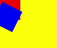
setTransform(transform?: Matrix2D): void
Resets the current transformation and creates a new transformation matrix based on the specified Matrix2D object.
Widget capability: This API can be used in ArkTS widgets since API version 9.
Atomic service API: This API can be used in atomic services since API version 11.
System capability: SystemCapability.ArkUI.ArkUI.Full
Parameters
| Name | Type | Mandatory | Description |
|---|---|---|---|
| transform | Matrix2D | No | Transformation matrix. Default value: null |
Example
// xxx.ets
 @Entry
 @Component
 struct TransFormDemo {
   private settings: RenderingContextSettings = new RenderingContextSettings(true);
   private context1: CanvasRenderingContext2D = new CanvasRenderingContext2D(this.settings);
   private offcontext1: OffscreenCanvasRenderingContext2D = new OffscreenCanvasRenderingContext2D(600, 200, this.settings);
   private context2: CanvasRenderingContext2D = new CanvasRenderingContext2D(this.settings);
   private offcontext2: OffscreenCanvasRenderingContext2D = new OffscreenCanvasRenderingContext2D(600, 200, this.settings);

   build() {
     Flex({ direction: FlexDirection.Column, alignItems: ItemAlign.Center, justifyContent: FlexAlign.Center }) {
       Text('context1');
       Canvas(this.context1)
         .width('230vp')
         .height('160vp')
         .backgroundColor('#ffff00')
         .onReady(() =>{
           this.offcontext1.fillRect(100, 20, 50, 50);
           this.offcontext1.setTransform(1, 0.5, -0.5, 1, 10, 10);
           this.offcontext1.fillRect(100, 20, 50, 50);
           let image = this.offcontext1.transferToImageBitmap();
           this.context1.transferFromImageBitmap(image);
         })
       Text('context2');
       Canvas(this.context2)
         .width('230vp')
         .height('160vp')
         .backgroundColor('#0ffff0')
         .onReady(() =>{
           this.offcontext2.fillRect(100, 20, 50, 50);
           let storedTransform = this.offcontext1.getTransform();
           this.offcontext2.setTransform(storedTransform);
           this.offcontext2.fillRect(100, 20, 50, 50);
           let image = this.offcontext2.transferToImageBitmap();
           this.context2.transferFromImageBitmap(image);
         })
     }
     .width('100%')
     .height('100%')
   }
 }
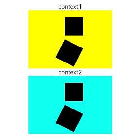
getTransform
getTransform(): Matrix2D
Obtains the current transformation matrix being applied to the context.
Widget capability: This API can be used in ArkTS widgets since API version 9.
Atomic service API: This API can be used in atomic services since API version 11.
System capability: SystemCapability.ArkUI.ArkUI.Full
Return value
| Type | Description |
|---|---|
| Matrix2D | Matrix object. |
Example
// xxx.ets
@Entry
@Component
struct TransFormDemo {
  private settings: RenderingContextSettings = new RenderingContextSettings(true);
  private context1: CanvasRenderingContext2D = new CanvasRenderingContext2D(this.settings);
  private offcontext1: OffscreenCanvasRenderingContext2D = new OffscreenCanvasRenderingContext2D(600, 100, this.settings);
  private context2: CanvasRenderingContext2D = new CanvasRenderingContext2D(this.settings);
  private offcontext2: OffscreenCanvasRenderingContext2D = new OffscreenCanvasRenderingContext2D(600, 100, this.settings);

  build() {
    Flex({ direction: FlexDirection.Column, alignItems: ItemAlign.Center, justifyContent: FlexAlign.Center }) {
      Text('context1');
      Canvas(this.context1)
        .width('230vp')
        .height('120vp')
        .backgroundColor('#ffff00')
        .onReady(() =>{
          this.offcontext1.fillRect(50, 50, 50, 50);
          this.offcontext1.setTransform(1.2, Math.PI/8, Math.PI/6, 0.5, 30, -25);
          this.offcontext1.fillRect(50, 50, 50, 50);
          let image = this.offcontext1.transferToImageBitmap();
          this.context1.transferFromImageBitmap(image);
        })
      Text('context2');
      Canvas(this.context2)
        .width('230vp')
        .height('120vp')
        .backgroundColor('#0ffff0')
        .onReady(() =>{
          this.offcontext2.fillRect(50, 50, 50, 50);
          let storedTransform = this.offcontext1.getTransform();
          console.log("Matrix [scaleX = " + storedTransform.scaleX + ", scaleY = " + storedTransform.scaleY +
          ", rotateX = " + storedTransform.rotateX + ", rotateY = " + storedTransform.rotateY +
          ", translateX = " + storedTransform.translateX + ", translateY = " + storedTransform.translateY + "]")
          this.offcontext2.setTransform(storedTransform);
          this.offcontext2.fillRect(50,50,50,50);
          let image = this.offcontext2.transferToImageBitmap();
          this.context2.transferFromImageBitmap(image);
        })
    }
    .width('100%')
    .height('100%')
  }
}
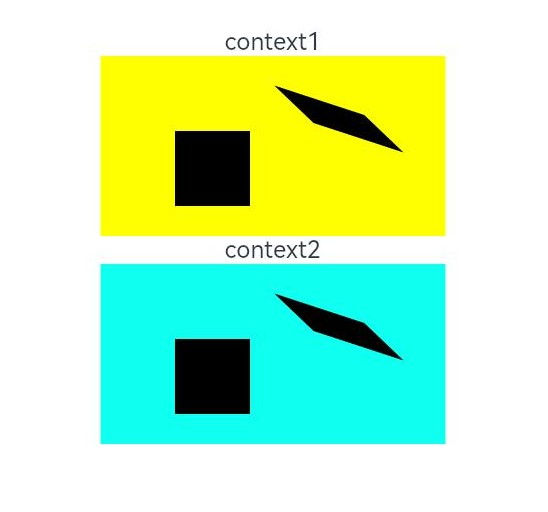
translate
translate(x: number, y: number): void
Moves the origin of the coordinate system.
Widget capability: This API can be used in ArkTS widgets since API version 9.
Atomic service API: This API can be used in atomic services since API version 11.
System capability: SystemCapability.ArkUI.ArkUI.Full
Parameters
| Name | Type | Mandatory | Description |
|---|---|---|---|
| x | number | Yes | Distance to translate on the x-axis. Default unit: vp |
| y | number | Yes | Distance to translate on the y-axis. Default unit: vp |
Example
// xxx.ets
@Entry
@Component
struct Translate {
  private settings: RenderingContextSettings = new RenderingContextSettings(true)
  private context: CanvasRenderingContext2D = new CanvasRenderingContext2D(this.settings)
  private offCanvas: OffscreenCanvas = new OffscreenCanvas(600, 600)

  build() {
    Flex({ direction: FlexDirection.Column, alignItems: ItemAlign.Center, justifyContent: FlexAlign.Center }) {
      Canvas(this.context)
        .width('100%')
        .height('100%')
        .backgroundColor('#ffff00')
        .onReady(() =>{
          let offContext = this.offCanvas.getContext("2d", this.settings)
          offContext.fillRect(10, 10, 50, 50)
          offContext.translate(70, 70)
          offContext.fillRect(10, 10, 50, 50)
          let image = this.offCanvas.transferToImageBitmap()
          this.context.transferFromImageBitmap(image)
        })
    }
    .width('100%')
    .height('100%')
  }
}
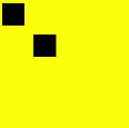
drawImage
drawImage(image: ImageBitmap|PixelMap, dx: number, dy: number): void
Draws an image on the canvas.
Widget capability: This API can be used in ArkTS widgets since API version 9, except that PixelMap objects are not supported.
Atomic service API: This API can be used in atomic services since API version 11.
System capability: SystemCapability.ArkUI.ArkUI.Full
Parameters
| Name | Type | Mandatory | Description |
|---|---|---|---|
| image | ImageBitmap or PixelMap | Yes | Image resource. For details, see ImageBitmap or PixelMap. |
| dx | number | Yes | X coordinate of the upper left corner of the drawing area on the canvas. Default unit: vp |
| dy | number | Yes | Y coordinate of the upper left corner of the drawing area on the canvas. Default unit: vp |
drawImage(image: ImageBitmap|PixelMap, dx: number, dy: number, dw: number, dh: number): void
Draws an image on the canvas.
Widget capability: This API can be used in ArkTS widgets since API version 9, except that PixelMap objects are not supported.
Atomic service API: This API can be used in atomic services since API version 11.
System capability: SystemCapability.ArkUI.ArkUI.Full
Parameters
| Name | Type | Mandatory | Description |
|---|---|---|---|
| image | ImageBitmap or PixelMap | Yes | Image resource. For details, see ImageBitmap or PixelMap. |
| dx | number | Yes | X coordinate of the upper left corner of the drawing area on the canvas. Default unit: vp |
| dy | number | Yes | Y coordinate of the upper left corner of the drawing area on the canvas. Default unit: vp |
| dw | number | Yes | Width of the drawing area. Default unit: vp |
| dh | number | Yes | Height of the drawing area. Default unit: vp |
drawImage(image: ImageBitmap|PixelMap, sx: number, sy: number, sw: number, sh: number, dx: number, dy: number, dw: number, dh: number): void
Draws an image on the canvas.
Widget capability: This API can be used in ArkTS widgets since API version 9, except that PixelMap objects are not supported.
Atomic service API: This API can be used in atomic services since API version 11.
System capability: SystemCapability.ArkUI.ArkUI.Full
Parameters
| Name | Type | Mandatory | Description |
|---|---|---|---|
| image | ImageBitmap or PixelMap | Yes | Image resource. For details, see ImageBitmap or PixelMap. |
| sx | number | Yes | X coordinate of the upper left corner of the rectangle used to crop the source image. If the type of image is ImageBitmap, the default unit is vp. If the type of image is PixelMap, the default unit is px. |
| sy | number | Yes | Y coordinate of the upper left corner of the rectangle used to crop the source image. If the type of image is ImageBitmap, the default unit is vp. If the type of image is PixelMap, the default unit is px. |
| sw | number | Yes | Target width by which the source image is cropped. If the type of image is ImageBitmap, the default unit is vp. If the type of image is PixelMap, the default unit is px. |
| sh | number | Yes | Target height by which the source image is cropped. If the type of image is ImageBitmap, the default unit is vp. If the type of image is PixelMap, the default unit is px. |
| dx | number | Yes | X coordinate of the upper left corner of the drawing area on the canvas. Default unit: vp |
| dy | number | Yes | Y coordinate of the upper left corner of the drawing area on the canvas. Default unit: vp |
| dw | number | Yes | Width of the drawing area. Default unit: vp |
| dh | number | Yes | Height of the drawing area. Default unit: vp |
Example
// xxx.ets
@Entry
@Component
struct DrawImage {
  private settings: RenderingContextSettings = new RenderingContextSettings(true)
  private context: CanvasRenderingContext2D = new CanvasRenderingContext2D(this.settings)
  private img:ImageBitmap = new ImageBitmap("common/images/example.jpg")
  private offCanvas: OffscreenCanvas = new OffscreenCanvas(600, 600)
  build() {
    Flex({ direction: FlexDirection.Column, alignItems: ItemAlign.Center, justifyContent: FlexAlign.Center }) {
      Canvas(this.context)
        .width('100%')
        .height('100%')
        .backgroundColor('#ffff00')
        .onReady(() => {
          let offContext = this.offCanvas.getContext("2d", this.settings)
          offContext.drawImage(this.img, 0, 0)
          offContext.drawImage(this.img, 0, 150, 300, 100)
          offContext.drawImage(this.img, 0, 0, 500, 500, 0, 300, 400, 200)
          let image = this.offCanvas.transferToImageBitmap()
          this.context.transferFromImageBitmap(image)
        })
    }
    .width('100%')
    .height('100%')
  }
}
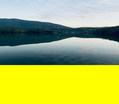
createImageData
createImageData(sw: number, sh: number): ImageData
Creates an ImageData object with the same width and height of this ImageData object. This API involves time-consuming memory copy. Therefore, avoid frequent calls to it. The example is the same as that of putImageData.
Widget capability: This API can be used in ArkTS widgets since API version 9.
Atomic service API: This API can be used in atomic services since API version 11.
System capability: SystemCapability.ArkUI.ArkUI.Full
Parameters
| Name | Type | Mandatory | Description |
|---|---|---|---|
| sw | number | Yes | Width of the ImageData object. Default unit: vp |
| sh | number | Yes | Height of the ImageData object. Default unit: vp |
createImageData(imageData: ImageData): ImageData
Creates an ImageData object by copying an existing ImageData object (without copying the image data). This API involves time-consuming memory copy. Therefore, avoid frequent calls to it. The example is the same as that of putImageData.
Widget capability: This API can be used in ArkTS widgets since API version 9.
Parameters
| Name | Type | Mandatory | Description |
|---|---|---|---|
| imagedata | ImageData | Yes | ImageData object to copy. |
Return value
| Type | Description |
|---|---|
| ImageData | New ImageData object. |
getPixelMap
getPixelMap(sx: number, sy: number, sw: number, sh: number): PixelMap
Obtains the PixelMap object created with the pixels within the specified area on the canvas. This API involves time-consuming memory copy. Therefore, avoid frequent calls to it.
Atomic service API: This API can be used in atomic services since API version 11.
System capability: SystemCapability.ArkUI.ArkUI.Full
Parameters
| Name | Type | Mandatory | Description |
|---|---|---|---|
| sx | number | Yes | X coordinate of the upper left corner of the output area. Default unit: vp |
| sy | number | Yes | Y coordinate of the upper left corner of the output area. Default unit: vp |
| sw | number | Yes | Width of the output area. Default unit: vp |
| sh | number | Yes | Height of the output area. Default unit: vp |
Return value
| Type | Description |
|---|---|
| PixelMap | PixelMap object. |
Example
NOTE
DevEco Studio Previewer does not support displaying content drawn using setPixelMap.
// xxx.ets
@Entry
@Component
struct GetPixelMap {
  private settings: RenderingContextSettings = new RenderingContextSettings(true)
  private context: CanvasRenderingContext2D = new CanvasRenderingContext2D(this.settings)
  private img: ImageBitmap = new ImageBitmap("common/images/example.jpg")
  private offCanvas: OffscreenCanvas = new OffscreenCanvas(600, 600)

  build() {
    Flex({ direction: FlexDirection.Column, alignItems: ItemAlign.Center, justifyContent: FlexAlign.Center }) {
      Canvas(this.context)
        .width('100%')
        .height('100%')
        .backgroundColor('#ffff00')
        .onReady(() => {
          let offContext = this.offCanvas.getContext("2d", this.settings)
          offContext.drawImage(this.img, 100, 100, 130, 130)
          let pixelmap = offContext.getPixelMap(150, 150, 130, 130)
          offContext.setPixelMap(pixelmap)
          let image = this.offCanvas.transferToImageBitmap()
          this.context.transferFromImageBitmap(image)
        })
    }
    .width('100%')
    .height('100%')
  }
}
setPixelMap
setPixelMap(value?: PixelMap): void
Draws the input PixelMap object on the canvas. The example is the same as that of getPixelMap.
Atomic service API: This API can be used in atomic services since API version 11.
System capability: SystemCapability.ArkUI.ArkUI.Full
Parameters
| Name | Type | Mandatory | Description |
|---|---|---|---|
| value | PixelMap | No | PixelMap object that contains pixel values. Default value: null |
getImageData
getImageData(sx: number, sy: number, sw: number, sh: number): ImageData
Obtains the ImageData object created with the pixels within the specified area on the canvas. This API involves time-consuming memory copy. Therefore, avoid frequent calls to it.
Widget capability: This API can be used in ArkTS widgets since API version 9.
Atomic service API: This API can be used in atomic services since API version 11.
System capability: SystemCapability.ArkUI.ArkUI.Full
Parameters
| Name | Type | Mandatory | Description |
|---|---|---|---|
| sx | number | Yes | X coordinate of the upper left corner of the output area. Default unit: vp |
| sy | number | Yes | Y coordinate of the upper left corner of the output area. Default unit: vp |
| sw | number | Yes | Width of the output area. Default unit: vp |
| sh | number | Yes | Height of the output area. Default unit: vp |
Return value
| Type | Description |
|---|---|
| ImageData | New ImageData object. |
Example
// xxx.ets
@Entry
@Component
struct GetImageData {
  private settings: RenderingContextSettings = new RenderingContextSettings(true)
  private context: CanvasRenderingContext2D = new CanvasRenderingContext2D(this.settings)
  private offCanvas: OffscreenCanvas = new OffscreenCanvas(600, 600)
  private img:ImageBitmap = new ImageBitmap("/common/images/1234.png")

  build() {
    Flex({ direction: FlexDirection.Column, alignItems: ItemAlign.Center, justifyContent: FlexAlign.Center }) {
      Canvas(this.context)
        .width('100%')
        .height('100%')
        .backgroundColor('#ffff00')
        .onReady(() =>{
          let offContext = this.offCanvas.getContext("2d", this.settings)
          offContext.drawImage(this.img,0,0,130,130)
          let imagedata = offContext.getImageData(50,50,130,130)
          offContext.putImageData(imagedata,150,150)
          let image = this.offCanvas.transferToImageBitmap()
          this.context.transferFromImageBitmap(image)
        })
    }
    .width('100%')
    .height('100%')
  }
}

putImageData
putImageData(imageData: ImageData, dx: number|string, dy: number|string): void
Puts an ImageData object onto a rectangular area on the canvas.
Widget capability: This API can be used in ArkTS widgets since API version 9.
Atomic service API: This API can be used in atomic services since API version 11.
System capability: SystemCapability.ArkUI.ArkUI.Full
Parameters
| Name | Type | Mandatory | Description |
|---|---|---|---|
| imagedata | Object | Yes | ImageData object with pixels to put onto the canvas. |
| dx | number |string10+ | Yes | X-axis offset of the rectangular area on the canvas. Default unit: vp |
| dy | number |string10+ | Yes | Y-axis offset of the rectangular area on the canvas. Default unit: vp |
putImageData(imageData: ImageData, dx: number|string, dy: number|string, dirtyX: number|string, dirtyY: number|string, dirtyWidth?: number|string, dirtyHeight: number|string): void
Puts an ImageData object onto a rectangular area on the canvas.
Widget capability: This API can be used in ArkTS widgets since API version 9.
Atomic service API: This API can be used in atomic services since API version 11.
System capability: SystemCapability.ArkUI.ArkUI.Full
Parameters
| Name | Type | Mandatory | Description |
|---|---|---|---|
| imagedata | Object | Yes | ImageData object with pixels to put onto the canvas. |
| dx | number |string10+ | Yes | X-axis offset of the rectangular area on the canvas. Default unit: vp |
| dy | number |string10+ | Yes | Y-axis offset of the rectangular area on the canvas. Default unit: vp |
| dirtyX | number |string10+ | Yes | X-axis offset of the upper left corner of the rectangular area relative to that of the source image. Default unit: vp |
| dirtyY | number |string10+ | Yes | Y-axis offset of the upper left corner of the rectangular area relative to that of the source image. Default unit: vp |
| dirtyWidth | number |string10+ | Yes | Width of the rectangular area to crop the source image. Default unit: vp |
| dirtyHeight | number |string10+ | Yes | Height of the rectangular area to crop the source image. Default unit: vp |
Example
// xxx.ets
@Entry
@Component
struct PutImageData {
  private settings: RenderingContextSettings = new RenderingContextSettings(true)
  private context: CanvasRenderingContext2D = new CanvasRenderingContext2D(this.settings)
  private offCanvas: OffscreenCanvas = new OffscreenCanvas(600, 600)

  build() {
    Flex({ direction: FlexDirection.Column, alignItems: ItemAlign.Center, justifyContent: FlexAlign.Center }) {
      Canvas(this.context)
        .width('100%')
        .height('100%')
        .backgroundColor('#ffff00')
        .onReady(() => {
          let offContext = this.offCanvas.getContext("2d", this.settings)
          let imageDataNum = offContext.createImageData(100, 100)
          let imageData = offContext.createImageData(imageDataNum)
          for (let i = 0; i < imageData.data.length; i += 4) {
            imageData.data[i + 0] = 255
            imageData.data[i + 1] = 0
            imageData.data[i + 2] = 255
            imageData.data[i + 3] = 255
          }
          offContext.putImageData(imageData, 10, 10)
          offContext.putImageData(imageData, 150, 10, 0, 0, 50, 50)
          let image = this.offCanvas.transferToImageBitmap()
          this.context.transferFromImageBitmap(image)
        })
    }
    .width('100%')
    .height('100%')
  }
}
setLineDash
setLineDash(segments: number[]): void
Sets the dash line style.
Widget capability: This API can be used in ArkTS widgets since API version 9.
Atomic service API: This API can be used in atomic services since API version 11.
Parameters
| Name | Type | Mandatory | Description |
|---|---|---|---|
| segments | number[] | Yes | An array of numbers that specify distances to alternately draw a line and a gap. Default unit: vp |
Example
@Entry
@Component
struct SetLineDash {
  private settings: RenderingContextSettings = new RenderingContextSettings(true)
  private context: CanvasRenderingContext2D = new CanvasRenderingContext2D(this.settings)
  private offCanvas: OffscreenCanvas = new OffscreenCanvas(600, 600)

  build() {
    Flex({ direction: FlexDirection.Column, alignItems: ItemAlign.Center, justifyContent: FlexAlign.Center }) {
      Canvas(this.context)
        .width('100%')
        .height('100%')
        .backgroundColor('#ffff00')
        .onReady(() =>{
          let offContext = this.offCanvas.getContext("2d", this.settings)
          offContext.arc(100, 75, 50, 0, 6.28)
          offContext.setLineDash([10,20])
          offContext.stroke()
          let image = this.offCanvas.transferToImageBitmap()
          this.context.transferFromImageBitmap(image)
      })
    }
    .width('100%')
    .height('100%')
  }
}
getLineDash
getLineDash(): number[]
Obtains the dash line style.
Widget capability: This API can be used in ArkTS widgets since API version 9.
Atomic service API: This API can be used in atomic services since API version 11.
Return value
| Type | Description |
|---|---|
| number[] | Interval of alternate line segments and the length of spacing. Default unit: vp |
Example
// xxx.ets
@Entry
@Component
struct OffscreenCanvasGetLineDash {
  @State message: string = 'Hello World'
  private settings: RenderingContextSettings = new RenderingContextSettings(true)
  private context: CanvasRenderingContext2D = new CanvasRenderingContext2D(this.settings)
  private offCanvas: OffscreenCanvas = new OffscreenCanvas(600, 600)
  build() {
    Row() {
      Column() {
        Text(this.message)
          .fontSize(50)
          .fontWeight(FontWeight.Bold)
          .onClick(()=>{
            console.error('before getlinedash clicked')
            let offContext = this.offCanvas.getContext("2d", this.settings)
            let res = offContext.getLineDash()
            console.error(JSON.stringify(res))
          })
        Canvas(this.context)
          .width('100%')
          .height('100%')
          .backgroundColor('#ffff00')
          .onReady(() => {
            let offContext = this.offCanvas.getContext("2d", this.settings)
            offContext.arc(100, 75, 50, 0, 6.28)
            offContext.setLineDash([10,20])
            offContext.stroke()
            let res = offContext.getLineDash()
            let image = this.offCanvas.transferToImageBitmap()
            this.context.transferFromImageBitmap(image)
          })
      }
      .width('100%')
    }
    .height('100%')
  }
}
toDataURL
toDataURL(type?: string, quality?: any): string
Creates a data URL that contains a representation of an image. This API involves time-consuming memory copy. Therefore, avoid frequent calls to it.
Widget capability: This API can be used in ArkTS widgets since API version 9.
Atomic service API: This API can be used in atomic services since API version 11.
System capability: SystemCapability.ArkUI.ArkUI.Full
Parameters
| Name | Type | Mandatory | Description |
|---|---|---|---|
| type | string | No | Image format. The options are as follows: "image/png", "image/jpeg", "image/webp". Default value: "image/png" |
| quality | any | No | Image quality, which ranges from 0 to 1, when the image format is image/jpeg or image/webp. If the set value is beyond the value range, the default value 0.92 is used. Default value: 0.92 |
Return value
| Type | Description |
|---|---|
| string | Image URL. |
Example
// xxx.ets
@Entry
@Component
struct ToDataURL {
  private settings: RenderingContextSettings = new RenderingContextSettings(true)
  private context: CanvasRenderingContext2D = new CanvasRenderingContext2D(this.settings)
  private offCanvas: OffscreenCanvas = new OffscreenCanvas(100, 100)
  @State dataURL: string = ""

  build() {
    Flex({ direction: FlexDirection.Column, alignItems: ItemAlign.Center, justifyContent: FlexAlign.Center }) {
      Canvas(this.context)
        .width(100)
        .height(100)
        .onReady(() => {
          let offContext = this.offCanvas.getContext("2d", this.settings)
          offContext.fillRect(0,0,100,100)
          this.dataURL = offContext.toDataURL()
        })
      Text(this.dataURL)
    }
    .width('100%')
    .height('100%')
    .backgroundColor('#ffff00')
  }
}
transferToImageBitmap
transferToImageBitmap(): ImageBitmap
Creates an ImageBitmap object from the most recently rendered image of the offscreen canvas.
Widget capability: This API can be used in ArkTS widgets since API version 9.
Atomic service API: This API can be used in atomic services since API version 11.
System capability: SystemCapability.ArkUI.ArkUI.Full
Return value
| Type | Description |
|---|---|
| ImageBitmap | Pixel data rendered on the offscreen canvas. |
Example
// xxx.ets
@Entry
@Component
struct PutImageData {
  private settings: RenderingContextSettings = new RenderingContextSettings(true)
  private context: CanvasRenderingContext2D = new CanvasRenderingContext2D(this.settings)
  private offCanvas: OffscreenCanvas = new OffscreenCanvas(600, 600)

  build() {
    Flex({ direction: FlexDirection.Column, alignItems: ItemAlign.Center, justifyContent: FlexAlign.Center }) {
      Canvas(this.context)
        .width('100%')
        .height('100%')
        .backgroundColor('#ffff00')
        .onReady(() =>{
          let offContext = this.offCanvas.getContext("2d", this.settings)
          let imageData = offContext.createImageData(100, 100)
          for (let i = 0; i < imageData.data.length; i += 4) {
            imageData.data[i + 0] = 255
            imageData.data[i + 1] = 0
            imageData.data[i + 2] = 255
            imageData.data[i + 3] = 255
          }
          offContext.putImageData(imageData, 10, 10)
          let image = this.offCanvas.transferToImageBitmap()
          this.context.transferFromImageBitmap(image)
        })
    }
    .width('100%')
    .height('100%')
  }
}
restore
restore(): void
Restores the saved drawing context.
NOTE
When the number of calls to restore() does not exceed the number of calls to save(), this API pops the saved drawing state from the stack and restores the properties, clipping path, and transformation matrix of the CanvasRenderingContext2D object.
If the number of calls to restore() exceeds the number of calls to save(), this API does nothing.
If there is no saved state, this API does nothing.
Widget capability: This API can be used in ArkTS widgets since API version 9.
Atomic service API: This API can be used in atomic services since API version 11.
System capability: SystemCapability.ArkUI.ArkUI.Full
Example
// xxx.ets
@Entry
@Component
struct CanvasExample {
  private settings: RenderingContextSettings = new RenderingContextSettings(true)
  private context: CanvasRenderingContext2D = new CanvasRenderingContext2D(this.settings)
  private offCanvas: OffscreenCanvas = new OffscreenCanvas(600, 600)

  build() {
    Flex({ direction: FlexDirection.Column, alignItems: ItemAlign.Center, justifyContent: FlexAlign.Center }) {
      Canvas(this.context)
        .width('100%')
        .height('100%')
        .backgroundColor('#ffff00')
        .onReady(() =>{
          let offContext = this.offCanvas.getContext("2d", this.settings)
          offContext.save() // save the default state
          offContext.fillStyle = "#00ff00"
          offContext.fillRect(20, 20, 100, 100)
          offContext.restore() // restore to the default state
          offContext.fillRect(150, 75, 100, 100)
          let image = this.offCanvas.transferToImageBitmap()
          this.context.transferFromImageBitmap(image)
        })
    }
    .width('100%')
    .height('100%')
  }
}
save
save(): void
Saves the current drawing context.
Widget capability: This API can be used in ArkTS widgets since API version 9.
Atomic service API: This API can be used in atomic services since API version 11.
System capability: SystemCapability.ArkUI.ArkUI.Full
Example
// xxx.ets
@Entry
@Component
struct CanvasExample {
  private settings: RenderingContextSettings = new RenderingContextSettings(true)
  private context: CanvasRenderingContext2D = new CanvasRenderingContext2D(this.settings)
  private offCanvas: OffscreenCanvas = new OffscreenCanvas(600, 600)

  build() {
    Flex({ direction: FlexDirection.Column, alignItems: ItemAlign.Center, justifyContent: FlexAlign.Center }) {
      Canvas(this.context)
        .width('100%')
        .height('100%')
        .backgroundColor('#ffff00')
        .onReady(() =>{
          let offContext = this.offCanvas.getContext("2d", this.settings)
          offContext.save() // save the default state
          offContext.fillStyle = "#00ff00"
          offContext.fillRect(20, 20, 100, 100)
          offContext.restore() // restore to the default state
          offContext.fillRect(150, 75, 100, 100)
          let image = this.offCanvas.transferToImageBitmap()
          this.context.transferFromImageBitmap(image)
        })
    }
    .width('100%')
    .height('100%')
  }
}
createLinearGradient
createLinearGradient(x0: number, y0: number, x1: number, y1: number): CanvasGradient
Creates a linear gradient.
Widget capability: This API can be used in ArkTS widgets since API version 9.
Atomic service API: This API can be used in atomic services since API version 11.
System capability: SystemCapability.ArkUI.ArkUI.Full
Parameters
| Name | Type | Mandatory | Description |
|---|---|---|---|
| x0 | number | Yes | X coordinate of the start point. Default unit: vp |
| y0 | number | Yes | Y coordinate of the start point. Default unit: vp |
| x1 | number | Yes | X coordinate of the end point. Default unit: vp |
| y1 | number | Yes | Y coordinate of the end point. Default unit: vp |
Return value
| Type | Description |
|---|---|
| CanvasGradient | New CanvasGradient object used to create a gradient on the offscreen canvas. |
Example
// xxx.ets
@Entry
@Component
struct CreateLinearGradient {
  private settings: RenderingContextSettings = new RenderingContextSettings(true)
  private context: CanvasRenderingContext2D = new CanvasRenderingContext2D(this.settings)
  private offCanvas: OffscreenCanvas = new OffscreenCanvas(600, 600)

  build() {
    Flex({ direction: FlexDirection.Column, alignItems: ItemAlign.Center, justifyContent: FlexAlign.Center }) {
      Canvas(this.context)
        .width('100%')
        .height('100%')
        .backgroundColor('#ffff00')
        .onReady(() =>{
          let offContext = this.offCanvas.getContext("2d", this.settings)
          let grad = offContext.createLinearGradient(50,0, 300,100)
          grad.addColorStop(0.0, '#ff0000')
          grad.addColorStop(0.5, '#ffffff')
          grad.addColorStop(1.0, '#00ff00')
          offContext.fillStyle = grad
          offContext.fillRect(0, 0, 400, 400)
          let image = this.offCanvas.transferToImageBitmap()
          this.context.transferFromImageBitmap(image)
        })
    }
    .width('100%')
    .height('100%')
  }
}
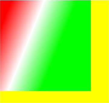
createRadialGradient
createRadialGradient(x0: number, y0: number, r0: number, x1: number, y1: number, r1: number): CanvasGradient
Creates a radial gradient.
Widget capability: This API can be used in ArkTS widgets since API version 9.
Atomic service API: This API can be used in atomic services since API version 11.
System capability: SystemCapability.ArkUI.ArkUI.Full
Parameters
| Name | Type | Mandatory | Description |
|---|---|---|---|
| x0 | number | Yes | X coordinate of the center of the start circle. Default unit: vp |
| y0 | number | Yes | Y coordinate of the center of the start circle. Default unit: vp |
| r0 | number | Yes | Radius of the start circle, which must be a non-negative finite number. Default unit: vp |
| x1 | number | Yes | X coordinate of the center of the end circle. Default unit: vp |
| y1 | number | Yes | Y coordinate of the center of the end circle. Default unit: vp |
| r1 | number | Yes | Radius of the end circle, which must be a non-negative finite number. Default unit: vp |
Return value
| Type | Description |
|---|---|
| CanvasGradient | New CanvasGradient object used to create a gradient on the offscreen canvas. |
Example
// xxx.ets
@Entry
@Component
struct CreateRadialGradient {
  private settings: RenderingContextSettings = new RenderingContextSettings(true)
  private context: CanvasRenderingContext2D = new CanvasRenderingContext2D(this.settings)
  private offCanvas: OffscreenCanvas = new OffscreenCanvas(600, 600)

  build() {
    Flex({ direction: FlexDirection.Column, alignItems: ItemAlign.Center, justifyContent: FlexAlign.Center }) {
      Canvas(this.context)
        .width('100%')
        .height('100%')
        .backgroundColor('#ffff00')
        .onReady(() =>{
          let offContext = this.offCanvas.getContext("2d", this.settings)
          let grad = offContext.createRadialGradient(200,200,50, 200,200,200)
          grad.addColorStop(0.0, '#ff0000')
          grad.addColorStop(0.5, '#ffffff')
          grad.addColorStop(1.0, '#00ff00')
          offContext.fillStyle = grad
          offContext.fillRect(0, 0, 440, 440)
          let image = this.offCanvas.transferToImageBitmap()
          this.context.transferFromImageBitmap(image)
        })
    }
    .width('100%')
    .height('100%')
  }
}
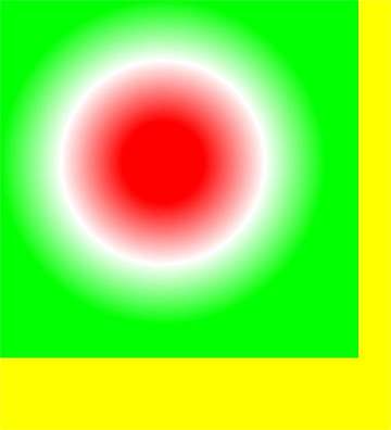
createConicGradient10+
createConicGradient(startAngle: number, x: number, y: number): CanvasGradient
Creates a conic gradient.
Atomic service API: This API can be used in atomic services since API version 11.
System capability: SystemCapability.ArkUI.ArkUI.Full
Parameters
| Name | Type | Mandatory | Description |
|---|---|---|---|
| startAngle | number | Yes | Angle at which the gradient starts. The angle measurement starts horizontally from the right side of the center and moves clockwise. Unit: radian |
| x | number | Yes | X coordinate of the center of the conic gradient. Default unit: vp |
| y | number | Yes | Y coordinate of the center of the conic gradient. Default unit: vp |
Return value
| Type | Description |
|---|---|
| CanvasGradient | New CanvasGradient object used to create a gradient on the offscreen canvas. |
Example
// xxx.ets
@Entry
@Component
struct OffscreenCanvasConicGradientPage {
  private settings: RenderingContextSettings = new RenderingContextSettings(true)
  private context: CanvasRenderingContext2D = new CanvasRenderingContext2D(this.settings)
  private offCanvas: OffscreenCanvas = new OffscreenCanvas(600, 600)

  build() {
    Flex({ direction: FlexDirection.Column, alignItems: ItemAlign.Center, justifyContent: FlexAlign.Center }) {
      Canvas(this.context)
        .width('100%')
        .height('100%')
        .backgroundColor('#ffffff')
        .onReady(() =>{
          let offContext = this.offCanvas.getContext("2d", this.settings)
          let grad = offContext.createConicGradient(0, 50, 80)
          grad.addColorStop(0.0, '#ff0000')
          grad.addColorStop(0.5, '#ffffff')
          grad.addColorStop(1.0, '#00ff00')
          offContext.fillStyle = grad
          offContext.fillRect(0, 30, 100, 100)
          let image = this.offCanvas.transferToImageBitmap()
          this.context.transferFromImageBitmap(image)
        })
    }
    .width('100%')
    .height('100%')
  }
}