Stepper
The Stepper component provides a step navigator, suitable for guiding users through a step-by-step task completion process.
NOTE
This component is supported since API version 8. Updates will be marked with a superscript to indicate their earliest API version.
Child Components
Only the child component StepperItem is supported.
APIs
Stepper(value?: { index?: number })
Atomic service API: This API can be used in atomic services since API version 11.
System capability: SystemCapability.ArkUI.ArkUI.Full
Parameters
| Name | Type | Mandatory | Description |
|---|---|---|---|
| value | { index?: number } | No | Index of the StepperItem that is currently displayed. Default value: 0 Since API version 10, this parameter supports two-way binding through $$. |
Attributes
None
Events
onFinish
onFinish(callback: () => void)
Invoked when the nextLabel of the last StepperItem in the Stepper is clicked and the ItemState attribute is set to Normal.
Atomic service API: This API can be used in atomic services since API version 11.
System capability: SystemCapability.ArkUI.ArkUI.Full
onSkip
onSkip(callback: () => void)
Invoked when the current StepperItem is ItemState.Skip and the nextLabel is clicked.
Atomic service API: This API can be used in atomic services since API version 11.
System capability: SystemCapability.ArkUI.ArkUI.Full
onChange
onChange(callback: (prevIndex: number, index: number) => void)
Invoked when the prevLabel of the current StepperItem is clicked to switch to the previous step page; or when the nextLabel of the current (not the last) StepperItem is clicked to switch to the next step page and the ItemState attribute is set to Normal.
Atomic service API: This API can be used in atomic services since API version 11.
System capability: SystemCapability.ArkUI.ArkUI.Full
Parameters
| Name | Type | Mandatory | Description |
|---|---|---|---|
| prevIndex | number | Yes | Index of the step page before the switching. Value range: [0, +∞) |
| index | number | Yes | Index of the step page after the switching, that is, index of the previous or next page. Value range: [0, +∞) |
onNext
onNext(callback: (index: number, pendingIndex: number) => void)
Invoked when the nextLabel of the current (not the last) StepperItem is clicked and the ItemState attribute is set to Normal.
Atomic service API: This API can be used in atomic services since API version 11.
System capability: SystemCapability.ArkUI.ArkUI.Full
Parameters
| Name | Type | Mandatory | Description |
|---|---|---|---|
| index | number | Yes | Index of the current step page. |
| pendingIndex | number | Yes | Index of the next step page. |
onPrevious
onPrevious(callback: (index: number, pendingIndex: number) => void)
Invoked when the prevLabel of the current StepperItem is clicked to switch to the previous step page.
Atomic service API: This API can be used in atomic services since API version 11.
System capability: SystemCapability.ArkUI.ArkUI.Full
Parameters
| Name | Type | Mandatory | Description |
|---|---|---|---|
| index | number | Yes | Index of the current step page. |
| pendingIndex | number | Yes | Index of the previous step page. |
Example
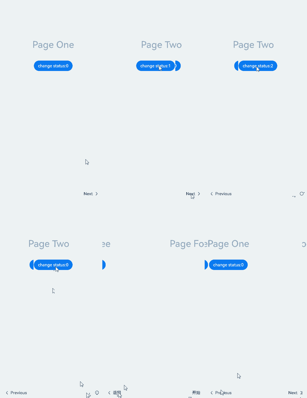
This example demonstrates how to use the Stepper component.
// xxx.ets
@Styles function itemStyle () {
  .width(336)
  .height(621)
  .margin({ top: 48, left: 12 })
  .borderRadius(24)
  .backgroundColor('#FFFFFF')
}

@Extend(Text) function itemTextStyle () {
  .fontColor('#182431')
  .fontSize(36)
  .fontWeight(500)
  .opacity(0.4)
  .margin({ top: 82, bottom: 40 })
}

@Entry
@Component
struct StepperExample {
  @State currentIndex: number = 0
  @State firstState: ItemState = ItemState.Normal
  @State secondState: ItemState = ItemState.Normal
  @State thirdState: ItemState = ItemState.Normal

  build() {
    Stepper({
      index: this.currentIndex
    }) {
      // First step page
      StepperItem() {
        Column() {
          Text('Page One')
            .itemTextStyle()
          Button('change status:' + this.firstState)
            .backgroundColor('#007dFF')
            .onClick(() => {
              this.firstState = this.firstState === ItemState.Skip ? ItemState.Normal : ItemState.Skip
            })
        }.itemStyle()
      }
      .nextLabel('Next')
      .status(this.firstState)
      // Second step page
      StepperItem() {
        Column() {
          Text('Page Two')
            .itemTextStyle()
          Button('change status:' + this.secondState)
            .backgroundColor('#007dFF')
            .onClick(() => {
              this.secondState = this.secondState === ItemState.Disabled ? ItemState.Normal : ItemState.Disabled
            })
        }.itemStyle()
      }
      .nextLabel('Next')
      .prevLabel('Previous')
      .status(this.secondState)
      // Third step page
      StepperItem() {
        Column() {
          Text('Page Three')
            .itemTextStyle()
          Button('change status:' + this.thirdState)
            .backgroundColor('#007dFF')
            .onClick(() => {
              this.thirdState = this.thirdState === ItemState.Waiting ? ItemState.Normal : ItemState.Waiting
            })
        }.itemStyle()
      }
      .status(this.thirdState)
      // Fourth step page
      StepperItem() {
        Column() {
          Text('Page Four')
            .itemTextStyle()
        }.itemStyle()
      }
    }
    .backgroundColor('#F1F3F5')
    .onFinish(() => {
      // Define the processing logic for when Finish on the last page is clicked, for example, redirection.
      console.info('onFinish')
    })
    .onSkip(() => {
      // Define the processing logic for when Skip on the page is clicked, for example, dynamically changing the index of the <Stepper> to redirect to a specific step.
      console.info('onSkip')
    })
    .onChange((prevIndex?: number, index?: number) => {
      if(index){
        this.currentIndex = index
      }
    })
  }
}