tabs
NOTE
This component is supported since API version 4. Updates will be marked with a superscript to indicate their earliest API version.
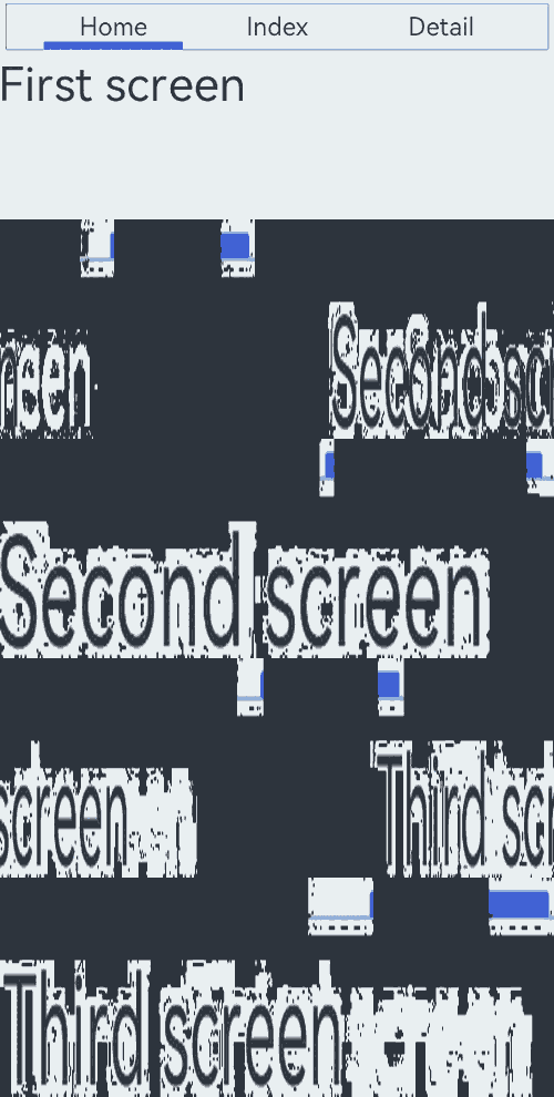
The <tabs> component provides a tab container.
Required Permissions
None
Child Components
Only <tab-bar> and <tab-content> are supported.
Attributes
In addition to the universal attributes, the following attributes are supported.
| Name | Type | Default Value | Mandatory | Description |
|---|---|---|---|---|
| index | number | 0 | No | Index of the active tab. |
| vertical | boolean | false | No | Whether the tab is vertical. Available values are as follows: - false: The <tab-bar> and <tab-content> are arranged vertically. - true: The <tab-bar> and <tab-content> are arranged horizontally. |
Styles
The universal styles are supported.
Events
In addition to the universal events, the following events are supported.
| Name | Parameter | Description |
|---|---|---|
| change | { index: indexValue } | Triggered upon tab switching. This event is not triggered when the index value is dynamically changed. |
Example
<!-- xxx.hml -->
<div class="container">
  <tabs class = "tabs" index="0" vertical="false" onchange="change">
    <tab-bar class="tab-bar" mode="fixed">
      <text class="tab-text">Home</text>
      <text class="tab-text">Index</text>
      <text class="tab-text">Detail</text>
    </tab-bar>
    <tab-content class="tabcontent" scrollable="true">
      <div class="item-content" >
        <text class="item-title">First screen</text>
      </div>
      <div class="item-content" >
        <text class="item-title">Second screen</text>
      </div>
      <div class="item-content" >
        <text class="item-title">Third screen</text>
      </div>
    </tab-content>
  </tabs>
</div>
/* xxx.css */
.container {
  flex-direction: column;
  justify-content: flex-start;
  align-items: center;
}
.tabs {
  width: 100%;
}
.tabcontent {
  width: 100%;
  height: 80%;
  justify-content: center;
}
.item-content {
  height: 100%;
  justify-content: center;
}
.item-title {
  font-size: 60px;
}
.tab-bar {
  margin: 10px;
  height: 60px;
  border-color: #007dff;
  border-width: 1px;
}
.tab-text {
  width: 300px;
  text-align: center;
}
// xxx.js
export default {
  change: function(e) {
    console.log("Tab index: " + e.index);
  },
}
你可能感兴趣的鸿蒙文章
harmony 鸿蒙JavaScript-compatible Web-like Development Paradigm (ArkUI.Full)