FolderStack
The FolderStack component extends the Stack component by adding the hover feature for foldable devices. With the upperItems parameter set, it can automatically avoid the crease area of the foldable device and move the content to the upper half screen.
NOTE
This component is supported since API version 11. Updates will be marked with a superscript to indicate their earliest API version.
Child Components
Multiple child components are supported.
APIs
FolderStack(options?: FolderStackOptions)
Atomic service API: This API can be used in atomic services since API version 12.
System capability: SystemCapability.ArkUI.ArkUI.Full
Parameters
| Name | Type | Mandatory | Description |
|---|---|---|---|
| options | FolderStackOptions | No | Configuration of the FolderStack component. |
FolderStackOptions14+
Atomic service API: This API can be used in atomic services since API version 14.
System capability: SystemCapability.ArkUI.ArkUI.Full
| Name | Type | Mandatory | Description |
|---|---|---|---|
| upperItems11+ | Array<string> | No | Configuration of the FolderStack component. upperItems: array of IDs of child components that will be moved to the upper half screen in the hover state. On hover, child components with IDs in this array automatically shift away from the folding screen's crease area and move to the upper half screen, while other components are stacked in the lower half screen. Atomic service API: This API can be used in atomic services since API version 12. |
Attributes
In addition to the universal attributes, the following attributes are supported.
alignContent
alignContent(value: Alignment)
Sets the alignment of child components in the container. When both this attribute and the universal attribute align are set, whichever is set last takes effect.
Atomic service API: This API can be used in atomic services since API version 12.
System capability: SystemCapability.ArkUI.ArkUI.Full
Parameters
| Name | Type | Mandatory | Description |
|---|---|---|---|
| value | Alignment | Yes | Alignment of child components in the container. Default value: Alignment.Center |
enableAnimation
enableAnimation(value: boolean)
Sets whether to enable the default animation.
Atomic service API: This API can be used in atomic services since API version 12.
System capability: SystemCapability.ArkUI.ArkUI.Full
Parameters
| Name | Type | Mandatory | Description |
|---|---|---|---|
| value | boolean | Yes | Whether to enable the default animation. Default value: true |
autoHalfFold
autoHalfFold(value: boolean)
Sets whether to enable auto rotation. This attribute is effective only when auto rotation is disabled in device system settings.
Atomic service API: This API can be used in atomic services since API version 12.
System capability: SystemCapability.ArkUI.ArkUI.Full
Parameters
| Name | Type | Mandatory | Description |
|---|---|---|---|
| value | boolean | Yes | Whether to enable auto rotation. Default value: true |
NOTE
Setting the offset and margin attributes may cause the upper and lower half screens to block the crease area. Therefore, avoid setting these attributes with this component.
Events
In addition to the universal events, the following events are supported.
onFolderStateChange
onFolderStateChange(callback: OnFoldStatusChangeCallback)
Called when the folding state changes. This API takes effect only in landscape mode.
Atomic service API: This API can be used in atomic services since API version 12.
System capability: SystemCapability.ArkUI.ArkUI.Full
Parameters
| Name | Type | Mandatory | Description |
|---|---|---|---|
| callback | OnFoldStatusChangeCallback | Yes | Current fold state of the device. |
onHoverStatusChange12+
onHoverStatusChange(handler: OnHoverStatusChangeCallback)
Called when the hover status changes.
Atomic service API: This API can be used in atomic services since API version 12.
System capability: SystemCapability.ArkUI.ArkUI.Full
Parameters
| Name | Type | Mandatory | Description |
|---|---|---|---|
| handler | OnHoverStatusChangeCallback | Yes | Callback invoked when the hover status changes. |
OnHoverStatusChangeCallback14+
type OnHoverStatusChangeCallback = (param: HoverEventParam) => void
Callback invoked when the hover status changes.
Atomic service API: This API can be used in atomic services since API version 14.
System capability: SystemCapability.ArkUI.ArkUI.Full
| Name | Type | Mandatory | Description |
|---|---|---|---|
| param | HoverEventParam | Yes | Callback invoked when the hover status changes. |
OnFoldStatusChangeCallback14+
type OnFoldStatusChangeCallback = (event: OnFoldStatusChangeInfo) => void
Current fold state of the device.
Atomic service API: This API can be used in atomic services since API version 14.
System capability: SystemCapability.ArkUI.ArkUI.Full
| Name | Type | Mandatory | Description |
|---|---|---|---|
| callback | OnFoldStatusChangeInfo | Yes | Current fold state of the device. |
OnFoldStatusChangeInfo14+
Called when the folding state changes. This API takes effect only in landscape mode.
Atomic service API: This API can be used in atomic services since API version 14.
System capability: SystemCapability.ArkUI.ArkUI.Full
| Name | Type | Mandatory | Description |
|---|---|---|---|
| foldStatus11+ | FoldStatus | Yes | Current fold state of the device. Atomic service API: This API can be used in atomic services since API version 12. |
HoverEventParam12+
Atomic service API: This API can be used in atomic services since API version 12.
System capability: SystemCapability.ArkUI.ArkUI.Full
| Name | Type | Mandatory | Description |
|---|---|---|---|
| foldStatus | FoldStatus | Yes | Current fold state of the device. |
| isHoverMode | boolean | Yes | Whether the device is in hover state. |
| appRotation | AppRotation | Yes | Current orientation. |
| windowStatusType | WindowStatusType | Yes | Window mode. |
WindowStatusType12+
type WindowStatusType = WindowStatusType
Enumerates the window modes.
Atomic service API: This API can be used in atomic services since API version 12.
System capability: SystemCapability.ArkUI.ArkUI.Full
| Type | Description |
|---|---|
| WindowStatusType | Window mode. |
Example
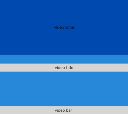
This example implements the foldable device hover capability.
@Entry
@Component
struct Index {
  @State len_wid: number = 480
  @State w: string = "40%"

  build() {
    Column() {
      // Set upperItems to IDs of the child components to be moved to the upper half screen in the hover state. Other components are stacked in the lower half screen.
      FolderStack({ upperItems: ["upperitemsId"] }) {
        // This column is automatically moved up to the upper half screen.
        Column() {
          Text("video zone").height("100%").width("100%").textAlign(TextAlign.Center).fontSize(25)
        }.backgroundColor('rgb(0, 74, 175)').width("100%").height("100%").id("upperitemsId")

        // The following two columns are stacked in the lower half screen.
        Column() {
          Text("video title")
            .width("100%")
            .height(50)
            .textAlign(TextAlign.Center)
            .backgroundColor('rgb(213, 213, 213)')
            .fontSize(25)
        }.width("100%").height("100%").justifyContent(FlexAlign.Start)

        Column() {
          Text("video bar ")
            .width("100%")
            .height(50)
            .textAlign(TextAlign.Center)
            .backgroundColor('rgb(213, 213, 213)')
            .fontSize(25)
        }.width("100%").height("100%").justifyContent(FlexAlign.End)
      }
      .backgroundColor('rgb(39, 135, 217)')
      // Set whether to enable animation.
      .enableAnimation(true)
      // Set whether to enable auto-rotate.
      .autoHalfFold(true)
      // Called when the folding status changes.
      .onFolderStateChange((msg) => {
        if (msg.foldStatus === FoldStatus.FOLD_STATUS_EXPANDED) {
          console.info("The device is currently in the expanded state")
        } else if (msg.foldStatus === FoldStatus.FOLD_STATUS_HALF_FOLDED) {
          console.info("The device is currently in the half folded state")
        } else {
          // .............
        }
      })
      // The hoverStatusChange callback is invoked when the hover status changes.
      .onHoverStatusChange((msg) => {
        console.log('this foldStatus:' + msg.foldStatus);
        console.log('this isHoverMode:' + msg.isHoverMode);
        console.log('this appRotation:' + msg.appRotation);
        console.log('this windowStatusType:' + msg.windowStatusType);
      })
      // If the folderStack component does not occupy the full screen, it is used as a common stack.
      .alignContent(Alignment.Bottom)
      .height("100%")
      .width("100%")
      .backgroundColor('rgb(39, 135, 217)')

    }
    .height("100%")
    .width("100%")
    .borderWidth(1)
    .borderColor('rgb(213, 213, 213)')
    .backgroundColor('rgb(0, 74, 175)')
    .expandSafeArea([SafeAreaType.SYSTEM], [SafeAreaEdge.BOTTOM])
  }
}
Figure 1 Expanded state in landscape mode
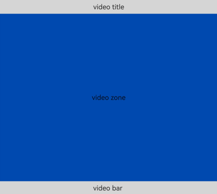
Figure 2 Half-folded state in landscape mode