Statck Layout
The stack layout reserves an area on the screen to display elements in a component and allows the elements to be stacked. You can implement a stack layout through the <Stack> component, which provides a stack container where child components are successively stacked and the latter one overwrites the previous one.
Alignment
Child components in the container can be aligned in any of the alignment modes described in the table below.
| Name | Description | Image |
|---|---|---|
| TopStart | Top start. | 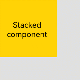 |
| Top | Horizontally centered on the top. | 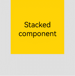 |
| TopEnd | Top end. | 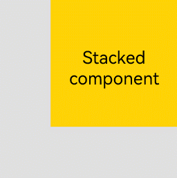 |
| Start | Vertically centered start. | 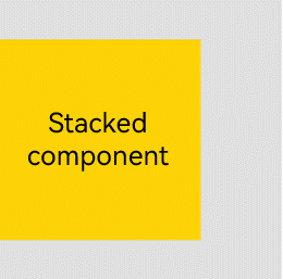 |
| Center | Horizontally and vertically centered. | 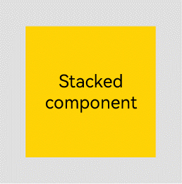 |
| End | Vertically centered end. | 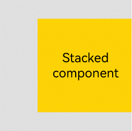 |
| BottomStart | Bottom start. | 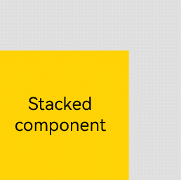 |
| Bottom | Horizontally centered on the bottom. | 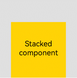 |
| BottomEnd | Bottom end. | 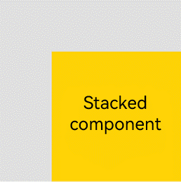 |
Z-order Control
You can use the zIndex attribute to set the z-order of a component in the stacking context, so as to create a custom stacking order of the child components. A larger zIndex value indicates a higher display level.
-
In the statck layout, if the size of a component is greater than that of the one before it, the one before it is hidden.
Stack({ alignContent: Alignment.BottomStart }) {
    Column() {
      Text ('Stacked component 1').textAlign (TextAlign.End).fontSize (20)
    }.width(100).height(100).backgroundColor(0xffd306)
    Column() {
      Text ('Stacked component 2').fontSize (20)
    }.width(150).height(150).backgroundColor(Color.Pink)
    Column() {
      Text ('Stacked component 3').fontSize (20)
    }.width(200).height(200).backgroundColor(Color.Grey)
}.margin({ top: 100 }).width(350).height(350).backgroundColor(0xe0e0e0)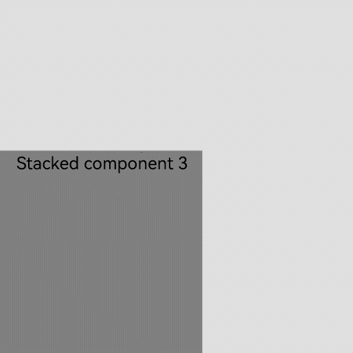
In the preceding figure, the size of the stacked component 3 is greater than that of all the components before it. Therefore, the first two components are completely hidden. To show these components, modify their zIndex attribute settings.
Stack({ alignContent: Alignment.BottomStart }) {
    Column() {
      Text ('Stacked component 1').textAlign (TextAlign.End).fontSize (20)
    }.width(100).height(100).backgroundColor(0xffd306).zIndex(2)
    Column() {
      Text ('Stacked component 2').fontSize (20)
    }.width(150).height(150).backgroundColor(Color.Pink).zIndex(1)
    Column() {
      Text ('Stacked component 3').fontSize (20)
    }.width(200).height(200).backgroundColor(Color.Grey)
}.margin({ top: 100 }).width(350).height(350).backgroundColor(0xe0e0e0)
你可能感兴趣的鸿蒙文章
harmony 鸿蒙Multi-Language Capability