harmony 鸿蒙Building a Food Category Grid Layout
Building a Food Category Grid Layout
The diet application allows food on the home page to display in list or grid mode. You can implement switching between food categories through tabs in grid mode.
- Import the Category enumeration type to the FoodCategoryList page.
import { Category, FoodData } from '../model/FoodData'
- Create the FoodCategoryList and FoodCategory components. The FoodCategoryList component is used as the entry component of the new page, and the initializeOnStartup method is invoked in the entry component.
   @Component
   struct FoodList {
     private foodItems: FoodData[]
     build() {
       ......
     }
   }

   @Component
   struct FoodCategory {
     private foodItems: FoodData[]
     build() {
       ......
     }
   }

   @Entry
   @Component
   struct FoodCategoryList {
     private foodItems: FoodData[] = initializeOnStartup()
     build() {
       ......
     }
   }
- Create the showList member variable in the FoodCategoryList component to control the rendering switchover between the list layout and grid layout. The conditional rendering statement if…else… is required.
   @Entry
   @Component
   struct FoodCategoryList {
     private foodItems: FoodData[] = initializeOnStartup()
     private showList: boolean = false

     build() {
       Stack() {
         if (this.showList) {
           FoodList({ foodItems: this.foodItems })
         } else {
           FoodCategory({ foodItems: this.foodItems })
         }
       }
     }
   }
- In the upper right corner of the page, create an icon for switching between the list and grid layouts. Set the stack alignment mode to TopEnd, top-bottom alignment. Create an image component, and set the click event, that is, negation of showList.
   @Entry
   @Component
   struct FoodCategoryList {
     private foodItems: FoodData[] = initializeOnStartup()
     private showList: boolean = false

     build() {
       Stack({ alignContent: Alignment.TopEnd }) {
         if (this.showList) {
           FoodList({ foodItems: this.foodItems })
         } else {
           FoodCategory({ foodItems: this.foodItems })
         }
         Image($r('app.media.Switch'))
           .height(24)
           .width(24)
           .margin({ top: 15, right: 10 })
           .onClick(() => {
           this.showList = !this.showList
         })
       }.height('100%')
     }
   }
- Add the @State decorator. After you click the switch tab in the upper right corner, the page does not change. This is because the showList does not have state data and its change does not trigger the page refresh. You need to add the @State decorator to make it state data. The change of the @State decorator will cause re-rendering of the component where the decorator is located.
   @Entry
   @Component
   struct FoodCategoryList {
     private foodItems: FoodData[] = initializeOnStartup()
     @State private showList: boolean = false

     build() {
       Stack({ alignContent: Alignment.TopEnd }) {
         if (this.showList) {
           FoodList({ foodItems: this.foodItems })
         } else {
           FoodCategory({ foodItems: this.foodItems })
         }
         Image($r('app.media.Switch'))
           .height(24)
           .width(24)
           .margin({ top: 15, right: 10 })
           .onClick(() => {
           this.showList = !this.showList
         })
       }.height('100%')
     }
   }
When you click the switch icon, the FoodList component is displayed. When you click the switch icon again, the FoodList component is hidden.
- Create a tab to display all food categories (All). Create the <Tabs> component and its child component TabContent in the FoodCategory component, and set tabBar to All. Set the width of the TabBars to 280 and the layout mode to Scrollable. This means that the TabBars can be scrolled when the total length exceeds 280. The <Tabs> component is a container component that allows users to switch between content views through tabs. Each tab page corresponds to a TabContent.
   @Component
   struct FoodCategory {
     private foodItems: FoodData[]
     build() {
       Stack() {
         Tabs() {
           TabContent() {}.tabBar('All')
         }
         .barWidth(280)
         .barMode(BarMode.Scrollable)
       }
     }
   }
- Create the FoodGrid component to function as a child component of the TabContent component.
   @Component
   struct FoodGrid {
     private foodItems: FoodData[]
     build() {}
   }

   @Component
   struct FoodCategory {
     private foodItems: FoodData[]
     build() {
       Stack() {
         Tabs() {
           TabContent() {
             FoodGrid({ foodItems: this.foodItems })
           }.tabBar('All')
         }
         .barWidth(280)
         .barMode(BarMode.Scrollable)
       }
     }
   }
- Implement a 2 x 6 grid layout (12 food data resources in total). Create a Grid component, and set columnsTemplate to (‘1fr 1fr’), rowsTemplate to (‘1fr 1fr 1fr 1fr 1fr 1fr’), and both rowsGap and columnsGap to 8. Create a Scroll component so that it can be slid.
   @Component
   struct FoodGrid {
     private foodItems: FoodData[]
     build() {
       Scroll() {
         Grid() {
           ForEach(this.foodItems, (item: FoodData) => {
             GridItem() {}
           }, (item: FoodData) => item.id.toString())
         }
         .rowsTemplate('1fr 1fr 1fr 1fr 1fr 1fr')
         .columnsTemplate('1fr 1fr')
         .columnsGap(8)
         .rowsGap(8)
       }
       .scrollBar(BarState.Off)
       .padding({left: 16, right: 16})
     }
   }
- Create a FoodGridItem component to display the food image, name, and calories and implement the UI layout. The FoodGridItem component is a child component of the GridItem component. The height of each FoodGridItem is 184, and the line spacing is 8. The total height of the Grid component is calculated as follows: (184 + 8) x 6 – 8 = 1144.
   @Component
   struct FoodGridItem {
     private foodItem: FoodData
     build() {
       Column() {
         Row() {
           Image(this.foodItem.image)
             .objectFit(ImageFit.Contain)
             .height(152)
             .width('100%')
         }
         Flex({ justifyContent: FlexAlign.Start, alignItems: ItemAlign.Center }) {
           Text(this.foodItem.name)
             .fontSize(14)
             .flexGrow(1)
             .padding({ left: 8 })
           Text(this.foodItem.calories + 'kcal')
             .fontSize(14)
             .margin({ right: 6 })
         }
         .height(32)
         .width('100%')
         .backgroundColor('#FFe5e5e5')
       }
       .height(184)
       .width('100%')
     }
   }

   @Component
   struct FoodGrid {
     private foodItems: FoodData[]
     build() {
       Scroll() {
         Grid() {
           ForEach(this.foodItems, (item: FoodData) => {
             GridItem() {
               FoodGridItem({foodItem: item})
             }
           }, (item: FoodData) => item.id.toString())
         }
         .rowsTemplate('1fr 1fr 1fr 1fr 1fr 1fr')
         .columnsTemplate('1fr 1fr')
         .columnsGap(8)
         .rowsGap(8)
         .height(1144)
       }
       .scrollBar(BarState.Off)
       .padding({ left: 16, right: 16 })
     }
   }
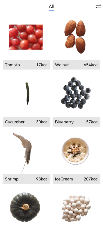
Create the Category.Vegetable, Category.Fruit, Category.Nut, Category.SeaFood, and Category.Dessert tabs.
@Component
struct FoodCategory {
  private foodItems: FoodData[]


  build() {
    Stack() {
      Tabs() {
        TabContent() {
          FoodGrid({ foodItems: this.foodItems })
        }.tabBar('All')


        TabContent() {
          FoodGrid({ foodItems: this.foodItems.filter(item => (item.category === Category.Vegetable)) })
        }.tabBar('Vegetable')


        TabContent() {
          FoodGrid({ foodItems: this.foodItems.filter(item => (item.category === Category.Fruit)) })
        }.tabBar('Fruit')


        TabContent() {
          FoodGrid({ foodItems: this.foodItems.filter(item => (item.category === Category.Nut)) })
        }.tabBar('Nut')


        TabContent() {
          FoodGrid({ foodItems: this.foodItems.filter(item => (item.category === Category.Seafood)) })
        }.tabBar('Seafood')


        TabContent() {
          FoodGrid({ foodItems: this.foodItems.filter(item => (item.category === Category.Dessert)) })
        }.tabBar('Dessert')
      }
      .barWidth(280)
      .barMode(BarMode.Scrollable)
    }
  }
}
Set the number of rows and height of grids for different food categories. Because the number of foods varies according to the category, the “1fr 1fr 1fr 1fr 1fr 1fr ‘ constant cannot be used to set the number of rows to 6. Create member variables gridRowTemplate and HeightValue, and set the number of grid rows and height by using these member variables.
@Component
struct FoodGrid {
  private foodItems: FoodData[]
  private gridRowTemplate: string = ''
  private heightValue: number


  build() {
    Scroll() {
      Grid() {
        ForEach(this.foodItems, (item: FoodData) => {
          GridItem() {
            FoodGridItem({ foodItem: item })
          }
        }, (item: FoodData) => item.id.toString())
      }
      .rowsTemplate(this.gridRowTemplate)
      .columnsTemplate('1fr 1fr')
      .columnsGap(8)
      .rowsGap(8)
      .height(this.heightValue)
    }
    .scrollBar(BarState.Off)
    .padding({ left: 16, right: 16 })
  }
}
Invoke the aboutToAppear API to calculate the number of rows (gridRowTemplate) and height (heightValue).
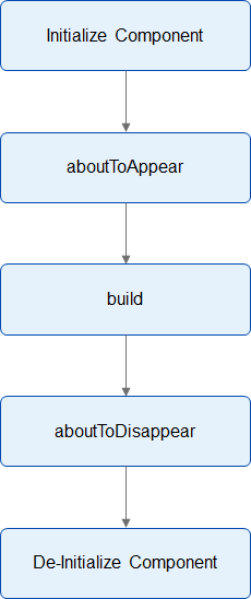
aboutToAppear() {
  var rows = Math.round(this.foodItems.length / 2);
  this.gridRowTemplate = '1fr '.repeat(rows);
  this.heightValue = rows * 192 - 8;
}
The custom component provides two lifecycle callbacks: aboutToAppear and aboutToDisappear. aboutToAppear is executed after the custom component is created and before the build method of the custom component is executed. aboutToDisappear is executed before the custom component is destroyed.
@Component
struct FoodGrid {
  private foodItems: FoodData[]
  private gridRowTemplate: string = ''
  private heightValue: number


  aboutToAppear() {
    var rows = Math.round(this.foodItems.length / 2);
    this.gridRowTemplate = '1fr '.repeat(rows);
    this.heightValue = rows * 192 - 8;
  }


  build() {
    Scroll() {
      Grid() {
        ForEach(this.foodItems, (item: FoodData) => {
          GridItem() {
            FoodGridItem({ foodItem: item })
          }
        }, (item: FoodData) => item.id.toString())
      }
      .rowsTemplate(this.gridRowTemplate)
      .columnsTemplate('1fr 1fr')
      .columnsGap(8)
      .rowsGap(8)
      .height(this.heightValue)
    }
    .scrollBar(BarState.Off)
    .padding({ left: 16, right: 16 })
  }
}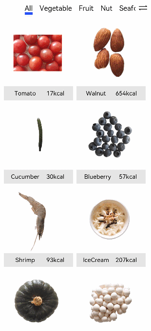
你可能感兴趣的鸿蒙文章
harmony 鸿蒙Multi-Language Capability
- 所属分类: 后端技术
- 本文标签:
热门推荐
-
2、 - 优质文章
-
3、 gate.io
-
8、 golang
-
9、 openharmony
-
10、 Vue中input框自动聚焦