GridContainer
The GridContainer component lays out components vertically. It is used only in the grid layout.
NOTE
This component is deprecated since API version 9. You are advised to use GridCol and GridRow instead.
This component is supported since API version 7. Updates will be marked with a superscript to indicate their earliest API version.
Child Components
Supported
APIs
GridContainer(value?: GridContainerOptions)
System capability: SystemCapability.ArkUI.ArkUI.Full
Parameters
| Name | Type | Mandatory | Description |
|---|---|---|---|
| value | GridContainerOptions | No | Options of the GridContainer component. |
GridContainerOptions
System capability: SystemCapability.ArkUI.ArkUI.Full
| Name | Type | Mandatory | Description |
|---|---|---|---|
| columns | number |'auto' | No | Total number of columns in the current layout. Default value: 'auto' |
| sizeType | SizeType | No | Device size type. Default value: SizeType.Auto |
| gutter | number |string | No | Gutter of the grid layout. This parameter cannot be set to a percentage. |
| margin | number |string | No | Margin of the grid layout. This parameter cannot be set to a percentage. |
SizeType
System capability: SystemCapability.ArkUI.ArkUI.Full
| Name | Description |
|---|---|
| XS | Device of the minimum size. |
| SM | Small-sized device. |
| MD | Medium-sized device. |
| LG | Large-sized device. |
| Auto | Auto. The size type is selected based on the device type. |
Attributes
The universal attributes and attributes of the Column component are supported.
Events
The universal events are supported.
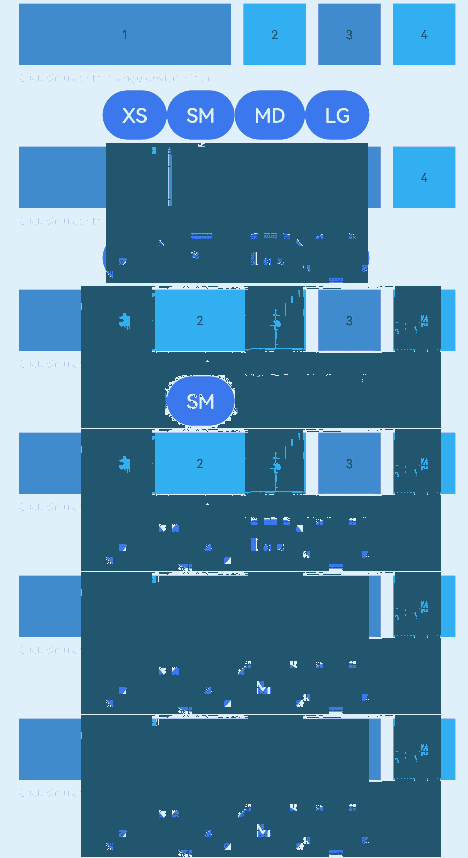
Example
// xxx.ets
@Entry
@Component
struct GridContainerExample {
  @State sizeType: SizeType = SizeType.XS

  build() {
    Column({ space: 5 }) {
      GridContainer({ columns: 12, sizeType: this.sizeType, gutter: 10, margin: 20 }) {
        Row() {
          Text('1')
            .useSizeType({
              xs: { span: 6, offset: 0 },
              sm: { span: 2, offset: 0 },
              md: { span: 2, offset: 0 },
              lg: { span: 2, offset: 0 }
            })
            .height(50).backgroundColor(0x4682B4).textAlign(TextAlign.Center)
          Text('2')
            .useSizeType({
              xs: { span: 2, offset: 6 },
              sm: { span: 6, offset: 2 },
              md: { span: 2, offset: 2 },
              lg: { span: 2, offset: 2 }
            })
            .height(50).backgroundColor(0x00BFFF).textAlign(TextAlign.Center)
          Text('3')
            .useSizeType({
              xs: { span: 2, offset: 8 },
              sm: { span: 2, offset: 8 },
              md: { span: 6, offset: 4 },
              lg: { span: 2, offset: 4 }
            })
            .height(50).backgroundColor(0x4682B4).textAlign(TextAlign.Center)
          Text('4')
            .useSizeType({
              xs: { span: 2, offset: 10 },
              sm: { span: 2, offset: 10 },
              md: { span: 2, offset: 10 },
              lg: { span: 6, offset: 6 }
            })
            .height(50).backgroundColor(0x00BFFF).textAlign(TextAlign.Center)
        }
      }.width('90%')

      Text('Click Simulate to change the device width').fontSize(9).width('90%').fontColor(0xCCCCCC)
      Row() {
        Button('XS')
          .onClick(() => {
            this.sizeType = SizeType.XS
          }).backgroundColor(0x317aff)
        Button('SM')
          .onClick(() => {
            this.sizeType = SizeType.SM
          }).backgroundColor(0x317aff)
        Button('MD')
          .onClick(() => {
            this.sizeType = SizeType.MD
          }).backgroundColor(0x317aff)
        Button('LG')
          .onClick(() => {
            this.sizeType = SizeType.LG
          }).backgroundColor(0x317aff)
      }
    }.width('100%').margin({ top: 5 })
  }
}