DataPanel
The DataPanel component is used to display proportions in a chart.
NOTE
This component is supported since API version 7. Updates will be marked with a superscript to indicate their earliest API version.
Child Components
Not supported
APIs
DataPanel(options: DataPanelOptions)
Widget capability: This API can be used in ArkTS widgets since API version 9.
Atomic service API: This API can be used in atomic services since API version 11.
System capability: SystemCapability.ArkUI.ArkUI.Full
Parameters
| Name | Type | Mandatory | Description |
|---|---|---|---|
| options | DataPanelOptions | Yes | Parameters of the data panel. |
DataPanelOptions
Widget capability: This API can be used in ArkTS widgets since API version 9.
Atomic service API: This API can be used in atomic services since API version 11.
System capability: SystemCapability.ArkUI.ArkUI.Full
| Name | Type | Mandatory | Description |
|---|---|---|---|
| values | number[] | Yes | Data value list. A maximum of nine values are supported. If more than nine values are set, only the first nine ones are used. A value less than 0 evaluates to the value 0. |
| max | number | No | - When set to a value greater than 0, this parameter indicates the maximum value in the values list. - When set to a value equal to or smaller than 0, this parameter indicates the sum of values in the values list. The values are displayed in proportion. Default value: 100 |
| type8+ | DataPanelType | No | Type of the data panel (dynamic modification is not supported). Default value: DataPanelType.Circle |
DataPanelType8+
Widget capability: This API can be used in ArkTS widgets since API version 9.
Atomic service API: This API can be used in atomic services since API version 11.
System capability: SystemCapability.ArkUI.ArkUI.Full
| Name | Description |
|---|---|
| Line | Line data panel. |
| Circle | Circle data panel. |
Attributes
In addition to the universal attributes, the following attributes are supported.
closeEffect
closeEffect(value: boolean)
Sets whether to disable the rotation and shadow effects for the component. This attribute enables or disables the shadow effect only when trackShadow is not set. The shadow effect enabled through this attribute is in the default style.
Widget capability: This API can be used in ArkTS widgets since API version 9.
Atomic service API: This API can be used in atomic services since API version 11.
System capability: SystemCapability.ArkUI.ArkUI.Full
Parameters
| Name | Type | Mandatory | Description |
|---|---|---|---|
| value | boolean | Yes | Whether to disable the rotation and shadow effects for the component. Default value: false false: Disable the rotation and shadow effects.true: Enable the rotation and shadow effects. |
valueColors10+
valueColors(value: Array<ResourceColor|LinearGradient>)
Sets an array of data segment colors.
Atomic service API: This API can be used in atomic services since API version 11.
System capability: SystemCapability.ArkUI.ArkUI.Full
Parameters
| Name | Type | Mandatory | Description |
|---|---|---|---|
| value | Array<ResourceColor |LinearGradient> | Yes | Array of data segment colors. A value of the ResourceColor type indicates a solid color, and A value of the LinearGradient type indicates a color gradient. |
trackBackgroundColor10+
trackBackgroundColor(value: ResourceColor)
Sets the background color.
Atomic service API: This API can be used in atomic services since API version 11.
System capability: SystemCapability.ArkUI.ArkUI.Full
Parameters
| Name | Type | Mandatory | Description |
|---|---|---|---|
| value | ResourceColor | Yes | Background color. The value is in hexadecimal ARGB notation. The first two digits indicate opacity. Default value: '#08182431' |
strokeWidth10+
strokeWidth(value: Length)
Sets the stroke width of the border. This attribute does not take effect when the data panel type is DataPanelType.Line.
Atomic service API: This API can be used in atomic services since API version 11.
System capability: SystemCapability.ArkUI.ArkUI.Full
Parameters
| Name | Type | Mandatory | Description |
|---|---|---|---|
| value | Length | Yes | Stroke width of the border. Default value: 24 Unit: vp NOTE If a value less than 0 is set, the default value is used. If the value exceeds the radius of the ring, the thickness will automatically be adjusted to 12% of the ring's radius to prevent visual issues. Excessively large values may cause the ring to disappear. |
trackShadow10+
trackShadow(value: DataPanelShadowOptions)
Sets the shadow style.
Atomic service API: This API can be used in atomic services since API version 11.
System capability: SystemCapability.ArkUI.ArkUI.Full
Parameters
| Name | Type | Mandatory | Description |
|---|---|---|---|
| value | DataPanelShadowOptions | Yes | Shadow style. NOTE If this attribute is set to null, the shadow effect is disabled. |
contentModifier12+
contentModifier(modifier: ContentModifier<DataPanelConfiguration>)
Creates a content modifier.
Atomic service API: This API can be used in atomic services since API version 12.
System capability: SystemCapability.ArkUI.ArkUI.Full
Parameters
| Name | Type | Mandatory | Description |
|---|---|---|---|
| modifier | ContentModifier<DataPanelConfiguration> | Yes | Content modifier to apply to the current component. modifier: content modifier. You need a custom class to implement the ContentModifier API. |
DataPanelShadowOptions10+
Inherits from MultiShadowOptions and has all attributes of MultiShadowOptions.
Atomic service API: This API can be used in atomic services since API version 11.
System capability: SystemCapability.ArkUI.ArkUI.Full
| Name | Type | Mandatory | Description |
|---|---|---|---|
| colors | Array<ResourceColor |LinearGradient> | No | Array of shadow colors for data segments. Default value: same as the value of valueColors NOTE If the number of the set shadow colors is less than that of the data segments, the number of the displayed shadow colors is the same as the former. If the number of the set shadow colors is greater than that of the data segments, the number of the displayed shadow colors is the same as the latter. |
LinearGradient10+
constructor
constructor(colorStops: ColorStop[])
Describes the linear gradient.
Atomic service API: This API can be used in atomic services since API version 11.
System capability: SystemCapability.ArkUI.ArkUI.Full
Parameters
| Name | Type | Mandatory | Description |
|---|---|---|---|
| colorStops | ColorStop[] | Yes | Gradient colors and color stops. |
ColorStop10+
Describes the gradient color stop.
Atomic service API: This API can be used in atomic services since API version 11.
System capability: SystemCapability.ArkUI.ArkUI.Full
| Name | Type | Mandatory | Description |
|---|---|---|---|
| color | ResourceColor | Yes | Color value. |
| offset | Length | Yes | Gradient color stop (proportion value between 0 and 1). A value less than 0 evaluates to the value 0. A value greater than 1 evaluates to the value 1. NOTE If the value is a string that represents a number, it will be converted to a number. For example, '10vp' is converted to 10, and '10%' is converted to 0.1. |
DataPanelConfiguration12+
You need a custom class to implement the ContentModifier API.
Atomic service API: This API can be used in atomic services since API version 12.
System capability: SystemCapability.ArkUI.ArkUI.Full
| Name | Type | Mandatory | Description |
|---|---|---|---|
| values | number[] | Yes | Current values of the data panel. Value range: [0, 9] Values less than 0 are adjusted to 0. |
| maxValue | number | Yes | Maximum value displayed in the data panel. Default value: 100 NOTE If the value is less than or equal to 0, maxValue is set to the sum of all items in the values array and displayed proportionally. |
Example
Example 1: Setting Data Panel Types
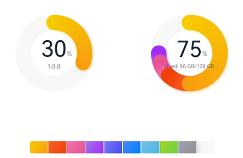
This example demonstrates how to set different types of data panels using the type attribute.
// xxx.ets
@Entry
@Component
struct DataPanelExample {
  public valueArr: number[] = [10, 10, 10, 10, 10, 10, 10, 10, 10]

  build() {
    Column({ space: 5 }) {
      Row() {
        Stack() {
          // Single-segment circular data panel
          DataPanel({ values: [30], max: 100, type: DataPanelType.Circle }).width(168).height(168)
          Column() {
            Text('30').fontSize(35).fontColor('#182431')
            Text('1.0.0').fontSize(9.33).lineHeight(12.83).fontWeight(500).opacity(0.6)
          }

          Text('%')
            .fontSize(9.33)
            .lineHeight(12.83)
            .fontWeight(500)
            .opacity(0.6)
            .position({ x: 104.42, y: 78.17 })
        }.margin({ right: 44 })

        // Multi-segment circular data panel
        Stack() {
          DataPanel({ values: [50, 12, 8, 5], max: 100, type: DataPanelType.Circle }).width(168).height(168)
          Column() {
            Text('75').fontSize(35).fontColor('#182431')
            Text('Used: 98 GB/128 GB') .fontSize(8.17).lineHeight(11.08).fontWeight(500).opacity(0.6)
          }

          Text('%')
            .fontSize(9.33)
            .lineHeight(12.83)
            .fontWeight(500)
            .opacity(0.6)
            .position({ x: 104.42, y: 78.17 })
        }
      }.margin({ bottom: 59 })

      // Linear data panel
      DataPanel({ values: this.valueArr, max: 100, type: DataPanelType.Line }).width(300).height(20)
    }.width('100%').margin({ top: 5 })
  }
}
Example 2: Setting Gradient Colors and Shadows
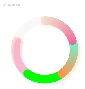
This example demonstrates how to set gradient colors and shadows using the valueColors and trackShadow attributes.
// xxx.ets
@Entry
@Component
struct LinearGradientDataPanelExample {
  public values1: number[] = [20, 20, 20, 20]
  public color1: LinearGradient =
    new LinearGradient([{ color: "#65EEC9A3", offset: 0 }, { color: "#FFEF629F", offset: 1 }])
  public color2: LinearGradient =
    new LinearGradient([{ color: "#FF67F9D4", offset: 0 }, { color: "#FFFF9554", offset: 1 }])
  public colorShadow1: LinearGradient =
    new LinearGradient([{ color: "#65EEC9A3", offset: 0 }, { color: "#65EF629F", offset: 1 }])
  public colorShadow2: LinearGradient =
    new LinearGradient([{ color: "#65e26709", offset: 0 }, { color: "#65efbd08", offset: 1 }])
  public colorShadow3: LinearGradient =
    new LinearGradient([{ color: "#6572B513", offset: 0 }, { color: "#6508efa6", offset: 1 }])
  public colorShadow4: LinearGradient =
    new LinearGradient([{ color: "#65ed08f5", offset: 0 }, { color: "#65ef0849", offset: 1 }])
  @State color3: string = '#00FF00'
  @State color4: string = '#20FF0000'
  @State bgColor: string = '#08182431'
  @State offsetX: number = 15
  @State offsetY: number = 15
  @State radius: number = 5
  @State colorArray: Array<LinearGradient|ResourceColor> = [this.color1, this.color2, this.color3, this.color4]
  @State shadowColorArray: Array<LinearGradient|ResourceColor> =
    [this.colorShadow1, this.colorShadow2, this.colorShadow3, this.colorShadow4]

  build() {
    Column({ space: 5 }) {
      Text('LinearGradient')
        .fontSize(9)
        .fontColor(0xCCCCCC)
        .textAlign(TextAlign.Start)
        .width('100%')
        .margin({ top: 20, left: 20 })
      DataPanel({ values: this.values1, max: 100, type: DataPanelType.Circle })
        .width(300)
        .height(300)
        .valueColors(this.colorArray)
        .trackShadow({
          radius: this.radius,
          colors: this.shadowColorArray,
          offsetX: this.offsetX,
          offsetY: this.offsetY
        })
        .strokeWidth(30)
        .trackBackgroundColor(this.bgColor)
    }.width('100%').margin({ top: 5 })
  }
}
Example 3: Disabling Animations and Shadows
This example demonstrates how to disable animations and shadows using the closeEffect attribute.
// xxx.ets
@Entry
@Component
struct LinearGradientDataPanelExample {
  public values1: number[] = [20, 20, 20, 20]
  public color1: LinearGradient =
    new LinearGradient([{ color: "#65EEC9A3", offset: 0 }, { color: "#FFEF629F", offset: 1 }])
  public color2: LinearGradient =
    new LinearGradient([{ color: "#FF67F9D4", offset: 0 }, { color: "#FFFF9554", offset: 1 }])
  public colorShadow1: LinearGradient =
    new LinearGradient([{ color: "#65EEC9A3", offset: 0 }, { color: "#65EF629F", offset: 1 }])
  public colorShadow2: LinearGradient =
    new LinearGradient([{ color: "#65e26709", offset: 0 }, { color: "#65efbd08", offset: 1 }])
  public colorShadow3: LinearGradient =
    new LinearGradient([{ color: "#6572B513", offset: 0 }, { color: "#6508efa6", offset: 1 }])
  public colorShadow4: LinearGradient =
    new LinearGradient([{ color: "#65ed08f5", offset: 0 }, { color: "#65ef0849", offset: 1 }])
  @State color3: string = '#00FF00'
  @State color4: string = '#20FF0000'
  @State bgColor: string = '#08182431'
  @State offsetX: number = 15
  @State offsetY: number = 15
  @State radius: number = 5
  @State colorArray: Array<LinearGradient|ResourceColor> = [this.color1, this.color2, this.color3, this.color4]
  @State shadowColorArray: Array<LinearGradient|ResourceColor> =
    [this.colorShadow1, this.colorShadow2, this.colorShadow3, this.colorShadow4]

  build() {
    Column({ space: 5 }) {
      Text('LinearGradient')
        .fontSize(9)
        .fontColor(0xCCCCCC)
        .textAlign(TextAlign.Start)
        .width('100%')
        .margin({ top: 20, left: 20 })
      DataPanel({ values: this.values1, max: 100, type: DataPanelType.Circle })
        .width(300)
        .height(300)
        .valueColors(this.colorArray)
        .strokeWidth(30)
        .closeEffect(true)
        .trackBackgroundColor(this.bgColor)
    }.width('100%').margin({ top: 5 })
  }
}

Example 4: Setting the Custom Content Area
This example shows how to customize the content area of the data panel using the contentModifier attribute.
// xxx.ets
@Builder
function buildDataPanel(config: DataPanelConfiguration) {
  Column() {
    Column() {
      ForEach(config.values, (item: number, index: number) => {
        ChildItem({ item: item, index: index, max: config.maxValue })
      }, (item: string) => item)
    }.padding(10)

    Column() {
      Line().width("100%").backgroundColor("#ff373737").margin({ bottom: 5 })
    }.padding({ left: 20, right: 20 })

    Row() {
      Text('Length=' + config.values.length + '    ').margin({ left: 10 }).align(Alignment.Start)
      Text('Max=' + config.maxValue).margin({ left: 10 }).align(Alignment.Start)
    }
  }
}

class DataPanelBuilder implements ContentModifier<DataPanelConfiguration> {
  constructor() {
  }

  applyContent(): WrappedBuilder<[DataPanelConfiguration]> {
    return wrapBuilder(buildDataPanel)
  }
}

@Entry
@Component
struct Index {
  build() {
    Column() {
      Text("Data panel").margin({ top: 12 });
      Row() {
        DataPanel({ values: [12.3, 21.1, 13.4, 35.2, 26.0, 32.0], max: 140, type: DataPanelType.Circle })
          .width(400)
          .height(260)
          .constraintSize({ maxWidth: "100%" })
          .padding({ top: 10 })
          .contentModifier(new DataPanelBuilder())
      }.margin(15).backgroundColor("#fff5f5f5")
    }
  }
}

@Component
struct ChildItem {
  @Prop item: number;
  @Prop index: number;
  @Prop max: number;
  public color1: string = "#65ff00dd"
  public color2: string = "#6500ff99"
  public color3: string = "#65ffe600"
  public color4: string = "#6595ff00"
  public color5: string = "#65000dff"
  public color6: string = "#650099ff"
  public colorArray: Array<string> = [this.color1, this.color2, this.color3, this.color4, this.color5, this.color6]

  build() {
    RelativeContainer() {
      Row() {
        Rect()
          .height(25)
          .width(this.item * 600 / this.max)
          .foregroundColor(this.colorArray[this.index])
          .radius(5)
          .align(Alignment.Start)
        Text(" " + this.item)
          .fontSize(17)
      }
    }.height(28)
  }
}
