Menu Control (Menu)
You can use menu APIs to display a context menu, a vertical list of items displayed by long pressing, clicking, or right-clicking a component. For details, see Menu Control.
A context menu displayed using bindContextMenu and configured with a preview image has a mask applied; in this case, it is modal.
A context menu displayed using bindMenu, or bindContextMenu without a preview image configured, does not have a mask applied; in this case, it is non-modal.
Lifecycle
| Name | Type | Description |
|---|---|---|
| aboutToAppear | () => void | Callback triggered when the menu is about to appear. |
| onAppear | () => void | Callback triggered when the menu is displayed. |
| aboutToDisappear | () => void | Callback triggered when the menu is about to disappear. |
| onDisappear | () => void | Callback triggered when the menu is hidden. |
Creating a Menu in the Default Style
Use the bindMenu API to implement a menu. bindMenu responds to the click event of the bound component. When the bound component is clicked, the menu is displayed.
Button('click for Menu')
  .bindMenu([
    {
      value: 'Menu1',
      action: () => {
        console.info('handle Menu1 select')
      }
    }
  ])

Creating a Menu in a Custom Style
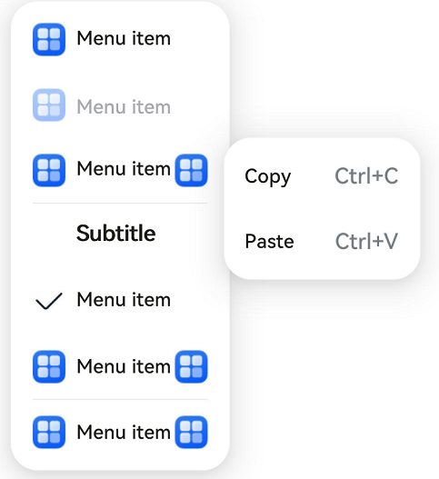
If the default style does not meet requirements, you can use @Builder to customize menu content and use the bindMenu API to bind the custom menu to a component.
@Builder: Customizing Menu Content
class Tmp {
  iconStr2: ResourceStr = $r("app.media.view_list_filled")

  set(val: Resource) {
    this.iconStr2 = val
  }
}

@Entry
@Component
struct menuExample {
  @State select: boolean = true
  private iconStr: ResourceStr = $r("app.media.view_list_filled")
  private iconStr2: ResourceStr = $r("app.media.view_list_filled")

  @Builder
  SubMenu() {
    Menu() {
      MenuItem({ content: "Copy", labelInfo: "Ctrl+C" })
      MenuItem({ content: "Paste", labelInfo: "Ctrl+V" })
    }
  }

  @Builder
  MyMenu() {
    Menu() {
      MenuItem({ startIcon: $r("app.media.icon"), content: "Menu item" })
      MenuItem({ startIcon: $r("app.media.icon"), content: "Menu item" }).enabled(false)
      MenuItem({
        startIcon: this.iconStr,
        content: "Menu item",
        endIcon: $r("app.media.arrow_right_filled"),
        // When the builder parameter is set, it indicates that a submenu is bound to a menu item. When the user hovers the cursor over the menu item, the submenu is displayed.
        builder: this.SubMenu
      })
      MenuItemGroup ({ header: 'Subtitle' }) {
        MenuItem ({ content: "Menu item" })
          .selectIcon(true)
          .selected(this.select)
          .onChange((selected) => {
            console.info("menuItem select" + selected);
            let Str: Tmp = new Tmp()
            Str.set($r("app.media.icon"))
          })
        MenuItem({
          startIcon: $r("app.media.view_list_filled"),
          content: "Menu item",
          endIcon: $r("app.media.arrow_right_filled"),
          builder: this.SubMenu
        })
      }

      MenuItem({
        startIcon: this.iconStr2,
        content: "Menu item",
        endIcon: $r("app.media.arrow_right_filled")
      })
    }
  }

  build() {
    // ...
  }
}
Using the bindMenu Attribute to Bind a Component
Button('click for Menu')
  .bindMenu(this.MyMenu)
Creating a Context Menu Displayed Upon Right-clicking or Long Pressing
Use the bindContextMenu API to customize the menu content and menu popup mode: right-click or long press. The menu items that are displayed using bindContextMenu are in an independent child window and can be displayed outside the application window.
-
The content in the @Builder is the same as that in the preceding section.
-
Check the menu popup mode and bind the component through the bindContextMenu attribute. In the example, the menu is displayed upon right-clicking.
Button('click for Menu')
  .bindContextMenu(this.MyMenu, ResponseType.RightClick)
你可能感兴趣的鸿蒙文章
harmony 鸿蒙Atomic Service Full Screen Launch Component (FullScreenLaunchComponent)
harmony 鸿蒙Arc Button (ArcButton)
harmony 鸿蒙Frame Animation (ohos.animator)
harmony 鸿蒙Implementing Property Animation