Panel
A panel is a lightweight window.
How to Use
-
Generally, use a panel at the bottom of the screen to facilitate one-hand operations.
-
Adjust the position and display mode of panels in different scenarios, because the screen sizes of foldable phones and tablets are not suitable for one-hand actions. For example, the Share panel is displayed in the middle of the screen.
-
The content displayed on panels depends on the scenario. Panels can be used to display the content that needs to be displayed persistently. For example, on an AI Touch screen, panels display the screen identification result. Panels can also be used to display the content that shows temporarily. For example, when a user looks up for a word, the meaning of the word is displayed on the panel.
-
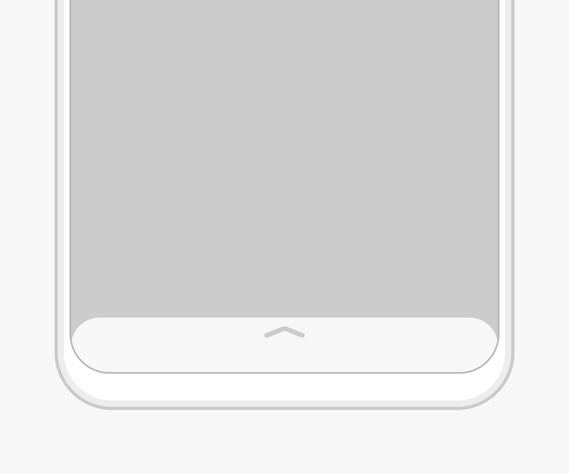
There are three sizes for a panel: small, medium (half screen), and large (full screen). The initial size is medium.
 |  |  |
|---|---|---|
| Small | Medium | Large |
Swipe
-
Swipe up to switch from the small screen to the half screen and continue sliding up to switch to the full screen.
-
Swipe down to switch from the full screen to the half screen and then to the small screen. The icon on the top of the panel changes with the screen size.
Touch
-
Touch the up arrow to switch from the small panel to the half screen.
-
Touch the down arrow to switch from the full screen to the half screen.
-
Touching the short horizontal line on the half screen does not change the display mode.
Resources
For details about the development guide related to the panel, see Panel.
你可能感兴趣的鸿蒙文章
harmony 鸿蒙OpenHarmony Application UX Design Specifications
harmony 鸿蒙Animation Attributes
harmony 鸿蒙Animation Design Principles
harmony 鸿蒙Application Navigation Structure Design
harmony 鸿蒙Application Page Structure Design