switch
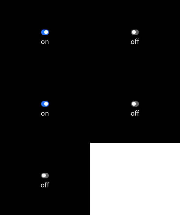
The <switch> component is used to enable or disable a function.
NOTE
This component is supported since API version 4. Updates will be marked with a superscript to indicate their earliest API version.
Child Components
Not supported
Attributes
| Name | Type | Default Value | Mandatory | Description |
|---|---|---|---|---|
| checked | boolean | false | No | Whether the component is checked or not. |
| id | string | - | No | Unique ID of the component. |
| style | string | - | No | Style declaration of the component. |
| class | string | - | No | Style class of the component, which is used to refer to a style table. |
| ref | string | - | No | Reference information of child elements, which is registered with the parent component on $refs. |
Events
| Name | Parameter | Description |
|---|---|---|
| change | { checked: checkedValue } | Triggered when the checked state changes. |
| click | - | Triggered when the component is clicked. |
| longpress | - | Triggered when the component is long pressed. |
| swipe5+ | SwipeEvent | Triggered when a user quickly swipes on the component. |
Styles
| Name | Type | Default Value | Mandatory | Description |
|---|---|---|---|---|
| width | <length> |<percentage>5+ | - | No | Component width. If this attribute is not set, the default value 0 is used. |
| height | <length> |<percentage>5+ | - | No | Component height. If this attribute is not set, the default value 0 is used. |
| padding | <length> | 0 | No | Shorthand attribute to set the padding for all sides. The attribute can have one to four values: - If you set only one value, it specifies the padding for all the four sides. - If you set two values, the first value specifies the top and bottom padding, and the second value specifies the left and right padding. - If you set three values, the first value specifies the top padding, the second value specifies the left and right padding, and the third value specifies the bottom padding. - If you set four values, they respectively specify the padding for top, right, bottom, and left sides (in clockwise order). |
| padding-[left|top|right|bottom] | <length> | 0 | No | Left, top, right, and bottom padding. |
| margin | <length> |<percentage>5+ | 0 | No | Shorthand attribute to set the margin for all sides. The attribute can have one to four values: - If you set only one value, it specifies the margin for all the four sides. - If you set two values, the first value specifies the top and bottom margins, and the second value specifies the left and right margins. - If you set three values, the first value specifies the top margin, the second value specifies the left and right margins, and the third value specifies the bottom margin. - If you set four values, they respectively specify the margin for top, right, bottom, and left sides (in clockwise order). |
| margin-[left|top|right|bottom] | <length> |<percentage>5+ | 0 | No | Left, top, right, and bottom margins. |
| border-width | <length> | 0 | No | Shorthand attribute to set the margin for all sides. |
| border-color | <color> | black | No | Shorthand attribute to set the color for all borders. |
| border-radius | <length> | - | No | Radius of round-corner borders. |
| background-color | <color> | - | No | Background color. |
| display | string | flex | No | How and whether to display the box containing an element. Available values are as follows: - flex: flexible layout - none: not rendered |
| [left|top] | <length> |<percentage>6+ | - | No | left|Edge of the element. - left: left edge position of the element. This attribute defines the offset between the left edge of the margin area of a positioned element and left edge of its containing block. - top: top edge position of the element. This attribute defines the offset between the top edge of a positioned element and that of a block included in the element. |
Example
<!-- xxx.hml -->
<div class="container">
  <div class="box">
    <switch checked="true" @change="switchChange"></switch>
    <text>{{title}}</text>
  </div>
</div>
/* xxx.css */
.container {
  width: 100%;
  height: 100%;
  justify-content: center;
  align-items: center;
}
.box{
  width: 18%;
  height: 25%;
  flex-direction:column;
  justify-content: center;
  align-items: center;
}
// xxx.js
export default {
  data: {
      title: 'on'
  },
  switchChange(e){
      console.log(e.checked);
      if(e.checked){
          this.title="on"
      }else{
          this.title="off"
      }
  }
}
你可能感兴趣的鸿蒙文章
harmony 鸿蒙JavaScript-compatible Web-like Development Paradigm (ArkUI.Lite)